I’d love to have some feedback about the way I’ve been presenting my photos on here. I’ve been playing around with pixel size and thumbnail vs. full size image, trying to get the photos to look clearer when you first see them on here. I know they’ve been rather blurry, and that has really been annoying me. So please leave me a comment and answer the following questions:
Do you like the current thumbnail-size images with the text wrapped around them? Would you rather have a larger photo to view? Do you ever click on the image to see it larger? Even if I had a larger preview photo, would you click on it for a better view?
Any other opinions or comments you’d like to make would be greatly appreciated! Brutal honesty isn’t going to hurt my feelings, so say what you mean. Thanks in advance.
Now, on to today’s card. One of the teachers at our elementary school is expecting a little boy any day now. Here is what I made to send her on behalf of the PTA Executive Board.
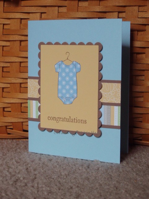 I just received Stampin’ Up’s Delicate Dots designer paper and decided to put it to use right away. The color scheme is taken from Splitcoaststampers’ weekly color challenge #213, and the layout is this week’s sketch challenge, #224. I wanted to use my scalloped Nestabilities for the mat for the two narrow strips of designer paper, but the largest die I had was still a little too short to reach across the entire width of the card. I love paper piecing the onesie!
Stamps: By Ones & By Twos, Hugs & Wishes (Stampin’ Up!)
Cardstock: Bashful Blue, So Saffron, Close to Cocoa, Delicate Dots designer paper (Stampin’ Up!)
Ink: Close to Cocoa
Other: Nestabilities scalloped rectangle die; Cutterbee scissors; dimensional adhesive
5 Responses to “A question for my readers…”
Sorry, the comment form is closed at this time.


I pretty much always click on the thumbnail, and in this case, the resulting picture was clear and perfectly sized. And so pretty!
I always click on thumbnails. In fact I guess I don’t spend much time looking at it at all because I never noticed they were blurry.
The size the picture is when you click is great. Can you teach me how to do it for my blog?;-)
Love the card. Everything is just the perfect sweet touch.
I click on the thumbnail and your picture is very clear. Cute card!
Hi Patricia!
I always click on the thumbnail. I love this card! So cute! Anyway, I think you’ve got them sized just right. I’ve been having issues myself (well, not lately I haven’t blogged in forever!) with the pics blowing up so huge that you have to scroll to see the whole card. That’s a bit annoying.
As for the initial pic, it could be a bit bigger, only because I really think that the artwork should stand out on the blog. And you do very pretty work, so it should stand out!
Just passing by and thought I’d stop awhile. I usually click on the thumb-nail if I want to see the picture in more detail, I don’t think you really need a bigger picture. A nice bright sunny day should give you a nice bright sunny picture and even cold days should give you crisp sharp images. My daughter’s sent me some lovely pictures of her walks through the mountains near where she lives in Seattle. They aren’t on my blog yet, but I’m thinking I might put a few on to show my British followers some of the lovely country-side you have over there! You’re soooo lucky!
Lovely cards too!!
((Lyn)))