When I’m working on a card, I usually have a mental picture going on of how I think the card will look when it’s completed. Often the mental picture and the completed card match up pretty well. However, today’s card is one where the finished card never quite got on track with the mental picture. I didn’t have time for a do-over so even though I’m not exactly pleased with the card, I have to share it anyway.
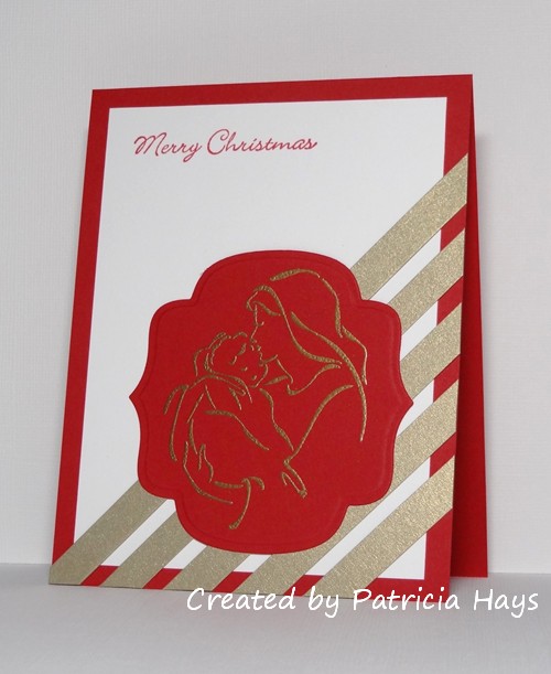
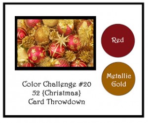
This week’s challenge at 52 {Christmas} Card Throwdown is a color challenge – red and metallic gold. Black and white (or ivory) may also be used. So I figured I’d end up heat embossing an image with gold embossing powder. I tossed around a few different ideas for images but my mind kept coming back to this Madonna and child image I haven’t used for quite a while. I discovered a new sketch challenge blog earlier this week and wanted to give their sketch a try. I had some long, narrow scrap strips of gold cardstock that I thought would be put to good use with the sketch, so I decided to use red for the background of my embossed image.
In retrospect I probably should have also done the sentiment in gold, to visually balance with the strips. But at that point I was already not really thrilled with the way the card was turning out and wasn’t in a mood to fuss with embossing the image and risking getting stray gold embossing powder flecks on the white cardstock.
I have to admit that I’m so much underwhelmed with this card that I’m hoping to have time to make something better for that sketch challenge and link the new card instead of this one. LOL I do have several more days in which to do that.
And yes – I know I’m my own worst critic. The card really isn’t awful. I’m just disappointed in the way it turned out. It’s still going to be all right to send to Operation Write Home (once I line it with white cardstock so handwriting will show up more easily inside the card).
Anyway – here’s your chance to make a better card with these colors than I did! 🙂 The design team at 52{C}CT would love to see what you can create! Use the linky tool at the challenge blog to share your card by 1:00 p.m. Eastern time Friday, August 16.
Thanks for stopping by today!
All supplies for this card are from Stampin’ Up unless otherwise noted:
Stamps: Madonna and Child
Cardstock: Real Red, Whisper White, Brushed Gold
Ink: Real Red; Gold (Colorbox)
Other: detail gold embossing powder; Labels Nine Nestabilities die (Spellbinders)
8 Responses to “52 {Christmas} Card Throwdown – August color challenge”
Sorry, the comment form is closed at this time.








Well, I do like it Patricia, I love the combination of very contemporary (stripes) and traditional (image) and I have to say it is very beautifully done. Very CAS in my eyes and and I would love to receive such a card. It is hard when you are not happy with a creation, I know that feeling well! I do hope it grows on you
Louise xx
So sorry Patricia that this didn’t come out as planned and that you don’t really like it. We really all are our own worst critics for sure. I really like your card – especially the embossed Madonna and Child and the gold stripes on the corner. It is a lovely CAS card and anyone would be very happy to receive it.
This is just lovely, Patricia! LOVE the amazing gold on red embossing–it’s so elegant! HUGS and happy weekend! 🙂 PS: I got the canvas, THANK YOU!!! Mynn xx
It’s a lovely card Patricia, I agree, we are our own worst critics! I love the diagonal stripes behind the image! My opinion – for what it’s worth – is that red is absolutely fine for the sentiment, a gold one may not show up as well. I think I might have tried a larger sentiment if I’m going to be super picky! The Madonna & Child image is so simply drawn but beautifully encapsulates the true meaning of Christmas! Ruth x
Your card really is very pretty, but I know what you mean about things not turning out the way you imagined. That happened about 3 times to me yesterday! But don’t be too hard on yourself; you made a lovely card!
We all get days like these (mine are very frequent!) it is a gorgeous card though – don’t be too hard on yourself – Jacqueline xx
I like it! The colours are rich and elegant, the layout is quite contemporary with the gold stripes – I think it’s great.
Hmmm my internet connnection just conked out so not sure if my comment went through or not…
Just wanted to say that we are our own worst critics and instead you should take heart from all these supportive comments I read!! Thanks for stopping by my blog.