Hello there! It’s time for another sketch challenge at CAS Colours & Sketches. You’re welcome to manipulate the sketch, or change the small squares to another shape, so long as we can still easily recognize the main elements of the sketch.
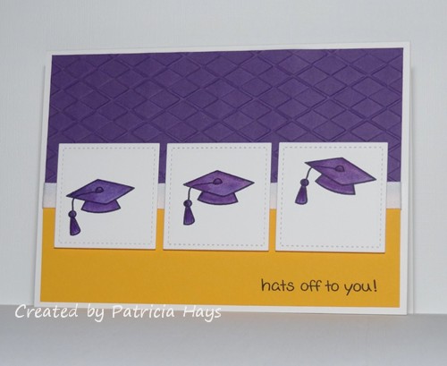
As I mentioned in last week’s post, many high schools are closing out the school year now, and it’s been “graduation season” for us. I’ve needed to make several graduation cards this year. I used our CC&S sketch for two of them. The colors are taken from the graduates’ schools’ colors – purple and golden yellow for one, and black and orange for the other. For the purple and gold card, I turned the sketch on its side. This is a larger than usual card for me, 5″ x 7″. I did that for two reasons – because I wanted to include some photos in the card, and because of the size of the mortarboard stamp. By positioning the stamp differently on each square, I was hoping to convey the idea of the cap being tossed into the air. I didn’t really think about it until I was formatting the photo, but the diamond shapes in the argyle embossing somewhat mimic the mortarboard shape. It felt good to use some retired cardstock colors for this card!
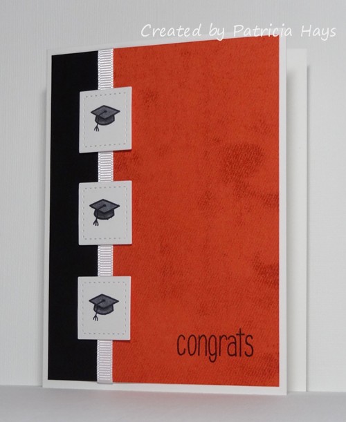
I stayed true to the original sketch for the orange and black card, and kept it the usual A2 size. The orange cardstock is stamped with a background stamp to give it some visual texture. After I inked the background stamp, I stamped it off once onto a scrap piece of paper before stamping the cardstock, to lighten it up a bit. A few areas of the stamp didn’t quite take to the scrap paper, so they showed up darker on the orange cardstock. I think it turned out like a serendipitous accident to give a little more interest.
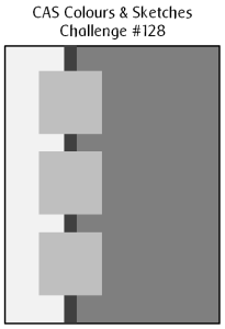
And here’s the sketch graphic:
Both of these cards are eligible for the current Retro Rubber challenge to use ribbon or twine. Although the “Hats Off to You” stamp set I used on the purple and yellow card is one of the first Lawn Fawn sets I bought back about 4 years ago, this is the first time I’ve used the mortarboard stamp. The “So Much to Say” set used on the orange and black card is newer but I’ve had it for about 18 months. And the “Just Jeans” background stamp there is an oldie but goodie from Stampin’ Up; I’ve had it for nearly 10 years!
Since the orange and black card went to a young man, I’m also submitting it into this week’s Masculine theme challenge at The Paper Players.

Thanks for stopping by today! Be sure to see what the rest of the CC&S Design Team has done with the sketch. Then show us your own take on it by linking your card at the CC&S site by 6:00 p.m. Eastern time Wednesday, June 17. We’d love to have you join us!
Supplies for the purple and yellow card:
Stamps: Hats Off to You (Lawn Fawn)
Cardstock: Eggplant Envy, Summer Sun (Stampin’ Up); Pure Luxury White (Gina K. Designs)
Ink: Tuxedo Black (Memento)
Other: Small Stitched Square Stackables die (Lawn Fawn); markers (Copic); Argyle embossing folder (Darice); white twill ribbon (source unknown)
Supplies for the orange and black card:
Stamps: So Much to Say (Lawn Fawn); Just Jeans (Stampin’ Up)
Cardstock: Tangerine Tango, Basic Black (SU); Pure Luxury White (Gina K. Designs)
Ink: Tuxedo Black (Memento); Tangerine Tango (SU)
Other: Small Stitched Square Stackables die (Lawn Fawn); markers (Copic); white grosgrain ribbon (SU)
12 Responses to “CAS Colours & Sketches #128”
Sorry, the comment form is closed at this time.


Wow! Love that purple and gold together and nice touch having the mortarboards flyng through the air. And the orange and black card looks so grand and traditional, fabulous!
Your mortarboards do look like they’re being thrown upwards. Nice colour combination – very regal.
It’s been interesting seeing all the graduation challenges and cards come along recently. It’s not a big thing in New Zealand. Firstly, our school year follows the calendar, so end of school is in December but secondly, we don’t usually do a big thing about finishing high school. Just as we don’t really do Halloween.
Love these sets of cards! They are so crisp and clean, perfect for any graduation. Thanks for playing along at The Paper Players!
Both great CAS graduation cards that would work in so many different colour combos and a perfect take on the sketch.Thanks for joining my masculine challenge over at The Paper Players this week!
Great Grad cards . . . I made a few myself this season as well, and like to use the school colors too! Nice use of the sketch and the ribbon is a nice little touch. Thanks so much for playing along with us at RRBC!
Fantastic grad cards! I finally got the two done that I needed too! I should have checked out this post earlier so I could have CASEd it!! I love the CAS quality of these cards! Beautiful work as always! I love to see what you create for us at Retro Rubber!
Great sketch for graduation cards. Love the grosgrain ribbon. Thanks for playing along with Retro Rubber this week!
What a great design, Patricia, and an effective way to use ribbon! I think your mortarboard definitely looks like it is being tossed in the air and I love it!! Thank you for playing in the Retro Rubber challenge!! Hugs, Darnell
Love both of your cards. The subtle ribbon took me a while to spot LOL! Thanks for joining us at Retro Rubber this week. Cx DT
Great combination of challenges! Graduation cards are fun to make and these will definitely be loved by the student. Thanks for playing along with Retro Rubber’s ribbon challenge.
2 fabby cards Patricia! I love how you twisted the sketch for your first card, and love the colours of your second one!
Lizy xx
Thanks for doing the challenge! Great card!