Well hello there! It’s the first Thursday of the month, which means we have a new hostess of the month over at CAS Colours & Sketches! Louise has come up with some neat challenges for us, and we hope you’ll join in to show us what you can do with them.
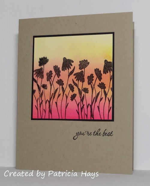
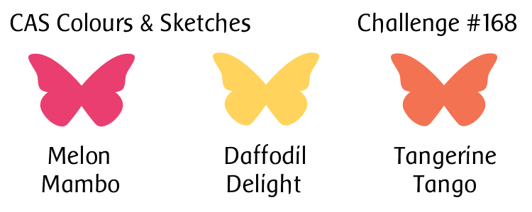
We’re starting off the month with a color challenge, and Louise has chosen some bright colors for it. I used them to create a watercolored background, so the colors are toned down a bit on my card. The way the colors blended kind of created a fourth color, but trust me, I used only the three challenge colors for the background. When it was dry, I stamped some silhouetted flowers to make it look like the flowers are set against a sunset sky. Or maybe it’s a sunrise. Use your imagination! 🙂 I added a simple thin black mat to the image to make it stand out from the card base, stamped a sentiment, and called it done. It felt good to use some of my older stamps for this card.
I’m going to submit this to the current Less is More challenge, where the theme is “white space that isn’t white”.
Go see what the rest of the CC&S Design Team has done with these vibrant colors! Then make your own card with these colors and share it with us at the CC&S challenge post. You have until 6:00 p.m. Eastern time Wednesday, April 13 to link your card. We hope you’ll join us! Thanks for stopping by today.
Supplies:
Stamps: Serene Silhouettes (Sweet ‘n Sassy Stamps); Everyday Sayings (Lizzie Anne Designs)
Cardstock: Kraft, Basic Black (Stampin’ Up); The Langton Prestige Extra Smooth Hot Press watercolor paper (Daler-Rowney)
Ink: Onyx Black (VersaFine)
Other: Daffodil Delight, Melon Mambo, and Tangerine Tango reinkers (SU)
15 Responses to “CAS Colours & Sketches #168”
Sorry, the comment form is closed at this time.


Wonderful card, Patricia! The background is beautiful and set off perfectly by the silhouette images.
Wow, Patricia! Love this silhouette scene. Those colours have blended together so well and setting them off on the Kraft card was such a great idea. So happy with all the cards from the DT,
Louise xx
Such a beautiful card and beautiful blended colours, this really caught my eye in the gallery.
Marie
Gorgeous card so well presented !
Such a pretty card! I love the coloured panel against the Kraft, and the stamping is lovely. Fab card!
I absolutely love this glorious watercolour sunset – it looks fabulous! Thank you for sharing with us at Less Is More 🙂
What a fabulous scene, just stunning!
Liz – LIM Guest Designer xx
This is just lovely
Kathyk
Just love your card. Karen x
Beautiful background, so atmospheric in these colours and the silhouetted flowers are perfect against it.
Sorry for my late visit this week, but time just ran away from me!
This is just lovely, great inking!
Thanks so much
Chrissie
“Less is More”
Beautiful sunset effect Patricia. Stunning backdrop for the silhoutte images. Stef x
What beautiful blending you have achieved on this card Patricia. A gorgeous scene.
So sorry for my late visit! Thank you for joining us at Less is More.
Sharon xx
Stunning! Love your inked background and the colours work beautifully with the silhouette image. Beautifully done & my apologies in my lateness in commenting. Hugs Bev x
Patricia – I really love that watercoloured background and the silhouettes of the flowers. Beautiful card. Liz x