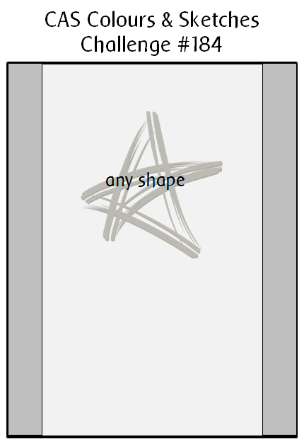
Hello there! It’s Thursday, which means it’s time for a new challenge at CAS Colours & Sketches. Karen has come up with a very simple little sketch to use this week.
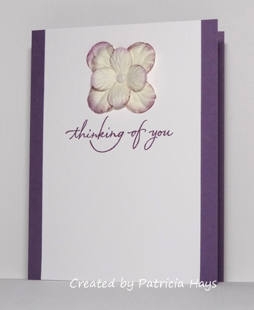
I have to admit, it’s such a versatile sketch that I was a little overwhelmed with all the possibilities for it. I finally decided to combine the sketch challenge with the current challenge at Less is More, which is to use something tactile on a clean and simple styled card. I have a bunch of paper flowers that I bought years ago – and by “years ago”, I mean that I used a similar one of these on a card for my son’s preschool teacher, and now he’s getting ready to start his senior year of high school. Yep! So I decided to use one on today’s card. I’ve added a little extra purple sponging to the edges of the petals to help it coordinate a bit better with the purple cardstock that matched it best. It’s probably very hard to see in the photo, but the white cardstock is linen textured. A simple flowing sentiment completes the card.
If you need more inspiration, check out what the rest of the CC&S design team and our July guest designer have made. Then create your own card using the sketch, and share it with us at the challenge site by 6:00 p.m. Eastern time Wednesday, August 3. We’d love to see what you make! Thanks for stopping by today.
Supplies:
Stamp: Everyday Greetings Collection (Wordsworth)
Cardstock: Perfect Plum (Stampin’ Up); Solar White Classic Linen (Neenah)
Ink: Perfect Plum (SU)
Other: Blossoms hydrangea (Making Memories)
10 Responses to “CAS Colours & Sketches #184”
Sorry, the comment form is closed at this time.


Beautiful CAS card and great combination of challenges. The sponging on the petals gives a more realistic feel to the flower too. Hugs Bev x
What a super card. It’s full of understated elegance, and the purples look very stylish. Great way to add texture for our challenge at Less is More – well done and thanks for playing!
Yay! Another purple card! So pretty, so CAS and yes tactile too!
Terrific CAS design. Your flower image is just perfect for this challenge. Thanks for sharing at Less is More!
Wonderful card! Love the color on the petal edges!
Patricia – it’s so beautiful. Like Jane, I adore purple, so this is right up my street. Liz x
Oh, I love that sentiment, it’s gorgeous. What a good choice! And the sponged flower is so clever, it really does tie it in perfectly. Fantastic card, Patricia. Caro x
This certainly is tactile Patricia… simply lovely!
Thanks so much
Chrissie
“Less is More”
I love the colour you added to the petals to co-ordinate with the ink and card. I always forget I have a box full of these flowers, I must use them!
Thanks for sharing with us.
Anita x
Less is More
CAS-tastic and perfectly tactile too. Superb choice of colour and design.
Thanks for sharing and playing along at Less is More this week.
Sarah