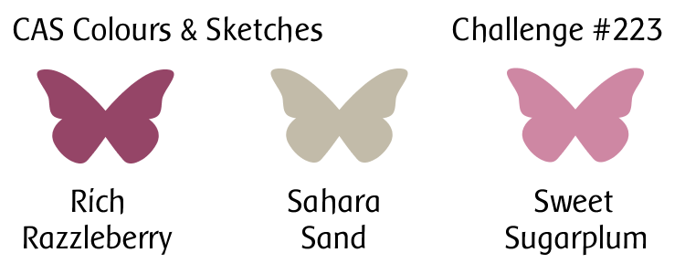
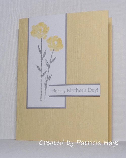
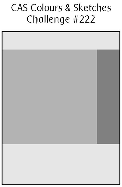
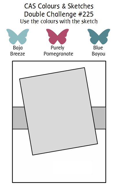
Hello!  It’s time for a Timeless Tuesday double challenge at CAS Colours & Sketches!  We’ve gone through our sketch archives and pulled out one of our previous sketches, and we’re pairing it with some retired Stampin’ Up colors.  To meet the challenge this week, the sketch must be used with the colors.  If you don’t have the exact colors it’s OK –  just use whatever you own that comes close to them.

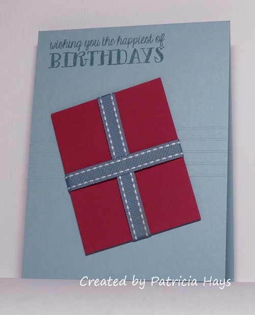
I’ve been away from my craft room for much of the past week, and I have to confess that last night when I was working on this card, I had a hard time getting into a crafting frame of mind.  This is definitely not one of my better cards but it meets the challenge so I’m going with it.  I used the lighter shade of blue for the card base and used the darker for the sentiment.  I rotated the sketch 180° so that I had a wider space at the top of the card for the sentiment.  Instead of using a piece of cardstock for the wide horizontal strip, I scored five lines.  It was hard to capture them in the photo, but they do extend across the entire front of the card.  It’s been a long time since I’ve used ribbon on a card, but I had the exact color of blue to work with the challenge.  I debated adding a bow, but I thought that would take away from the clean and simple style of the card.  The “present” is raised up from the card base with dimensional adhesive.

CASCAS225

double 225 finalBe sure to stop by the challenge blog and see what our Design Team members have done with this challenge!  Then create your own card using these colors and the sketch, and link it to the challenge site by 6:00 p.m. Eastern time Monday, June 5.  We’d love to have you join us!  Thanks for stopping by today.

Supplies:
Stamp: Cake & Candles (Avery Elle)
Cardstock: Baja Breeze, Purely Pomegranate (Stampin’ Up)
Ink: Blue Bayou (SU)
Other: Blue Bayou ribbon, dimensionals (SU)

My younger son graduates from high school tonight.  From a mom’s perspective, it’s bittersweet.  It’s so easy to remember him as a playful, smiling little boy, but now he has grown up to be a witty, handsome young man.

So today’s card is the one I made for my husband and I to give to our son.  I’ve used the ending-soon Freshly Made Sketches challenge for layout inspiration and used the school’s colors of blue, white, and black for the color palette.  (I purposefully stocked up on this blue cardstock when it retired because it’s perfect for the school color!)  My son has been active in both band and choir, so using a musical score background seemed like a no-brainer.   Coloring the digital image of the graduate was a little daunting.  Trying to get the shadows/shading to look realistic isn’t my forte, especially when working with colors that are dark to begin with.  This is actually my second attempt because I didn’t like the way the first one turned out.  If you look closely, you can see that I’ve included a golden yellow to represent my son’s honor graduate stole, and a bit of pink around the collar to take the place of the pink music honors cords he’ll wear.  After the time I spent coloring the image, I didn’t dare attempt to fussy cut to the exact edges of the image.  The white border blended in with the background, so I decided to back the image with a black rectangle.

FMS288

Doggone it.  I have Pandora on and right now they’re playing a song that my son played with the marching band as part of the pre-game shows before football games last season.  Cue sentimental feelings.

Thanks for stopping by today!  I’d best get off the computer and go iron the fold creases from my son’s gown…

Supplies:
Digital Image: The Boy and The Dog 007 (Heather Ellis)
Stamps: Happy Everything (Lawn Fawn); musical score (JudiKins)
Cardstock: Brilliant Blue, Basic Black (Stampin’ Up); Solar White (Neenah)
Ink: Tuxedo Black (Memento); printer ink
Other: stitched rectangle die (Lawn Fawn); markers (Copic)

Hello!  It’s time for another color challenge at Christmas Card Throwdown.  We have a rather unusual color combo for you this time:  yellow, kraft, and gold.

After a whole lot of thought about how to make these colors work together, I ended up getting inspiration from a card I made several years ago.  This time, I decided to use a text stamp for the background, and set a couple of stars on the edges of the text.  The text is stamped in kraft-colored ink.  I die cut the stars from a soft shade of yellow, rather than a bright one, because I felt it would provide more contrast with the gold.  I rubbed my Versamark ink pad against the corners of the stars and heat embossed them with gold embossing powder.  The stars are attached with dimensional adhesive for a little more dramatic effect.  I also decided to snip opposing corners for some additional interest.

52CCT 05-20-2017

Now it’s your turn to show us what you can make with these colors!  If you need more inspiration first, go visit the CCT site and see what the rest of the design team has created.  Be sure to link your card at the CCT site by 7:00 p.m. Eastern time on Friday, June 2.  We look forward to having you join us!

Supplies:
Stamp: Lexicon of Love (Stampin’ Up)
Cardstock: Kraft, Gold foil, Whisper White (SU)
Ink: Crumb Cake (SU); VersaMark
Other: Stars die (Sweet ‘n Sassy Stamps); dimensionals and tag corner punch (SU); gold embossing powder (Ranger)

Hello!  It’s the third Tuesday of the month, which means it’s time for another color challenge at CAS Colours & Sketches.

After some mental debate about how I wanted to use the challenge colors, I decided to go retro with one of my favorite retired Stampin’ Up stamp sets.  The neutral color has a bit of a greenish tint to it, which made it seem like it would work well with a floral image.  I used my trusty Stamp-a-ma-jig positioner to help place the different stamps that combine to make the tulip image.  Stamping it onto shimmery white cardstock gives a little extra elegance.  I decided to round two opposing corners of the card for a little something different.  Confession time:  when I was getting ready to adhere the image panel to the mat, I noticed there was a slight smudge of ink at the bottom edge of the panel.  So I decided to lightly sponge the entire edge of the panel with the lighter purple ink.  I think that tones down the contrast between the white panel and the raspberry mat and gives the card a little softer feel.

CASCAS223

CC&S color223-001

Go see what the rest of the CC&S Design Team has done with these pretty colors!  Then use the colors to make a card of your own, and share it with us at the CC&S challenge post.  You have until 6:00 p.m. Eastern time Monday, May 22 to link your card.  We hope you’ll join us!  Thanks for stopping by today.

Supplies for this card are from Stampin’ Up unless otherwise noted.
Stamps: Terrific Tulips, Delightful Dozen
Cardstock: Sahara Sand, Rich Razzleberry, Shimmery White
Ink: Sahara Sand, Rich Razzleberry, Sweet Sugarplum
Other: corner rounder (EK Success); sponge

Hello!  Just a quick post today to show the card I made combining the current Freshly Made Sketches challenge with the Less is More challenge that is expiring shortly.  I needed to make another Mother’s Day card for this year, so I decided to go with a floral theme because that seemed to work with the color challenge.  I’ve slightly amended the size of the panels on the sketch and lowered the placement of the sentiment strip, but I think it’s pretty obvious that my card was inspired by the sketch.  I used textured cardstock in a retired Stampin’ Up color for the base of the card.

FMS287

Thanks for stopping by today!  Comments are always welcome and appreciated!

All supplies are from Stampin’ Up.
Stamps: Painted Petals, Messages for Mom
Cardstock: Barely Banana textured, Smoky Slate, Whisper White
Ink: Smoky Slate, Barely Banana

Hello again!  This week at CAS Colours & Sketches we have a simple little sketch challenge up for the offering.

There is a myriad of things that can be done within the blocks on the sketch – and of course, the sketch can be rotated if one pleases.  I decided to keep true to the way the sketch was drawn and create a little scene in the square, and add the sentiment in the rectangle to the right of it.  I used watercolor pencils softened with blender pens to color the image.  This is not one of my best coloring jobs, but I wanted to keep it sort of sketchy looking to go with the look of the stamp.  Not adding color at all would have made the card look a little too “bare”.  Even though the sentiment says “thank you”, when it’s paired with the scene, I think it could work as a Father’s Day card, too.  The card base is textured cardstock to keep the card from looking too plain.

CASCAS222

sketch 222

What will you do with this sketch?  There are so many possibilities!  I hope you’ll try out something and share what you create with us!  Link your work to the CAS Colours & Sketches blog by 6:00 p.m. Eastern time Monday, May 15.  Thanks for stopping by today!

Supplies:
Stamps: Seaside Sketches (Stampin’ Up); Thank You Note (Hero Arts)
Cardstock: Sahara Sand textured, Soft Suede (SU); The Langton Prestige Extra Smooth Hot Press watercolor paper (Daler-Rowney)
Ink: Tuxedo Black (Memento)
Other: stitched square die (Lawn Fawn); watercolor pencils, blender pens (SU)

Hello hello!  It’s time for another sketch challenge at Christmas Card Throwdown.

I stayed pretty true to how the sketch was drawn, although it allows for flexibility in the shapes used.  I layered several different circles for my focal point, topping them with a penguin that I’d fussy cut.  I attached the circles to an embossed background that replicates falling snow.  A simple sentiment finished the card.

52CCT 05-06-2017

How will you interpret the sketch?  Be sure to share your card at the CCT site by 7:00 p.m. Eastern time Friday, May 19.  We’d love to have you join in the fun and creativity!

Supplies:
Stamps: Warm Penguin (Lizzie Anne Designs for Gourmet Rubber Stamps); Most Wonderful (Uniko)
Cardstock: Baja Breeze, Basic Black (Stampin’ Up); Solar White (Neenah); scrap from Fa La La 6″ x 6″ paper pad (Lawn Fawn)
Ink: Tuxedo Black (Memento)
Other: markers (Copic); standard circle and lacy circle Nestabilities dies (Spellbinders); Softly Falling embossing folder (SU)

Greetings!  We’re starting a new month of challenges at CAS Colours & Sketches today, and with it, the design team is doing something a little bit different.  Instead of having one team member being the hostess for the entire month, the team members are taking turns and each hosting one challenge either in May or June.  We’re still keeping our usual rotation of color and sketch challenges, and we have an awesome Timeless Tuesday double challenge later this month, so be sure to check out the challenge site!

As usual, we start the month with a color challenge.  This week’s colors made me think of flowers.  I turned to CAS(E) this Sketch! for inspiration for the layout of my card.  After I stamped the blossom on a piece of scrap cardstock, I softened the lines with a blender pen, and then fussy cut the flower.  It’s raised up from the card with dimensional adhesive, which is how I’ve incorporated a shadow into my card for the current Less is More challenge.  I don’t know how much it shows in the photo, but the card front is textured cardstock, for a little extra visual interest.

CASCAS221

CC&S color221-001

Thanks so much for stopping by today!  I hope you’ll make a card with these challenge colors and share it with us at CC&S.  You have until 6:00 p.m. Eastern time Monday, May 8 to link your card at the challenge site.

Supplies:
Stamps: Delight in Life (Stampin’ Up)
Cardstock: Pool Party; Classic Linen and Solar White (Neenah)
Ink: Wild Wasabi, Melon Mambo (SU)
Other: candy dots, dimensionals, blender pen (SU)

© 2019 Suffusion theme by Sayontan Sinha