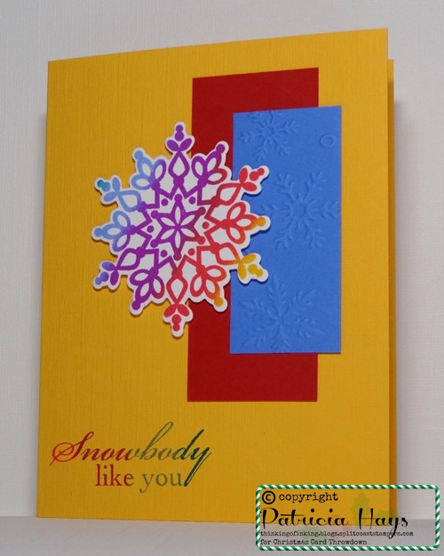
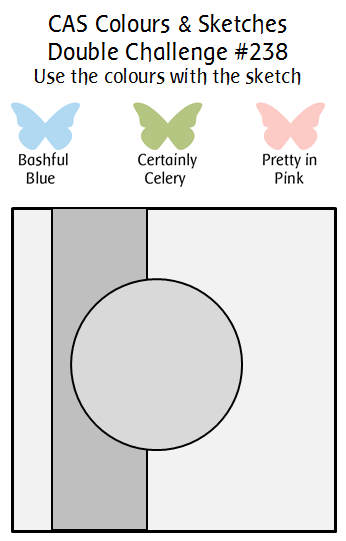
Hello there!  August has five Tuesdays, so that means it’s Timeless Tuesday double challenge week at CAS Colours & SketchesKaren and I combined forces for creating this week’s challenge – she chose a previous CC&S sketch to use, and I picked some of Stampin’ Up’s retired colors to use with it.  Although we use Stampin’ Up color names for reference, you may use any companies’ products to make your card, so long as you match the colors closely.  You’re also welcome to stretch the square format of the sketch into a rectangular card, and/or turn the sketch on its side.

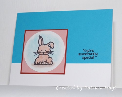
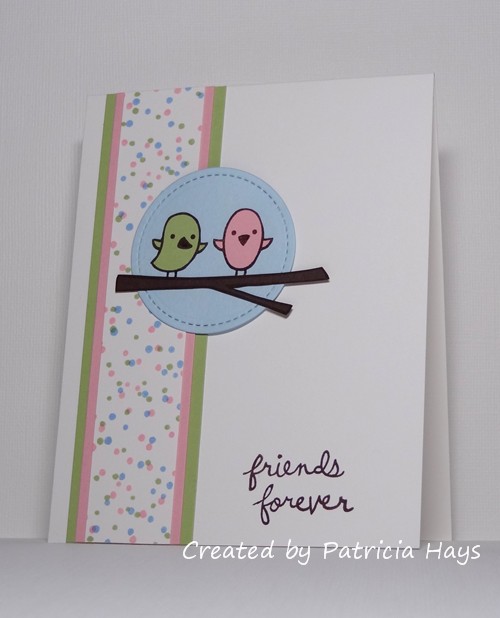
At first the colors suggested two things to me:  flowers and babies.  I ended up going with a different nature-related thing:  birds.  I stamped the birds and their branch on scraps of cardstock and fussy cut them to add to the blue background circle.  I didn’t fussy cut around their legs, though, because that’s tooooo fussy.  So I drew the legs back into place as I was assembling the focal point.  For the vertical strip, I stamped dots in each of the challenge colors onto a scrap of white cardstock, and matted it with pink and green.  I chose a sentiment to tie into the “friends” theme going on at Addicted to CAS.

CASCAS238

double 238

Be sure to check out what the rest of the CC&S Design Team has made.  Then get your craft on and link your own card to our challenge post!  You have until 7:00 p.m. Eastern time Monday, September 4 to share your card with us.  We’d love to see what you can do with our double challenge!  Thanks for stopping by today.

Supplies:
Stamps: Feathered Friends [for Simon Says Stamp], Sophie’s Sentiments (Lawn Fawn); Itty Bitty Backgrounds (Stampin’ Up)
Cardstock: Bashful Blue, Chocolate Chip, Whisper White, Pretty in Pink, Certainly Celery, thick Whisper White (SU)
Ink: Chocolate Chip, Bashful Blue, Certainly Celery, Pretty in Pink (SU)
Other: stitched circle die (Lawn Fawn)

Christmas Card Throwdown - August technique challenge

Comments Off on Christmas Card Throwdown – August technique challenge
Aug 262017

Hello there!  Today’s post is a reminder for the technique challenge that’s currently running at Christmas Card Throwdown.  It’s one that was new to me – Embossed Impressions.  Although the original challenge writeup at CCT says entries can have either heat or dry embossed techniques, “embossed impressions” is a technique all to itself.  Since I hadn’t tried it before, I Googled it and found a few different videos on YouTube to guide me along.  The idea is to use VersaMark ink to ink up a die, then run it through your die cutting/embossing machine with an embossing mat so that the die leaves an inked impression in the cardstock.  Then you sprinkle the impression with embossing powder and heat emboss the design.

I have to say that this did not turn out as well for me as I had hoped.   It seemed easy enough based on the videos, so I tried it with a snowflake die.  My results were pretty disastrous.  My first attempt, I had the wrong “sandwich” of materials and they were too thick to go through my Big Kick, so I had to abort that try.  My second go at it, I was interrupted mid-process by a telephone call and the ink dried before I could add the embossing powder.  I hoped that the third time would be the proverbial charm, but no.  I thought I had tapped the ink on the die very gently, but the embossing powder stuck all around the edges of the die and on some of the solid areas.  Even though I was able to clean off some of the excess powder before I heated it, it still looked like a huge mess.  So I thought about what other dies I could use.  I decided to try it with my “happy” die, thinking I’d add in the word “holidays” with a stamp.  This worked somewhat better.  Still messy, but not as bad.  I added the “holidays” with gold ink and heat embossed it… but then the “holidays” showed up much brighter than the “happy” because of the gold ink.  That prompted a lightbulb moment.  I tried it once again, but used gold ink on the die instead of VersaMark.  That gave me a brighter, bolder result with the embossing of the impression.  I do think it’s downright near impossible to get a good clean image with this technique, though.

Anyway… now that my fifth attempt resulted in a somewhat decent looking embossed impressed sentiment, the gold on the red background seemed a little too simple.  I figured since I already had the embossing powder out, I’d add some embossing to the edge of the red panel.  In retrospect I probably got a little too heavy handed with that.  But as they say, the show must go on, so I went ahead and put the panel on a white card base.  It’s definitely not the best card I’ve made. And sadly, it’s one of the worst ones I’ve made as a CCT Design Team member. But at least it’s an honest attempt at the technique.

52CCT 08-19-2017

Goodbyes are rarely easy.  It’s with a bittersweet note that this is the last card I’m making as a Design Team member for Christmas Card Throwdown.  I’ve been a part of the team there since March 2013, and while I’ve enjoyed my time there, four and a half years is long enough and it’s time for me to step down from the team.  I hate that this card that I really don’t like is my last one for the team.  I guess I’ll just have to play along as a participant in a future challenge and see if I can come up with something better.

Thanks for stopping by today!  If you’d like to give our challenge a try, you have until 7:00 p.m. Eastern time Friday, September 1 to submit your card at the CCT site.

Supplies:
Stamp: So Happy (Avery Elle)
Cardstock: Real Red (Stampin’ Up); Solar White (Neenah)
Ink: gold (ClearSnap)
Other: Simply Said Happy die (Avery Elle); gold embossing powder (Ranger); corner rounder punch (EK Success)

Hi there!  Today’s post is just a really quick one before the current challenge at The Paper Players ends.  They wanted to see clean and simple styled cards that incorporated coloring.  I also wanted to make something for the current Cards in Envy challenge to use a thought or speech balloon on a card.

I’ve put together a card from bits and pieces left over from other projects.  The penguin was already stamped; all I did with him for this card was color him and cut him out.  I found a scrap on my desk that was just the right size for the speech bubble.  I painted some shimmery white paint on another scrap of cardstock that I’d cut for the snowbank/ice for the penguin to stand on.  And the card base was a half sheet of cardstock left over from another card.  So yay for using up stuff!

PP358

Thanks for stopping by today!  Comments are always welcome and appreciated!

Supplies:
Stamps: Critters in the Snow, Sophie’s Sentiments, A Birdie Told Me (Lawn Fawn)
Cardstock: Cool Caribbean (Stampin’ Up); Pure Luxury White (Gina K. Designs)
Ink: Tuxedo Black (Memento)
Other: markers (Copic); Frost White shimmer paint (SU)

Hello!  Today starts sketch challenge week at CAS Colours & Sketches and Karen has drawn up a very nice clean and simple one for us!

Karen says she was inspired by triptych paintings when she created the sketch, and that was also my first thought when I saw it.  There are several ways one could make the three vertical panels.  Instead of following my normal instinct to attach three panels to a card base, I went a different route.  I printed the sketch at full size (4.25″ x 5.5″) onto regular copy paper, cut it out, and cut the three panels out from it, making sure the panels were long enough to accommodate the image I wanted to use.  Then I used the paper as a mask, attaching it with repositional adhesive to my card base.  I brushed some blue and green ink into the panels to create a background.  I need more practice with that technique.  When I was satisfied with the coloring of the background, I stamped the tree image, with the mask still in place.  I made sure the ink was dry before I carefully removed the mask and cleaned up the adhesive dots with an adhesive eraser.  Lastly, I added the sentiment.  I toyed with the idea of using a coordinating marker to draw lines around the three panels, but decided against it… ok, more like chickened out because I didn’t want to risk messing up the card.  But there you have it… a one layer card!

CASCAS237

sketch 237

The current AAA Cards challenge calls for using masking, so I’m going to enter this card there.

Be sure to check out the terrific cards the rest of the CC&S Design Team have made.  Then make your own card following the sketch and share it with us at the CC&S site.  You have until 6:00 p.m. Monday, August 28 to link your card.  We’d love to have you join in the fun and creativity!  Thanks for stopping by today.

Supplies:
Stamps: Thoughts & Prayers, It’s Your Birthday (Stampin’ Up)
Cardstock: Pure Luxury Ivory (Gina K. Designs)
Ink: Marina Mist, Bashful Blue, Pear Pizzazz (SU)
Other: stencil brushes (Claritystamp)

Hello!  It’s the third Tuesday of the month, which means it’s color challenge time again at CAS Colours & Sketches.  Karen has chosen some bright, playful colors for us to work with this week.

Despite the cheeriness of the colors, I seem to have a hard time working with them whenever they come up separately in our challenges – so putting them all together had me wondering what to make for a while!  Oh, but that’s what makes it a challenge, right?  🙂  Finally I settled on using a musical stamp that I’ve had for years but I don’t think I’ve ever actually used.  I thought that combined with a sentiment, it would make a pretty decent birthday card.  I’ve trimmed down the focal panel so that I could use a colored card base to mat it, for an extra pop of color. I used a stitched border die for the bottom edge, but because I didn’t have any stitched detailing on the rest of the card, I turned the die so the stitching would be on the cut off portion.

CASCAS236

CC&S color236-001

Now it’s your turn to create a clean and simple styled card using these colors, and share it with us at the CC&S site!  You have until 6:00 p.m. Eastern time Monday, August 21 to link your card.  We hope you’ll join us!

Supplies:
Stamps: unnamed musical notes stamp (Inkadinkadoo); Handwritten Notes (Avery Elle)
Cardstock: Crushed Curry, Whisper White (Stampin’ Up)
Ink: Crushed Curry, Bermuda Bay, Calypso Coral (SU)
Other: Landscape Trio die (Mama Elephant)

Hello!  Today starts the second week of the August theme challenge challenge at Christmas Card Throwdown.  It’s a different one this time:  Tropical Christmas. Well, at least for people like me who have always lived where it’s winter time at Christmas, it’s different!

I will admit that I was struggling for ideas last week before the challenge went live, but I finally got a card made this week to share in the challenge reminder post at the challenge blog.  I’ve taken extreme liberties with nature and made a very brightly colored snowflake.  Because it’s pretty unique, I thought the “snowbody like you” sentiment went well with it.  Hopefully this will cheer up somebody who receives this card through Send a Smile 4 Kids.  The layout for this card comes from the current Freshly Made Sketches challenge.  It’s hard to tell in the photo, but the card base is textured cardstock, which gives a little extra visual interest to the card.

52CCT 08-05-2017

How will you interpret the theme of Tropical Christmas?  Share your card at the CCT blog by 7:00 p.m. Eastern time Friday, August 18.  We’d love to see what you make!  Thanks for stopping by today.

Supplies:
Stamps: Festive Flurry (Stampin’ Up); Kissmas & Mistletoe (Unity Stamp Company)
Cardstock: Summer Sun textured, Real Red, Ballet Blue, Whisper White (SU)
Ink: Fiesta Spectrum pad (SU)
Other: Snowflakes embossing folder (Darice); dimensionals (SU)

Hello!  It’s time for the first sketch challenge of the month over at CAS Colours and Sketches!  We have a very easy peasy one that allows for a lot of creativity from our participants.  It allows for a non-rectangular element to extend off the edge of the card.  (That will make more sense when you see my sample card and the sketch graphic.)

I’ve reached back into my digital images for this week’s card and used one that I’ve always thought was pretty cute.  I couldn’t bear to cut off the mouse’s tail, though.  In retrospect I wish I’d rotated the image a little differently so that I could cut off more of the heart shape, in keeping with the sketch, while still keeping the tail intact.  I originally planned to make this a one-layer card, but my thicker cardstock doesn’t like to feed through my printer.  So I had to use a lighter weight cardstock to print the panel and then mount it on a card base.  I colored the mouse with my Copics, and chose a card base to coordinate with the grey mouse.  I offset the panel, lining it up even with the card base along the top and right of the card, and letting the base add a pop of color along the left and bottom of the card.  Oh yeah, the sentiment was generated on the computer, too, printed along with the mouse image.

CASCAS235

sketch 235

And there’s another card for the stash I’m building for Send a Smile 4 Kids. Be sure to visit the CAS Colours and Sketches blog to see the terrific cards the rest of the design team has made.  I’m sure they’d love it if you left them comments, too.  Then show us what you can do with this sketch!  Link your card to the CC&S site by 6:00 p.m. Eastern time Monday, August 14.  I hope you’ll join in the fun there!

Supplies:
Digital Image: Cocoa’s Heart (Sweet ‘n Sassy Stamps)
Cardstock: Solar White (Neenah); Smoky Slate (Stampin’ Up)
Ink: printer ink
Other: markers (Copic)

Greetings!  It’s time for another color challenge at CAS Colours & Sketches.

Karen and I are sharing hosting duties this month, and I’ve kicked things off with a color challenge.  When I planned it, I wanted to utilize colors that haven’t come up in our challenges for a while.  When I sat down to make a card, however, it turned out to be a little more difficult than I’d bargained for!  I finally settled on this cute little bunny image.  I wanted to color him with my Prismacolor pencils blended with odorless mineral spirits, but I’m out of the OMS.  I’ve heard of other people using Goo Gone adhesive remover or baby oil in place of the OMS.  We don’t have any baby oil in the house, but we do have a liquid adhesive remover.  It’s Elmer’s brand Sticky Out.  I decided to try that.  Well, it did blend the colored pencil some… but it also started to dissolve the ink of the bunny’s whiskers and roughed up the cardstock there, and it made a real mess out of my blending stump.  In retrospect it doesn’t look quite as bad as I thought it did while I was working on the card.  But I did go back to the proverbial drawing board and started over.  My second time around, I decided to go old school and used my Stampin’ Pastels chalks to color the image panel.   That worked a lot better, even with these pastels being a good 13 years old!  I originally planned to mat the image onto a couple of circles, but I had a scrap square of Blushing Bride cardstock that the image circle fit onto perfectly.  So I thought “why not?” and squared it up.

CASCAS234

CC&S color234-001 Be sure to check out what the rest of the CC&S Design Team and our August guest designer have done with these colors!  Then share your own card with us by linking it to the challenge post by 6:00 p.m. Eastern time Monday, August 7.  We’d love to have you join us!  Thanks for stopping by today.

Supplies:
Stamps: Cute Critters (Sweet & Sassy Stamps)
Cardstock: Tempting Turquoise, Cajun Craze, Blushing Bride (Stampin’ Up); Solar White (Neenah)
Ink: Tuxedo Black (Memento)
Other: Stampin’ Pastels (SU); standard circle Nestabilities die (Spellbinders)

© 2019 Suffusion theme by Sayontan Sinha