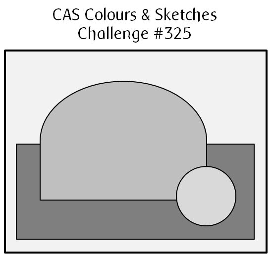
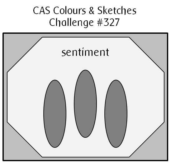
Hello there!  It’s the fourth Tuesday of the month, which means it’s sketch challenge time again at CAS Colours & Sketches.  This one is pretty unique and I hope our challenge participants will have fun with it.

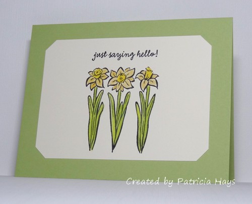
I was looking through some of my wood-mounted stamps and rediscovered this one.  The three daffodils made me think of the three oval elements of the sketch.  I colored them with colored pencils blended with odorless mineral spirits.  The daffodil image lent itself pretty well to one of our previous CC&S color challenges, too.  The two yellows are really not that different when put next to each other, but I tried to make each of them stand out on the different parts of the blossoms.  When it came to matching cardstock for the card base, Certainly Celery ended up being a better match to my coloring job than Pear Pizzazz.  I didn’t have an octagonal die that matched exactly to the sketch and I didn’t feel like doing the measuring to make sure I cut all the corners the same, so I took the easy way out by using a punch to nip off the corners of the focal panel to give me the octagonal shape.

Thanks so much for stopping by today! I hope you’ll make a card with this sketch and share it with us at CC&S. You have until 6:00 p.m. Eastern time Monday, July 1 to link your card at the challenge site.

Supplies:
Stamps: Three Daffodils (Hero Arts); Everyday Sayings (Lizzie Anne Designs)
Cardstock: Certainly Celery, Very Vanilla (Stampin’ Up)
Ink: Onyx Black (VersaFine)
Other: Premier colored pencils (Prismacolor); odorless mineral spirits (Gamsol); corner punch (SU)

CAS Colours & Sketches #325

Comments Off on CAS Colours & Sketches #325
Jun 112019

Hello!  I hope your week has gotten off to a good start.  After a rainy weekend, it’s nice to finally see some sunshine this morning.

It’s Tuesday, which means it’s time for a new challenge at CAS Colours & Sketches.  This week is a sketch challenge and I’ll admit I was kind of stumped by it at first.  I don’t have any dies that match well to the rounded shape in the sketch, so I browsed through my stamps.  I’m not exactly sure why this stamp set beckoned to me because the shapes don’t quite match up proportionally to the sketch elements, but it’s such a cute set of stamps that I decided to give it a go anyway.  I stamped the toast slices and the muffin on white cardstock, colored them, and fussy cut them.  My cat thought he could help me cut by jumping up on my desk and head bumping my hand, which made me accidentally cut off an arm on one of the pieces of toast, so I decided to just go ahead and cut off all the arms and legs that are part of the toast images.  They were much easier to cut that way, anyway.  I stamped the toaster on some silver brushed metallic cardstock to make it look like stainless steel and fussy cut it, too.  I searched through my designer papers and found a very old one that had a sort of marble-y kitchen countertop vibe to it, and I chose that for the rectangular part of the sketch.  I held up the various pieces of the card to white cardstock but that seemed a little too bland for the card base, so I looked through my colored cardstocks and picked a light yellow with a subtle linen texture.  The yellow adds some cheer and seemed to coordinate better with the sketch elements than other colors of cardstock.

What will you do with this sketch?  There are so many possibilities!  I hope you’ll try out something and share what you create with us! Link your work to the CAS Colours & Sketches blog by 6:00 p.m. Eastern time Monday, June 17.  Thanks for stopping by today!

Supplies:
Stamps: Love ‘n Breakfast (Lawn Fawn)
Cardstock: Barely Banana textured, Brushed Silver (Stampin’ Up); Solar White (Neenah); patterned paper (source unknown)
Ink: Onyx Black (VersaFine)
Other: markers (Copic); dimensionals (SU)

CAS Colours & Sketches #324

Comments Off on CAS Colours & Sketches #324
Jun 042019

Well hello there!  It’s the first Tuesday of the month, which means we have a new hostess of the month over at CAS Colours & SketchesYoonYoung has planned some fun things for us this time, and she’s starting us off with a really nice pastel color challenge.

When I was trying to decide what to make for this challenge, the idea of using kraft with the challenge colors stuck in my head.  But none of my image stamps really seemed “right” to use with that combination.  I finally decided to use the colors for a sentiment and make that the focal point of the card.  I die cut the word “hello” from a panel slightly smaller than a card front.  I adhered scraps of cardstock in the challenge colors to the card base so that they would show through the die cut word.  I originally planned to use dimensional adhesive to pop up the front panel from the card base, but quickly realized that would be a pain to use with the insides of the “e” and the “o”, so I attached the panel directly to the card base and then glued the insides of the letters in place.  I opted not to include the inner loops of the “h” and the “l”s – that was too fiddly even for me, LOL!

Thanks for stopping by today!  I hope you’ll share your own card with the CC&S challenge colors by linking it to the CC&S site by 6:00 p.m. Eastern time Monday, June 10.

Supplies:
Stamps: none
Cardstock: Crumb Cake, Powder Pink, So Saffron, Pool Party (Stampin’ Up)
Ink: none
Other: Simply Said Hello die (Avery Elle); stitched rectangle die (Lawn Fawn)

© 2019 Suffusion theme by Sayontan Sinha