Hello there! I’m excited to be the challenge hostess at CAS Colours and Sketches during the month of April! I hope you’ll join in the fun and creativity of our color and sketch challenges.
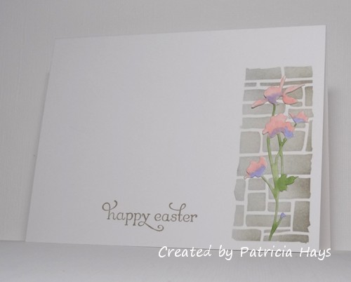
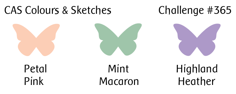
We have a soft, light trio of springtime colors for you to work with this week. I couldn’t resist doing something floral with them. I decided to try something I hadn’t done before – coloring a die cut image and mounting it over a stenciled background. It wasn’t difficult to do, but I’m not sure I really like how it turned out. This is actually my second attempt at the stenciling; the first turned out too dark and the die cut didn’t show off against it very well. The second time I trimmed the tape holding the stencil in place to give it an irregular edge, which looks more natural. Overall I don’t think it’s one of my better cards, but it’ll do.
Be sure to check out what the rest of the CC&S Design Team has made! Then create your own clean and simple styled card with these colors and link it to the CC&S site by 6:00 p.m. Eastern time Monday, April 13. We’d love to see what you make!
Supplies:
Stamp: Delightful Dozen (Stampin’ Up)
Cardstock: Solar White (Neenah)
Ink: Sahara Sand, Smoky Slate (SU)
Other: Wildflowers #1 die, Slate layering stencil (Tim Holtz); markers (Copic)
2 Responses to “CAS Colours & Sketches #365”
Sorry, the comment form is closed at this time.


This is beautiful! Love the stenciled brick.
Your post had me laughing Patricia – we really are our own severest critics aren’t we?! Your card is really lovely and my eye keeps coming back to your pretty coloured die cut flower on the CASC&S site! I do know what you mean about ink coming out too dark through a stencil (although I don’t think it turned out too dark on your finished card) and it’s the reason I invested in distress inks. But sponging really lightly through them with a paler colour ink seems to work for me too. Hope you are safe and well. Vicky x