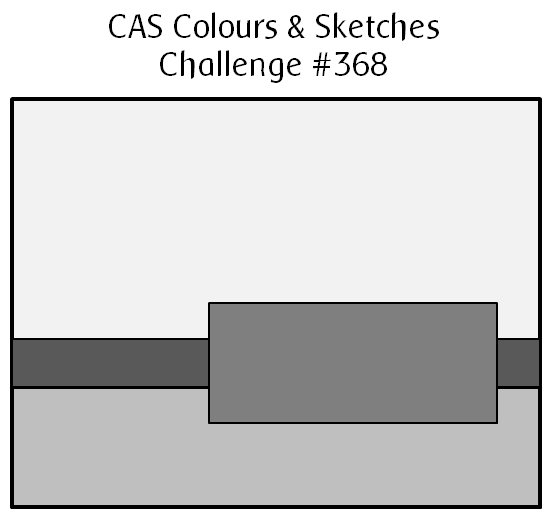
It’s the last Tuesday in April, which means it’s the last week for a while that I’ll be hosting the challenges at CAS Colours & Sketches. I’ve enjoyed seeing what our challenge participants have done with the ideas I came up with for our April challenges. This week there’s a sketch to follow.
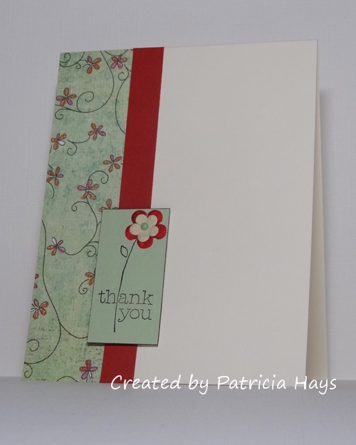
I’ve turned the sketch clockwise on its side to create a vertically formatted card. I chose designer paper with flowers that coordinated pretty well with the stamp image I wanted to use, and picked a few scraps of solid color cardstock that went with the colors in the designer paper. After I stamped the image on the solid green cardstock, I decided I’d add a little textural interest by attaching a Prima flower over the petals of the stamped flower. I didn’t have a Prima in the right shade of red, so I colored an ivory one with Copic markers. Then that looked too bold by itself, so I added a smaller ivory one on top of it, and secured the two in place with a tiny brad. I used dimensional adhesive to attach the stamped panel to the card. When I had the card all assembled, I felt there wasn’t quite enough visual definition between the stamped panel and the designer paper, but I knew that trying to take it apart to add a mat to the stamped panel would destroy it. Instead, I carefully used a dark brown marker in the same color as the inked image to edge the stamped panel. That tiny bit of brown helped a lot more than I expected, and allowed me to call the card finished.
What will you do with this sketch? I hope you’ll try out something and share what you create with us! Link your work to the CAS Colours & Sketches blog by 6:00 p.m. Eastern time Monday, May 4. Thanks for stopping by today!
Supplies:
Stamp: For a Friend (Stampin’ Up)
Cardstock: Pure Luxury Ivory (Gina K. Designs); Riding Hood Red and Pistachio Pudding (SU); scrap from Phoebe 6″ x 6″ paper pad (Basic Grey)
Ink: Early Espresso (SU)
Other: flowers (Prima); brad (Recollections); markers (Copic); dimensionals and Early Espresso marker (SU)
2 Responses to “CAS Colours & Sketches #368”
Sorry, the comment form is closed at this time.






The sketch looks rather good on it’s side. I like how you have colour co ordinated everything so well. The card looks great
Very pretty “twist” to the sketch!!!