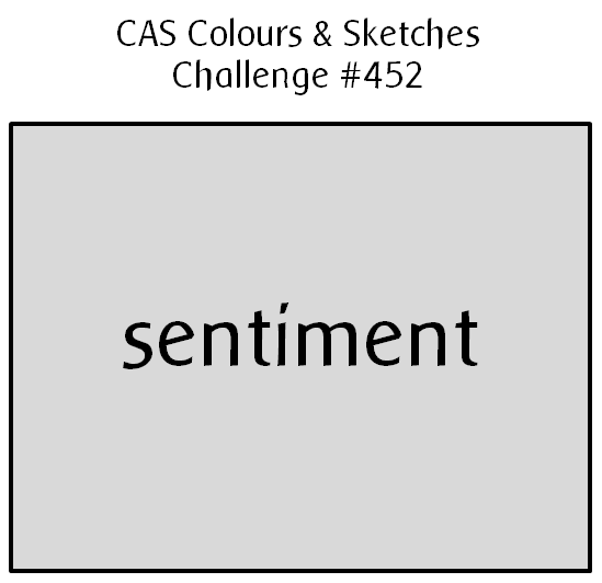
Hello! This week at CAS Colours & Sketches, we have a very simple sketch for you to try!
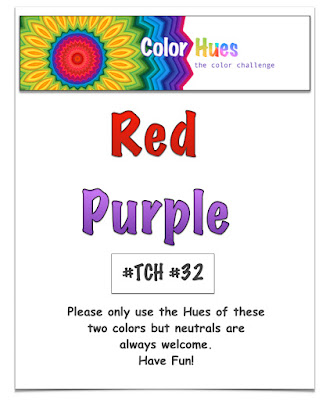
I have to confess that for how simple the sketch appears, I struggled with it. I fully admit that I’m my own worst critic, but my first attempt ended up looking to me like something a four-year-old might make, so I went back to the proverbial drawing board. I wanted to include the color scheme from the current Color Hues challenge. After a bunch of playing around with how to layer the die cut sentiment, and whether to use a colored card base, I finally got this put together:
I still don’t love my card, but it’s a lot better than the first one! At least it uses up a little of some very old purple cardstock that I had in my stash. I may try some other ideas with different sentiments and see how that goes. Stay tuned…
In the meantime, I hope you’ll give the sketch a chance and share your card with us at CC&S! You have until 6:00 p.m. Eastern U.S. time Monday, January 17 to link your card at the challenge site. Thanks for stopping by today!
Supplies:
Cardstock: Eggplant Envy, Real Red (Stampin’ Up); Pure Luxury Ivory (Gina K. Designs)
Other: Simply Said Hello Die (Avery Elle)
7 Responses to “CAS Colours & Sketches #452”
Sorry, the comment form is closed at this time.







So clean and simple! I love it! Thanks for joining us at Color Hues! Happy New Year!
Sometimes the simplest designs turn out to be challenging, but it was worth the effort! Thanks for joining us at Color Hues!
CAS is so hard for me so I hear you! Love the way you offset the colors on the edge and the hello is a great font! Thanks for sticking with it and joining us at Color Hues! Have a great day!
Yes, the challenge of CAS Patricia! Love the offset sentiment and border detail – it really highlights the white space.
A great CAS take on red and purple! Simplicity allows the elements son your card to shine. Thank you so much for sharing with us at the Color Hues!
I LOVE the simplicity which make the challenge colors shine!
Thank you so much for playing at Color Hues!
Sure enough, simplicity is not that simple! Anyway, you nailed it beautifully! The red and purple color palette is not an easy one and it turned out beautiful on your card.