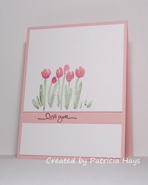
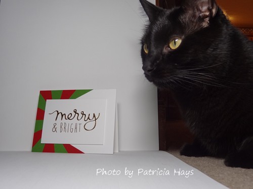
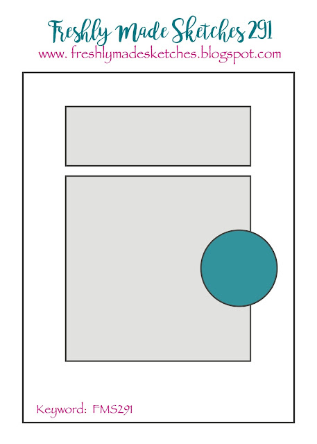
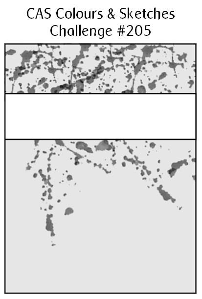
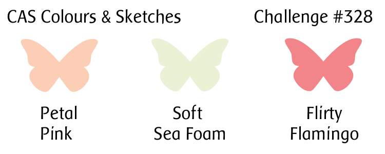
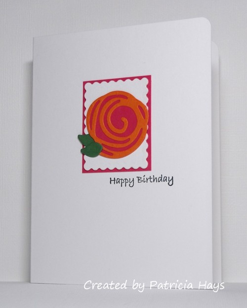
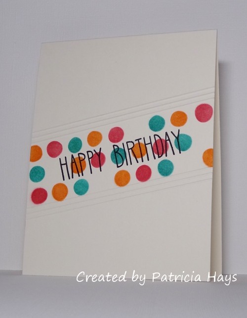
Hello there!  It’s time for a new challenge at CAS Colours & Sketches and this week we have some pretty pastel colors to play with. The colors practically shouted “Do a floral card!” so that’s the direction I took with them.  I pulled out an oldie-but-goodie stamp set that has stamps to create the different layers and shading effects.  To get the two shades of green for the foliage, I stamped the image off on scrap paper once before applying the stamp to the image panel.  Then I selectively inked the rubber again and stamped it over top the first impression.  I originally planned to just adhere the image panel directly to the card base, but that seemed a little too plain, so I decided to add a very narrow mat of green.  It’s really difficult to tell in the photo, but I used shimmery cardstock for the image panel, so in real life the card has a hint of sparkle to it.  The only color in the challenge trio that I actually own is the darker pink, so I substituted the closest colors I have to the lighter pink and the green.

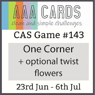
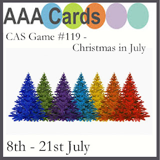
I’m going to enter this into the current challenge at AAA Cards, too.


Thanks for stopping by today!   I hope you’ll try this color challenge and share your card with us at CC&S!  You have until 6:00 p.m. Eastern time Monday, July 8 to link your card at the challenge site.

All supplies for this card are from Stampin’ Up.
Stamps: Terrific Tulips, Lotus Blossom
Cardstock: Blushing Bride, Pistachio Pudding, Shimmery White
Ink: Blushing Bridge, Pistachio Pudding, Flirty Flamingo

Well hi there!  It’s Tuesday, which means it’s time for a new challenge at CAS Colours & Sketches.  This time we have some bold, bright colors for you.

After seeing that some of the other CC&S design team members had used a floral theme for their cards, I decided to do something different.  As I looked through my stamp sets, I realized this hot-air balloon would work well with the challenge colors.  I stamped the balloon on some white cardstock, colored it, and fussy cut around it.  The current sketch at CAS(E) this Sketch! also seemed like a good fit for the balloon image, but I ended up having to scoot the balloon over a bit so that the sentiment would fit the way I wanted it.  I embossed a scrap of cardstock with a cloud pattern for the horizontal strip portion of the sketch, and used dimensional adhesive to attach the balloon over it.  The card all came together quite quickly, so it’s eligible for the current AAA Cards challenge, too.


Thanks for stopping by today!  I hope you’ll join us over at CAS Colours & Sketches with your own take on these colors!  You have until 6:00 p.m. Eastern time Monday, April 8 to link your card at the challenge website.

Supplies:
Stamps: Vintage Birthday (Lizzie Anne Designs)
Cardstock: Pure Luxury White (Gina K. Designs)
Ink: Onyx Black (VersaFine)
Other: markers (Copic); clouds embossing folder, dimensionals (Stampin’ Up)

Well hello there!  It’s time for a new month of challenges at CAS Colours & Sketches and we have a color challenge for you this week.

Today also happens to be my husband’s birthday.  Although this week’s color combination is rather valentine-ish, I decided to use it for his birthday card.  The only one of the challenge colors that I own in either ink or cardstock is Powder Pink, so I used close matches for the Gray Granite and Lovely Lipstick.  I opted to use Naturals White cardstock for the card base because the tiny flecks in it give more visual interest than plain white or ivory does.  I used Smoky Slate ink for the tree trunk, and I sponged some more of the ink along the bottom edge of the card to give more of a “ground” beneath the tree.  Instead of leaves, I stamped a tiny heart in Powder Pink and in Rose Red.  I prefer to use sentiment stamps that have the entire sentiment on one block, but this time I used a set that has different words that can be put together to make phrases.  So this sentiment actually came from four separate wood-mounted stamps and I used my trusty Stamp-a-ma-jig to line them up.  I still managed to get it a little wonky looking.  Oh well.

I’m entering this card into the current challenges at AAA Cards, The Paper Players, and The Male Room, too.


Of course, just because we had Valentine’s Day in mind at CC&S, it doesn’t mean that you need to create a valentine card in order to participate in our challenge! Let your creativity take you wherever it wants to go. Just be sure to share your card with us at the challenge site before the linky tool closes at 6:00 p.m. Eastern time Monday, February 11. We’d love to have you join us! Thanks for stopping by today.

All supplies for this card are from Stampin’ Up.
Stamps: Branch Out, Small Sayings, Fundamental Phrases
Cardstock: Naturals White
Ink: Smoky Slate, Rose Red, Powder Pink
Other: sponge

Hello!  I’ve been away for much of the last few weeks and while I’ve enjoyed seeing different places, it’s nice to be back home for a little while before my next adventure.  Now it’s time for me to get back in creative mode for some more card making challenges.  Today a new color challenge starts at CAS Colours & Sketches.

I have to admit this color combo threw me for a bit of a loop at first, and I finally decided that something with geometric shapes might be my best choice for using the three colors.  But the Christmas in July challenge at AAA Cards held my interest and I wondered if I could combine the two challenges.  Even though these colors are a bit unusual for Christmas, I thought they would work for ornaments.  After I inked up the stamp with the three balls, I stamped it off once on scrap paper to lighten the colors before stamping it onto my cardstock.  Then I inked it up again only partially and stamped it over the original, to add a shadow effect.  I wasn’t going for a perfect, truly realistic look and I like the sort of sketchy effect I achieved.  I finished my stamping by adding the ornament hangers and the sentiment in silver ink.  I chose a card base in one of the challenge colors and rounded the one corner of the card to mimic the shape of the ornaments.

CASCAS281

CC&S color281-001

I considered adding a clear lacquer over the ornaments to give them some shine, but I was pressed for time in making the card and didn’t think it would dry quickly enough.  (I’m actually writing this post a few days in advance because I’ll be out of town again when it’s due to go live.)

What will you create with these colors?  Share your work with us at the CAS Colours & Sketches site by 7:00 p.m. Eastern time Monday, July 23.  Be sure to check out what the other design team members have made, too!  Thanks for stopping by today!

Supplies:
Stamps: Fun With Shapes, All Year Cheer I (Stampin’ Up)
Cardstock: Coastal Cabana (SU); Solar White (Neenah)
Ink: Coastal Cabana, Powder Pink, Lemon Lime Twist (SU); silver (ColorBox)
Other: corner rounder (EK Success)

Hello there!  It’s the last Tuesday of the month, which means that it’s sketch week at CAS Colours & Sketches.  I really like the angled panel in this sketch because it provides a lot of fun creative opportunities.

I checked out a few other challenges before creating my card and combined them with the sketch challenge.  Less is More is challenging their participants to use up bits and pieces leftover from other projects, and AAA Cards wants to see frames on cards.  I chose a scrap piece of floral patterned paper which (I think) coordinates well with this stamp that combines a floral image with a sentiment.  Because of the way the flower image is oriented, I thought it would look better to use the mirror image of the sketch.  I cut a frame for the vertical rectangle from a scrap of cardstock in a coordinating color.  Instead of coloring the image, I decided to cover the petals with a Prima flower, held in place with a tiny brad.  I’ve used shims of scrap cardstock to add dimension behind the vertical panel.

CASCAS278

sketch 278

If you need further inspiration for the CAS Colours & Sketches challenge, go see what the rest of the design team has made!  Then create your own clean and simple card using this week’s sketch, and link it to the challenge blog by 6:00 p.m. Eastern time Monday, July 2.  We’d love to see what you can do!  Thanks for stopping by today.

Supplies:
Stamps: For a Friend (Stampin’ Up)
Cardstock: Pure Luxury Ivory (Gina K. Designs); Perfect Plum (SU); scrap from Kioshi 6″ x 6″ paper pad (Basic Grey)
Ink: Early Espresso (SU)
Other: stitched rectangle dies (Lawn Fawn); flower (Prima); brad (Recollections)

Hello!  It’s the third Tuesday of the month, which means it’s color challenge time again at CAS Colours & Sketches.

Despite the cheeriness of the colors, I seem to have a hard time working with both Bermuda Bay and Calypso Coral whenever they come up separately in our challenges – so having them together had me puzzled for a while.  I noticed that the current Paper Players challenge is to use birds on a clean and simple card, so I finally decided that the Bermuda Bay and Pool Party could work together to color this bird image I haven’t used yet.  After I stamped the bird on the focal panel, I covered it with a mask and then stenciled blocks in the coral color for a background.  The stamps and the stencil were purchased together as a set.  The blocks should fit the geometric challenge currently going on at AAA Cards.  After I peeled off the mask, I colored the bird with Copics and added in a speech balloon for the sentiment.  I trimmed the bottom corner to mimic the shape of the bird’s body, and mounted the focal panel to a Bermuda Bay card base.

CASCAS277

CC&S color277-001

Now it’s your turn to create a clean and simple styled card using these colors, and share it with us at the CC&S site!  You have until 6:00 p.m. Eastern time Monday, June 25 to link your card.  We hope you’ll join us!

Supplies:
Stamps: THMM108 (Tim Holtz/Stampers Anonymous); A Birdie Told Me (Lawn Fawn)
Cardstock: Bermuda Bay (Stampin’ Up); Pure Luxury Ivory (Gina K. Designs)
Ink: Calypso Coral (SU); Tuxedo Black (Memento)
Other: markers (Copic); corner rounder (EK Success); THMM108 stencil (Tim Holtz); sponge dauber

Hello hello!  I hope the month of June has gotten off to a good start for you.  As usual at CAS Colours & Sketches, we start off the month with a color challenge.  Our challenge hostess, Wei, has chosen some bright and cheery colors for us.

It’s been a while since I’ve played along at CAS(E) this Sketch! but I liked the simplicity of this week’s sketch.  I decided to use dies rather than stamps to create my focal point.  After I cut the “lines” of the rose from pumpkin colored cardstock, I attached the die cut to a scrap of bright pink cardstock and then fussy cut around it to get my rose blossom.  I originally planned to attach the small scalloped rectangle directly to the card base, and stacked it with an extra rectangle underneath to give it more dimension and definition.  But the card still seemed too plain, so I decided to add a pop of pink underneath it.  The sentiment comes from one of my oldest stamp sets and is stamped in green ink to match the leaves.  That makes this another birthday card for the challenge at AAA Cards.

CASCAS275

CC&S color275-001

Be sure to stop by the CAS Colours & Sketches blog to see what the rest of the Design Team has created!  Then make your own card using the challenge colors and share it via the linky tool by 6:00 p.m. Eastern time Monday, June 11.  We’d love to have you join us!

Supplies:
Stamp: All Occasions (Stampin’ Up)
Cardstock: Melon Mambo, Pumpkin Pie, Garden Green (SU); Solar White and Solar White textured (Neenah)
Ink: Garden Green (SU)
Other: Swirly Scribbles dies (SU); Classic Rectangles Scalloped Nestabilities die (Spellbinders)

Hello!  It’s color challenge week at CAS Colours & Sketches and we have a bright and cheery color combo to work with.

This color combination seemed pretty gender neutral to me so I decided to use it for a birthday card that I can donate to Send a Smile 4 Kids.  The current challenges at AAA Cards and Less is More seemed interesting, so I’ve combined them with the CC&S challenge.  I started off by working with scrap paper to create a mask that divided my card into thirds on a diagonal.  I put the mask in place on my card front and centered a stencil in it.  Then I masked off portions of the stencil with washi tape so I could brush ink in the three challenge colors, keeping the colors separated from each other.  Once I got the colors all done, I removed the masks and stamped the sentiment with black ink.  The card still looked like something was missing, so I scored a trio of lines both above and below the inked portion of the card.

CASCAS264

CC&S color264-001

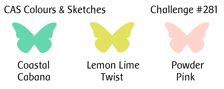
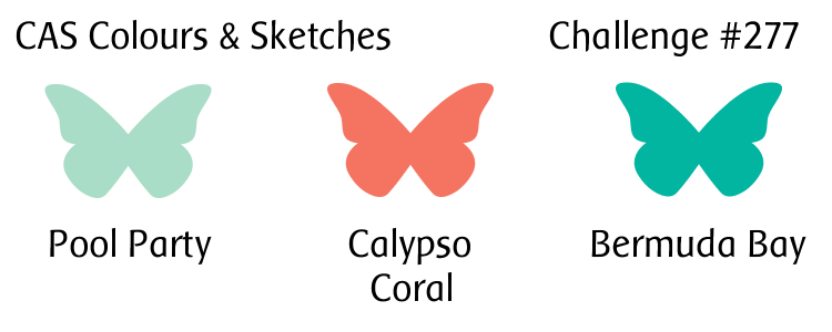
We’d love to see what you can create with this week’s colors!  Share your card at the CC&S website by 6:00 p.m. Eastern time Monday, March 26, 2018.  Thanks for stopping by today!
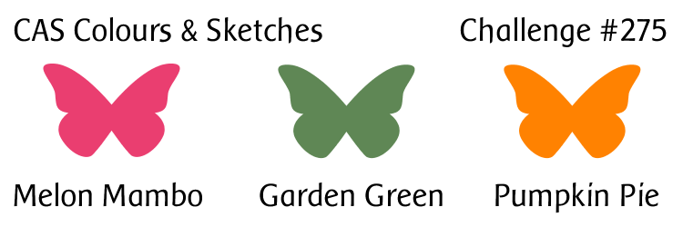
Supplies:
Stamp: So Much to Say (Lawn Fawn)
Cardstock: Pure Luxury Pure Ivory (Gina K. Designs)
Ink: Bermuda Bay, Rose Red, Pumpkin Pie (Stampin’ Up); Onyx Black (VersaFine)
Other: Fresh Dots Small stencil (Dylusions); stencil brushes (Claritystamp)

Hello there!  This month it’s my turn to create the color combinations and sketches for the challenges at CAS Colours & Sketches! I’m excited about it, and I hope you’ll join in and share your artwork with us!

For this week’s color challenge, I decided to put an updated spin on a card I made back in 2007, before I had a blog.  (It’s a little embarrassing to admit that the link is for a scan of the card, because this also was before I started using a camera to take photos of my cards!)  I’ve swapped out the colors used on that card for colors that are currently offered by Stampin’ Up.  Of course, as with all of our CC&S challenges, you don’t need to use Stampin’ Up products – we just use their color names as a point of reference.

I decided to use the current sketch from CAS(E) this Sketch! for the layout of my card.  Instead of putting the sentiment on its own strip, I split the focal panel and stamped the sentiment in the gap, directly on the card base.  I used a few pieces of scrap cardstock as shims to give a little dimension to the white panels.  To get the two-tone effect on the blossoms, I inked the stamp with the lighter pink first, and then sponged some of the darker pink ink onto the stamp, before pressing the stamp on the cardstock.

CASCAS258

CC&S color258-001

Valentines and love are popular challenge themes going on right now, so I’m entering this card at AAA Cards, The Paper Players, and Cards in Envy, too.

So – if you need further inspiration for the CAS Colours & Sketches challenge, go see what the rest of the design team has made!  Then create your own clean and simple card using this week’s colors, and link it to the challenge blog by 6:00 p.m. Eastern time Monday, February 12.  We’d love to see what you can do!

Edited on February 11, 2017 to add:  Thank you to the team at CAS(E) this Sketch! for naming my card as an honorable mention!  What an awesome way to start my week!

All supplies for this card, except the white cardstock, are from Stampin’ Up.
Stamps: Spring Garden, Short & Sweet
Cardstock: Solar White (Neenah); Powder Pink
Ink: Powder Pink, Berry Burst, Wild Wasabi

Hello there!  It’s time for another challenge at CAS Colours & Sketches and this time we have a very simple sketch for you to try.

After some mental debate over whether to make a birthday card or a holiday card, I finally decided on holiday.  I used one of my newest dies to cut the word “merry” from shiny gold cardstock.  Using the die to help with placement, I stamped “& bright” with gold ink and heat embossed it.  It didn’t turn out quite as shiny as I’d hoped; I think the embossing powder is going old and stale.  Anyway, I knew I wanted to use some festive red and green for the background.  I played around with a couple different ideas before settling on this partial starburst pattern.  I opted not to continue the starburst around the entire card base in order to keep the card more clean and simple in style.  The sentiment panel is attached with dimensional adhesive to give it more actual and visual separation from the card base.

CASCAS251

sketch 251

I’m entering my card into two additional challenges:  Less is More, and AAA Cards.

I had a furry “helper” supervise me while I was photographing the card.  LOL

CASCAS251 Lyric

What will you create with this sketch?  Share your work with us at the CAS Colours & Sketches site by 7:00 p.m. Eastern time Monday, December 4.  Be sure to check out what the other design team members have made, too!  Thanks for stopping by today!

Supplies:
Stamps: All Occasion Sentiments #4 (Uniko)
Cardstock: Solar White (Neenah); Real Red, Gumball Green (Stampin’ Up)
Ink: gold pigment (ColorBox)
Other: Merry Script die (Mama Elephant); gold detail embossing powder, dimensionals (SU)

I have a quick post today to share a card made for an important man in my life – my dad.  He’ll be celebrating his birthday this weekend, and I’ll be lucky enough to visit with him on his special day.  He’s not one to turn down ice cream when it’s offered to him, LOL, so that’s why I thought he’d like the cute little ice cream cone.

FMS291

I’m combining several challenges here:  Less Is More, Freshly Made Sketches, AAA Cards, and The Paper Players.


Thanks for stopping by today!

Supplies:
Stamps: Here’s the Scoop (Lawn Fawn); Cake & Candles (Avery Elle)
Cardstock: Pure Luxury White, Pure Luxury Ivory (Gina K. Designs); Close to Cocoa (Stampin’ Up); scraps from Blush 6″ x 6″ paper pad (Basic Grey)
Ink: Close to Cocoa (SU)
Other: birthday embossing folder (ProvoCraft)

Hello there!  It’s color challenge week again at CAS Colours & Sketches.  I’ve combined the color challenge with one of our recent sketch challenges, #224, taking the liberty of using the mirror-reverse of the sketch.

The card is pretty straightforward so there’s not a lot I can say about it.  I used Versamark ink to stamp a bit of texture on the kraft-colored strip.  The flower is raised up from the card base with some scrap cardstock shims to add a bit of dimension.

CASCAS226

CC&S color226-001

Since the theme at The Paper Players and at AAA Cards is “birthday”, I’m going to enter this card in those challenges.

Be sure to check out what the rest of the CC&S design team did with this sketch. Then show us what you can make with it! You can link your creation to the challenge blog until 6:00 p.m. Eastern time Monday, June 12.  Thanks for stopping by today!

Supplies:
Stamps: Delight in Life, Canvas (Stampin’ Up); Cake & Candles (Avery Elle)
Cardstock: Soft Sky, Kraft, Very Vanilla (SU)
Ink: Calypso Coral, Soft Sky (SU); VersaMark (Tsukineko)

Hello!  Today’s post is just a quick one to show off a rather clean and simple card using the current sketch at Freshly Made Sketches.  Well, actually, if you look carefully at the curved area, I’ve used the mirror image of the sketch.  I had an embossed, curved piece of cardstock left over from another card I’d made some time ago, so all I needed to do with it was attach it to the card base and trim it down (it was originally about 5″ wide).  The sentiment fit nicely in the “dip” of the curve.  In an attempt to use some products I’ve had stashed around here for a long time, I’ve added some Prima flowers and glued Dew Drops in place for the centers of the flowers.  I’m not sure why the color is coming off of the Dew Drops but I like the variegated look it gives.  The soft color scheme and the flowers make me feel that the card also fits into the theme for the current challenge at AAA Cards so I’ll enter it there, too.

FMS283

Thanks for stopping by today, and enjoy your weekend!

Supplies:
Stamps: Sincere Salutations (Stampin’ Up)
Cardstock: Pure Luxury Ivory (Gina K. Designs); Pink Pirouette (SU)
Ink: Pink Pirouette (SU)
Other: flowers (Prima); Dew Drops (Robin’s Nest); Victoria embossing folder (ProvoCraft)

Yikes!  I’m a little late today with my post for this week’s challenge at CAS Colours & Sketches.  I made a card yesterday but I wasn’t very happy with it.  As I was trying to fall asleep last night, another idea popped up in my mind.  So I got up this morning and gave it a try… and as luck would have it, it didn’t go quite as easily as I’d hoped.  But anyway…

I wanted to combine this week’s sketch challenge with the ombre challenge at Less is More and the “hello” challenge at AAA Cards.  My first card had a large flourish that I inked in three shades of blue, but I just wasn’t pleased with the overall look of it.  For my second attempt, I thought of using the sentiment “hello, sunshine” with my sunburst stencil.  I used two different shades of yellow to ink the stencil design, layering the darker shade to make it bolder toward the center of the design and fading out the lighter shade toward the edges.  Then I went to my stamps, looking for what I thought was a “hello, sunshine” stamp… and was disappointed to discover that the stamp only says “sunshine”, and it’s made to be used with a “hello” die.  At that point I thought, “My ‘hello’ die is going to look too big.  I have alphabet stamps, so I can spell out the sentiment with them.”  That didn’t go too badly, other than trying to position an apostrophe stamp for the comma… until I stamped the sentiment.  The first two times, the sentiment came out splotchy and messy looking.  So I cleaned the stamps and tried again.  That was slightly better but the letters still looked fuzzy.  So I figured I’d try my “hello” die anyway.  It turned out that the die filled up some of the tiny areas of the stencil that didn’t ink up well.  So I went with it, using textured cardstock for the die cut.  And finally the card came together.

CASCAS205

sketch 205


Despite all the troubles I had putting this card together, it’s still a lot better than my first card!

I hope you’ll have better luck creating a card with this sketch, and that you’ll share it with us at CC&S!  You have until 6:00 p.m. Eastern time Monday, January 16 to link your card there.  Thanks for stopping by today!

Supplies:
Stamps: none
Cardstock: Solar White (Neenah); Summer Sun textured (Stampin’ Up)
Ink: Summer Sun, Daffodil Delight (SU)
Other: Simply Said Hello die (Avery Elle); Rays stencil (Tim Holtz)

I’m just writing a quick post today to show a card I’ve made for the Freshly Made Sketches challenge that will be closing soon, as well as the current AAA Cards challenge.  The two challenges worked together so well that I couldn’t resist joining in them.

I thought it would be cute to have animals peeking through round windows.  I created the front panel of the card first by adding a strip of light green cardstock to the bottom of a 4.25″ x 5.5″ piece of white cardstock and adding a sentiment.  Why green?  Because it was a scrap that was lying on my desk, and because it seemed like it would work as a “ground” or “grass”.  And because I used a scrap, I’m going to enter this into the Shopping Our Stash challenge, too.  Then I used my circle dies to cut the circles from the panel.  I laid the die cut panel over a white card base and traced the outlines of the circles so I’d know where to position the animals.  After I stamped them, I colored them with colored pencils blended with odorless mineral spirits.  The colored pencils tend to give a softer look than my Copic markers do, plus the pencils don’t bleed through the cardstock like Copics often do.  Once I was done coloring, I attached the die cut panel to the card base.  I think it turned out pretty well, considering I was running out of the odorless mineral spirits!

FMS263


And there’s another any occasion card for the stockpile I’m creating for Send a Smile 4 Kids.  Thanks for stopping by today!  Comments are always welcome and appreciated.

Supplies:
Stamps: Skater Kids (Mama Elephant)
Cardstock: Solar White (Neenah); Certainly Celery (Stampin’ Up)
Ink: Tuxedo Black (Memento)
Other: Premier colored pencils (Prismacolor); odorless mineral spirits (Houston Arts); standard circle Nestabilities dies (Spellbinders)

© 2019 Suffusion theme by Sayontan Sinha