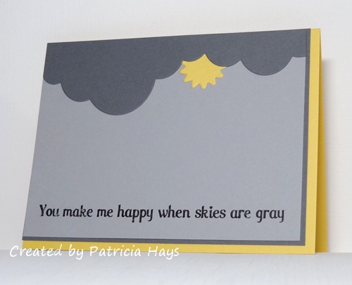
Hello there!  I hope 2022 is off to a good start for you.  We’ve had some crazy weather here in Virginia.  On January 1, the afternoon temperatures were around 70 degrees Fahrenheit, warm and a little humid.  On January 3, the afternoon temperatures were around 30 degrees and we had almost 8 inches of snow on the ground! 

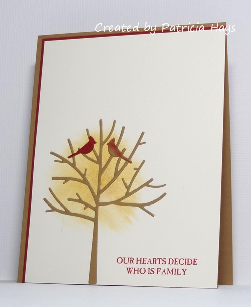
Now that the holidays are over, it’s time to try to get back into the usual routine with the weekly challenges at CAS Colours & Sketches.  I have decided to take a step back from creating and stay in a more behind-the-scenes administrative role there.  However, in the midst of all the pre-Christmas hustle and bustle, it totally slipped my mind to invite someone to be the January Guest Designer at CC&S.  So I’m going to be joining in the challenges in that capacity this month. 

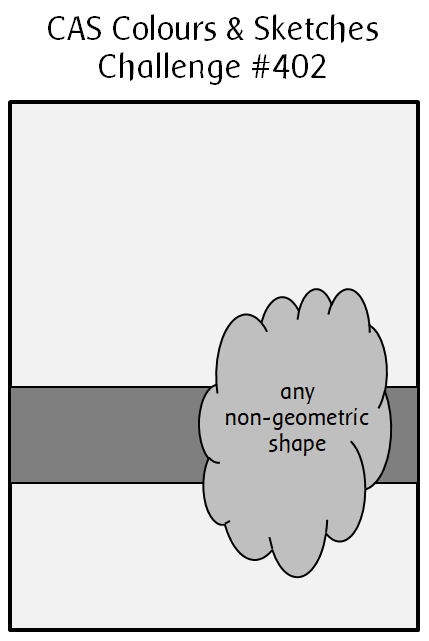
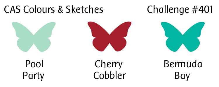
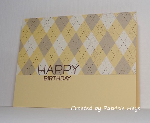
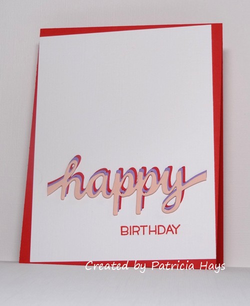
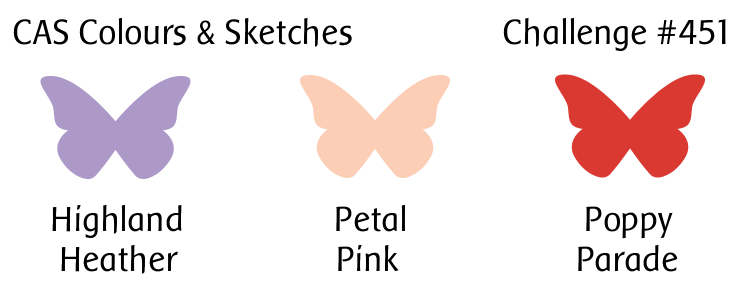
This week we have a color challenge.  I decided to focus the colors on the sentiment, using a die to cut the word “happy” from cardstock in each color.  I offset the die cuts when I glued them together so that each color would show.  I used the bottom color of the stacked dies for my card base and for the stamped portion of the sentiment.  The focal panel is at an intentional angle to the card base.  I thought it would make it look quirky and fun.  Now I’m wondering if it just looks… crooked.  Oh well.

I hope you’ll stop by the CC&S blog to meet the newest members of our design team and to see what the team has created!  Or, if you’d rather, you can “like” our Facebook page or follow us on Instagram!  We’d love to have you join in the fun and creativity with us.  You have until 6:00 p.m. Eastern U.S. time Monday, January 10 to link your card at our challenge post.

Supplies:
Stamp: Happy Happy Happy (Lawn Fawn)
Cardstock: Poppy Parade, Highland Heather, Petal Pink (Stampin’ Up); Solar White Linen (Neenah)
Ink: Poppy Parade (SU)
Other: Happy Sash die (Poppystamps)

Hello there!  Yes, it’s been a while since I’ve shared anything here on my blog.  Hopefully I will start feeling more creative again now that the winter doldrums are well over.

We have a new color challenge starting today at CAS Colours & Sketches.  As the blog manager there, I normally don’t let the challenge hosts pick two neutral colors for a color challenge combination (since we allow neutral colors to accent the challenge colors).  But this month’s hostess, Samantha, backed up her choices with the fact that they tie into the Pantone Colors of the Year for 2021, so I figured why not roll with it?

The colors immediately made me think of sunshine contrasted against a dark sky, and the lyrics to the song “You Are My Sunshine” popped into my head.  So I went along with that theme for my card.  I printed the sentiment onto the lighter grey cardstock and trimmed it down to fit my card front.  Then I die cut the clouds and sunshine and glued them into place.  I added a mat, offsetting it with the card front, and attached it to a card base matching the sunshine yellow.  Easy-peasy!

We’d love to see what you can create with these colors!  Share your card at the CC&S site by 6:00 p.m. Eastern U.S. time Monday, May 10.  Thanks for stopping by today!

Supplies:
Stamps: None
Cardstock: Daffodil Delight, Basic Gray, Smoky Slate (Stampin’ Up)
Ink: printer ink
Font: Care Bear Family
Other: Rainbow Builder dies (SU)

Hello again!  It’s sketch week at CAS Colours & Sketches, and we have a good one for you!  We’d like to see some sort of curved element as the focal point of your card.

I turned the sketch 90 degrees on its side for my card, and used a rainbow to represent the curve.  I die cut the rainbow’s stripes and the clouds from shimmery white cardstock, and then used markers to color the stripes.  It wasn’t easy to capture the shimmer in the photograph, but it’s there.  I used shims from the cardstock scraps behind the clouds and the rainbow to give it a little dimension off the card base.  A simple sentiment finished off the card.

What will you create with this sketch?  We would love to see your clean and simple card submitted for our challenge!  You have until 6:00 p.m. Eastern U.S. time Monday, March 15 to link your card at the challenge site.  Thanks for stopping by today!

Supplies:
Stamps: Simply Said: You (Avery Elle)
Cardstock: Soft Sky (Stampin’ Up); Curious White (Cryogen)
Ink: Tuxedo Black (Memento)
Other: Rainbow Builder Framelits dies (SU); markers (Copic)

Hello there!  It’s time for the first sketch challenge of the year at CAS Colours & Sketches.  It’s a fun one that will provide a lot of opportunity for creativity!

For the “non-geometric shape” element, I looked through my animal stamps and settled on this little fox.  I had used other stamps from this set before, but this was a first for him.  I decided to make him a grey fox rather than a red fox, and colored him with my Copics.  I’m not quite sure yet who this card might be going to, so I went with a gender-neutral purple for the present and the birthday hat.  I set off the horizontal strip part of the sketch by piercing two rows across the focal panel.  I couldn’t very well pierce on a one-layer card, so I attached the focal panel to a card base in a coordinating grey, offsetting the panel for a little extra visual interest.  Because of the way the fox is made, I thought it looked better for him to be on the left side of the card than the right, so I’ve flipped the sketch.

What will you do with this sketch? I hope you’ll try out something and share what you create with us! Link your work to the CAS Colours & Sketches blog by 6:00 p.m. Eastern time Monday, January 18. Thanks for stopping by today!

Supplies:
Stamps: Party Animal, Happy Happy Happy (Lawn Fawn)
Cardstock: Solar White (Neenah); Basic Gray (Stampin’ Up)
Ink: Tuxedo Black (Memento)
Other: markers (Copic); piercing tool

Hello!  Welcome to the start of a new year of challenges at CAS Colours & Sketches!  We’re back from our holiday break and ready for some more fun and creativity!

We’re kicking off the year with a color challenge.  I’ve used the colors to make a wintry scene.  I made a mask to create a snowy hill, and blended the two shades of aqua to create a sky above it.  After I removed the mask, I die cut the tree and the cardinals from cardstock and glued them into place.  The focal panel is the same size as the card front, and I attached it to a base of the lighter shade of aqua.  I couldn’t decide on a sentiment for the card, so I chose to let it go without.  Sometimes a card doesn’t necessarily need a sentiment on the front, don’t you think?

Be sure to stop by the challenge blog and welcome our newest Design Team members and our Guest Designer!  Then create your own card using these colors, and link it to the challenge site by 6:00 p.m. Eastern time Monday, January 11.  We’d love to have you join us!  Thanks for stopping by today.

Supplies:
Stamps: none
Cardstock: Solar White (Neenah); Pool Party, Cherry Cobbler (Stampin’ Up)
Ink: Bermuda Bay, Pool Party (SU)
Other: Winter Trees dies (Penny Black); stencil brushes

Hello hello!  At CAS Colours & Sketches, we’re celebrating our challenge blog’s 400th challenge this week!  To thank our challenge participants for helping us to reach this milestone, we’re offering up a prize from Uniko to one lucky player in this week’s challenge.  You won’t want to miss out on this event!  All the details are at the challenge site.

We’re also getting into the holiday spirit by asking our challenge participants to choose any CC&S challenge from 2020 and turn it into a seasonal card.  I ended up using the mirror image of sketch challenge #381.  To get the variegated lighter shade of green for the leaves on the wreath, I inked up the stamp and then pressed a paper towel against the ink, to lift some of the ink off the stamp.  Then I stamped onto the cardstock.

We’d love to see what you can create with this week’s colors, and to have you join in celebrating with us!  Share your card at the CC&S website by 6:00 p.m. Eastern time Monday, December 14, 2020.  We hope you’ll continue to join in our challenges.  Thank you to our fantastic sponsor for this week, Uniko!

https://uniko.co.uk/blog

I’m joining in the challenges at AAA Cards and The Paper Players with today’s card, too!

All supplies for this card are from Stampin’ Up:
Stamps: Wondrous Wreath, Short & Sweet
Cardstock: Cherry Cobbler, Thick Whisper White
Ink: Wild Wasabi, Cherry Cobbler
Other: Wonderful Wreath Framelits dies

Wow!  It’s the first day of December!  It’s also Tuesday, which means it’s challenge introduction day at CAS Colours & Sketches.  We’re starting off the month with a color challenge that’s a lighter nod to the traditional Christmas colors of red and green, with a dash of metallic silver.

I knew I wanted to use my favorite Christmas tree image, so then I had to figure out a layout for my card.  The current challenge at CAS(E) this Sketch! looked like it would work.  I did stretch the height of the focal panel and background panel a little to accommodate my tree image and the sentiment.  I used a combination of silver brads and pink enamel dots to decorate the tree.  The subtle houndstooth patterned paper was a great match to the challenge pink.  I realize it doesn’t show in the photo, but the card base is linen textured cardstock.  The shiny silver strip made getting a good picture more challenging than I expected, but in the end, I think it all turned out all right.

The CC&S team would love to see what you can create with this week’s colors!  Share your card at the CC&S website by 6:00 p.m. Eastern time Monday, December 7.  Thanks for stopping by today!

Supplies:
Stamps: Season of Joy (Stampin’ Up)
Cardstock: Solar White, Solar White Classic Linen (Neenah); silver foil (SU); patterned paper from Holly Jolly Christmas 6″ x 6″ paper pad (Echo Park)
Ink: Mint Macaron (SU)
Other: enamel dots (SU); star brad (The Paper Studio); mini brads (Recollections)

Wow!  It’s already the third Tuesday in November, and that means it’s color challenge time again at CAS Colours & Sketches.

I decided to combine the colors with the sketch from the current AAA Cards challenge and the theme from this week’s challenge at The Paper Players.  I used a tree die for the vertical and horizontal elements of the sketch, and I hope with the wash of color for the sky behind it, that I’m not taking too many liberties with the sketch idea.  The little birdie fills in for the “any shape” element.  I stamped the birdie onto a scrap of cardstock, colored him in the grey and darker purple of the challenge colors, and fussy cut him (even around his tiny little legs!) so I could glue him in place on his perch.  Then I used my stamping platform to help me add the sentiment precisely in place.  I opted to use the grey from the challenge color trio for the card base because it’s neutral and it matched my coloring the best.


What will the CC&S colors inspire you to create?  We’d love to see your clean and simple card in our challenge gallery!  You have until 6:00 p.m. Eastern U.S. time Monday, November 23 to link your card to the challenge post.  Thanks for stopping by today!

Supplies:
Stamps: Winter Sparrows (Lawn Fawn)
Cardstock: Basic Gray (Stampin’ Up); The Langton Prestige Extra Smooth Hot Press watercolor paper (Daler-Rowney); Pure Luxury White (Gina K. Designs)
Ink: Tuxedo Black (Memento)
Other: Almost Amethyst reinker (SU); markers (Copic); Winter Trees die (Penny Black)

CAS Colours & Sketches #394

Comments Off on CAS Colours & Sketches #394
Oct 272020

Hello there!  After a break for a couple weeks, I’m back at it again with this week’s sketch challenge from CAS Colours & Sketches.  This is a nice little sketch that can be interpreted in various ways, since any shape can be used for the nine background shapes – so you could use nine stars, nine diamonds, nine leaves, or nine of whatever other shape you like.  I’m looking forward to seeing what our challenge participants do with it!

Once I figured out what I wanted to do for my card, it came together pretty easily and quickly.  I decided to use hearts for my shape.  I cut them from red textured cardstock (which, unfortunately, looks kind of orange in my photo, and it’s hard to see the texture).  I cut the word “love” from black cardstock three times and stacked the die cuts together for some dimension.  The stitched rectangle die adds a little extra interest to the kraft panel.

What will you do with this sketch? I hope you’ll try out something and share what you create with us! Link your work to the CAS Colours & Sketches blog by 6:00 p.m. Eastern time Monday, November 2. Thanks for stopping by today!

Supplies:
Cardstock: Basic Black, Crumb Cake, Real Red Core’dinations (Stampin’ Up)
Other: Hearts, Scripty Love, Stitched Rectangle dies (Lawn Fawn)

Hello there!  This week’s challenge at CAS Colours & Sketches features some bright, cheery colors.

For today’s card, I originally was thinking I’d probably do something with abstract flowers.  As I was browsing through my folder of white cardstock, I found this piece that had already been cut with a scalloped die.  Then my thought wheels started turning in a different direction.  I decided instead to make the sentiment the focus of the card, using a combination of alphabet stamps and sentiment stamps.  The open outline letters allowed me to color them in an ombre manner with the challenge colors.  I chose to use the middle tone of the challenge trio for the card base.

And there you have it.  What ideas do you have for these colors?  We’d love to see you share your CAS styled card with them at the CC&S site!  You have until 6:00 p.m. Eastern U.S. time Monday, October 12 to link your card at the challenge site.  Thanks for stopping by today!

Supplies:
Stamps: Happy Happy Happy, Quinn’s ABCs (Lawn Fawn)
Cardstock: Pure Luxury White (Gina K. Designs); Melon Mambo (Stampin’ Up)
Ink: Tuxedo Black (Memento)
Other: markers (Copic); Edgelits Large Scallop die (SU)

CAS Colours & Sketches #389

Comments Off on CAS Colours & Sketches #389
Sep 222020

Hello there!  It’s the fourth Tuesday of the month, which means we have a new sketch challenge to present to you today at CAS Colours & Sketches.

Some time ago I had used a tree embossing folder on some designer paper that had a birch-like pattern, and cut the trees out from it.  Then I decided not to use them for that project, and they just sat in one of my folders of cardstock, where I would see them occasionally.  Today’s card finally puts them to use.  I ended up trimming the trees down further, both in height and width, so they would fit better onto the card front.  For the background, I brushed ink onto glossy white cardstock and blended the colors together, first with the brushes, and then with a tissue.  I took the color inspiration from an old “rainbow” ink pad that has four colors of ink, but I added a bit of brown to the bottom edge to help make it look more like ground.  I added a simple small white mat because it looked too bare-bones without one.  For the sentiment, I die-cut the “thanks” from both white and kraft cardstock because I wanted to stack them for depth.  I originally planned to have the white layer on top, thinking that the kraft would add more shadow below it, but the kraft showed up better against the tree trunks so I ended up reversing the layers.  And yes, I’ve used the mirror image of the sketch, although I can’t say I did that for any particular reason.

What will you do with this sketch?  I hope you’ll try out something and share what you create with us!  Link your work to the CAS Colours & Sketches blog by 6:00 p.m. Eastern time Monday, September 28.  Thanks for stopping by today!

Supplies:
Cardstock: Crumb Cake, Whisper White, Glossy White (Stampin’ Up); designer paper from Aspen Frost 6″ x 6″ paper pad (Basic Grey)
Ink: Cranberry, Eggplant, Denim, Bottle, and Espresso (Adirondack)
Other: tree embossing folder (Darice); Olivia alphabet die (ProvoCraft); stencil brushes

Hello there!  It’s another Tuesday, which means it’s new challenge day at CAS Colours & Sketches!  This week we have a trio of colors for you to work with that should start helping you think about autumn.  Of course, if you live in the southern hemisphere, you’re probably thinking about spring about now, so we hope you’ll show us a springtime way to use them.  As always, if you don’t own the exact colors named in the graphic, just use whatever product you have that closely matches them.

I wasn’t in the mood for coloring an image, so I opted to use some dies to create a little scene on my card.  The challenge colors made it pretty easy to decide which to use for the tree trunk, the leaves, and a couple of cardinals.  After I die cut the bare tree, I laid it on the card front to figure out where I wanted to position it.  I didn’t want to fiddle with cutting and gluing a bunch of leaves, so I used a gel stick in a color that seemed to match the challenge yellow and blended it out to add some color for the “leaves”.  I cut the male cardinal from cherry cardstock and the female cardinal from the same brown as the tree, adding a little cherry ink to her to make her look more realistic.  Offsetting the card front on the mat and the card base allows a little extra color to show. I think the cardinal pair and the sentiment I picked will make this a decent enough anniversary card to give to my husband next month.

We’d love to see what you can create with this week’s colors! Share your card at the CC&S website by 6:00 p.m. Eastern time Monday, September 21. Thanks for stopping by today!

Supplies:
Stamp: Picture Perfect (Stampin’ Up)
Cardstock: Baked Brown Sugar, Cherry Cobbler, Very Vanilla (SU)
Ink: Cherry Cobbler (SU)
Other: Winter Trees dies (Penny Black); gel stick (Faber Castell)

Hello!  Today starts sketch challenge week at CAS Colours & Sketches and YoonYoung has drawn up a very nice clean and simple one for us!

When I first saw the sketch, I thought it would make a good opportunity to use some designer paper.  I have a huge variety of papers to choose from, so to narrow it down, I took a look at some of my other favorite challenge blogs and saw that The Paper Players is having a theme challenge to create masculine birthday cards.  I picked an argyle print from, I must admit, one of my very oldest packs of designer paper.  I knew this pattern would allow for a sentiment to still be easily read.  The difficult thing about using this pattern is making sure to line it up so that it’s centered on the card front, but after some careful measuring, I think I’ve accomplished that.  I also took the liberty of turning the sketch 180° so that the wider rectangular portion is at the top of the card, and I let the sentiment straddle the line dividing the two parts of the sketch.


So, there you have it!  What will you create with this sketch?  Share your work with us at the CAS Colours & Sketches site by 6:00 p.m. Eastern time Monday, September 14. Be sure to check out what the other design team members have made, too!  Thanks for stopping by today!

Supplies:
Stamps: Happy Happy Happy (Lawn Fawn)
Cardstock: Barely Banana, Spring Flowers designer paper (Stampin’ Up)
Ink: Chocolate Chip (SU)

Well hi there!  It’s sketch week again at CAS Colours & Sketches.  I think this one can be interpreted in multiple ways, and I’m looking forward to seeing how our challenge participants use it!

I decided to rotate the sketch 90° to the left and have the banner element go horizontally across my card.  I chose my trusty scripty “hello” die for the focal point of my banner, and gave it a rainbow striped background that I created by blending gel sticks on shimmery white paper.  Since the middle rainbow stripe was yellow, I picked that color for the main card panel.

I hope you’ll go see what the rest of the CC&S design team and our August guest designer have done with this sketch. Then make a card of your own and share it with us by 6:00 p.m. Eastern time Monday, August 31. Thanks for stopping by today!

Supplies:
Stamps:  none
Cardstock:  Basic Black, Yoyo Yellow (Stampin’ Up); Cryogen White (Curious Metallic)
Ink:  none
Other:  Simply Said Hello die (Avery Elle); gel sticks (Faber Castell)


Hello there!  We have a sketch challenge opening up today at CAS Colours & Sketches.

I took a bit of liberty with the sketch by flipping it mirror image and by changing the shapes from octagons to hexagons and enlarging one of them.  I originally planned to use die-cut hexagons but for some reason that didn’t seem CAS enough to me.  So I used the cardstock from which I’d cut them as stencils and brushed ink into place on the main card panel.  I glued the die-cut snowflakes over the stenciled hexagons.  The larger snowflake was die-cut twice and stacked for a little more dimension.  I wasn’t sure what sentiment I wanted to use so I decided to just leave one off.  I might add one later, but really there’s no reason the card *needs* one.  The card still seemed a little plain, so I went digging through my embellishments and found a half-pearl in just the right color and size to adorn the largest snowflake.

I hope you’ll go see what the rest of the CC&S design team and our August guest designer have done with this sketch. Then make a card of your own and share it with us by 6:00 p.m. Eastern time Monday, August 17. Thanks for stopping by today!

Supplies:
Stamps: none
Cardstock: Soft Sky (Stampin’ Up); Curious White (Cryogen)
Ink: Soft Sky (SU)
Other: Stitched Snowflakes dies (Lawn Fawn); hexagon Nestabilities dies (Spellbinders); half pearl (Basic Grey)

© 2019 Suffusion theme by Sayontan Sinha