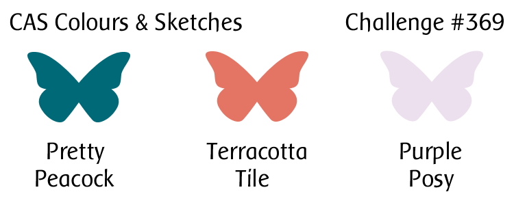
Hello!  This week’s color challenge at CAS Colours & Sketches is a little different, but I hope you’ll give it a try!

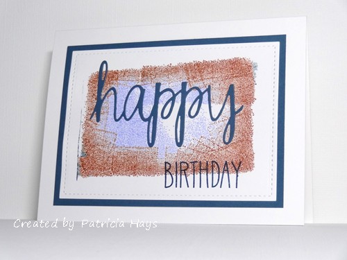
I’ll admit the colors had me stumped for a good while.  That was probably at least partly because I don’t own any of these actual colors, so I knew I’d have to figure out which colors I do own that are closest to the challenge colors.  Finally I thought I’d try to use them as a background for a large sentiment.  I found an old background block stamp and inked it up, using the lavender color toward the middle of the block, with the reddish-brown color surrounding it, and then the dark teal just on the edges of the stamp.  Then I held the stamp under the mist from a water bottle before stamping it onto white cardstock.  When I picked the stamp up off the cardstock, I learned that over the years, the edges of the stamp have curved in just enough that they barely made an impression on the cardstock.  Ooops.  But I decided to go along with it anyway.  I die cut the word “happy” from the coordinating teal cardstock, attached it to the card front, and stamped the word “birthday” below it.  It still seemed a little too blah so I used a stitched rectangle die to trim the excess cardstock from around the image, and then matted that with the teal cardstock before attaching it to a white card base.

It’s not one of my favorite cards.  It doesn’t have as much white space as I think a clean and simple card should have.  But it isn’t really a “bad” card.  I may try going back to the proverbial drawing board and give these colors another go with some different idea.

How will you use these colors?  Be sure to check out the CC&S blog to see what the rest of the design team and our May guest designer have made.  Once you’ve made your own card, be sure to link it at the challenge post by 6:00 p.m. Eastern time Monday, May 11.  We’d love to have you join us!  Thanks for stopping by today.

Supplies:
Stamps: So Much to Say (Lawn Fawn); Large Straight-Edge Rectangle (Hero Arts)
Cardstock: Solar White (Neenah); Not Quite Navy (Stampin’ Up)
Ink: Not Quite Navy, Dusty Durango, Almost Amethyst (SU)
Other: Simply Said Happy die (Avery Elle); Stitched Rectangle die (Lawn Fawn)
Hello there!  It’s the fourth Tuesday of the month, which means it’s sketch challenge time again at CAS Colours & Sketches.  This one is pretty unique and I hope our challenge participants will have fun with it.

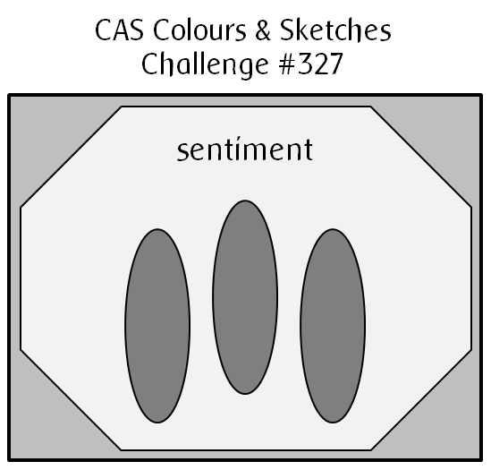
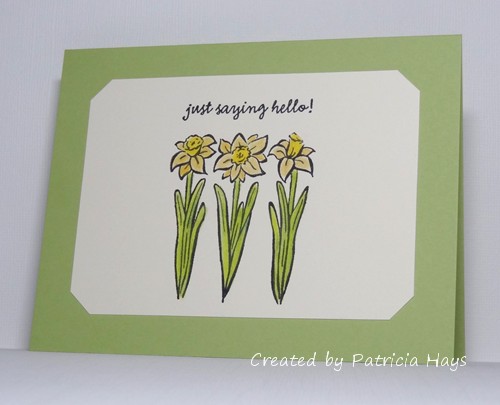
I was looking through some of my wood-mounted stamps and rediscovered this one.  The three daffodils made me think of the three oval elements of the sketch.  I colored them with colored pencils blended with odorless mineral spirits.  The daffodil image lent itself pretty well to one of our previous CC&S color challenges, too.  The two yellows are really not that different when put next to each other, but I tried to make each of them stand out on the different parts of the blossoms.  When it came to matching cardstock for the card base, Certainly Celery ended up being a better match to my coloring job than Pear Pizzazz.  I didn’t have an octagonal die that matched exactly to the sketch and I didn’t feel like doing the measuring to make sure I cut all the corners the same, so I took the easy way out by using a punch to nip off the corners of the focal panel to give me the octagonal shape.

Thanks so much for stopping by today! I hope you’ll make a card with this sketch and share it with us at CC&S. You have until 6:00 p.m. Eastern time Monday, July 1 to link your card at the challenge site.

Supplies:
Stamps: Three Daffodils (Hero Arts); Everyday Sayings (Lizzie Anne Designs)
Cardstock: Certainly Celery, Very Vanilla (Stampin’ Up)
Ink: Onyx Black (VersaFine)
Other: Premier colored pencils (Prismacolor); odorless mineral spirits (Gamsol); corner punch (SU)

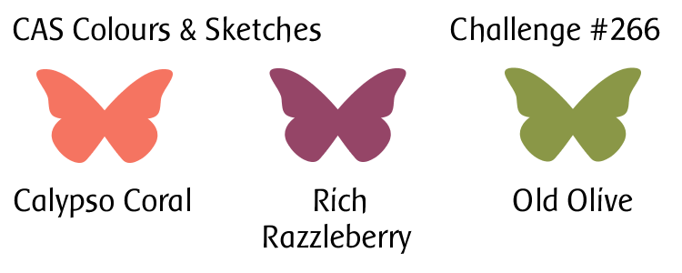
Well hi there!  It’s Tuesday, which means it’s time for a new challenge at CAS Colours & Sketches.  This time we have some bold, bright colors for you.

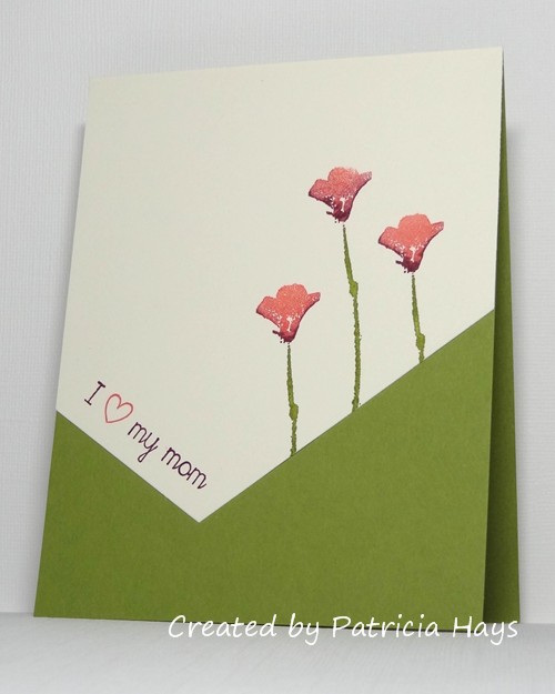
I gave in to the instinct to do something floral with these colors.  It just seemed right, and I hadn’t used this flower stamp for a long time so it felt nice to ink it up again.  I still have a few more weeks to work on Mother’s Day and Father’s Day cards for Send a Smile 4 Kids, so that’s how I chose the theme for my card.  I used a die to cut the asymmetrical angle of the focal panel.

CASCAS266

CC&S color266-001

Thanks for stopping by today!  I hope you’ll join us over at CAS Colours & Sketches with your own take on these colors!  You have until 6:00 p.m. Eastern time Monday, April 9 to link your card at the challenge website.

Supplies:
Stamps: A Real Wild Poppy (Hero Arts); It’s Good to Be Queen (Lizzie Anne Designs)
Cardstock: Old Olive, Very Vanilla (Stampin’ Up)
Ink: Old Olive, Calypso Coral, Rich Razzleberry (SU)
Other: Custom Panels die (Avery Elle)

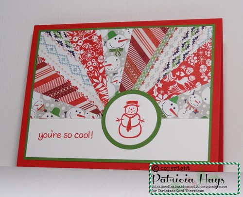
Hello!  It’s technique challenge time at Christmas Card Throwdown.  For the next two weeks, we’re hoping you’ll give the sunburst technique a try.  Some people call it the starburst technique.  Either way, it’s a super way to use up some of your designer papers!  Here’s the link to the tutorial I used when I first learned how to do it:  Starburst Technique

I decided to go with a snowman theme for my card.  It ended up using the not-so-snowy, traditional Christmassy colors of red and green.  Usually I sponge the edges of the triangles when I do this technique, but I opted not to take the time to do that this time.

52CCT 02-18-2017

Be sure to check out the cards the Design Team has made.  Then create your own card using this technique, and share it with us at the CCT site by 7:00 p.m. Eastern time Friday, March 3.  We’d love to see your take on the technique!

Supplies:
Stamps: Snowmen & Snowflakes (Hero Arts); Critters in the Snow (Lawn Fawn)
Cardstock: Poppy Parade, Gumball Green, Whisper White (Stampin’ Up); designer papers from Nordic Holiday 6″ x 6″ paper pad (Basic Grey)
Ink: Poppy Parade (SU)
Other: standard circle Nestabilities dies (Spellbinders)

finishing strong... with mixed emotions

Comments Off on finishing strong… with mixed emotions
Aug 022015

If you’ve been reading my blog for a while, you’ve probably learned that over the last five years, I’ve been donating the majority of the cards I make to Operation Write Home.  OWH is an organization that provides handmade greeting cards to our country’s military men and women who are deployed overseas, so that they may use the cards to write home to their loved ones.  OWH also welcomed “AnyHero” cards and letters containing messages of support for our troops.

It’s with mixed emotions on my part for me to state that OWH has ceased its collection efforts as of August 1, 2015.  This is due to many more deployed service members returning home, and staying home, than in the past.  On the one hand, it’s wonderful news that there are not as many people stationed overseas, and that they no longer need to make the sacrifices of being away from their homes and families.  That’s a fantastic thing!  On the other hand, as a card maker, to me it feels like a loss of a purpose, the end of a good cause.

OWH called its final campaign “Finishing Strong” – and that’s what I aimed to do.  Thanks to the USPS tracking system, I know that my last shipment to OWH was received by them on July 30.  I’m not going to state the total number of cards I’ve sent over the last five years because I don’t want to come across as bragging, but I’m proud of the number.  And I will readily admit that I couldn’t have done it without the support of a number of friends – friends who encouraged me by commenting on the cards I’ve posted here on my blog, friends who didn’t mind my donating cards they’d sent to me as part of card swaps (yes, I gave the friends credit for creating the cards!), and an elementary school principal and several teachers who gave me permission to bring AnyHero coloring pages into the classrooms in which I was substitute teaching for the students to complete after they’d finished their assignments.  To all of you who have helped me – THANK YOU so much.

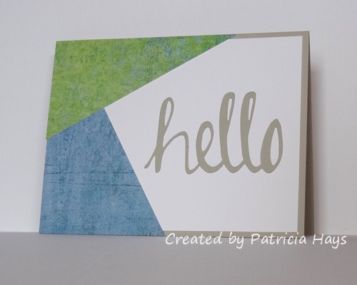
Most of the cards in my last shipment have already been shared here on my blog, but I did make a few at the last minute so I could finish up with a nice round number.  I’m sharing a couple of them here today.  First is an any occasion card.  The “hello” is suitable for just about any reason.  I cut it from textured cardstock.  The white cardstock is textured, too.  The layout of the card is a sketch I’d designed for a CAS Colours & Sketches challenge last February, turned on its side.  The designer papers come from one of my favorite Basic Grey collections (which is kind of hard to say because I love so many of the Basic Grey collections!).  Although the colors seem to suggest masculinity, this card could be sent to pretty much any person of any age.

7-15 hello

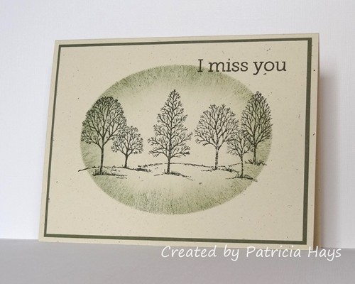
And here is the last card I made specifically for OWH.  It’s a quick and easy design I’ve used in the past, but it just seems pretty classic, like this well-known tree image from Stampin’ Up.

7-15 miss you

Operation Write Home, I will miss you – the sketches, the other challenges, the blog hops, the virtual card making parties, and most of all, the camaraderie of everyone involved with the organization.  Thank you for allowing me to brighten the lives of our military men and women and their families.

As for me – I’ll still continue to make cards.  I’ve been looking into some other organizations that accept donations of handmade cards.  Although my time with OWH is finished, there are still plenty of other opportunities for me to spread some cheer through my creative efforts.

Supplies for the “hello” card:
Stamps: none
Cardstock: Sahara Sand, Sahara Sand textured, Whisper White textured (Stampin’ Up); scraps from Oh Baby! Boy collection (Basic Grey)
Ink: none
Other: Hello die (Avery Elle)

Supplies for the tree card:
Stamps: Lovely As a Tree (Stampin’ Up); Year-Round Sentiments (Hero Arts)
Cardstock: Naturals Ivory, Always Artichoke (SU)
Ink: Always Artichoke (SU)
Other: sponge

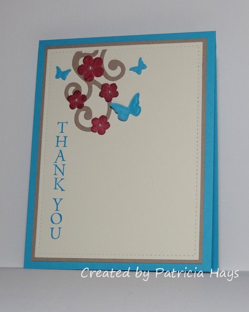
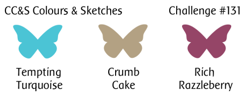
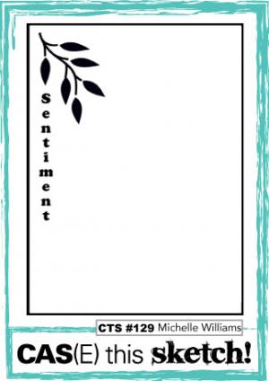
Hello!  It’s time for a new challenge at CAS – Colours and SketchesJane is our challenge hostess for the month of July, and she’s chosen some nice vibrant colors plus a neutral to get us started this week.  I’ve combined our challenge colors with the soon-to-close sketch challenge at CAS(E) this Sketch!  The sketch was a perfect opportunity to use this sentiment stamp.  I didn’t have flowers in the deep raspberry color, and all my flower punches would have been too big, so I dyed some white Prima flowers with reinker.

CASCAS131

CC&S color131-001

Go see what the rest of the design team and our July Guest Designer have done with these colors.  Then show us what you can create with them!  You have until 6:00 p.m. Eastern time Wednesday, July 8 to link your card at the challenge site.  We’d love to have you join us!  Thanks for stopping by today.

Supplies:
Stamp: Thank You Note (Hero Arts)
Cardstock: Tempting Turquoise, Kraft, Very Vanilla (Stampin’ Up)
Ink: Tempting Turquoise (SU)
Other: Rich Razzleberry reinker, pearls, Beautiful Wings die (SU); Scribbles Swirls die (Sizzix); Stitched Rectangle die (Lawn Fawn)
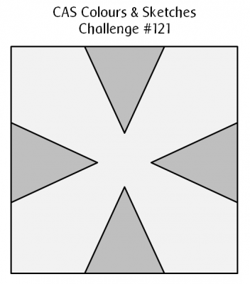
Hello!  It’s time for a sketch challenge again over at CAS Colours & Sketches.  We have a pretty interesting one for you this time!  You’re welcome to manipulate the sketch, so long as we can still easily recognize the main elements.

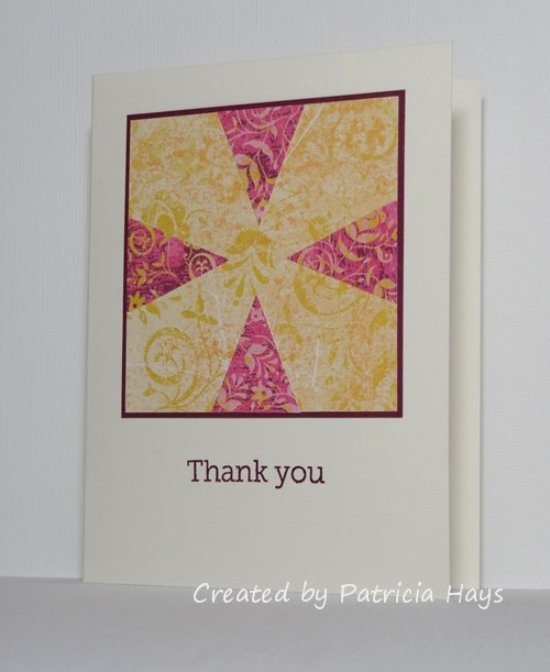
The sketch was drawn up for a square card.  Since I prefer to make A2 sized rectangular cards, rather than trying to stretch the sketch out into a rectangle, I just put the square element on a rectangular card base.  Even though I think it’s a really neat sketch, I had a difficult time deciding what I wanted to do with it.  I thought about using butterflies or flowers or even ice cream cones for the triangular elements of the sketch, but nothing seemed “right”, so in the end I just stayed very true to the sketch and used triangles of designer paper.  It was a nice way to use up some scraps I had!  I have to admit it’s not one of my most favorite cards – it seems too flat, like it’s lacking something.  But it’s definitely not one of my worst cards either, so I’m OK with it.  It will be a good addition to the stockpile I’m building for Operation Write Home.

CASCAS121

Be sure to check out what the rest of the CC&S Design Team has done with this sketch – they’ve made some amazing cards!  Then give it a try yourself.  You have until 6:00 p.m. Eastern time Wednesday, April 29 to link your card at the challenge site.  Thanks for stopping by today!

Supplies:
Stamps: Year-Round Sentiments (Hero Arts)
Cardstock: Pure Luxury Ivory (Gina K. Designs); Rich Razzleberry, Razzleberry Tart designer papers (Stampin’ Up)
Ink: Rich Razzleberry (SU)

Hello!  Since it’s the third Monday of the month, it’s time for another challenge at Cards in Envy.  Our theme for the next few weeks is “Spring is in the Air”.  Let anything related to the season of Spring inspire your creativity when you make a card for this challenge – flowers, colors, animals, whatever seems like Spring to you!  Remember that for our challenges, all cards must be A2 sized and cannot have lumpy, bumpy embellishments more than 1/4″ thick.

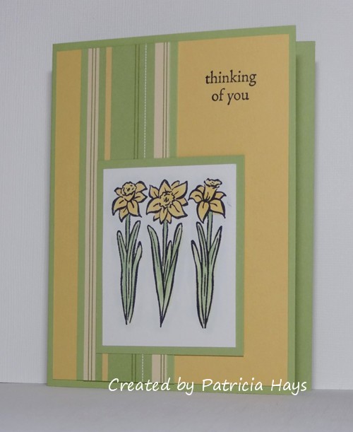
One of my favorite things about Spring is that flowers start blooming.  Even though we’ve had a lot of cold, snowy weather over the last month, the daffodils in my flower border are starting to put out foliage.  In anticipation of them showing their sunshiny-yellow blossoms, I’ve used a daffodil stamp for my card and colored it in representation of the daffodils that grew in my family’s yard when I was growing up.  The layout is OWH Stars & Stamps sketch #B-17 – a bonus sketch from a 2012 blog hop.  I’ve turned the sketch on its side and stamped the sentiment directly onto the main panel of the card rather than making a small panel especially for it.  The vertical strip of designer paper is some pretty old stuff, and the green cardstock is a retired Stampin’ Up color, so I’m continuing on my personal goal of actually using up some of my older stamping supplies.

CIE 03-16-2015

Be sure to check out what the rest of the Cards in Envy design team has made!  How will the changing season inspire you?  We’d love to see your creativity!  Share your card using the linky tool at the Cards in Envy site by 7:00 p.m. Eastern time Sunday, April 5.

Supplies:
Stamps: Three Daffodils (Hero Arts); Always in My Thoughts (Stampin’ Up)
Cardstock: Certainly Celery, So Saffron, Petals & Paisleys designer series paper (SU); Pure Luxury White (Gina K. Designs)
Ink: Tuxedo Black (Memento)
Other: markers (Copics)

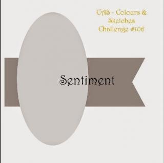
Hello!  The design team from CAS – Colours and Sketches is back from holiday break and ready to start off another year of fun clean and simple challenges!  We’re starting back up again with a sketch.  You’re welcome to manipulate the sketch, or change the oval to another shape, so long as we can still easily recognize the main elements of the sketch.

I’ve stretched the sketch out to a rectangle and turned it 90° on its side.  I’ve also decided to use a heart in place of the oval.  Although it’s too late now to send Valentine’s Day cards to Operation Write Home to be used this year, I kept the sentiment simple enough that this card could be sent during other times of the year.    The heart is raised up from the front panel with dimensional adhesive.

CASCAS106

Be sure to stop by the challenge blog and welcome our two newest DT members, Jane and Stef!  Then create your own card using this sketch, and link it to the challenge site by 1:00 p.m. Eastern time Wednesday, January 14.  We’d love to have you join us!  Thanks for stopping by today.

Supplies:
Stamps: Real Carnation (Hero Arts); Short & Sweet (Stampin’ Up)
Cardstock: Pure Luxury White (Gina K. Designs); Pink Pirouette (SU)
Ink: Pink Pirouette, Pear Pizzazz, Purely Pomegranate (SU)
Other: Purely Pomegranate satin ribbon, dimensionals (SU); heart die (Sizzix)

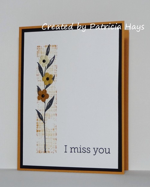
Today’s card is a quick, clean and simple one using the colors for the current Dynamic Duos challenge.  For the block behind the vine, I inked up the stamp with More Mustard, stamped it off on a piece of scrap paper, then “rock and rolled” the ink pad along the edges of the stamp to get the color variation.  The tiny Prima flowers were a last minute decision, and I’m glad I went with it because they really do perk up the card.  This card is going into my stash for Operation Write Home.


Thanks for stopping by today!  Comments are always read and appreciated!  🙂

Supplies:
Stamps: The Art of Life (Stampin’ Up); Year Round Sentiments (Hero Arts)
Cardstock: More Mustard, Basic Black, Whisper White (SU)
Ink: More Mustard (SU); Tuxedo Black (Memento)
Other: flowers (Prima Marketing); mini brads (Recollections)

Hello!  It’s time for a new challenge at CAS – Colours and Sketches!

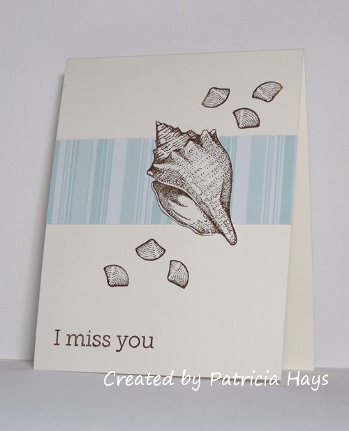
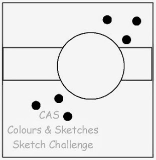
This week Lizy has drawn up a very nice sketch that lends itself well to clean and simple (CAS) styled cards.  I’ve stretched it out to a 4.25″ x 5.5″ rectangular format.  The large circular element of the sketch can be replaced with any shape.  I’ve chosen to use a large seashell.  I enjoyed last week’s color challenge so much that I’ve used it again this week!  🙂  Operation Write Home frequently requests cards with a “missing you” theme, so that prompted the sentiment I chose for this card.  I like that the card turned out gender neutral, so it can be sent to either a man or a woman.

Now it’s your turn!  Show us what you can do with this sketch by linking your card at the CAS – Colours and Sketches website by 1:00 p.m. Eastern time Wednesday, November 20.  Be sure to check out the other design team members’ cards and give them a little love by commenting on them, too!  Thanks for stopping by today!

Supplies:
Stamps: Stipple Shells (Stampin’ Up); Year Round Sentiments (Hero Arts)
Cardstock: Pure Luxury Ivory (Gina K. Designs); Soft Sky Prints designer series paper (SU)
Ink: Soft Suede (SU)

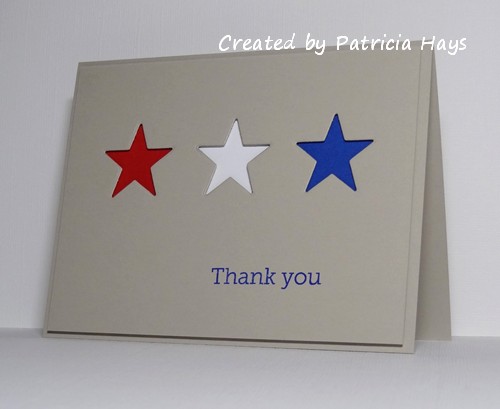
As I was finishing up the challenges for the Operation Write Home Labor Day Virtual Card Making Party, it struck me that I hadn’t made any cards for it that could be used as AnyHero mail – a card in which I would write a message to one of our heroes stationed overseas, thanking them for their service to our country.  So I kept that in mind as I planned my card for the ninth (and last) challenge, which was to use the negative of a punch or a die cut shape on the card.  I decided that my star dies would work well for a patriotic design, and quickly came up with this very clean and simple card.  The red, white, and blue backgrounds are attached directly to the card base.  The main panel, from which the stars are cut, is attached to the card with dimensional adhesive.

And ta-da!  I’ve completed all of the VCMP challenges!  Now I just need to work on filling the rest of the box I’ve started, so that I can get my remaining fall and Christmas cards out to my shipper by the beginning of October.

Thanks for stopping by today!  All comments are welcome and appreciated.

Supplies for this card:
Stamps: Year Round Sentiments (Hero Arts)
Cardstock: Sahara Sand, Real Red, Whisper White, Brilliant Blue (Stampin’ Up)
Ink: Brilliant Blue (SU)
Other: Star die (Sweet ‘n Sassy Stamps); dimensionals (SU)

OWH Labor Day VCMP 3 - triple die cutting technique

Comments Off on OWH Labor Day VCMP 3 – triple die cutting technique
Sep 032013

The third OWH Labor Day Virtual Card Making Party challenge puts a twist on a popular stamping technique.  Instead of stamping on multiple layers, separating them to mat them, and then reassembling them, this time we’re to cut the layers from one piece of either designer paper or cardstock that’s been stamped with a design.

I decided to use a piece of designer paper for my card. I originally cut the smallest oval from the designer paper, too, but I felt the card looked really “busy” so I replaced it with an oval cut from the same color cardstock as the card base.  I added the flowers because the card needed a little something extra to dress it up.

I do appreciate this technique’s use of less cardstock or designer paper, but making sure my graduated dies were aligned correctly was extremely painstaking for me because I’m a perfectionist.  Assembling the layers so they’d line back up correctly also took a lot of patience.  But eventually I ended up with another card for my OWH stash.

Thanks for stopping by today!

Supplies:
Stamps: Year Round Sentiments (Hero Arts)
Cardstock: Pool Party, Tangerine Tango, Island Indigo, Sycamore Street designer paper (Stampin’ Up)
Ink: Island Indigo (SU)
Other: Spring Bouquet punch (SU); petite oval Nestabilities dies (Spellbinders); mini brads (Making Memories)

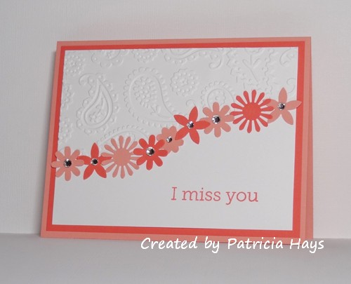
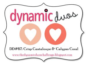
Today’s card uses the color combination for Dynamic Duos challenge #67.  I wasn’t sure what to do with this monochromatic scheme at first, but then I decided to simply rework a card I made earlier this year.  It all came together pretty quickly after that.  Because this card is going to be included in my next shipment to Operation Write Home, I chose one of their most desired card themes when I was considering what sentiment to use.  A few rhinestones add a bit of sparkly fun.

Thanks for stopping by today!

Supplies for this card:
Stamps: Year Round Sentiments (Hero Arts)
Cardstock: Crisp Cantaloupe, Calypso Coral, Whisper White (Stampin’ Up)
Ink: Calypso Coral (SU)
Other: Boho Blossoms punch, Spring Bouquet punch, rhinestones (SU); Paisley embossing folder (ProvoCraft)

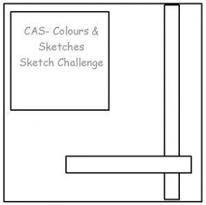
Hello there!  It’s time for another CAS – Colours and Sketches challenge.  Louise has one more sketch for us during her month of hosting our challenges.

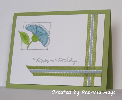
I’ll admit that yesterday’s card followed the sketch pretty much, but it didn’t seem really clean and simple to me when it was all finished, so I went back to the figurative drawing board for my sample card for this challenge.  I decided to use a lighter color scheme and less cardstock layers.  I did, however, choose to layer two ribbons.  In retrospect I probably should have done the two pieces of pear seam binding first, and then the narrow blue ribbon over both.  But I suppose this looks all right.  I used my Xyron to adhere the ribbons.  What a timesaver that proved to be, rather than trying to use glue dots or my most narrow sticky tape.  I briefly considered keeping my card a square like the sketch, but opted against it so I’d have more open space in which to stamp the sentiment.  The focal panel is adhered with dimensional adhesive.

What will you create with this sketch? Share your work via the linky tool on the CAS – Colours and Sketches blog by noon eastern time on July 31.  Thanks for stopping by today!

Supplies:
Stamps: Peeking Posies (Hero Arts); Everyday Messages (Stampendous)
Cardstock: Pear Pizzazz (Stampin’ Up); Pure Luxury White (Gina K. Designs)
Ink: Smoky Slate (SU)
Other: Pear Pizazz seam binding, Baja Breeze taffeta ribbon, dimensionals (SU); markers (Copic)

© 2019 Suffusion theme by Sayontan Sinha