Hello!  Today I’ve combined this week’s Dynamic Duos color challenge with Freshly Made Sketch #42.  I used the mirror image of the sketch so the flower image wouldn’t be “looking off the edge” of the card.  Yeah, I’m weird like that!  LOL  I decided not to put a sentiment on this one so it can be a real “any occasion” card.  The kind of sketchy look in the flower petals wasn’t really intentional (they should be more solidly filled) but I like it.  I achieved that by first stamping the image first on my Stamp-a-ma-jig imaging sheet.  Then I spritzed a bit of water into the air and held the stamp, inky rubber side up, underneath the mist to remoisten the ink a bit.  Then I stamped that onto the cardstock.


Thanks for stopping by today!

All supplies for this card are from Stampin’ Up unless otherwise noted.
Stamp: A Real Sierra Primrose (Hero Arts)
Cardstock: Old Olive, Rich Razzleberry, Very Vanilla, Razzleberry Lemonade designer paper
Ink: Old Olive, Rich Razzleberry
Other: Swiss Dots embossing folder (ProvoCraft)

This week’s CAS challenge at Splitcoaststampers is to use die cuts on your project.  I decided to pair that challenge with this week’s Stars and Stamps blog sketch.  And this card came together really quickly, allowing me to add one more to my stash for Operation Write Home.

Supplies:
Stamps: Right at Home (Hero Arts)
Cardstock: Luxury White (Gina K. Designs); designer papers from Kioshi 6″ x 6″ paper pad (Basic Grey)
Ink: Elegant Eggplant (Stampin’ Up)
Other: Beautiful Wings die (SU)

Today I have two cards for you using OWH sketch #67.

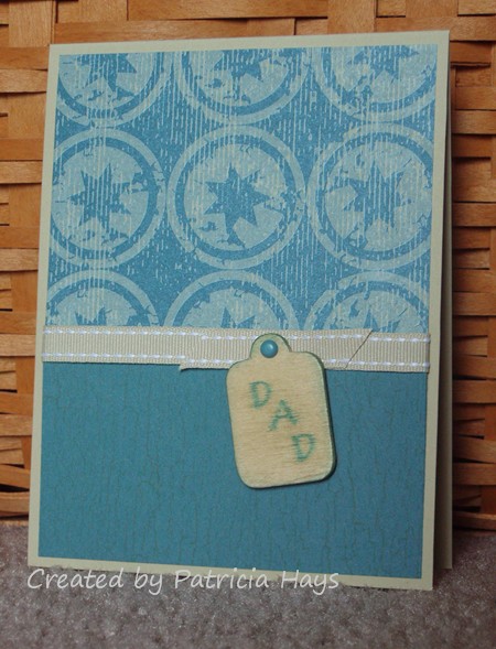
For the first card, I combined the sketch with Splitcoaststampers Mini VSN challenge #5, to use wood or something wood-like on your card.  Several years ago I bought a package of wooden tags for a ridiculously low price, thinking I could use them on cards.  I found them recently when I was doing some reorganizing but still didn’t do anything with them.  Then when I read the requirements for the Mini VSN challenge, I knew it was time to put one to use.  I didn’t originally plan to use this shape (with the rounded corners) on a masculine card, but after testing out how the ink would work on the wood, I didn’t want to waste my efforts.  And I guess it coordinates with the circles in the designer paper.  I sponged and smeared some River Rock ink on the tag first, then stamped the sentiment and sponged the edges with Blue Bayou ink.  I didn’t realize the letters would bleed so much but I suppose it adds to the weathered look and coordinate better with the background stamp on the bottom portion of the card. Where the tag is attached to the ribbon, I tried a ribbon loop first, but it seemed too bulky.  But the way it is now seems a little too plain.  I dunno.  It’ll be OK.  I’m sending this card to Operation Write Home so I’m hoping some service member will appreciate it even though I’m not thrilled with it.


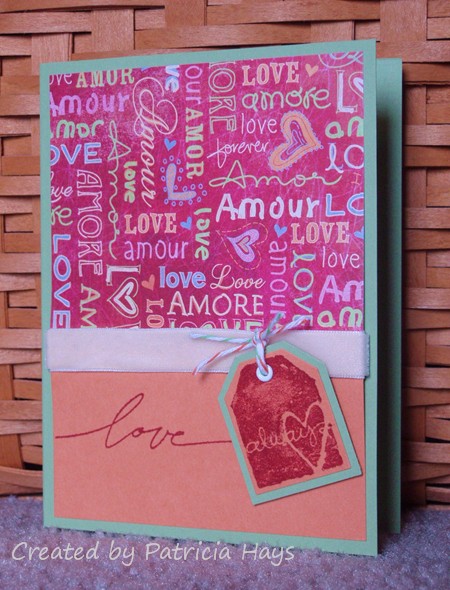
I did the second card just kind of for fun, to show how one sketch can yield different results just by using different colors.  The bright, cheery colors on this one make me smile, and I just love the softness of the velvet ribbon.  This one is going to Operation Write Home, too.

Supplies for the first card:
Stamps: Good Alphabet (Hero Arts); Weathered (Stampin’ Up)
Cardstock: River Rock, Blue Bayou, Western Sky designer series paper (SU)
Ink: River Rock, Blue Bayou (SU)
Other: River Rock ribbon (SU); mini brad (Making Memories); Woodsies tag (Forster)

Supplies for the second card:
Stamps: Wonderful Words, Too Terrific Tags (SU)
Cardstock: Pear Pizzazz, Peach Parfait (SU); designer paper from Sugar Rush 6″ x 6″ paper pad (Basic Grey)
Ink: Riding Hood Red (SU)
Other: tag punches (SU); ribbon (Prima Marketing); apple and orange twine (Really Reasonable Ribbon); eyelet (source unknown)

Happy Thursday!  The weekend is almost here, hooray!  It’s hard to believe April is about halfway over already.

Today’s card was made with three challenges in mind.  I used the April InStyle Stamps sketch challenge for the layout and the April InStyle Stamps color challenge for the color scheme.  I also used the following elements from Desert Islands Crafters Challenge #5: ribbon, a birthday theme, a bow, dots, pearls, and bright colors.

Supplies:
Stamps: present from Patty’s Appreciation (InStyle Stamps); Friendly Greetings (Hero Arts)
Cardstock: Basics White (Papertrey Ink); Daffodil Delight, Chocolate Chip, Prints designer series paper (Stampin’ Up)
Ink: Chocolate Chip (SU); printer ink
Other: markers (Copic); Chocolate Chip grosgrain ribbon (SU); standard circles Nestabilities dies (Spellbinders); self-adhesive pearls (KaiserCraft)


In the spirit of full disclosure, the present image used on today’s project was provided to me by InStyle Stamps to aid in promoting their products.

To the beach!

Comments Off on To the beach!
Aug 102009

That’s a place I haven’t been for a while… the beach.  I enjoy walking along the shore and letting the waves tickle my feet, but I don’t care for having sand stuck in my swimsuit.  Ick.  LOL

I have a little confession to make about today’s card. I actually made the focal point several years ago.  Like probably 5 years.  Really.  It’s been sitting around, and I came across it last month and decided I’d finally put it to use on my parents’ anniversary card.  I stamped the “congratulations” on it and trimmed it up and matted it and got it on a card base, and ta-da… card done.

parent-anniversary-2009.jpg

So how did I create it?  It’s honestly not quite as difficult as it might look.  It’s a technique that I’ve heard described as “palette stamping.”  I used a large solid rectangle stamp for the base.  I applied pigment ink directly to the stamp in random fashion.  (Hint: the “cat’s eye” or petal-shaped ink pads work better for this than a full-sized ink pad.)  Next I inked the large and medium shell stamps with dye ink and stamped them directly onto the pigment inked-up rubber.  Then I stamped onto the white cardstock.  Lastly, I added the little shell images with dye ink.

Now that doesn’t sound too hard, does it?  Hey, if I can do it, so can you.  🙂  If you decide to try this version of palette stamping, please add a comment including a link to your creation so I can see it!

Supplies:
Stamps: Stipple Shells (Stampin’ Up!); Large Straight-Edge Rectangle (Hero Arts)
Cardstock: Whisper White, Blue Bayou, Chocolate Chip, Naturals Ivory (Stampin’ Up!)
Ink: Chocolate Chip and Really Rust dye ink (Stampin’ Up!); Dune, Harbor, and I’m not sure of the other color of pigment ink (ColorBox)

Stuck in a rut

Comments Off on Stuck in a rut
Apr 102009

That’s me.  I’m stuck in a creative rut.  Despite having some new stamps to play with, I just can’t get focused on creating anything with them.  But I did want to post *some*thing. 

lois-birthday-2008.jpg

I made this card a year ago for one of my longtime friends.  I chose colors that she liked.  I used a Cuttlebug folder to emboss the designer paper, and then I swiped my ink pad over it to make the embossing stand out even more. It’s hard to tell in the photo, but the Chocolate Chip punched circle just underneath the rhinestone brad is crumpled/distressed a bit. I popped the alignment guard off of my corner rounder punch and used the punch to make the scalloped edge at the bottom of the designer paper.

I have to confess that I borrowed the layout idea from a birthday card that another longtime friend made for me.  Dee, if you read this, thank you for the inspiration!

Stamps: Riveting (Stampin’ Up!); Wavy Wishes (Hero Arts)
Cardstock: Blue Bayou, Whisper White, Chocolate Chip, Fall Flowers designer paper, Spring Showers designer paper (Stampin’ Up!)
Ink: Blue Bayou, Chocolate Chip (Stampin’ Up!)
Other: Rhinestone brad, corner rounder punch, and Soft Sky stitched ribbon (Stampin’ Up!); “Harmony” alphabet [for scalloped circle] and “Happy Birthday” embossing folder (Cuttlebug)

It seems like there’s never really a “good time” to send a sympathy card.  KWIM? 

I’ve mentioned before that I make and send cards to the faculty and staff of my son’s elementary school on behalf of the PTA Executive Board.  Today I had to mail a card to a teacher whose mother recently passed away. 

paxton-sympathy.jpg

For some reason, I often use purple when I make a sympathy card.  It seems soothing to me, I guess.  Today I decided to use one of my Hero Arts floral stamps that hasn’t seen ink in a long time.  I spritzed the stamp with water from a spray bottle after I inked it. It’s probably hard to see, but the card base is stamped with the Stampin’ Up! Linen background stamp.  I reached back into the Splitcoaststampers Challenge archives and used Sketch Challenge #50 for the layout.

The details:
Stamps: A Real Candytuft (Hero Arts); Linen background and Always In My Thoughts (Stampin’ Up!)
Cardstock: Almost Amethyst, Lovely Lilac, Whisper White, Almost Amethyst Prints designer paper (Stampin’ Up!)
Ink: Almost Amethyst, Lovely Lilac (Stampin’ Up!)
Other: Almost Amethyst, Lovely Lilac, Barely Banana, and Garden Green markers (Stampin’ Up!); spray bottle of water

© 2019 Suffusion theme by Sayontan Sinha