Happy New Year, everyone! I hope that 2011 brings all the best to all of my readers.

I’m excited today to announce that I’m now an InStyle Stamps Chickie!  I’m really looking forward to being a part of this design team and sharing fun projects and ideas.  Take time to check out the InStyle Stamps company blog for more fantastic news and upcoming plans for the new year. 

I’m still tired from the traveling my family did over the holiday season, and being away from my supplies didn’t allow me to get any new things created.  So I’m sorry I don’t have anything crafty to share today.  But don’t worry – I’ll be back at it by Monday!

My younger son is taking band now that he’s in middle school, and he plays percussion.  So when I saw this stamp at In Style Stamps, I knew I should make him a card with it.  Since he’s still somewhat interested in Pokemon and Bakugan, I thought he’d like the anime style image. 

Today’s card is the birthday card I recently made for him.  I used the current In Style Stamps sketch challenge layout, paired the image with a Stampin’ Up sentiment and chose some Basic Grey papers to go with it. 

My husband doesn’t usually say much of anything about the cards I make, but he told me that this one was “really good”.  I have to admit I’m pretty pleased with it, too.

Supplies:
Stamps: Travis (In Style Stamps); Birthday Whimsy (Stampin’ Up)
Cardstock: So Saffron (SU); Vintage Cream (Papertrey Ink); “Blue Bonnet”, “Matthew”, and “Nathan” papers from Oh Baby! Boy collection (Basic Grey)
Ink: Onyx Black (VersaFine)
Other: Premier colored pencils (Prismacolor); odorless mineral spirits (Houston Arts)

I know it probably seems weird to be gearing up for Valentine’s Day right now, but for Operation Write Home, ’tis the season! 

If you’re unfamiliar with Operation Write Home, it’s an organization that collects handmade greeting cards to send to our military members stationed overseas.  Our troops in Iraq, Afghanistan, Kuwait, and at sea can then send cards home to their loved ones – since they can’t easily get out to the Hallmark store or Walmart or whatever to buy a card.  You are also welcome to send “any hero” cards to encourage our brave men and women overseas.  For more details, click on the link above or the one in my sidebar to visit Operation Write Home’s website. 

Because of the lag time in sending the cards out to the Middle East, and then allowing time for the troops to mail them back home, OWH works its seasons ahead of the calendar.  The deadline for sending Christmas, Hanukkah and Kwanzaa cards has passed, so now they are working on collecting Valentines.  If you’d like to make some handmade Valentines for them, you’ll need to mail them to one of the OWH shippers by January 7, 2011.

If making cards to donate doesn’t interest you, you can still help Operation Write Home in another effort.  Jo-Ann Fabric and Craft Stores recently held a Craft for a Cause Contest, and Operation Write Home was one of the three organizations that received the most donations.  Now, the top three organizations are in a contest for votes.  The one that receives the most votes by December 4, 2010 will receive $50,000 from OWH!  Please click on this link to vote, and vote often!  But remember you can vote only once per 24-hour period.

And now, here’s today’s card.  I really wanted to make it a little fancier, with scalloped borders or some of my Nestabilities, but nothing worked with the size of this image.  So I opted for just a simple straight edged mat with punched corners embellished with pearls.  When I got the pearls out, I wondered if they’d work on the sash of the dress – and it turned out they fit quite nicely there. 
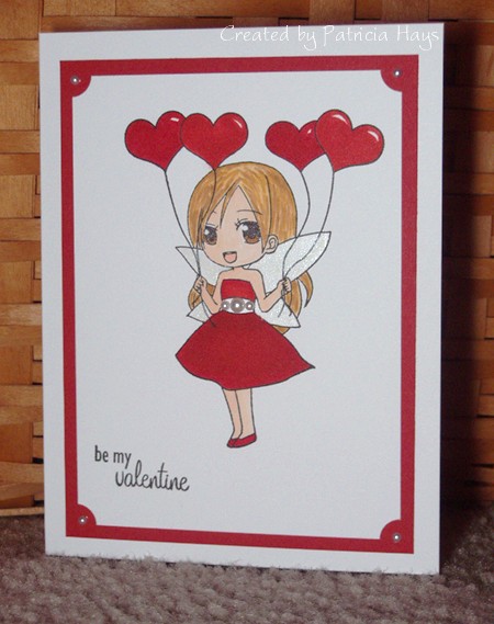
Supplies:
Stamps: Ava Holding Balloons (In Style Stamps); So Much Love (Lizzie Anne Designs)
Cardstock: Basics White (Papertrey Ink); Real Red (Stampin’ Up)
Ink: Onyx Black (VersaFine)
Other: markers (Copic); self adhesive pearls (KaiserCraft); ticket corner punch (SU); Angel Wings paint (Shimmerz)

Here’s a funny.  Whenever I photograph one of my cards, I take at least 3 or 4 shots of it, and then choose the one that looks the best.  I think I took 5 pictures this time – and as I was looking at them up close on my computer, I realized NONE of them showed off the Shimmerz paint on the wings.  Not a one.  So back to my photo staging area I went.  Because I took the photo at night, I was using my small Ott-Lite lamp to shine light on the card.  It took me a while to get it adjusted to pick up the glimmer.  Lesson learned – when all else fails, turn the lamp upside down so the light shines up onto the card.  Seriously.  It worked!

If you came here from Giselle’s Cross My Heart Papercrafts blog, thanks so much for stopping by!  The next link in today’s blog hop will take you to Operation Write Home’s Homefront Blog, where you can learn even more info about this fantastic organization, and start off at the top of the blog hopper list.
butterfly of hope, healing and peace

Comments Off on butterfly of hope, healing and peace
Oct 302010

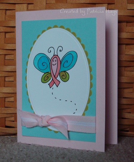
Today’s card uses a color combo that I feel is a little unusual, but I think it holds a great meaning. I created this card for one of the Splitcoaststampers.com Hope You Can Cling To challenges.  For this particular challenge, we were to use the colors pink, aqua and olive… pink symbolizing breast cancer awareness, aqua to represent healing and hope, and olive for peace.  The butterfly is a digital image from In Style Stamps, created especially for breast cancer awareness.  (Check out the link in the previous sentence to find out how you can get this image for free until October 31, 2010.)  I think in general a butterfly is a wonderful symbol of hope, because of the way it seems lifeless in its chrysalis before emerging as a lovely creature. 

The card itself is pretty simple.  I colored the butterfly, added a few layers, and wrapped the focal panel with ribbon tied in a knot bow.  I didn’t think any sentiment was necessary.

Supplies:
Digital Image: Hope Butterfly (In Style Stamps)
Cardstock: Pink Pirouette, Cool Caribbean, Kiwi Kiss (Stampin’ Up); Basics White (Papertrey Ink)
Ink: n/a
Other: markers (Copic); Pink Pirouette ribbon (SU); petite oval and petite scalloped oval dies (Nestabilities)

Here’s another card I created for Operation Write Home.  Once again, I used an image from In Style Stamps with a sentiment from Lizzie Anne Designs to make a card that I thought one of our military members might like to send home to his or her son.  I pulled out another colorblocking template for the layout.  My Basic Grey papers don’t exactly match my coloring, but I think it’ll be OK. 

Supplies:
Stamps: Bobby (In Style Stamps); Everyday Sayings (Lizzie Anne Designs)
Cardstock: Going Gray (Stampin’ Up); Basics White (Papertrey Ink); designer papers from Boxer 6″ x 6″ paper pad (Basic Grey)
Ink: Onyx Black (VersaFine)
Other: card colorblocking template 3-C (Deluxe Cuts); Premier colored pencils (Prismacolor); odorless mineral spirits (Houston Arts)

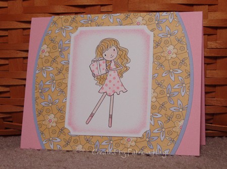
Here’s another Birthday Chloe card.  I just think she’s darling.  This time I used the CPS weekly sketch for the layout. I decided to paper piece her dress and her gift so the card would meet one of the Hope You Can Cling To challenges at Splitcoaststampers.   

Supplies:
Digital Image: Birthday Chloe (In Style Stamps)
Cardstock: Pretty in Pink, Almost Amethyst, Tea Party designer series paper (Stampin’ Up)
Ink: Pretty in Pink (SU)
Other: Premier colored pencils (Prismacolor); odorless mineral spirits (Houston Arts); sponge; Small Labels die (Nestabilities)

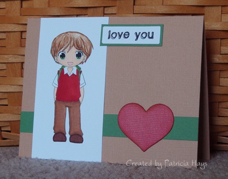
Today’s card is another one I created for Operation Write Home.  I thought one of our soldiers overseas might like to send it home to his or her son.  I combined two of In Style Stamps’ challenges for this one – the September color challenge for the color scheme and the October sketch challenge for the layout.  Even though I liked the original long, narrow layout of the sketch, I knew that reworking it into a 5.5″ x 4.25″ card would go easier for the OWH people.  The boy is a digital image, but the sentiment is a stamp. I had just the right size scrap of red print designer paper to cover the chipboard heart – I love when things work out like that! I added a little sponging around the edges of the heart.

Supplies:
Stamps: Everyday Sayings (Lizzie Anne Designs)
Digital Images: Jacob (In Style Stamps)
Cardstock: Creamy Caramel textured, Garden Green, Western Sky designer paper (Stampin’ Up); Basics White (Papertrey Ink)
Ink: Onyx Black (VersaFine); Ruby Red (SU)
Other: markers (Copic); heart die (Sizzix); chipboard; sponge

October is Breast Cancer Awareness Month, and in honor of that, Splitcoaststampers.com is offering up a month’s worth of “Hope You Can Cling To” challenges.  The cards created for the challenges will be donated to the UT MD Anderson Cancer Center to benefit those affected by breast cancer.  Since breast cancer touches so many lives, I plan to participate in as many of these challenges as I can to try to give hope or at least a brief smile to someone.

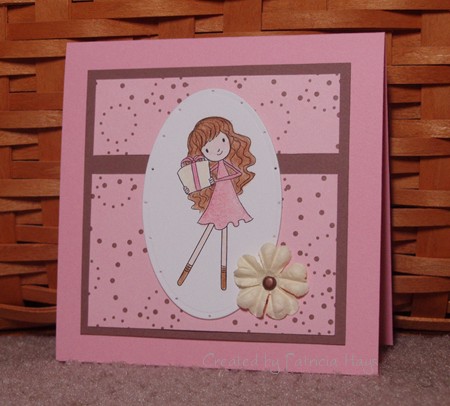
One of the challenges that was presented a few days ago was to make a card primarily using pink and brown.  I hadn’t yet made a card for the In Style Stamps September sketch challenge so I decided to combine the two.  I’ll confess that took the easy way out on the In Style challenge, though.  Although the participants were encouraged to make a T-slide card for it, I didn’t feel that I had the patience for it.  And since I don’t know who is going to end up being the sender or the recipient of the card because I’m donating it, I felt that it would be better to keep it simple and easy to send.  So I did a simplified, scaled-down version of the sketch to end up with a 4.25″ square card. 

This little Chloe image makes me smile.  I hope the person who eventually receives this card will smile, too.

Supplies:
Digital Image: Birthday Chloe (In Style Stamps)
Cardstock: Pretty in Pink, Close to Cocoa, Berry Bliss designer paper (Stampin’ Up); Basics White (Papertrey Ink)
Ink: printer ink
Other: Premier colored pencils (Prismacolor); odorless mineral spirits (Houston Arts); flower (Prima); mini brad, piercing tool (Making Memories); petite standard oval die (Nestabilities)

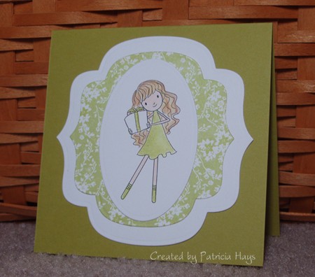
Last week In Style Stamps hosted a Birthday Bash challenge to help Operation Write Home celebrate their birthday.  Anyone who made a birthday card to donate to Operation Write Home and linked it to the In Style Stamps blog by Sunday afternoon (Sept. 26) would be eligible to win a great prize from In Style Stamps.  ISS was generous enough to even provide a free digital image called Birthday Chloe to use on the cards!  I thought, “This is GREAT!  I can get a super cute image to use on my card for the challenge, and just maybe I’ll be lucky enough to win the prize!” 

Unfortunately, due to circumstances beyond ISS’s control, there was a delay in getting the free image out to the people who requested one.  Birthday Chloe didn’t arrive in my email inbox until Friday morning.  Because of work, helping out with our high school’s marching band at Friday night’s football game and a competition on Saturday, and spending time with my family, I didn’t have a chance to work on a card until yesterday afternoon.  I was relieved to see that ISS had extended their original deadline… but then, I don’t know if I’d misread the information on their blog early yesterday, or what, but suddenly I realized I had only 50 minutes to make my card, photograph it, upload it online, and then link it to the ISS blog.  ACK! 

I’d already printed out the image and had a vague idea for my card layout.  Because of the time constraint, I knew I had to keep the color scheme pretty simple.  I don’t know why, but I felt a strong pull to use green on the card.  I hastily flipped through my Basic Grey papers and found a green floral.  I matched it to some SU cardstock, grabbed my Prismacolor pencils and started coloring.  I ran some Nestabilities dies through my Big Kick, assembled all the layers, and there it was – a simple, super quick 4.25″ square card.  I snapped a couple photos of it (literally – usually I take 4 or 5 photos to compare and upload the best), rapidly chose one of the two to use online, and uploaded it to my Splitcoaststampers.com gallery in a hurry so I could get it linked to the In Style Stamps blog.

I made it with 4 minutes to spare.  Whew!

Even if I don’t win the prize offered by In Style Stamps, the real winner here is Operation Write Home.  I’m happy to be able to help their worthwhile cause. 

And now, here’s the card.

Supplies:
Digital Image: Birthday Chloe (In Style Stamps)
Cardstock: Kiwi Kiss (SU); Basics White (Papertrey Ink); green floral print from LilyKate 6″ x 6″ pad (Basic Grey)
Other: Labels Nine and Petite Oval Nestabilities dies; Premier colored pencils (Prismacolor); odorless mineral spirits

It’s finally Friday!  Hooray!  It’s been a kind of busy week and my creativity is lagging, so today’s card is just a fairly simple one.  Once again I used this week’s CPS sketch layout.  This time I stayed more true to the sketch. 

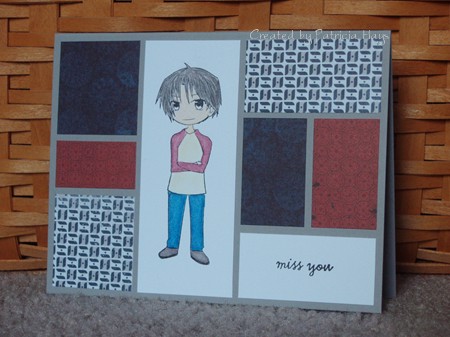
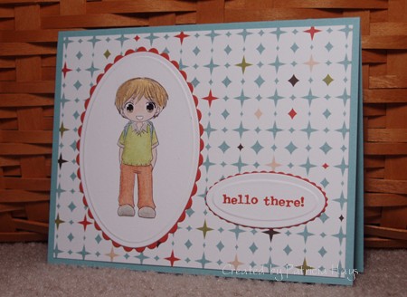
This is my first attempt at coloring an anime style image.  It’s one that I was able to choose for free for winning the In Style Stamps color challenge last month. 🙂 (The other image I chose for free was shown in Monday’s post.)  I guess I didn’t do too bad with coloring it – then again, if it *was* bad, I wouldn’t be sharing it, LOL!  I know I need more practice with my coloring skills.

cps184-jacob.jpg

Supplies:
Stamps: Treasured Trinkets (Lizzie Anne Designs)
Digital Images: Jacob (In Style Stamps)
Cardstock: Baja Breeze, Dusty Durango (Stampin’ Up); Basics White (Papertrey Ink); “Alternative” from Offbeat 6″ x 6″ pad (Basic Grey)
Ink: Dusty Durango (SU)
Other: Premier colored pencils (Prismacolor); odorless mineral spirits (Houston Arts); petite oval and petite scalloped oval dies (Nestabilities)

Sep 132010

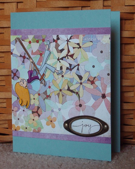
Did you like swinging on the playground when you were a child?  I always enjoyed it.  I remember sometimes I’d close my eyes and imagine that instead of swinging I was riding on the back of a pegasus, or being rushed up and down hills on a roller coaster, or soaring through the air with outstretched wings.

The image on today’s card brought back those fond memories to me when I saw it.  It’s a digital image called “Melanie” from In Style Stamps.  After I colored her, I decided to cut her out and adhere her to the floral paper, to make her look like she’s swinging among a bunch of flowers.  The top of the “rope” is attached directly to the floral paper, but the rest of the image is raised from the background with dimensional adhesive.  The layout is this week’s CPS sketch.  I thought the word stamp was an appropriate sentiment to put on this card, because doesn’t she look like she is having fun?

Melanie’s shirt and hair color are a little nod to my alma mater’s football team – the James Madison University Dukes, who came out with a very unexpected upset victory over the Virginia Tech Hokies last Saturday.  Go DUKES!

cps184.jpg

Supplies:
Stamps: Small Script (Stampin’ Up)
Digital Images: Melanie (In Style Stamps)
Cardstock: Baja Breeze (SU); papers from Kioshi 6″ x 6″ pad (Basic Grey); Basics White (Papertrey Ink)
Ink: Chocolate Chip (SU)
Other: markers (Copic); Hodgepodge Hardware (SU)

© 2019 Suffusion theme by Sayontan Sinha