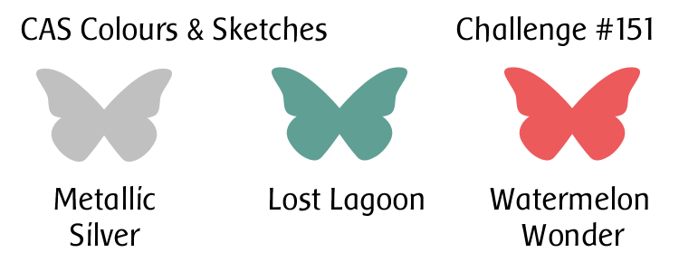
Hello!  It’s time for another color challenge at CAS Colours & Sketches!  Louise, our challenge hostess, is getting into a Christmas mood, and she has picked a color combo that’s a step off from the traditional red and green and mixed it with a great metallic.

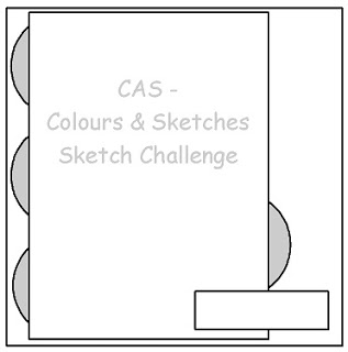
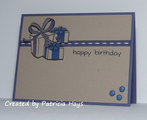
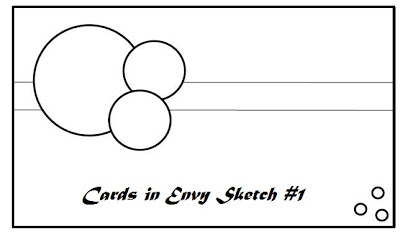
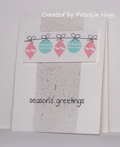
I”ll be honest, I had a hard time figuring out what to do with this color combo, but finally I got it together and came up with this card.  I’ve used the current sketch from The Crooked Stamper Sketch Challenge for my layout.  I used some scrap paper to mask off the middle vertical strip area and blasted it with a pewter-colored pearl mist.  In real life, it’s very shimmery!  I’ve added a second photo below to help show off the shimmer.  Although our CC&S color challenges use the names of Stampin’ Up colors, any company’s products can be used so long as the colors match closely.  So I’ve played into the shimmer concept and used Brilliance ink in colors similar to the other two challenge colors to stamp a few Christmas ornaments.  The ornament panel is attached to the card with dimensional adhesive.  Even though the colors were a bit out of my comfort zone at first, I’m pleased with how the card turned out.

CASCAS151 full

CASCAS151 shimmer

CC&S color151-001

Thanks for stopping by today!  I hope you’ll join us over at CAS Colours & Sketches with your own take on these colors!  You have until 6:00 p.m. Eastern time Wednesday, November 25 to link your card at the challenge website.  Also, we’re looking to add some new members to our design team in 2016, so if this is something you’re interested in, be sure to add the letters “DT” to your name when you link your card, and play along in next week’s sketch challenge, too!

Supplies:
Stamps: Holiday Baubles (Sweet ‘n Sassy Stamps)
Cardstock: Pure Luxury White (Gina K. Designs)
Ink: Peacock and Aurora Brilliance three-color ink pads (Tsukineko); Tuxedo Black (Memento)
Other: pewter Perfect Pearls Mist (Ranger); dimensionals (SU)

Hello!  Today’s post is just a quick one to share a card I made using the current Freshly Made Sketches layout.  It’s a fantastic sketch for using up some paper scraps! I actually made this card last week so I could send it off to Operation Write Home before their December 31 Valentine deadline, but I didn’t have a chance to blog it until now.  This also works with the current Inkspirational challenge theme of “Anything Inkspirational Goes”.


Thanks for stopping by today!  Comments are always welcome – I read each one, and they brighten my day! 🙂

Supplies:
Stamps: So Much Love (Lizzie Anne Designs)
Cardstock: Riding Hood Red, Whisper White (Stampin’ Up); scraps of designer papers from Two Scoops 6″ x 6″ paper pad (Basic Grey)
Ink: Riding Hood Red (SU)
Other: Riding Hood Red pleated satin ribbon (SU); sponge

Over the years we’ve become friends with several of the other families from our high school who are involved in the marching, symphonic and concert bands.  Today’s card was made for one band girl extraordinaire who is graduating this year.  She is an excellent flautist, she’s a bunch of fun and joy to be around, and we’ll miss her when she is off to college next year.

I used Freshly Made Sketches #88 for the layout, but turned it on its side.  I made an attempt to have the graduate image resemble our friend.  I added length to the hair on the image, but I wasn’t brave enough to draw in eyeglasses.  The school’s colors are bright blue and white, but the marching band uniforms and sports teams’ uniforms also have a lot of black on them.  So I chose blue, black and white for my color scheme.  I had to do some tweaking with my photo editing software, but the embossing I did on the black strip shows on the photo now.  I had the pieces of the card all laid out before adhering them down to the card base, and it seemed like something was missing.  I called my older son over because he’s good friends with the graduate, and I asked for his thoughts.  We decided together that a little bit of red would help brighten everything – and it also ties in with the red cording accents on the marching band uniforms.  Here is the final result:

I’ve decided to go ahead and enter this in this week’s Inkspirational “Anything Goes” challenge, too.

Thanks for stopping by today!  I hope you’ll join me in wishing all the best to Emilie and to all the other members of the class of 2013!

Supplies:

Digital Image: Pure Innocence 028 (Heather Ellis)
Stamp: Itty Bitty Banners (Stampin’ Up)
Cardstock: Brilliant Blue, Basic Black, Real Red (SU); Pure Luxury White (Gina K. Designs)
Ink: printer ink; Real Red (SU)
Other: Victoria embossing folder (ProvoCraft); Bitty Banners Framelits dies (SU/Sizzix)

It’s been a busy few days around here, but I finally had time to sit down and make an anniversary card for my husband’s parents.  I combined the sketch from this week’s Inkspirational challenge with the colors from this week’s Dynamic Duos challenge.  I tweaked the sketch a bit by adding a panel and by rounding the bottom corners of the card.  It might not show well in the photo, but the hearts are punched from textured cardstock.  Since my inlaws aren’t into a lot of frou-frou, I think this card will be just right for them, even though I can’t shake the feeling that it ought to have a little something else to perk it up.  Oh well.


edited on 6/2/13 to add: This card was selected as the Diva Dynamo for the week!  Thank you, Janet B., for choosing my card!

Thanks for stopping by today!

All supplies for today’s card are from Stampin’ Up unless otherwise noted:
Stamps: Hugs & Wishes
Cardstock: Midnight Muse, Bashful Blue, Whisper White textured
Ink: Midnight Muse
Other: heart punch (EK Success); half pearls (Basic Grey); corner rounder punch

It’s the Dynamic Duos challenge’s one-year anniversary!  They have been celebrating this week by allowing their challenge participants to choose their own color combination from any of the previous Dynamic Duos challenges.  How fun is that?!? 🙂

I discovered the Dynamic Duos blog shortly after they published their first challenge.  I made a goal for myself to keep up with their challenges every week, and I’m proud to say that I have participated in each of their challenges.  I even made two cards for a couple of them!  So I went back through the year’s posts with the Dynamic Duos tag, refreshing my memory on all the color combos.  It wasn’t easy deciding which one to revisit for this week’s challenge.  Finally I thought, since I still have several family members and friends with birthdays coming up before the middle of June, I’d better get working on birthday cards.  I decided to make a masculine card, and chose Dynamic Duos challenge #37 for the color inspiration.  The layout is this week’s Inkspirational case challenge.  I hadn’t used this stamp set for a long time, so it was nice to ink it up again.


Best wishes to the Dynamic Duos team as they start on their second year of challenges!  I thank them for a fun year of inspiration, and I’m looking forward to playing along for another year!

All supplies for today’s card are from Stampin’ Up, except the corner punch.
Stamps: Wide Open Spaces, It’s Your Birthday
Cardstock: Naturals Ivory, Soft Suede
Ink: Soft Suede, Crumb Cake
Other: Crumb Cake seam binding; corner rounder punch (EK Success)

Between friends and family, the month of May is full of birthdays for me, so I’ll be making a bunch of birthday cards in the next few weeks.  Today I’m sharing one that I made this morning.  I’ve combined the Freshly Made Sketches #84 layout with the colors from Inkspirational challenge #18.  I did take the liberty of turning the sketch on its side.  I really like this gift image – even though it’s from a Christmasy stamp set, it’s perfect for birthday presents, too. I stamped it on a scrap piece of white cardstock and then colored it and cut it out. When I colored it, I drew in some polka dots to help tie the olive color of the banner in with the rest of the card.  I also took a little artistic license in cutting off the curl on the left side of the ribbon.  I didn’t mind trimming out the inside of the ribbon loops, but the curl on the end of the ribbon was a little *too* fussy cutting for me.  I’m not sure how well it shows in the photo, but the white panel is textured cardstock, to help give the card a little extra visual interest without detracting from the layout and design.

Thanks for stopping by today!

Supplies:
Stamps: Bows and Holly, Hats Off to You (Lawn Fawn)
Cardstock: Concord Crush, Whisper White textured, Peach Parfait (Stampin’ Up); Pure Luxury White (Gina K. Designs); designer paper from Bright Side 6″ x 6″ paper pad (Lawn Fawn)
Ink: Tuxedo Black (Memento)
Other: markers (Copic)

Saturday means it’s time for another 52 {Christmas} Card Throwdown challenge! This week we have a fun theme that I guess is kind of a cross between a technique challenge and an embellishment challenge – punch art. You can join in by making a Christmas or winter card using punches to create your focal point, and linking it to the 52{C}CT website by 1:00 pm Eastern time Friday, May 2. Check out the challenge site for all the details.

I saw a darling snowman card in the Splitcoaststampers.com gallery a couple years ago and have wanted to give it a try.  I thought the perspective of looking down at the snowman was a fun alternative to looking at him at something nearer to eye level.  This challenge was just the nudge I needed to go ahead and try it.  I confess that I fudged a little on the “punch” aspect with regard to the circles for the snowman – my punches were either too large or too small, so I used my Nestabilities dies to cut them.  The edges of them are very lightly sponged with blue ink to add some visual dimension (so very lightly that it doesn’t really show in the photo.  Ooops.).  The top part of the hat (the crown?) was made with a square punch, and the brim is just a narrow scrap of cardstock that I cut to fit.  I also cut the arms and nose from scraps of cardstock.  I used my 1/4″ circle punch for the eyes and buttons, and the circles for the mouth were done with my old “anywhere punch” from setting eyelets.  I chose the ribbon to decorate the hat by color coordinating it with the snowman’s “carrot” nose, and that’s also how I chose the color for the card base.   I used my shimmer paint on the snow for the ground.  I didn’t have a whole lot of room for a sentiment, so I chose a short one that will make this a cute “any reason” card to donate to Operation Write Home for one of our heroes to use this coming winter.  (I know I still need to put a light-colored liner inside of it.)  Even though the different parts of the snowman are raised up with dimensional adhesive, I think the card will smoosh flat enough to go through the mail all right.  In real life, the dimension helps prevent the hat from visually blending into the black mat so much.

The layout for my card was taken from this week’s Inkspirational challenge.

So, there you have it.  Thanks for stopping by today!  I hope you’ll join us and play along with 52{C}CT this week!

Supplies:
Stamps: Two Scoops for Flopsey (My Favorite Things)
Cardstock: Tangerine Tango, Basic Black, Soft Sky, Early Espresso, Whisper White (Stampin’ Up)
Ink: Tuxedo Black (Memento)
Other: standard circle Nestabilities dies (Spellbinders); 1″ square punch (Creative Memories); 1/4″ circle handheld punch (source unknown); 3/16″ hole punch (Making Memories); Frost White shimmer paint (SU); orange gingham ribbon (Offray)

Here’s a card I put together pretty quickly this morning, just in time to enter into the Inkspirational color challenge of pink, banana and slate.  I used Stampin’ Up’s retired color Going Gray for my slate color.  The layout for this card is this week’s OWH Stars & Stamps sketch, substituting the bunny for the circle.  I fussy cut the bunny after I colored him, and he’s attached to the card with dimensional adhesive. I also incorporated the OWH Midweek Throwdown challenge of using tags and twine.

Thanks for stopping by today!

Supplies:
Stamps: Two Scoops for Flopsey (My Favorite Things)
Cardstock: Going Gray (Stampin’ Up); Pure Luxury White (Gina K. Designs) [for the bunny]; designer papers from Two Scoops 6″ x 6″ paper pad (Basic Grey)
Ink: Tuxedo Black (Memento)
Other: markers (Copic); dimensionals (SU); Oyster twine (Really Reasonable Ribbon); petite oval Nestabilities die (Spellbinders)

This week the girls over at Inkspirational have provided a card to “CASE” as the inspiration piece.  Over the years I’ve come across several different definitions for “CASE”, but my favorite is “Copy And Selectively Edit” – which means, to me, to copy some of the elements of the original piece but change some of the other things.

I really liked the clean, simple layout of the card provided in the Inkspirational prompt.  I actually made several cards with it because it was a fantastic way to get some last minute cards made for the box I’m sending to Operation Write Home.  I discovered that using this layout, I can quickly create three cards from just two sheets of cardstock (plus a few scraps for the sentiment panels).  For the sake of brevity, though, I’m sharing only two of the cards in this blog post.

First is a card that follows the prompt card pretty closely.  I’ve used different stamps and colors, and my sentiment panel is an oval rather than a circle, and I didn’t use textured cardstock for the card base.  But otherwise you can definitely tell that the original card provided inspiration for mine.

For my second card, I used a different ink color, and I turned the layout on its side:


When I started to attach the image panels to the card bases, I felt like they disappeared into the bases.  I added some sponging to the edges of the image panel on one card (not shown here) but wasn’t really loving the look when the card was all put together.  So for the two cards shown here, I used the scrap pieces of cardstock from cutting down the image panels to create a shim to put underneath each corner of the image panel.  This raises the image panel up off the card a bit and gives it a bit more definition, but not so much as using dimensional adhesive would.

But now I’d better get back to finishing up that box of cards for OWH.  Thanks for stopping by today!

Supplies for the Father’s Day card:
Stamps: Lovely As a Tree (Stampin’ Up); Dream Big (Lizzie Anne Designs)
Cardstock: Naturals White (SU)
Ink: True Thyme (SU)
Other: petite ovals Nestabilities die (Spellbinders)

Supplies for the Thank You card:
Stamps: Lovely As a Tree (Stampin’ Up); Year Round Sentiments (Hero Arts)
Cardstock: Naturals White (SU)
Ink: Soft Suede (SU)
Other: petite ovals Nestabilities die (Spellbinders)

I didn’t think I was going to have time to make something with this week’s Freshly Made Sketches layout, but I managed to pull a card together this morning and share it here.  I’ve also been eyeing the Inkspirational inspiration photo challenge because I had what I felt was the perfect image for it.  I’ve tweaked the sketch layout by turning it on its side and then flipping it horizontally, and I stretched the image panel a bit taller.  I tried fiddling with the photo editing but wasn’t able to get the card base and mats to show up as purple rather than black.  Oh well.

Thanks for stopping by today!

Supplies:
Stamps: Springtime Babies (Sweet ‘n Sassy Stamps)
Cardstock: Elegant Eggplant, Certainly Celery Prints designer paper (Stampin’ Up); Pure Luxury White (Gina K. Designs)
Ink: Tuxedo Black (Memento)
Other: markers (Copic); Certainly Celery satin ribbon (SU); flower (Prima Marketing); dew drop (Robin’s Nest)

Happy Friday! It’s time for a new Sweet ‘n Sassy Digi Challenge! This week our challenge is to Go Green. Create a project using the color green, and/or repurpose or recycle something on your project. Be sure to use a digital image for your main focal point! You don’t have to use a Sweet ‘n Sassy digital image, but we do enjoy seeing our participants use them (and you get the chance for extra perks if you do – see the Digi Challenge site for more details!). Link your card at the Sweet ‘n Sassy Digi Challenge site by midnight eastern time Thursday, March 14.

I’ll admit it took me a while to figure out what I wanted to do for this challenge. I do like to recycle things when I can, but nothing was really striking my fancy for the challenge. Then yesterday afternoon I walked by my dresser and this ticket seemed to call out to me. I’ve had it sitting there for a while; it’s from our high school’s football team’s playoff game. But I figured I could work it into a card. And it was green. Since football season is still quite a way off, but baseball is getting into swing (sorry, pun actually not intended for once!), I decided to use the Baseball Rhubarb image and give Rhubarb a green uniform.  I used Microsoft Word to create the sentiment, and notched the ends of the strip to form the banner shape.

This is going in my box of cards for Operation Write Home, and I think it’s neutral enough that one of our military personnel could send it home to either a boy or a girl.  The colors tie in with this week’s Inkspirational challenge.  This week’s theme at ‘ABC’ Challenges is “Anything Goes” – so that means this card can be entered there, too.

I hope you’ll join in this week’s Sweet ‘n Sassy Digi Challenge!  Thanks for stopping by today.

Supplies:
Digital Image: Baseball Rhubarb (Sweet ‘n Sassy Stamps)
Cardstock: Wild Wasabi (Stampin’ Up); Pure Luxury White (Gina K. Designs)
Ink: printer ink
Other: markers (Copic); Spots and Dots embossing folder (ProvoCraft); ticket from football game

It’s that time of year when I start looking forward to the flowers blooming again.  (Although depending on which weather forecast you prefer, my area is in for either lots of rain, or up to 16 inches of snow tonight and tomorrow!)  This week’s Dynamic Duos color challenge made me think of daffodils – I guess partly because one of the colors has the word “daffodil” in its name.  My own daffodils have about 5 inches of foliage sprouting up from the ground.  Since that isn’t enough to enjoy, I decided to create some flowers with my stamps today.  I used the Inkspirational challenge #9 sketch for the layout of this card.


Thanks for stopping by today!

Supplies:
Stamps: Three Daffodils (Hero Arts); Filigree, Three Little Words (Stampin’ Up)
Cardstock: Daffodil Delight, Garden Green (SU); Pure Luxury White (Gina K. Designs)
Ink: Garden Green (SU); Tuxedo Black (Memento)
Other: markers (Copic); half pearls (KaiserCraft)

My card today combines two challenges – the layout of the card provided for inspiration for Inkspirational #8 and the color scheme of Dynamic Duos #41.  I added a little sponging to the flower embellishment.  I chose the sentiment because I need to get working on some Mother’s Day cards for Operation Write Home.  There’s not much else to say about this quick, easy, clean and simple card except here it is:


All supplies except the white cardstock are from Stampin’ Up:
Stamp: Delightful Dozen
Cardstock: Island Indigo, Pool Party; Pure Luxury White (Gina K. Designs)
Ink: Island Indigo, Pool Party
Other: rhinestone, sponge

Here’s what I’ve come up with for the current Inkspirational challenge.  They provided a photo for inspiration, and I took it pretty literally with the bouquet and the colors.  I was using the CAS Colours and Sketches layout, but now that I’ve taken the photo I realized I forgot to add a flower behind the right side of the main image panel. Ooops!  I didn’t have any thank you cards yet for the box of cards I’m putting together for Operation Write Home, so that’s how I chose the sentiment.

Operation Write Home held a Virtual Card Making Party last weekend, with 10 different challenges to complete by the beginning of next week. I hadn’t had the chance to really focus on completing the challenges yet, but I see that this card works for challenge #10 – to use something glitzy that isn’t glitter. I think the rhinestones fit into that category. So maybe I’ll just do the rest of the challenges in reverse order now, LOL! 🙂

Supplies:
Stamps: Watercolor Garden II (Stampin’ Up); Year Round Sentiments (Hero Arts)
Cardstock: Pure Luxury White (Gina K. Designs); Real Red, Melon Mambo, Tangerine Tango (SU)
Ink: Wild Wasabi, Real Red (SU)
Other: 5-Petal Flower punch, Mixed Bouquet punch (SU); rhinestones (Bazzill)

Last weekend I found a new challenge blog called Cards in Envy.  I thought the idea of it was pretty smart:  cards made for this challenge must be able to fit easily into a standard envelope, with no big, bulky embellishments.  Since most of the cards I make fall into that category, I thought I’d play along.  This time their challenge is a sketch to follow.  I’d also been throwing different ideas for this week’s Inkspirational color challenge around in my mind for several days.  The idea of kraft and plum didn’t bother me, and kraft and a not-really-navy type of blue didn’t bother me, but the idea of the blue and plum together threw me off.  Finally I decided to combine them all into a birthday card using the Cards in Envy sketch, tweaking it into the usual A2 size.  Here’s the result:

I used Stampin’ Up’s Vintage Violet for my plum color so it would match the ribbon.  The blue brads are a good match to Not Quite Navy, although they appear lighter in the photo.  I had to play around with my Copics a little to find colors to match to the Vintage Violet and Not Quite Navy when colored onto kraft cardstock, since kraft is darker than white.  I did a little masking on the small presents – the actual stamp has a smiley face on it, but I decided not to go with the cutesy look for this card. Although both of the present images come from Christmas-themed stamp sets, I think they work well for year-round use, too.

Thanks for stopping by today!  Just so you know – all comments are read and appreciated.

Supplies:
Stamps: Bows and Holly, Pa-Rum-Pa-Pum-Pum, Hats Off to You (Lawn Fawn)
Cardstock: Vintage Violet, Kraft (Stampin’ Up)
Ink: Tuxedo Black (Memento)
Other: markers (Copic); dimensionals, Vintage Violet stitched ribbon (SU); brads (Making Memories)

© 2019 Suffusion theme by Sayontan Sinha