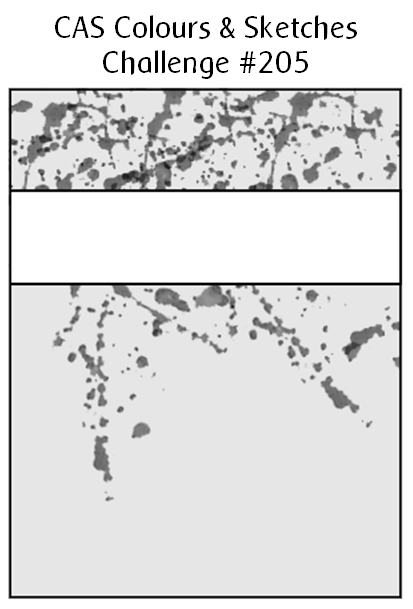
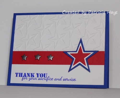
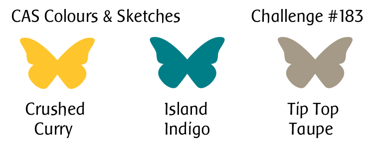
Yikes!  I’m a little late today with my post for this week’s challenge at CAS Colours & Sketches.  I made a card yesterday but I wasn’t very happy with it.  As I was trying to fall asleep last night, another idea popped up in my mind.  So I got up this morning and gave it a try… and as luck would have it, it didn’t go quite as easily as I’d hoped.  But anyway…

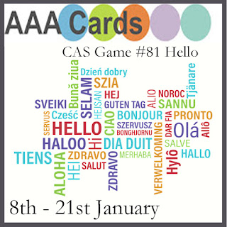
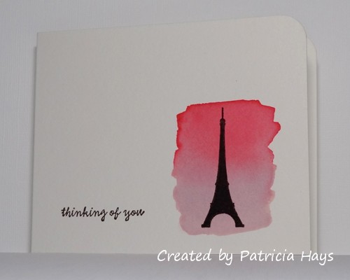
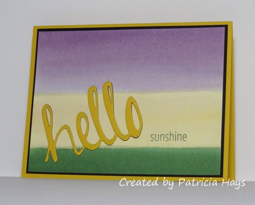
I wanted to combine this week’s sketch challenge with the ombre challenge at Less is More and the “hello” challenge at AAA Cards.  My first card had a large flourish that I inked in three shades of blue, but I just wasn’t pleased with the overall look of it.  For my second attempt, I thought of using the sentiment “hello, sunshine” with my sunburst stencil.  I used two different shades of yellow to ink the stencil design, layering the darker shade to make it bolder toward the center of the design and fading out the lighter shade toward the edges.  Then I went to my stamps, looking for what I thought was a “hello, sunshine” stamp… and was disappointed to discover that the stamp only says “sunshine”, and it’s made to be used with a “hello” die.  At that point I thought, “My ‘hello’ die is going to look too big.  I have alphabet stamps, so I can spell out the sentiment with them.”  That didn’t go too badly, other than trying to position an apostrophe stamp for the comma… until I stamped the sentiment.  The first two times, the sentiment came out splotchy and messy looking.  So I cleaned the stamps and tried again.  That was slightly better but the letters still looked fuzzy.  So I figured I’d try my “hello” die anyway.  It turned out that the die filled up some of the tiny areas of the stencil that didn’t ink up well.  So I went with it, using textured cardstock for the die cut.  And finally the card came together.

CASCAS205

sketch 205


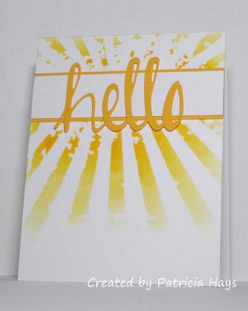
Despite all the troubles I had putting this card together, it’s still a lot better than my first card!

I hope you’ll have better luck creating a card with this sketch, and that you’ll share it with us at CC&S!  You have until 6:00 p.m. Eastern time Monday, January 16 to link your card there.  Thanks for stopping by today!

Supplies:
Stamps: none
Cardstock: Solar White (Neenah); Summer Sun textured (Stampin’ Up)
Ink: Summer Sun, Daffodil Delight (SU)
Other: Simply Said Hello die (Avery Elle); Rays stencil (Tim Holtz)

Hello!  It’s time for a new month of challenges at CAS Colours & Sketches, and for November, I get to be your challenge hostess!  I hope you’ll enjoy the cards the design team and I make this month, and I hope you’ll join in and make some cards, too.

A new month always gets started off with a color challenge.   I’ve chosen a trio of colors that haven’t been used much on our blog.  I felt they worked in nicely with the autumn season.  Because of that, I was compelled to use tree images on my card.  I’ve pulled out one of my “oldie but goodie” sets that was retired several years ago.  Rather than layering colored cardstock to mat the image panel, I’ve made a mat out of the three challenge colors – which was a great way to use some scraps of cardstock!  The ribbon was a last minute addition.  The card looked too plain without it, but now it almost seems like the ribbon was a bit too much.  What do you think?

CASCAS198

CC&S color198-001

Our friends at the Less is More challenge blog are celebrating their 300th challenge this week!  What an amazing milestone for them!  I’m helping them celebrate by playing along in their challenge this week.  I’m also joining in the challenge for masculine cards at AAA Cards.

Go check out the other design team members’ cards at the CAS Colours & Sketches blog.  They’ve done an amazing job this week!  Then show us what you’re inspired to create using these colors.  If you don’t have the exact Stampin’ Up colors, that’s all right; simply use whatever you have that matches them closely. You have until 6:00 p.m. Eastern time Wednesday, November 9 to link your card at the challenge post.  Happy crafting!

All supplies except the ivory cardstock are from Stampin’ Up.
Stamps: Trendy Trees, Birthday Whimsy
Cardstock: Early Espresso, Pumpkin Pie, Always Artichoke; Pure Luxury Ivory (Gina K. Designs)
Ink: Early Espresso, Pumpkin Pie, Always Artichoke
Other: Always Artichoke grosgrain ribbon

Hello!  We’re back to another color challenge week at CAS Colours & Sketches.

I have to admit that I had a hard time figuring out what to do with these colors, mainly because the chocolate brown was the only one I’ve seen in person.  So I browsed online and eventually found a few blogs where the new Stampin’ Up In Colors were compared to other SU colors.  I think I’ve picked fairly close approximates of the challenge colors for the watercolor wash on my card.  I decided to try to use the colors as a background, rather than for the main image of the card.  Blending the colors fits the current challenge at AAA Cards.  When I was browsing my stamps for silhouette images to use with the background, I came across this Eiffel Tower stamp I’d forgotten I had.  So I decided to use it and join in the current challenge at Less is More.  Once the watercolor wash was dry, I added the sentiment and the silhouette image of the Eiffel Tower in chocolate brown.  I rounded the top corner of the card and decided to call it done.  Very CAS, n’est-ce pas?

CASCAS187

CC&S color187-001

Edited on September 15, 2016 to add:  Thank you to the team of AAA Cards for choosing my card as one of your Top Three for the Blending challenge!

Thanks for stopping by today!  I hope you’ll check out what the rest of the design team members have made, and then share your own creation with us at the CAS Colours & Sketches site!  You have until 6:00 p.m. Eastern time Wednesday, August 24 to link your card.

Supplies:
Stamps: Simply Sweet, Everyday Sayings (Lizzie Anne Designs)
Cardstock: watercolor paper (Artist’s Loft)
Ink: Chocolate Chip (Stampin’ Up)
Other: Regal Rose and Pale Plum reinkers (SU); corner rounder punch (EK Success)

Hello there!  It’s the second Thursday of the month, which means it’s time for another sketch challenge at CAS Colours & Sketches.

I’ve used the mirror image of the sketch because it just seemed to work better with placing the sentiment I chose.  I decided to combine the sketch challenge with the color challenge at Less is More and the theme challenge at Addicted to CAS.  I stamped the birdies, the notes, and the sentiment with very dark brown ink.  I colored the birds to coordinate with the dusty blue of the card base and the sandy brown of the background banner.  It’s really a quite simple little card so without further chitchat, here it is:

CASCAS186

sketch 186

Since the birdies do have wings, I’ve decided to enter into the theme challenge at Cards in Envy, too.  I recently stepped down from the design team there due to time constraints in my personal life, but I still love the concept of their challenges (making cards that are flat enough to easily fit “in envy” – in an envelope – to be mailed) so I don’t think I’ll be able to completely stay away from there!  😉

Thanks for stopping by today!  Be sure to check out the CAS Colours & Sketches blog to see what the rest of the design team has done with this sketch.  Then make your own card and link it to the challenge post.  You have until 6:00 p.m. Eastern time Wednesday, August 17 to participate.  We hope you’ll join us!

Supplies:
Stamps: Love Quotes (Mama Elephant); Pa-Rum-Pa-Pum-Pum (Lawn Fawn)
Cardstock: Baja Breeze, Kraft (Stampin’ Up); Pure Luxury Ivory (Gina K. Designs)
Ink: Early Espresso (SU)
Other: markers (Copic)

Hello!  Please accept my apologies for being a little late with my card for this week’s challenge at CAS Colours & Sketches.  I was having a hard time getting in a crafting frame of mind after being out of town last weekend.  But my brain finally kicked back into gear this morning.  So without any further ado…

We have a color challenge this week.  I bought this stamp set a while ago but hadn’t worked up the nerve to use it yet – I’ve seen so many adorable cards using it, that I worried I wouldn’t make one up to par!  But I felt the taupe in the color challenge was a good color for this cutie pie elephant and I decided it was time for me to give it a go.  I don’t have ink in the actual Tip Top Taupe color, so I colored the elephant with my markers the best I could to match the cardstock.  Trying to blend grey with a brownish color to make taupe wasn’t the easiest thing, but I think it worked out okay in the end.  (This card shows my second attempt; my first elephant didn’t match as well.)  I attached the striped piece of designer paper to the card base and stamped the balloon to get a sense of where to place the elephant.  I also stamped the balloon onto some curry-colored designer paper to fussy cut and adhere into place along with the elephant.  The card seemed a little flat once I had it all together.  So I stamped the balloon again onto the same designer paper and onto a scrap of cardstock.  I fussy cut them and glued them on top of the first designer paper balloon, sandwiching the cardstock between the two designer paper layers.  This gives the balloon a little more dimension, which makes me happier with the finished card.

CASCAS183

CC&S color183-001

I’m going to enter this card into a couple of challenges.  The code word for the current challenge at Addicted to CAS is “stripes”, and the repeating stripes are my repetitive element for the current challenge at Less is More.

Be sure to check out what the rest of the CAS Colours & Sketches design team did with these colors.   Then show us what you can make with them!  You can link your creation to the challenge blog until 6:00 p.m. Eastern time Wednesday, July 27.  Thanks for stopping by today!

Supplies:
Stamps: Ellie (Avery Elle)
Cardstock: Tip Top Taupe, Watercolor Wonder designer series papers (Stampin’ Up); Pure Luxury White (Gina K. Designs)
Ink: Tuxedo Black (Memento)
Other: markers (Copic)

Here’s another card I created using this week’s sketch at CAS Colours & Sketches.  I wanted to incorporate the “time” theme of this week’s challenge at Less is More.  My first attempt with a clock stencil didn’t turn out well, so I decided to try a different tactic on the “time” theme.  My second go, I used a sentiment that includes the word “time”, which allowed me to pair it with an image of something that pretty much everyone loves… cake!  I masked off a square area and stamped around it to create a frame for the cake image.  I used the mirror image of the sketch because it worked better with the orientation of the smiley face on the cake.

LIM284

sketch 182

Thanks for stopping by today!  Comments are always welcome.

Supplies:
Stamps: Year Three (Lawn Fawn); Itty Bitty Backgrounds, Party Pants (Stampin’ Up)
Cardstock: Pure Luxury Ivory (Gina K. Designs)
Ink: Tuxedo Black (Memento); Melon Mambo, Daffodil Delight, Only Orange (SU)
Other: markers (Copic)

Well hi there!  It’s Thursday, which means it’s time for a new challenge at CAS Colours & Sketches.  This time we have some summery nature-inspired colors for you.

I gave in to the instinct to do something floral with the colors.  It just seemed right.  I’ve used the CAS(E) this Sketch! challenge which closes in a little while for the layout of my card.  I also wanted to join in the current Less is More challenge to use splatters on a one-layer card.  So for my card, I started off by cutting a rectangle into an index card to use as a mask on my card front.  I attached the mask with temporary adhesive and then sponged around the edges of it to define a rectangular area on the card.  Then I dipped a paintbrush in a few drops of reinker, held the brush over the card front, and tapped the brush so the ink would splatter pretty randomly over the card.  I set that aside to dry thoroughly and went to work stamping the rose and a couple of leaves onto a scrap of white cardstock.  Then I fussy cut the rose and leaves and assembled them together.  I had a scrap of Pool Party cardstock just the right size for the sentiment banner.  Once I decided on the sentiment I wanted to use, I stamped it with Pear Pizzazz ink and notched the end of the banner into a fishtail shape.  The ink splatters on the card front were dry by this time, so I removed the mask, attached the banner to the card and then added the rose on top of it.  Lots of small steps, but it was all pretty easy.

CASCAS178

CC&S color178-001

Thanks for stopping by today!  I hope you’ll join us over at CAS Colours & Sketches with your own take on these colors!  You have until 6:00 p.m. Eastern time Wednesday, June 22 to link your card at the challenge website.

Supplies:
Stamps: Picture Perfect (Stampin’ Up)
Cardstock: Pool Party, Whisper White (SU); watercolor paper (Artist’s Loft)
Ink: Pool Party, Calypso Coral, Pear Pizzazz (SU)
Other: Pool Party reinker (SU); sponge

Well hi there!  It’s Thursday, which means it’s time for a new challenge at CAS Colours & Sketches.  This time we have some nature-inspired colors for you.

I’ve decided to combine the color challenge with a few other challenges.  The Paper Players challenge is to use at least one butterfly on a clean and simple card.  At Less is More, the challenge is to use three stamps; my three are the butterfly, the wordy sentiment, and the “happy birthday”.  Since I didn’t want the ends of the chocolate brown ribbon to show, I’ve attached the turquoise card front to a blush pink card base.  The butterfly was stamped onto a scrap of white cardstock, colored, and fussy cut.  The left side is attached directly to the card front, but the right side is adhered with dimensional adhesive to add a little visual interest to the card.

CASCAS170

CC&S color170-001

Be sure to see what the rest of the CC&S design team has done with these colors!  Then create your own card and share it with us at the CC&S blog.  You have until 1:00 p.m. Eastern time Wednesday, April 27 to enter the challenge.  Thanks for stopping by today!

Supplies:
Stamps: Flutter By (Lawn Fawn); Birthday Greetings (Gina K. Designs)
Cardstock: Blushing Bride, Tempting Turquoise (Stampin’ Up); Pure Luxury White (GKD)
Ink: Chocolate Chip (SU)
Other: Chocolate Chip satin ribbon, dimensionals (SU); markers (Copic)

Well hello there!  It’s the first Thursday of the month, which means we have a new hostess of the month over at CAS Colours & SketchesLouise has come up with some neat challenges for us, and we hope you’ll join in to show us what you can do with them.

We’re starting off the month with a color challenge, and Louise has chosen some bright colors for it.  I used them to create a watercolored background, so the colors are toned down a bit on my card.  The way the colors blended kind of created a fourth color, but trust me, I used only the three challenge colors for the background.  When it was dry, I stamped some silhouetted flowers to make it look like the flowers are set against a sunset sky.  Or maybe it’s a sunrise.  Use your imagination!  🙂  I added a simple thin black mat to the image to make it stand out from the card base, stamped a sentiment, and called it done. It felt good to use some of my older stamps for this card.

CASCAS168

CC&S color168-001

I’m going to submit this to the current Less is More challenge, where the theme is “white space that isn’t white”.

Go see what the rest of the CC&S Design Team has done with these vibrant colors!  Then make your own card with these colors and share it with us at the CC&S challenge post.  You have until 6:00 p.m. Eastern time Wednesday, April 13 to link your card.  We hope you’ll join us!  Thanks for stopping by today.

Supplies:
Stamps: Serene Silhouettes (Sweet ‘n Sassy Stamps); Everyday Sayings (Lizzie Anne Designs)
Cardstock: Kraft, Basic Black (Stampin’ Up); The Langton Prestige Extra Smooth Hot Press watercolor paper (Daler-Rowney)
Ink: Onyx Black (VersaFine)
Other: Daffodil Delight, Melon Mambo, and Tangerine Tango reinkers (SU)

I feel like I’ve gone into a rut of only creating cards for design team work, and not participating in as many of the other online challenges as I would like. After lunch today I told myself I was going to break out of that and try something new.  I saw that the Less is More challenge that’s ending in a little while was to use texture.  So I decided to give it a go.

Over the last few years I’ve seen a number of cards that use embossing paste for texture, and I like the way they look.  Unfortunately, embossing paste is not easy to find in the few craft stores in my area.  I’d read that drywall compound can be used in its place.  So a while ago when we were doing some small home repairs, I scooped some drywall compound out of the big bucket my husband had bought, and put it and a damp paper towel in a small container and set it aside in my craft room.  This afternoon it took me a few minutes to remember where I’d put that small container, but when I found it, I was glad to see that compound was still moist enough to be workable.  I decided to use a floral stencil with the compound.  Since the compound is white, I chose to put it on ivory cardstock for a subtle difference in color.  I had a sheet of ivory cardstock already cut in half, so I cut it to give me a piece 4″ x 5.25″ for the main panel of my card.  I planned out where to lay the stencil to allow for a sentiment.  On the actual stencil, the short flower on the right of my card is actually on the left side of the stencil, with the tallest flower in the middle of the stencil.  I knew I could move the stencil around, and putting the smallest flower on the right gave me room for the sentiment I wanted to use.  I stamped the sentiment in the corner before adding the floral design.  I used washi tape to hold the stencil in place and to mask off areas where I didn’t want the compound to go.  Then I set the panel aside for a while to allow the compound to dry.  That didn’t take as long as I thought it would, so that was a nice surprise.  However… when I picked up the panel to dry fit it to the card base, I realized I’d made an oops.  Instead of working with the 4″ x 5.25″ piece of cardstock I’d cut, I’d used the other half.  After saying “Oh, crap!” a few times, and figuring I didn’t have enough time before the challenge closes to try it again, I knew I’d have to trim down the piece.  I held my breath while doing it because I was afraid the compound would crack, but thankfully, it held.  Unfortunately, trimming it down left me with less margins around the design than I would have liked.  But I guess it still looks OK.  I made a last-minute decision to round the opposing corners of the panel and the card base, to soften the look a bit.  In the end I think the card turned out all right, considering I wasn’t sure how the compound was going to behave.

LIM264

I’m thinking I’m going to have to play with this technique again some time!  Thanks for stopping by today.

Supplies:
Stamps: Sincere Salutations (Stampin’ Up)
Cardstock: River Rock (SU); Pure Luxury Ivory (Gina K. Designs)
Ink: River Rock (SU)
Other: Wildflower stencil (Tim Holtz); drywall compound (source unknown); corner rounder punch (EK Success)

Happy Thursday!  It’s time for a new month of challenges at CAS Colours & Sketches and we’re getting it started off with a color challenge.  Our November hostess, Louise, has chosen some autumnal colors for us.

I have to admit it took me a while to figure out what I was going to do with these colors.  I looked around online to see if any of the many sketch challenges would help inspire me.  The one at Freshly Made Sketches looked like it could easily be kept clean and simple in style, so I decided to give it a try.  Then I had a couple different ideas for what stamps to use.  In the end, this puppy image won out.  I figured since one of the challenge colors is called “Chocolate Chip”, that this could be a chocolate labrador.  Heh heh.  Rather than trying to color him, I stamped him onto some chocolaty brown designer paper and fussy cut him from that.  I stamped his head a second time so I could cut that out and pop it up over the whole dog image with a shim of scrap cardstock, to give him some dimension.  I pieced his dog bed together from cardstock in the remaining two challenge colors.  I’m hoping this is enough paper piecing to make my card count for the current Less is More challenge.  I played with my photo editing stuff the best I could to try to show the deep purple blackberry color correctly.  I’m not sure how well the photo shows that the main panel of the card is textured cardstock, either.  At any rate, I think the card will serve well for Send a Smile 4 Kids.

CASCAS149

CC&S color149-001 Be sure to check out what the rest of the CC&S Design Team has done with these colors!  Then share your own card with us by linking it to the challenge post by 6:00 p.m. Eastern time Wednesday, November 11.  We’d love to have you join us!

Supplies:
Stamps: Furry Friends (Avery Elle); A Birdie Told Me (Lawn Fawn)
Cardstock: Pure Luxury Ivory (Gina K. Designs); Blackberry Bliss, More Mustard, Autumn Vine designer series paper (Stampin’ Up); scrap from Pyrus 6″ x 6″ paper pad (Basic Grey)
Ink: Tuxedo Black (Memento)
Other: petite scalloped circle Nestabilities die (Spellbinders)

Here’s a quick card I made to enter into the challenges that are ending today at The Paper Players and Less is More.  I’ve used the Paper Players sketch to create an AnyHero card for Operation Write Home.  I’ve had these metal star snaps for a long time and haven’t used them much because they’re pretty thick, but the Less is More challenge to use metal gave me the incentive to use them.  Since the card isn’t going to be mailed, the thickness of the metal won’t cause any issues.

LIM PP

Thanks for stopping by today!  All comments are read and appreciated.

Supplies:
Stamp: Unity
Cardstock: Brilliant Blue, Real Red Core’dinations (Stampin’ Up); Pure Luxury White (Gina K. Designs)
Ink: Brilliant Blue (SU)
Other: Stars embossing folder (ProvoCraft); metal star snaps (Making Memories); Star dies (Sweet ‘n Sassy Stamps)

Hello!  It’s time for another color challenge at CAS Colours & Sketches!  Our hostess, Stef, has chosen some bright springtimey colors for us this time.

I ended up making two cards for this challenge.  The first one uses the sketch from the CAS(E) this Sketch! challenge that closes later this morning.  I’ve used watercolor washes of the three CC&S colors for the stripes of the sketch.  I die cut the word “hello” a couple times from Crushed Curry cardstock and once from black cardstock and stacked them together for the star-shaped element of the sketch.  I was going for the idea of the stripes making a landscape with the “hello” working as a sun, but I’m not sure I quite achieved it because I didn’t want to blend the color washes together too much and end up with a yucky color where the purple and yellow met.  But anyway, I think it will still fit into this week’s Less is More challenge theme of “hello sunshine”.

CASCAS125 hello

My second card is more CAS than the first one.  Since I still had my reinkers out from the first card, I started off with a watercolor wash for the background.  Then I added in some simple flowers and a sentiment, rounded two corners of the image panel, and adhered it to the card base.  Seriously, the most time consuming part of making this card was waiting for the background to dry.  This card uses the sketch from The Crooked Stamper Sketch Challenge and the “May Flowers” theme from Retro Rubber.

CASCAS125 flowers

RRCB14

Go see what the rest of the CC&S Design Team has done with these pretty colors!  Then use the colors to make a card of your own, and share it with us at the CC&S challenge post.  You have until 6:00 p.m. Eastern time Wednesday, May 27 to link your card.  We hope you’ll join us!  Thanks for stopping by today.

Supplies for the “hello sunshine” card:
Stamps: Simply Said Hello (Avery Elle)
Cardstock: Crushed Curry, Basic Black (Stampin’ Up); watercolor paper (Artist’s Loft)
Ink: Garden Green (SU)
Other: Elegant Eggplant, Crushed Curry, and Garden Green reinkers (SU); Simply Said Hello die (Avery Elle)

Supplies for the floral card:
Stamps: Spring Garden, Three Little Words (Stampin’ Up)
Cardstock: watercolor paper (Artist’s Loft)
Ink: Elegant Eggplant, Garden Green (SU)
Other: Crushed Curry reinker (SU); corner rounder punch (EK Success)

Hello!  Today’s card combines the layout from Freshly Made Sketches challenge #182 and the “Up, up and away” theme from Less is More challenge #220.  I took a few liberties with the sketch, turning it 180° upside-down and substituting the owl for the rectangular shape. That forced me to move the sentiment onto the main focal panel.  I’ve used dimensional adhesive to attach the owl to better give it the effect of being in flight.

FMS182

Edited on April 21, 2015:  At Sarah’s invitation in the comments, I’m also entering this into the Uniko Studio “Things with Wings” challenge.

Thanks for visiting my blog today!  All comments are read and appreciated.

Supplies:
Stamps: Critters in Costume (Lawn Fawn)
Cardstock: Kraft, Real Red Core’dinations, Soft Sky (Stampin’ Up); Pure Luxury White (Gina K. Designs)
Ink: Tuxedo Black (Memento)
Other: markers (Copic); cloud dies (Sweet ‘n Sassy Stamps); dimensionals (SU)

It’s color challenge week again at CAS Colours & Sketches, and we have some bright cheery ones for you this time.  I have to admit it took me a while to decide how I wanted to use them on my card.  I finally decided to combine the color challenge with a couple other challenges and make a birthday card.

The current challenge at Less is More is to make a one-layer card incorporating splatters of some sort.  So I masked off an area on the front of my card, stamped the balloons (masking each one as I stamped them), and splattered some Coastal Cabana ink over the area with an old toothbrush.  Then I removed all the masks, partially colored the balloons with Perfect Plum and Rose Red watercolor crayons, and used a paintbrush and water to spread and blend the color over the balloons.  It’s been a long time since I’ve participated in a challenge at AEIHeartU, and their current one is to use watercoloring, so the balloons qualify this card for that.  Using the corner rounder on the bottom corners of the card was a last-minute decision to do something a bit different.  I think it ties in with the roundness of the balloons.  And there you have it – one layer, splatters, watercoloring, and the three CC&S colors.

CASCAS120

Challenge 23

How will you use our challenge colors?  If you want additional inspiration, be sure to see what the rest of the CC&S design team has made.  Then link your own card to the challenge post by 6:00 p.m. Eastern time Wednesday, April 22.  We’d love to have you join us!  Thanks for stopping by today.

Supplies:
Stamps: Storybook, So Happy (Avery Elle)
Cardstock: watercolor paper (Artist’s Loft)
Ink: Tuxedo Black (Memento)
Other: Coastal Cabana reinker, Rose Red and Perfect Plum watercolor crayons (Stampin’ Up); corner rounder (EK Success); paintbrush, water

© 2019 Suffusion theme by Sayontan Sinha