Hello!  It’s time for a new color challenge over at CAS – Colours and Sketches.  We’re hoping that these colors will help chase away any lingering winter doldrums that might be hanging around.

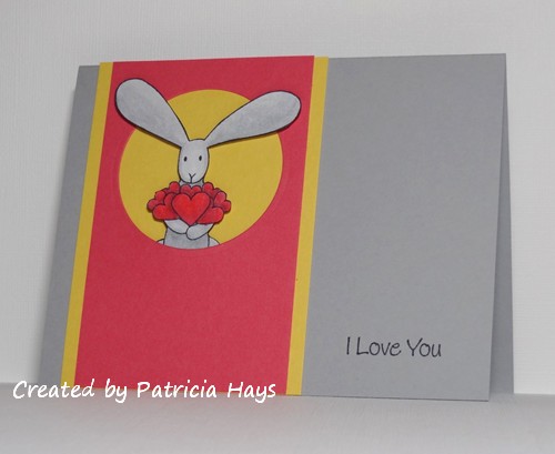
I’ve made another love-themed card to add to my stash for Operation Write Home.  The layout is from a recent OWH Stars & Stamps sketch challenge.  I stamped the rabbit on white cardstock, colored him, and fussy cut him. Then I used dimensional adhesive to pop up his ears and body out of the die cut circle window.


Thanks for stopping by today!  I hope you’ll check out what the rest of the design team members have made, and then share your own creation with us at the CAS – Colours and Sketches site!  You have until 1:00 p.m. Eastern time Wednesday, February 26 to link your card.

Supplies:
Stamps: Flopsey Bunch of Hearts (My Favorite Things)
Cardstock: Smoky Slate, Daffodil Delight, Strawberry Slush (Stampin’ Up); Pure Luxury White (Gina K. Designs)
Ink: Tuxedo Black (Memento)
Other: dimensionals (SU); markers (Copic); standard circle Nestabilities die (Spellbinders)

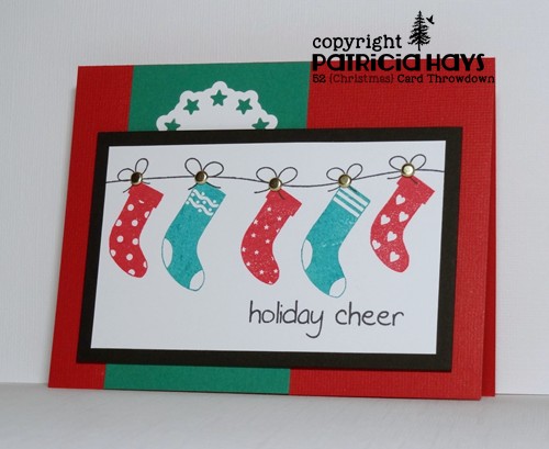
Hello!  It’s time for another color challenge at 52 {Christmas} Card Throwdown.  Jacqueline, our hostess, has given us some bright, bold colors from which to choose and to pair them up with gold.

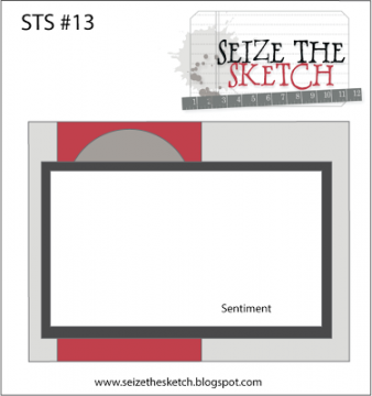
I opted to use the minimum requirement of three of the four colors, and I decided to use the current layout from Seize the Sketch for my card.  I had a hard time at first figuring out what to do for the half-circle part of the sketch, but then I figured this die with the stars around the outside of the circle would tie in with the tiny stars on the stocking in the middle.  The focal panel is attached with dimensional adhesive to accommodate the prongs of the gold brads. I’m wishing I’d chosen a different color green.  In real life, the ink matches the cardstock much better than the way it’s captured in the photo.

And now it’s your turn to show us what you can create!  We’d love it if you joined our challenge this week.  You have until 1:00 pm Eastern time Friday, February 14 to link your card at the 52{C}CT site. Thanks for stopping by today!

Supplies:
Stamps: Holiday Baubles (Sweet ‘n Sassy Stamps)
Cardstock: Whisper White, Basic Black, Glorious Green, Real Red textured (Stampin’ Up)
Ink: Glorious Green, Real Red (SU); Tuxedo Black (Memento)
Other: gold brads, dimensionals (SU); Star Circle Nestabilities die (Spellbinders)

Hello!  Today marks the start of a new challenge at Cards in Envy.  This time we’re looking “through the window” …  making cards that have a window in the front so that something on the inside of the card shows through.  As usual, cards for the challenge need to be A2 sized and have no thick, lumpy, bumpy embellishments.

This card ended up being a good example of what happens when I create on the fly (so to speak) and not really have a plan in mind for it.  It started off with my wanting this little bunny image to be seen through the window.  This small, sort of fancy rectangular die was a great size to use for the window.  Then I got the idea to use the largest die from that set of Nestabilities to create the shape of the card, since it is very nearly A2 sized.  (It’s actually a bit smaller, about 5 3/8″ x 4″.  But it’ll still fit just fine in an A2 envelope!)  I cut the card base, putting the fold of the card just inside the die so the fold wouldn’t get cut.  Then I cut the designer paper so that the curve of the die shape would hide the fold of the card once the paper was attached to the base.  I stamped the bunny and colored him… and that’s when things started not going as well.  I added a little stippling around the bunny to help set him off from the card base, but when I’m doodling freeform like that, I’m never quite sure whether to follow the shape of the image or the shape of the image panel.   I wanted the end of the sentiment panel that’s against the window to follow the shape of the aperture, so I figured that out, but then I thought that a standard pointy banner shape for the other end wouldn’t look right, so I cut the opposite end to follow the shape, too.  The card still looked too plain, so after a search through my embellishments, I finally found a couple of Prima flowers that coordinated with the colors in the designer paper, and added them to the corner diagonally opposite the window to help balance the design.  Larger flowers would probably have looked better, but I didn’t have any in the right colors. I didn’t think about using a flower punch until literally just now, as I’m typing this post!
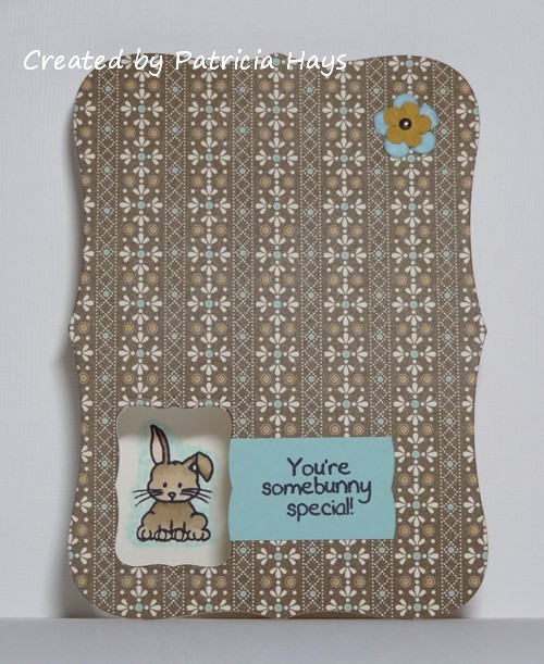
Trying to photograph the card so the window would show depth took a few tries, but this one turned out all right.

Whew.  There ya have it.  Even though I don’t think it’s one of my better cards, it’s still good enough to send to Operation Write Home.

Thanks for stopping by today!  Go see what the rest of the Cards in Envy design team are looking at through their windows.  Then create a card of your own and link it to the Cards in Envy site by 7:00 p.m. Eastern time Sunday, February 2.  We’d love to see what you make!

Supplies:
Stamps: Mini Critters, Cute Critters (Sweet ‘n Sassy Stamps)
Cardstock: Pure Luxury Ivory (Gina K. Designs); Spice Cake designer paper (Stampin’ Up)
Ink: Tuxedo Black (Memento)
Other: Labels Eight Nestabilities dies (Spellbinders); markers (Copic); paper flowers (Prima Marketing); mini brad (Recollections)

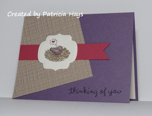
Hello!  We’re back to another color challenge this week at CAS – Colours and Sketches.  Karen, our hostess, has mixed a neutral color in with some muted jewel tones (if that makes sense).   I think it’s a pretty combo!

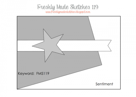
I knew I wanted to use my new birdie set that I got for Christmas again, and I picked out this image of the bird sitting in its nest.  I looked to the current Freshly Made Sketches challenge for the layout of the card.  I tossed around a few different ideas for which color to make the card base and which to make the tilted panel, and finally settled on the plum base with an embossed panel.  The colors for the image panel were pretty easy to figure out, but in retrospect, I probably should have stamped the bird again on a scrap piece of cardstock, colored that, and popped it up on top of the panel to help the bird stand out more from the nest.  I’ll have to remember that the next time I use this image.


Thanks for stopping by today!  I hope you’ll check out what the rest of the design team members have made, and then share your own creation with us at the CAS – Colours and Sketches site!  You have until 1:00 p.m. Eastern time Wednesday, January 22 to link your card.

Supplies:
Stamps: For the Birds (Stampin’ Up); Sophie’s Sentiments (Lawn Fawn)
Cardstock: Perfect Plum, Kraft, Rose Red (SU); Pure Luxury Ivory (Gina K. Designs)
Ink: Tuxedo Black (Memento)
Other: Plaid embossing folder (Sizzix); markers (Copic); Labels Nine Nestabilities die (Spellbinders)

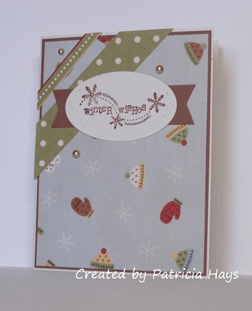
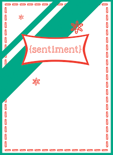
Hello!  Over at 52 {Christmas} Card Throwdown the rest of the design team and I are ready for another fun year of challenges!  We’re also excited to be showing off our redesigned blog.  January starts off with a sketch challenge, and this month’s hostess, Mynnette, has come up with a nice one that can be kept clean and simple or dressed up all fancy.

I’ve decided to let designer papers do most of the work on my card.  The papers and the sentiment stamp are from two different companies, so it was a nice little surprise to discover how well the snowflakes on the two coordinate.  I added tiny pearls to the snowflakes in the sentiment to tie in with the larger scattered pearls.

Thanks for stopping by today.  Be sure to see what the rest of the design team has made.  Then share your own creation with us by linking it at the 52{C}CT blog by 1:00 p.m. Eastern time Friday, January 10.  We’d love to see what you make with our sketch!

Supplies:
Stamps: Winter Wishes (Unity)
Cardstock: Naturals White, Close to Cocoa (Stampin’ Up); designer papers from Winter Wonderland paper pack (Lizzie Anne Designs)
Ink: Close to Cocoa (SU)
Other: pearls (KaiserCraft); petite oval plain Nestabilities die (Spellbinders)

Hello!  Since it’s the third Monday of the month, it’s time for another challenge at Cards in Envy.  Our theme for the next few weeks is “Icy Hot”.  Show us your A2 size cards that feature either something icy cold, or something very hot.  Remember to keep your cards less than 1/4″ thick – after all, the “in envy” part of our challenge name means that the cards should fit in an envelope and be mailable at the standard first class postage rate.

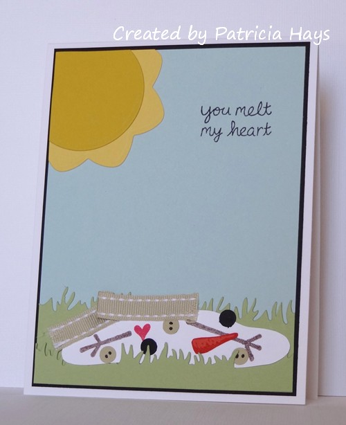
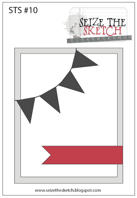
I ended up putting my own spin on the challenge theme and featured things that are both hot and cold.  I’d seen a few “melted snowman” cards at Splitcoaststampers.com and decided to make one of my own.  The current challenge over at Seize the Sketch helped spark this idea, too, because the banner element of the sketch reminded me of cartoonish sunshine images.  I cut the snowman puddle shape freehand and added some various stamped and/or punched snowman parts – eyes, buttons, carrot nose, arms, and a heart to tie in with the sentiment.  The scarf is a scrap of ribbon I had left over from my last CAS – Colours and Sketches card; the photo probably doesn’t show that I snipped into the ends of the ribbon with scissors to resemble the fringe on the ends of a scarf.  I debated adding a hat, too, but thought the card would look too crowded.  The sentiment makes this fit in as as love-themed card for Operation Write Home.


What will you choose – icy, hot, or something combining the two? Share your work with us at the Cards in Envy site by 6:00 p.m. Central Time on Sunday, January 5, 2014.  (Because of the holiday season, there’s an extra week to participate!) Be sure to check out what the rest of the design team has made and give them some blog love, too! Thanks for stopping by today!

Supplies:
Stamps: Here’s the Scoop (Lawn Fawn); Snowman (Basic Grey)
Cardstock: Pure Luxury White (Gina K. Designs); Basic Black, Soft Sky, Certainly Celery, Daffodil Delight, Crushed Curry, Tangerine Tango, River Rock (Stampin’ Up)
Ink: Chocolate Chip, Tangerine Tango, Real Red (SU); Tuxedo Black (Memento)
Other: Grass border die (Sweet ‘n Sassy Stamps); Dahlia and standard circle Nestabilities dies (Spellbinders); River Rock ribbon (SU); 1/4″ hole punch

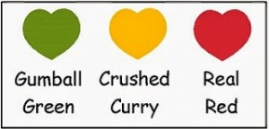
Hello!  It’s time for our first challenge of December at CAS – Colours and Sketches.  We have a color challenge for you this time:  Gumball Green, Crushed Curry, and Real Red.  Although we use Stampin’ Up color names for reference, you’re welcome to use whatever brand products you have that are close to those colors.

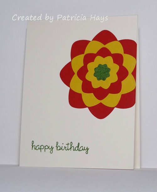
I have to admit that the first thing I thought of when I saw the colors was “traffic light”.  Yes, really!  I toyed with the idea of making something with a traffic light design, but I wasn’t coming up with a good sentiment to put with it, so I figured I’d better scrap that thought and go on to something else.  As I fill up a box of cards for Operation Write Home, I keep a tally of the different card themes in it, and I noticed that I’m low on birthday cards for my current box.  So I decided to make a birthday card.  I checked out the current Seize the Sketch challenge and it fit perfectly into the clean and simple style necessary for the CAS – Colours and Sketches challenge.  Then I just needed to figure out what to do to put the colors into the sketch.  I finally chose to use a set of my Nestabilities dies that I’ve been neglecting lately, and I created a flower with them.  I added that to a card base, stamped the sentiment, and ended up with a very simple one-layer card (well, not counting the layers of the flower!).  I wanted the flower center to have some visual texture, so I lightly “stamped” my Gumball Green ink cube on it.  In retrospect, I probably should have added some leaves to the flower… oh well.

Be sure to see what the rest of the design team has made!  Then we’d love it if you join in our challenge by making a clean and simple styled card of your own using these colors.  Share your work with us at the CAS – Colours and Sketches site by 1:00 p.m. Eastern time Wednesday, December 11.  We’d love to see what you make!

Supplies:
Stamps: Happy Everything (Lawn Fawn)
Cardstock: Real Red, Crushed Curry, Gumball Green (Stampin’ Up); Pure Luxury Ivory (Gina K. Designs)
Ink: Gumball Green (SU)
Other: Dahlia Nestabilities dies (Spellbinders)

Hello!  I hope your weekend has gotten off to a good start!

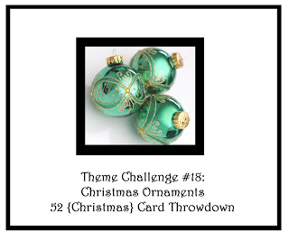
Because it’s a fifth Saturday of the month, this week at 52 {Christmas} Card Throwdown we have a “Pick a Previous” challenge for you.  Louise, our challenge hostess, is asking us to choose a previous 52{C}CT theme for our inspiration this time.  You can find the previous themes at the 52{C}CT site, in the “labels” list in the right sidebar.

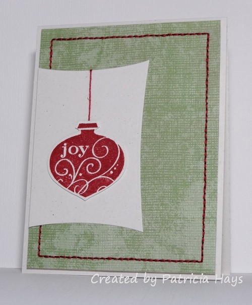
I’ve chosen the June 2013 theme of Christmas ornaments for my card.  The layout for the card is a direct copy from a card I made in February, minus the little baubles at the bottom right corner.  (I was in a creative rut when I was trying to get this card made, and when that happens I tend to just go back to something I’ve done in the past and rework it into something new.)  The main panel is adhered with dimensional adhesive to accommodate the stitching on the back side of the panel.  The ornament was stamped on a scrap piece of cardstock and punched out, and it’s raised up with scrap cardstock shims to allow for the “hanger” thread.  The card is still flat enough to work well for Operation Write Home, so I’ll just set it aside and wait until next summer or fall to send it off to them.

I’m looking forward to seeing the variety of themes that our challenge participants will choose this week!  Be sure to share your card at the 52{C}CT site by 1:00 p.m. Eastern time Friday, December 6.

Supplies:
Stamps: Delightful Decorations (Stampin’ Up)
Cardstock: Naturals White, Afternoon Tea designer paper (SU)
Ink: Raspberry Ripple (SU)
Other: Ornament punch, dimensionals (SU); embroidery floss (DMC); Wonky Rectangle Nestabilities die (Spellbinders)

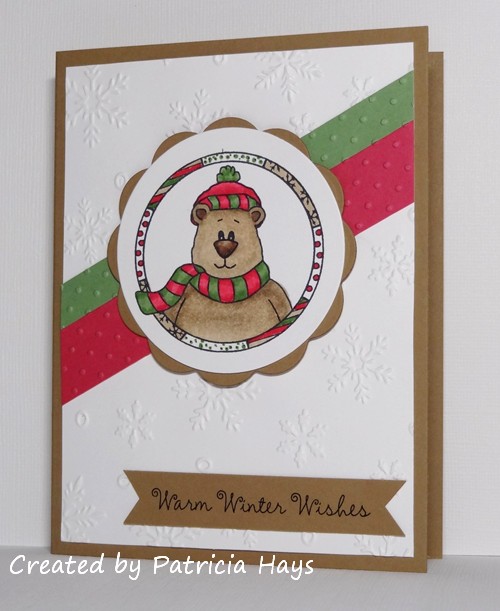
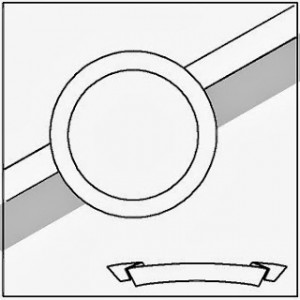
Hello everyone!  Can you believe it’s November already?  The change of month means it’s time for a different design team member to take on hosting duties at 52 {Christmas} Card Throwdown.  It’s Louise‘s turn this time, and she’s created a really neat sketch to get us started.

I’ve stretched the sketch from a square to a rectangle and made it a panel attached to a card base.  Even though I had the layout predetermined for me, it took me a while to figure out what images and colors to use with it.  I finally settled on this bear in a circle image because it lent itself easily to the sketch.  I decided to check out this week’s Color Challenge at Splitcoastampers.com and felt those colors would work with the image.  Although I usually leave the bear white and add just a bit of grey shading to make him a polar bear, this time I decided to challenge myself a bit and color him brown to fit in with the color challenge.  The bear also ties into Stacey’s “Warm & Furry Fuzzies” Hope You Can Cling To challenge.

Thanks for stopping by today!  Be sure to see what the rest of the design team has created.  Then show us what you can do with this sketch.  Link your card to the 52 {Christmas} Card Throwdown site by 1:00 pm Eastern time Friday, November 8.  We’d love to see what you make!

Supplies:
Stamp: Cozy Friends (Sweet ‘n Sassy Stamps)
Digital Sentiment: Winter Wishes (SNSS)
Cardstock: Baked Brown Sugar, Wild Wasabi, Melon Mambo (Stampin’ Up); Pure Luxury White (Gina K. Designs)
Ink: Tuxedo Black (Memento); printer ink
Other: markers (Copic); Snowflake Background embossing folder (Darice); Swiss Dots embossing folder (ProvoCraft); standard circle and big scalloped circle Nestabilities dies (Spellbinders); dimensionals (SU)

Hello!  It’s time for another challenge at CAS – Colours and Sketches.  I’ve been enjoying my turn as hostess this month!

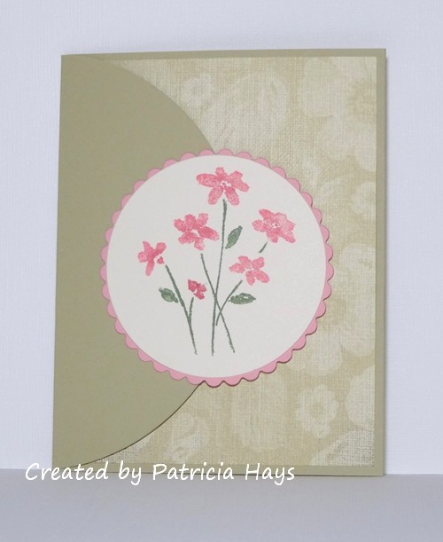
Today marks the start of another sketch challenge week.  The sketch I’ve prepared has a lot of fun curves in it.  (Well, I think they’re fun.)  I’ve decided to turn my card into a flap card that’s held closed by a very thin set of magnets.  I had the Hope You Can Cling To “Sending Flowers” challenge from earlier this week on my mind as I was creating this card. I enjoyed using some of my retired cardstock and designer paper, along with a stamp set I haven’t used in quite a while.

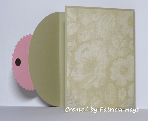
Here’s what it looks like when the flap is opened.  The designer paper hides one of the magnets.


What will you do with this sketch?  Will you layer designer papers or solid cardstock?  Will you create a standard fold card or try a flap card?  Maybe you’ll turn the sketch on its side, or squash it into a square rather than use it as a rectangle.  There are so many possibilities!  I hope you’ll try out something and share what you create with us!  Link your work to the CAS – Colours and Sketches blog by 1:00 p.m. eastern time Wednesday, October 30.

Thank you for stopping by today!  Comments are always welcome and appreciated!

Supplies are from Stampin’ Up unless otherwise indicated:
Stamps: Close as a Memory
Cardstock: River Rock, Pretty in Pink, Very Vanilla, Porcelain Prints designer series paper
Ink: Pretty in Pink, Regal Rose, Wild Wasabi markers
Other: standard circle and petite scalloped circle Nestabilities dies (Spellbinders); magnets (Basic Grey)

Hello!  I hope you’ve been having a wonderful week!

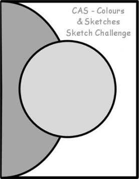
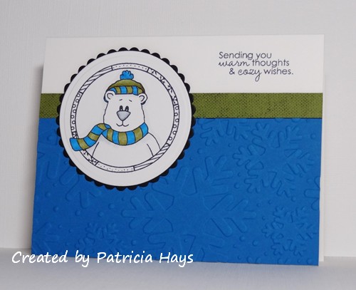
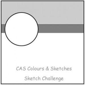
Since it’s Thursday, that means it’s time for a new challenge at CAS – Colours and Sketches.  This week our hostess, Karen, has a nice simple sketch for us (which does make sense since the challenge is about the clean and simple style of card making!).  I’ve chosen to combine the sketch with the Dynamic Duos color challenge that ends today and create a winter-themed card to add to my stockpile of cards for Operation Write Home.  I’ve stretched the sketch out to a rectangle, which ended up putting my panels at a slightly different proportion than the original sketch.  But I think the main idea of the sketch is still intact. I added a subtle print to the olive green strip to give it a little visual interest.

And there it is.  Be sure to check out what the rest of the CAS – Colours and Sketches design team did with this sketch.   Then show us what you can make with it!  You can link your creation to the challenge blog until noon eastern time Wednesday, September 18.  Thanks for stopping by today!

Supplies:
Stamps: Cozy Friends (Sweet ‘n Sassy Stamps); Linen (Stampin’ Up)
Cardstock: Pure Luxury White (Gina K. Designs); Pacific Point, Old Olive (SU)
Ink: Tuxedo Black (Memento); Old Olive (SU)
Other: markers (Copic); standard circle and petite scalloped circle Nestabilities dies (Spellbinders); Snowflakes embossing folder (Sizzix)

Hello!  It’s time for a new month of challenges at 52 {Christmas} Card ThrowdownRuth is sharing her talents with us as hostess during September, and I although I’m not allowed to give away any secrets, I can tell you that she has some great stuff planned for the month!

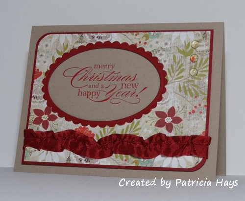
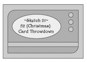
The first weekend of the month always brings us to a sketch challenge, and I’ve tweaked this one into A2 size for my card.  The designer paper did a lot of the design work for me on this one.  However, I decided to do something different than normal for the sentiment.  Instead of die cutting a piece of cardstock, stamping the sentiment onto it, and adhering it to the designer paper, this time I cut through the designer paper and the cherry red mat.  The sentiment is actually stamped onto the card base.  The panel with the designer paper is adhered with dimensionals, so it gives a shadow box effect to the sentiment.  Because I was stamping the sentiment onto kraft cardstock instead of white or ivory, I chose a lighter color of red ink than the cardstock mat and seam binding, to help make the colors match better.  Using the same color red ink as cardstock would have resulted in a darker sentiment that wouldn’t have matched well.  I ruffled the seam binding to keep it from looking too plain.   A few clear dew drops in the corner finish the sketch.

Thank you for stopping by today!  Be sure to visit the 52{C}CT site to see what the rest of the design team has made.  If you’d like to join us, simply make a Christmas card using the provided sketch, and link it at our challenge website by 1:00 pm eastern time on Friday, September 13.  We’d love to see what you create!

Supplies:
Stamps: More Merry Messages (Stampin’ Up)
Cardstock: Kraft, Cherry Cobbler (SU); designer paper from Aspen Frost 6″ x 6″ paper pad (Basic Grey)
Ink: Real Red (SU)
Other: Cherry Cobbler seam binding, dimensionals (SU); petite oval and petite scalloped oval Nestabilities dies (Spellbinders); corner rounder punch (EK Success); dew drops (Robin’s Nest)

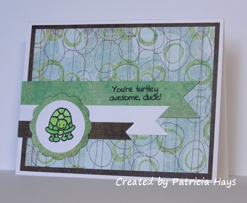
Hello!  Today’s card combines this week’s OWH Stars & Stamps sketch challenge with the sixth OWH Labor Day Virtual Card Making Party challenge.  For the VCMP challenge, we were asked to make a card for a child, but choose elements for the card from a tic-tac-toe diagram.  I went straight down the middle of the diagram to create a card that involved both stamping and coloring, a punny sentiment, and a creature with four legs.   I hope some boy will enjoy receiving this card from his mom or dad!

I still have a few more VCMP challenges to complete.  I’m still hoping I can get them all done before the challenge deadline on Sunday.  Wish me luck!  😉  Thanks for stopping by today.

Supplies:
Stamps: Mini Critters, Cute Critters (Sweet ‘n Sassy Stamps)
Cardstock: Pure Luxury White (Gina K. Designs); designer papers from Phoebe collection (Basic Grey)
Ink: Tuxedo Black (Memento)
Other: standard circle and big scalloped circle Nestabilities dies (Spellbinders); markers (Copic)

Hello!  Happy Saturday!  I hope your weekend has gotten off to a good start.  Here in the United States it’s Labor Day weekend.  Locally, it’s the start of the high school and college football seasons, as well as the start of marching band season!  Although I don’t talk about my personal life much on this blog, my readers who know me well know that I enjoy a good football game, and that I’m very proud of my two sons who are active in their high school’s marching band.  I’m happy to report that our team won their season opener last night, and our marching band was featured as the “Band of the Week” on our local TV station’s football highlights show.  Woo-hoo!!!  🙂

Since it’s the fifth Saturday of August, the 52 {Christmas} Card Throwdown challenge this week is “Pick a Previous”!  This time it’s a double challenge.  Our challenge participants will need to pick a previous sketch and a previous color combination from the 52{C}CT archives and use both together for their challenge card.

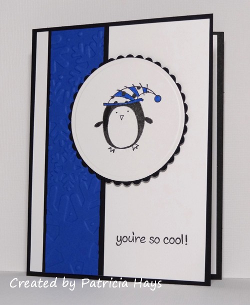
For my card I wanted to use some of the challenges I hadn’t participated in, so I chose sketch #1 from January 2012 and color combo #7 from July 2012.   I couldn’t help but pick these colors because they are a nod to our high school’s colors (officially blue and white, but the various sports teams and the marching band have a lot of black on their uniforms).  I used my snowflake embossing folder to add some interest to the narrow vertical strip.  I chose the cute penguin image because it was easy to leave black and white, with a few touches of blue on his hat.

In retrospect I guess technically this is more of a winter card than a Christmas card.  I had “winter” in the back of my mind for adding to my Operation Write Home stockpile.  It’s close enough, you think?  😉  At any rate, it does qualify for the “no flowers” challenge going on at ‘ABC’ Challenges.

Thanks for stopping by today!  Go check out what the other design team members have created and give them a little blog love, too.  Then join us in our challenge!  You can link your work at the 52{C}CT website until 1:00 pm eastern time Friday, September 6.  We’d love to see what you make!

Supplies:
Stamps: Christmas Characters (Inkadinkado); Critters in the Snow (Lawn Fawn)
Cardstock: Basic Black, Whisper White, Brilliant Blue (Stampin’ Up)
Ink: Onyx Black (VersaFine)
Other: Snowflakes embossing folder (Sizzix); marker (Copic); standard circle and petite scalloped circle Nestabilities dies (Spellbinders); dimensionals (SU)

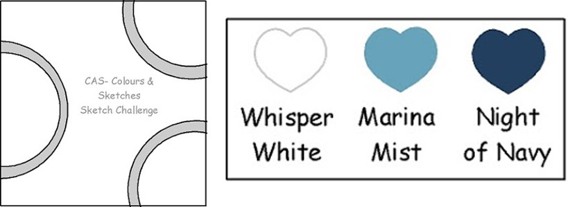
Hello! Because today is a relatively rare fifth Thursday of the month, we have a special double challenge for you at CAS – Colours and Sketches this week!  Kylie is our hostess, and she has drafted a really neat sketch for us to pair with a great monochromatic color combo.

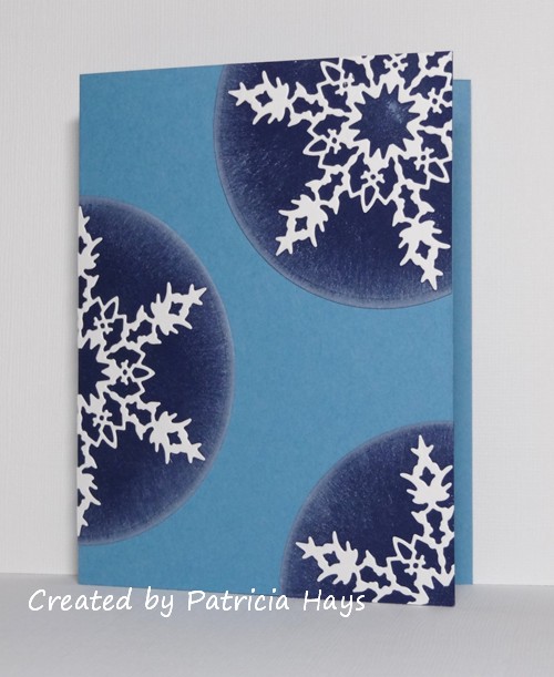
I took an inventory of the cards I’ve been accumulating for my next shipment to Operation Write Home and noticed that I didn’t have many winter themed cards, as opposed to Christmas or holiday cards.  I thought that this week’s challenge colors would work well for a winter card and that I could somehow incorporate snowflakes into the circular elements.  I stretched the sketch into an A2 rectangle and here’s what I came up with:

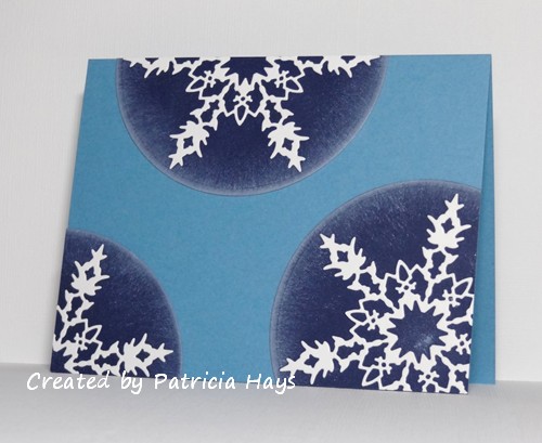
Although the sponged ink along the edges of the circles looks rather grey, it’s actually from my Whisper White ink pad.  The sponging was an afterthought just before I assembled the card.  I’m glad I did it because the card was too stark without it, and because I think it lends a more wintery feel to the card.  I opted not to put a sentiment on the card so that way the hero who chooses to send it home can make it a “thinking of you” or “I miss you” or whatever other type of card he or she wants.  And without a sentiment on the front, the card could also be used as a top fold card, like this:

Oh, I suppose I ought to include the challenge rubrics:

Although the colors listed are Stampin’ Up color names, you do not need to use Stampin’ Up products to create your card.  Simply use whatever you have that is closest to those colors.

Be sure to see what the rest of the design team has made!  Then we’d love it if you join in our challenge by making a clean and simple styled card of your own using this sketch and these colors.  Share your card at the CAS – Colours and Sketches site by noon eastern time Wednesday, September 4.

This card fits into the current ‘ABC’ Challenge, so I’m entering it there, too.

Thanks for stopping by today!  All comments are welcome and appreciated.

Supplies:
Stamps: none
Cardstock: Marina Mist, Night of Navy, Whisper White (Stampin’ Up)
Ink: Whisper White (SU)
Other: Bianca snowflake die (Memory Box); standard circle Nestabilities die (Spellbinders); sponge

© 2019 Suffusion theme by Sayontan Sinha