Hello there, and welcome!  Today marks the beginning of a new challenge at Cards in Envy.  We’re following up our “Hey Dude!” challenge with “Girls, Girls, Girls”.  Cards for this challenge should be A2 sized (4.25″ x 5.5″) and be thin enough to be mailed at the standard postage rate – and be suitable to send to a girl of any age.

Even though Operation Write Home will stop accepting cards after August 1, 2015, I’m still working on filling up a box to send them in July.  So I decided to make a “miss you” themed card that one of our military men or women could send home to their daughter.  I think this little girl image is really cute.  When she’s colored with dark hair, she reminds me of Boo from the movie “Monsters, Inc.”  OK, so the eyes are really different, but the hair style is exactly the same.  I used the current Splitcoaststampers.com sketch challenge for layout inspiration, turning the sketch on its side to give me more space for the sentiment.  It felt good to use up a few scraps of some of my oldest Basic Grey papers for the banners.

CIE 06-01-2015

So now it’s your turn! Check out the Cards in Envy site for all the challenge details and to see what the rest of the design team has made. Then share your girly creation(s) with us by 7:00 p.m. Eastern time Sunday, June 14. We’d love to have you play along with us!

Supplies:
Stamps: In My Heart (Mama Elephant)
Cardstock: Baja Breeze, Pink Pirouette (Stampin’ Up); Pure Luxury White (Gina K. Designs); scraps from Blush 6″ x 6″ paper pad (Basic Grey)
Ink: Tuxedo Black (Memento)
Other: markers (Copic); stitched circle die (Lawn Fawn)

Hello!  I hope your weekend has gotten off to a good start!  Because it’s a fifth Saturday of the month, this week at 52 {Christmas} Card Throwdown we have a “Pick a Previous” challenge for you.  We’d like you to choose one of our previous color challenges and use that to create your card.

I really liked the April 2014 challenge colors, and since I’d missed participating in that one because I was out of town, I knew that was the color scheme I wanted to use for this week’s card.  I’ve used four of the six colors from the graphic – all three blues, plus kraft.  I created a watercolor resist for the focal panel by heat embossing the snowflakes with white ink and white embossing powder and then spreading a watercolor wash over them using inks in the three shades of blue.  I stamped the sentiment on a die cut label and added some ribbon and brads to attach it to the card front.  This was a really fun card to make.  I’ll have to do the watercolor resist again sometime.

52CCT 05-30-2015

Which color scheme will you pick?  There are over 35 from which to choose, so have fun deciding!  Then be sure to share your card with us at the 52{C}CT site by 7:00 p.m. Eastern time Friday, June 5.  Thanks for stopping by today!

Supplies:
Stamps: Festive Flurry (Stampin’ Up); sentiment from Warm Penguin (Lizzie Anne Designs for Gourmet Rubber Stamps)
Cardstock: Kraft, Night of Navy (SU); watercolor paper (Artist’s Loft)
Ink: Whisper White craft, Night of Navy (SU)
Other: navy grosgrain ribbon, Night of Navy, Marina Mist, and Bashful Blue reinkers (SU); white embossing powder (Stampendous); Ribbon Tags Trio die (Spellbinders); brads (source unknown)

Congratulations to Lori Kobular, who left the following comment on my OWH Memorial Day Weekend Blog Hop post:

You’ve won the blog candy I offered during the blog hop!  I’ll be sending you an email shortly.  While I wait for you to reply with your mailing address, I’ll be stuffing a padded Priority Mail Flat Rate envelope full of crafting goodies for you.  There will be at least one stamp set, some brads, some designer papers, a roll of ribbon, and whatever else I can fit in the envelope.

Thank you to everyone who stopped by during the blog hop, whether or not you left a comment!

Here’s a quick card I made to enter into the challenges that are ending today at The Paper Players and Less is More.  I’ve used the Paper Players sketch to create an AnyHero card for Operation Write Home.  I’ve had these metal star snaps for a long time and haven’t used them much because they’re pretty thick, but the Less is More challenge to use metal gave me the incentive to use them.  Since the card isn’t going to be mailed, the thickness of the metal won’t cause any issues.

LIM PP

Thanks for stopping by today!  All comments are read and appreciated.

Supplies:
Stamp: Unity
Cardstock: Brilliant Blue, Real Red Core’dinations (Stampin’ Up); Pure Luxury White (Gina K. Designs)
Ink: Brilliant Blue (SU)
Other: Stars embossing folder (ProvoCraft); metal star snaps (Making Memories); Star dies (Sweet ‘n Sassy Stamps)

finishingstrongbadge

Hello, and welcome to my stop on the Operation Write Home Memorial Day Weekend Blog Hop.  We’re remembering the brave men and women who have given their all for our country and its freedom by sharing cards made for the purpose of sending to our military members stationed overseas so that they may write home to their loved ones. Operation Write Home, a/k/a OWH, is a fantastic charity that has been supporting our military men and women since 2007.  However, because so many of our troops are coming home, OWH will be closing later this year.  All cards to be donated to them need to be sent in by August 1, 2015, so I’m helping to get the word out!

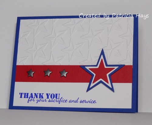
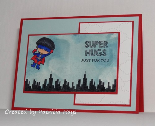
For my card, I knew I wanted to use my little superhero image.  I looked through the OWH Stars & Stamps sketches and found one that I hadn’t yet used – sketch #144.  I ended up flipping it mirror-image because that suited my card design better.  I had a piece of “smashed” cardstock in sky blue tones left over from a cardmaking session last fall (click here to find out how I did it), so I deviated a little from the typical patriotic red, white, and blue for my card.  To make it look more like a sky, I stamped some buildings along the bottom of it, so it would look like the superhero was flying above them.  I stamped the little superhero image on a scrap piece of white cardstock, colored him, and carefully fussy cut him.  Then I glued him onto the sky.  I added a sentiment that makes this card appropriate to give to pretty much anyone, although the image is kind of geared toward kids.  The white panel is dry embossed with clouds, making this card eligible for the current OWH ODBD challenge.

OWH sketch 144

What’s a blog hop without some “blog candy”?  🙂  I have a Priority Mail Flat Rate padded envelope ready and waiting to pack with some crafty goodies.  I’ll send it to one lucky person who comments on this post.  The more comments I receive, the more items will be in the envelope!  I will be reading every comment to ensure that spammers will not qualify for the prize drawing.  Since this is a pretty big blog hop, I’ll give everyone until 12:00 noon Eastern time Friday, May 29, 2015 to leave their comment. The winner will be posted later that day.  Be sure to include your email address when you leave your comment, so I’ll have a way to contact you.

This is my fifth Memorial Day Weekend Blog Hop with OWH, and I’m a little sad that it’s going to be the last one.  However, it’s a good feeling to know that our men and women in service are going to be back home with their loved ones.  I’m glad that I’ve been able to help military families keep in touch, one card at a time, since 2010.

To see the rest of the blog hop participants’ creations, click on the OWH banner at the top of this post.  Thanks for stopping by!  All comments are read and appreciated.  Enjoy the rest of your weekend, and be sure to take some time to remember our heroes who have died in service in order to make our country and world a better place.

Supplies:
Stamps: Super Duo (Mama Elephant for Simon Says Stamp)
Cardstock: Real Red, Soft Sky, Glossy White (Stampin’ Up); Pure Luxury White (Gina K. Designs)
Ink: Tuxedo Black (Memento)
Other: markers (Copic); Soft Sky and Baja Breeze reinkers, Cloudy Day embossing folder (SU); silver paint pen (Zig)

Hello there!  This week is stash challenge week at 52 {Christmas} Card Throwdown.  That means we’re inviting our challenge participants to use particular items from their crafting stash to create a Christmas or wintry card.  I’m the challenge hostess for the month of May, and I’ve chosen ribbon as the stash item.  Most everyone has ribbon, and there are so many different ways to use it, so we’re hoping to see a lot of great cards this week!

I went through the OWH Stars & Stamps sketch challenges to find one that would work well with ribbon, and chose sketch #92, which I hadn’t used yet.  I modified it a bit by using the snowman image in place of the small block shape.  One nice thing about clear photopolymer stamps is that it’s pretty easy to line them up, like I did with the sentiment – the stamp has both words side by side, but I needed to use them one on top of the other to fit the available space.  After I attached my ribbon across the length of the card front, I cut another piece and looped it for a little extra interest.  The snowman is adhered with dimensional adhesive to accommodate the thickness of the ribbon.  It’s still a pretty flat card overall, and the ribbon loop will smush down for mailing.

52CCT 05-23-2015

What will you do with your ribbon?  We’d love to see!  Link your card at the 52CCT site by 7:00 p.m. Eastern time Friday, May 29.  Be sure to check out the rest of the design team members’ cards for more inspiration.  Thanks for stopping by today!

Supplies:
Stamps: Be Jolly (Avery Elle)
Cardstock: Bordering Blue, Naturals White, Cherry Cobbler (Stampin’ Up); designer paper from Winter Wonderland paper pack (Lizzie Anne Designs)
Ink: Tuxedo Black (Memento)
Other: Be Jolly die (Avery Elle); ribbon (Offray); dimensionals (SU)

Hello!  It’s time for another color challenge at CAS Colours & Sketches!  Our hostess, Stef, has chosen some bright springtimey colors for us this time.

I ended up making two cards for this challenge.  The first one uses the sketch from the CAS(E) this Sketch! challenge that closes later this morning.  I’ve used watercolor washes of the three CC&S colors for the stripes of the sketch.  I die cut the word “hello” a couple times from Crushed Curry cardstock and once from black cardstock and stacked them together for the star-shaped element of the sketch.  I was going for the idea of the stripes making a landscape with the “hello” working as a sun, but I’m not sure I quite achieved it because I didn’t want to blend the color washes together too much and end up with a yucky color where the purple and yellow met.  But anyway, I think it will still fit into this week’s Less is More challenge theme of “hello sunshine”.

CASCAS125 hello

My second card is more CAS than the first one.  Since I still had my reinkers out from the first card, I started off with a watercolor wash for the background.  Then I added in some simple flowers and a sentiment, rounded two corners of the image panel, and adhered it to the card base.  Seriously, the most time consuming part of making this card was waiting for the background to dry.  This card uses the sketch from The Crooked Stamper Sketch Challenge and the “May Flowers” theme from Retro Rubber.

CASCAS125 flowers

RRCB14

Go see what the rest of the CC&S Design Team has done with these pretty colors!  Then use the colors to make a card of your own, and share it with us at the CC&S challenge post.  You have until 6:00 p.m. Eastern time Wednesday, May 27 to link your card.  We hope you’ll join us!  Thanks for stopping by today.

Supplies for the “hello sunshine” card:
Stamps: Simply Said Hello (Avery Elle)
Cardstock: Crushed Curry, Basic Black (Stampin’ Up); watercolor paper (Artist’s Loft)
Ink: Garden Green (SU)
Other: Elegant Eggplant, Crushed Curry, and Garden Green reinkers (SU); Simply Said Hello die (Avery Elle)

Supplies for the floral card:
Stamps: Spring Garden, Three Little Words (Stampin’ Up)
Cardstock: watercolor paper (Artist’s Loft)
Ink: Elegant Eggplant, Garden Green (SU)
Other: Crushed Curry reinker (SU); corner rounder punch (EK Success)

Hello there, and happy Saturday to you!  It’s time for another theme challenge at 52 Christmas Card Throwdown:  “O Little Town”.  Although the theme was derived from the Christmas carol “O Little Town of Bethlehem”, cards for this challenge don’t necessarily need to depict the holy city.  Any town or village scene showing several buildings will be just fine.

I readily admit that my card for this challenge is heavily inspired by a card made by my friend Taylor way back in 2008.  I’ve added a couple of layers to the card, arranged the buildings differently, and used different ovals for the sentiment panel.  My stamp-a-ma-jig made it easy to neatly line up the buildings, which are all individual stamps.  I thought the sentiment is appropriate for a card that will be donated to Operation Write Home.

52CCT 05-16-2015

If you’d like more inspiration, be sure to see what the rest of the 52CCT Design Team has made.  Then link your own card to the challenge post by 7:00 p.m. Eastern time Friday, May 22.  We’d love to have you join in the fun and creativity!  Thanks for stopping by today.

Supplies:
Stamps: Holiday Lane (Lizzie Anne Designs)
Cardstock: Naturals Ivory, Close to Cocoa, Kraft (Stampin’ Up)
Ink: Close to Cocoa (SU)
Other: petite oval and petite scalloped oval Nestabilities dies (Spellbinders)

Once again, it’s sketch week at CAS Colours & Sketches!  We have a pretty interesting and versatile one for you this time.

I’ve stretched the sketch out into a rectangle since I prefer to make A2 sized cards, and I flipped it mirror image because I felt it worked better with the image of the snuggling birdies.  I also took the liberty of substituting hearts for the squares in the sketch, but it’s still easy to see that my card is modeled after the sketch.  There’s a slight woven texture to the red cardstock I used for the hearts, but it doesn’t show in the photo.  The birds are raised up from the card base with dimensional adhesive.  The largest heart (below the word “hugs”) is raised with a few scraps of cardstock as shims, so it has some dimension but not as much as the birds.

CASCAS124

I’m also entering this card into the challenges at Addicted to CAS, where the challenge code word is “birds”, and to Addicted to Stamps and More who are having a CAS style challenge.

What will you create with this sketch?  Check out what the rest of the design team has made for further inspiration.  Share your artwork with us at the CAS – Colours and Sketches site by 6:00 p.m. Eastern time Wednesday, May 20.  We’d love to have you join us!  Thanks for stopping by my blog today!

Supplies:
Stamps: Feathered Friends [for Simon Says Stamp], So Much to Say (Lawn Fawn)
Cardstock: Soft Sky, Sahara Sand, Real Red Core’dinations (Stampin’ Up)
Ink: Tuxedo Black (Memento)
Other: dimensionals (SU); marker (Copic); corner rounder punch (EK Success)

Hello!  It’s color challenge week at 52 Christmas Card Throwdown!  Since I’m the challenge hostess this month, I picked the color scheme this time, and it’s a bit nontraditional:  the pastel colors of soft pink, pale yellow, and light green.  I’ve based it off of a card I made for 52CCT a few years ago – click here to see it.

Once again, I used a sketch from the OWH Stars & Stamps blog for the layout of my card.  I’ve kept the tree idea from my earlier card and used the same colors of cardstock.  I used my glitter pen to add a tiny bit of sparkle to the star, but it doesn’t show well in the photo.  The ornaments on the tree are three different colors of self-adhesive pearls – pink, yellow, and ivory.  This card is being added to the stockpile I’m creating to send to Operation Write Home in the fall.

52CCT 05-09-2015

Now it’s your turn to show us what you can make with these colors!  If you need more inspiration first, go visit the 52CCT site and see what the rest of the design team has created.  Be sure to link your card at the 52CCT site by 7:00 p.m. Eastern time on Friday, May 15.  We look forward to having you join us!

Supplies are from Stampin’ Up unless otherwise noted:
Stamps: Season of Joy, Endless Wishes
Cardstock: Barely Banana, Blushing Bride, Very Vanilla, Certainly Celery Prints designer paper
Ink: Certainly Celery, Barely Banana
Other: petite oval and petite scalloped oval Nestabilities dies (Spellbinders); Stitched Scalloped Border die (Lawn Fawn); pearls (KaiserCraft); Wink of Stella pen (Zig)

Hello, and happy Monday!  It’s time for a new challenge at Cards in Envy.  For the next couple of weeks, we have a challenge theme of “When Nature Calls”.  Your card should feature something found in nature.  Remember to make it A2 size (4.25″ x 5.5″) and thin enough to fit in an envelope.

I pulled out a lot of retired supplies for my card – the stamps, the multicolored ink pad, and the red and mustard cardstocks.  I made the focal panel by liberally spritzing water onto a piece of natural cardstock, inking up the leaf stamps with the multicolored ink pad, and stamping onto the wet cardstock, which caused the dye ink to run and blur.  After the cardstock dried, I stamped the leaves again, providing the detailed veining in them.  The layout of my card is OWH Stars & Stamps sketch #253.  I’m also going to enter this card into the current Retro Rubber “Anything Goes” challenge.

CIE 05-04-2015

sketch 253

Now it’s your turn!  Show us your own card depicting something found in nature by linking it to the Cards in Envy challenge post by 7:00 p.m. Eastern time Sunday, May 17.  We’d love to see what you create!  Thanks for stopping by today.

All supplies for this card are from Stampin’ Up unless otherwise noted:
Stamps: Autumn, Always On My Mind
Cardstock: Ruby Red, More Mustard, Naturals Ivory
Ink: Pumpkin Patch Spectrum pad
Other: standard circle Nestabilities dies (Spellbinders)

Hello!  The current challenge at The Paper Players has been intriguing me all week.  It’s to create a clean and simple styled card and incorporate watercoloring into it.  Since the challenge closes this afternoon, I figured this morning it was now or never if I wanted to join in.  The current CAS(E) this Sketch! layout seemed to lend itself well to including a watercolored background so I’ve combined the two challenges in today’s card.  I started off with a wash of green ink on watercolor paper, which turned out pretty light, but that was OK because I didn’t want it to obscure the image.  Once it was dry, I stamped the holly image.  Then I used a damp paintbrush to trace over the lines, blending in all the little shading lines and softening the edges of the image.  I stamped a cherry colored ink pad on acetate and used the ink from there to color in the berries.  I accidentally tapped the brush over the cardstock as I was finishing up the berries, splattering a bit of the watered-down red ink near the bottom edge of the watercolor paper.  So I made a last-minute decision to add some more splatters randomly over and around the image.  I chose a green cardstock for the base and here’s the final result:

CTS120

I realize it probably seems a little weird to have a Christmasy design in April, but none of the previous ideas I had came together very well for me.  It still makes a good card for me to stockpile for Operation Write Home.  Since there’s no sentiment on it, the person who chooses to send it can use it for any occasion during the holiday season.  And Christmas Eve is just 8 months away from today!

Thanks for stopping by my blog today.  All comments are read and appreciated!  (Well, not the spam comments.  They are read, but they are not appreciated unless the content or grammar strikes my funny bone – like the poorly worded one that talked about testing traffic lights.  LOL!)

Supplies:
Stamp: Christmas Blueprint 4 (Tim Holtz)
Cardstock: Garden Green (Stampin’ Up); watercolor paper (Artist’s Loft)
Ink: Garden Green, Cherry Cobbler (SU)
Other: paintbrush

Hello!  It’s time for a sketch challenge again over at CAS Colours & Sketches.  We have a pretty interesting one for you this time!  You’re welcome to manipulate the sketch, so long as we can still easily recognize the main elements.

The sketch was drawn up for a square card.  Since I prefer to make A2 sized rectangular cards, rather than trying to stretch the sketch out into a rectangle, I just put the square element on a rectangular card base.  Even though I think it’s a really neat sketch, I had a difficult time deciding what I wanted to do with it.  I thought about using butterflies or flowers or even ice cream cones for the triangular elements of the sketch, but nothing seemed “right”, so in the end I just stayed very true to the sketch and used triangles of designer paper.  It was a nice way to use up some scraps I had!  I have to admit it’s not one of my most favorite cards – it seems too flat, like it’s lacking something.  But it’s definitely not one of my worst cards either, so I’m OK with it.  It will be a good addition to the stockpile I’m building for Operation Write Home.

CASCAS121

Be sure to check out what the rest of the CC&S Design Team has done with this sketch – they’ve made some amazing cards!  Then give it a try yourself.  You have until 6:00 p.m. Eastern time Wednesday, April 29 to link your card at the challenge site.  Thanks for stopping by today!

Supplies:
Stamps: Year-Round Sentiments (Hero Arts)
Cardstock: Pure Luxury Ivory (Gina K. Designs); Rich Razzleberry, Razzleberry Tart designer papers (Stampin’ Up)
Ink: Rich Razzleberry (SU)

This is a pretty quick and simple card I made to combine the current CAS(E) this Sketch! layout with the current Clear It Out challenge to use yellow things.  I’ve cut this doily die from some textured sunshiny yellow cardstock and used the same color ink for the sentiment.  A couple matching brads hold the banner in place.

CTS118

Thanks for stopping by!

Supplies:
Stamp: In My Heart (Mama Elephant)
Cardstock: Pure Luxury White (Gina K. Designs); Summer Sun textured (Stampin’ Up)
Ink: Summer Sun (SU)
Other: For the Record 2, Documented die (Sizzix); Dimensional Banner die (My Favorite Things); brads (Making Memories)

Hello there!  It’s the second Saturday of the month, and that means it’s color challenge time at 52 {Christmas} Card Throwdown.  This time we’re asking our challenge participants to be inspired by the colors of coffee and cream.

I am not a coffee drinker – I like the smell of it (most of the time, at least), but I don’t care for the taste.  But with the challenge colors stated the way they are, I couldn’t resist using the Stampin’ Up color called Early Espresso.  It’s a very dark brown, so I guess that goes along with my husband’s preference to drink his coffee black.  It doesn’t show up very well because the cardstock is so dark, but I stamped it with a background stamp to (try to) give it a little extra visual interest.  I stamped the toy soldier stamp with Early Espresso ink on watercolor paper and then used a slightly damp paintbrush to blur some of the lines and give the image a bit of color.  The layout for this card comes from this week’s Freshly Made Sketches challenge.  The sentiment is from a long-retired Stampin’ Up stamp set.  I thought it was especially appropriate for a card that’s going to be donated to Operation Write Home.

52CCT 04-11-2015

Be sure to check out what the rest of the design team has made.  Then show us what you can create with these colors!  We’d love it if you joined our challenge this week.  You have until 7:00 pm Eastern time Friday, April 17 to link your card at the 52{C}CT site. Thanks for stopping by today!

Supplies:
Stamps: Christmas Blueprint (Tim Holtz); Wishes Awash, Sanded (Stampin’ Up)
Cardstock: Pure Luxury Ivory (Gina K. Designs); Early Espresso (SU); watercolor paper (Artist’s Loft)
Ink: Early Espresso (SU)
Other: brads (Recollections); paintbrush, water

© 2019 Suffusion theme by Sayontan Sinha