Hello there! I hope you and your family are staying safe and healthy during these uncertain times. Despite our being under stay-at-home orders, April seems to be flying by. It’s hard for me to believe the month is nearly half over!
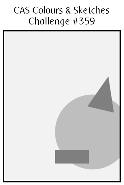
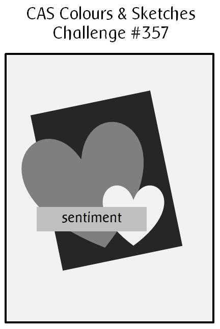
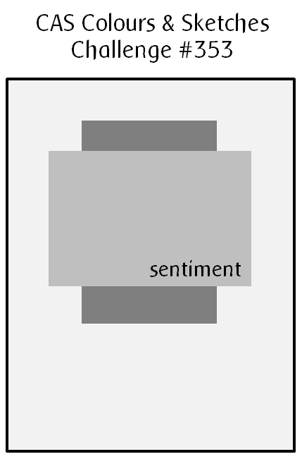
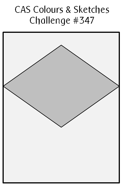
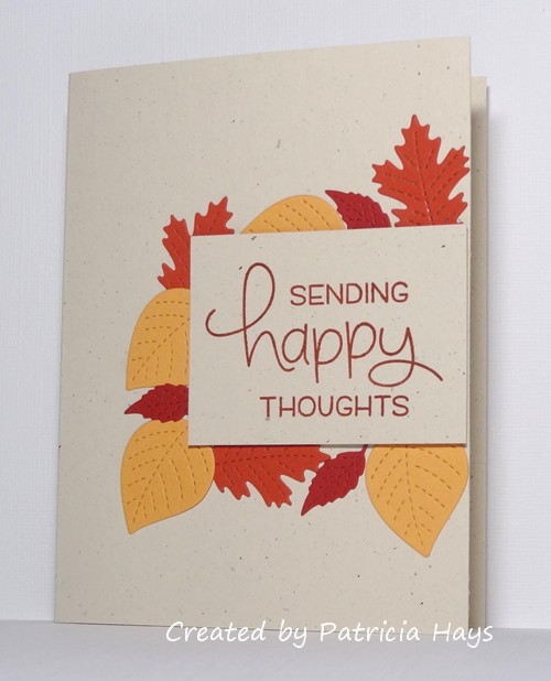
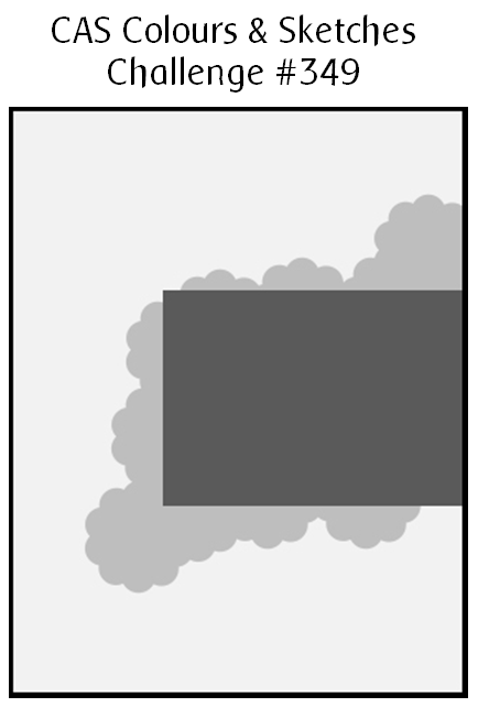
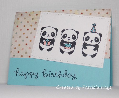
It’s sketch challenge week at CAS Colours & Sketches, and we have a nice little one for you this time. It’s been a while since I made a birthday card so I went with that for my theme. My panda stamp fit well stamped three times in the rectangular focal panel area. I wanted to use a stitched rectangle die for that portion of the sketch and it’s a bit smaller than as shown on the sketch, but the idea of the sketch is still very evident. I chose the colors for the party elements from the scrap of designer paper I used for the background area of the card. In retrospect I think the card would have felt more balanced (or something like that) if I’d used the designer paper at the bottom of the card, but it’s too late to change that now. Oh well.
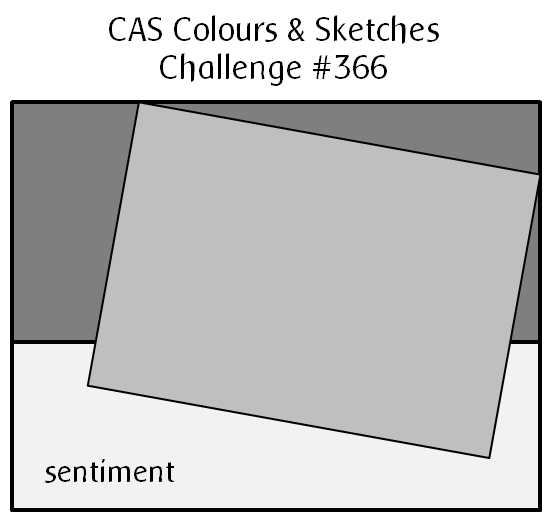
What will you do with this sketch? I hope you’ll try out something and share what you create with us! Link your work to the CAS Colours & Sketches blog by 6:00 p.m. Eastern time Monday, April 20. Thanks for stopping by today!
Supplies:
Stamps: Party Panda, Party Animal (Lawn Fawn)
Cardstock: Solar White (Neenah); Cool Caribbean (Stampin’ Up); scrap from Blush 6″ x 6″ paper pad (Basic Grey)
Ink: Tuxedo Black (Memento)
Other: markers (Copic)