I liked this week’s color combination from Dynamic Duos so much that I wanted to make a second card with it.  So here, just in the nick of time before the challenge closes, is another card with these colors.  Since the first card I made was geared towards Mother’s Day, I decided to go more masculine with the second one and get started on Father’s Day cards for Operation Write Home.  I’ve used my brand new Quinn’s ABCs dies along with the matching stamp set; I will need to use them more often to gain more practice in aligning the stamps with the die cut letters, but I’m pleased enough with how these turned out.


A few days ago I found this technique for making the scored chevron stripes and wanted to give it a go.  Here’s a link to the tutorial:  Creating a Chevron Pattern I tweaked it a bit, making my strips 3/4″ wide, and scoring every 3/8 inch.  It really is pretty simple and quick to do!

Thanks for stopping by today!

Supplies:
Stamps: Quinn’s ABCs (Lawn Fawn)
Cardstock: Naturals White, Pool Party, Island Indigo (Stampin’ Up)
Ink: Island Indigo (SU)
Other: Quinn’s ABCs dies (Lawn Fawn); scoring board (Martha Stewart)

My card today combines two challenges – the layout of the card provided for inspiration for Inkspirational #8 and the color scheme of Dynamic Duos #41.  I added a little sponging to the flower embellishment.  I chose the sentiment because I need to get working on some Mother’s Day cards for Operation Write Home.  There’s not much else to say about this quick, easy, clean and simple card except here it is:


All supplies except the white cardstock are from Stampin’ Up:
Stamp: Delightful Dozen
Cardstock: Island Indigo, Pool Party; Pure Luxury White (Gina K. Designs)
Ink: Island Indigo, Pool Party
Other: rhinestone, sponge

two more...

Comments Off on two more…
Feb 252013

Here are two more cards I was able to create today for two of the Virtual Card Making Party challenges that Operation Write Home presented over Presidents’ Day weekend.   Both of them tie into the disappearing act challenge that Leslie hosted, but each also was created with one of the other challenges in mind.

Misty’s challenge was to create a card for a child, using an image of an animal.  Goodness knows I have plenty of animal stamps and digital images that are suitable for children’s cards!  I figured a “thinking of you” card would be most suitable for any occasion, and this particular sentiment seemed to go well with this cute little turtle.  So here they are, put together, along with another piece cut from the same 12″ x 12″ paper I used for the cards I shared on Friday.

Jen hosted a challenge to use an image depicting coffee, chocolate, or some other form of caffeine.  So I dove back into my digital images and decided to use this one.  I used Microsoft Word to create the sentiment.

I paper pieced the animals on both of these cards. (OK, so the turtle wasn’t really “pieced”, it was simply stamped on the green paper and cut out.) I still have one more piece from that 12″ x 12″ paper to use.  I’m trying to figure out a way to use it with this week’s OWH Stars & Stamps sketch.  I don’t have any more time today to work on that idea, so that card won’t get blogged before the Virtual Card Making Party officially ends and the links close.  Oh well.  But I am NOT giving up on that paper!  🙂

Supplies for these cards:
Stamps for the turtle card: Cute Critters, Thoughtful Rhubarb (Sweet ‘n Sassy Designs)
Digital Image for the koala card: Kiwi’s Cuppa (SNSS)
Cardstock: Pure Luxury White (Gina K. Designs); “Ashbury Street” and various scraps from Phoebe collection (Basic Grey); scraps from Ambrosia 6″ x 6″ paper pad (BG)
Ink: printer ink; Tuxedo Black (Memento)
Other: dimensionals (Stampin’ Up)

When washi tape first became popular about two years ago, I just couldn’t understand all the interest in it.  I figured I already had enough gorgeous ribbon to work with and that I didn’t need this new tape stuff to eat up my crafting dollars.

So when the washi tape challenge was introduced as part of Operation Write Home’s President’s Day weekend Virtual Card Making Party, I just figured I’d have to pass on that challenge.

Then Wednesday, one of my favorite online craft stores sent me an email to notify me that a product I’d been waiting to order was in stock.  So I went to the store’s site and put my long-awaited dies in my shopping cart, along with a few other things that sparked my interest.  And when I decided I’d picked up enough new goodies to satisfy my creative sweet tooth for a while, I realized I was $2.90 short of qualifying for free shipping on my order.

I weighed the options.  Buy something worth about $3.00 and get free shipping?  Or keep my cart the way it was, and spend an additional $7.95 for shipping?  The first option seemed to make more sense (and cents).

So I browsed around the site some more… and found the washi tape.  $3.19 for a package of two color-coordinating rolls seemed reasonable enough to me.  So I took the plunge.  I figured a black print was neutral enough to coordinate with a lot of different cardstock.

The order arrived yesterday, and here is my first creation with washi tape.

I used a rub-on for the sentiment.  I kept the card very clean and simple, mainly because I wasn’t sure what else to do with the tape, LOL!  But now that I’ve worked with it once, I won’t be as hesitant to try it again.  Actually, I’m already curious to see how it will look with colored cardstock underneath it.

Supplies:
Cardstock: Basic Black (Stampin’ Up); Pure Luxury White (Gina K. Designs)
Other: washi tape (We R Memory Keepers); rub-on (American Crafts)

I’ve been considering different ideas for this week’s 52 {Christmas} Card Throwdown challenge all week.  This time it’s a theme challenge of hearts and love.  I’ve gone through different sentiments and images that I could use.  But then I thought, what love-related thing do people do at Christmastime but really not at other times of the year?  Kiss under the mistletoe.  That’s what.  So I decided to do something along that line.  I’ve combined that thought with the layout for Freshly Made Sketches #74, adding an extra panel to the sketch.  I did some hand stitching around the edge of the extra panel to tie in with the “All Stitched Up” ABC Challenge.  I love the look of stitching on cards, but I always underestimate how long it takes me to do it!  The result is this rather clean and simple card:


I kept the heart/love theme going with the sentiment and the heart-shaped brads.  The mistletoe image is a stamp, but I created the sentiment using Microsoft Word.  This card will be going into the stash I’m creating to send to Operation Write Home later this year, and I think it’ll be a cute one for one of our military heroes to send home to a loved one this Christmas season.  I thought about using pearls for the mistletoe berries, but I hesitated to go with that idea because I felt that would be overdoing it.  Since the green panel is attached with dimensional adhesive and I already had the brads on there, I didn’t want to make the card too bulky.

Thanks for stopping by today!

Stamps:  Bows and Holly (Lawn Fawn)
Cardstock: Naturals White, Garden Green (Stampin’ Up)
Ink: Tuxedo Black (Memento); printer ink
Other: Wonky Squares Nestability die (Spellbinders); markers (Copic); pewter heart mini brads (Making Memories); embroidery floss (DMC); dimensionals (SU)

Happy Friday! It’s time for a new Sweet ‘n Sassy Digi Challenge! We have a fun theme for our challenge this week – create a card for a child. It can be for any occasion, so long as it’s appropriate for a child.  You don’t have to use a Sweet ‘n Sassy digital image, but we do enjoy seeing our participants use them (and you get the chance for extra perks if you do – see the Digi Challenge site for more details!). Link your card at the Sweet ‘n Sassy Digi Challenge site by midnight eastern time Thursday, February 28.

I’ve actually created a trio of cards for this challenge. I was inspired to do multiple cards by Leslie’s OWH Virtual Card Making Party challenge, which was to use one sheet of 12″ x 12″ designer paper to create at least 6 cards using a certain OWH Stars & Stamps sketch. Well, I got halfway there before I started running out of time to get this blog post written.  So I’ll share what I have.  For my 12″ x 12″ paper, I decided to part ways with one of the designs from the Basic Grey “Phoebe” collection.  I used scraps from the coordinating 6″ x 6″ paper pad to paper piece the bears because I wasn’t in a mood to color with markers.  I kept the cards a consistent theme with Rhubarb the bear images and bear-related sentiments.  I added some linen thread for the balloon strings on the birthday card.  I used a scrap from a different 6″ x 6″ pad for the darker brown Rhubarb on the ice cream cone card.  I had to make that bear darker so the cone would show up against his tummy.  I’ve changed things up a little on the cards by varying the width of the vertical strip, and the length of the sentiment panel, and by adding mats and using pop dots to attach Rhubarb on a couple of the cards.


Be sure to see what the other Sweet ‘n Sassy Digi Challenge Design Team members have created for this challenge.  Then go make a card for a child, and share it with us!

One last thing… congratulations to Snoopy!  She’s won the blog candy I offered in last week’s Sweet ‘n Sassy Digi Challenge post.  I’ll be sending a note to her via the email message she left in her comment.

Supplies for today’s cards:
Digital Images: Rhubarb’s Balloons, Rhubarb’s Heart, Rhubarb’s Ice Cream Cone, Bear Sentiments (Sweet ‘n Sassy Stamps)
Cardstock: Pure Luxury White (Gina K. Designs); “Ashbury Street” and various scraps from Phoebe collection (Basic Grey); scrap from Pyrus 6″ x 6″ paper pad (BG)
Ink: printer ink
Other: dimensionals, linen thread (Stampin’ Up)

This week the color combination for the Dynamic Duos challenge was Tempting Turquoise and Basic Black, with the option of adding clouds.  I tossed several different ideas around in my head before finally settling on this rather quick and easy one-layer card.  I didn’t want the bird to be just floating in mid-air, so I drew an overhead power line so it could perch on it.  Now I can add “overhead power line” to my repertoire of things I can draw!  😛  (My long-time readers might remember that I am NOT good at drawing, so the list of things I can draw is pretty sparse!)  I decided to use one of the cloud shapes for the bird’s thought balloon, and I also hand drew the little “bubbles” connecting it to the bird.  I didn’t want the bird to be as bright white as the clouds, so I used vanilla cardstock for it, and I added in a tiny bit of shading around the tail and wing with a marker.

This card also fits into the OWH Virtual Card Making Party challenge called “Things with Wings”.

Thanks for stopping by today!

Supplies:
Stamps: Cute Critters (Sweet ‘n Sassy Stamps)
Cardstock: Tempting Turquoise, Whisper White, Very Vanilla (Stampin’ Up)
Ink: Tuxedo Black (Memento)
Other: multiliner pen (Copic); Clouds & Raindrops dies (SNSS); marker (Copic)

You’ve probably heard the expression “When Life gives you lemons, make lemonade.”  There’s also a version where you combine the lemons with tequila and salt and make margaritas.  But if neither of those is your style, today’s card might have the solution for you.

I first saw the sentiment I used on today’s card about 10 years ago.  It made me laugh, so I tucked it away into my memory.  Over the weekend when I first saw the sketch for challenge #12 at CAS – Colours and Sketches, I thought this sentiment might work for it.  The main part of the sentiment seemed like it would fit in the long rectangle, the last three words could go in the small panel, and images of lemon slices could fill in for the half circles.  I finally took the time to get it all together with cardstock and ink, and here it is.  The sentiment is computer generated, and the lemon stamp is one that I’ve had for a long time.  I inked only the cut lemon part of the image when I stamped it for the half circles.  When I stamped over the sentiment on the image panel, I stamped off the ink lightly onto a scrap piece of paper first so the yellow wouldn’t be quite so bold against the print.

Although I’d already made one card for the CAS – Colours and Sketches challenge, I felt bad about it because I accidentally left an element off of the sketch.  So this is my attempt at redeeming my oversight there.  The fruit element makes this card work for the February Our Daily Bread Designs challenge on the OWH Stars and Stamps blog.  I also had kept the CAS-ual Fridays challenge of black and white plus one other color in the back of my mind while I was making this card.

Thanks for stopping by today!  And remember, when Life starts getting rough, sometimes you need to give it a back a little attitude of your own.

Supplies:
Stamp: Lemons (Impression Obsession)
Cardstock: Daffodil Delight (Stampin’ Up); Pure Luxury White (Gina K. Designs)
Ink: Daffodil Delight (SU); printer ink

Here’s what I’ve come up with for the current Inkspirational challenge.  They provided a photo for inspiration, and I took it pretty literally with the bouquet and the colors.  I was using the CAS Colours and Sketches layout, but now that I’ve taken the photo I realized I forgot to add a flower behind the right side of the main image panel. Ooops!  I didn’t have any thank you cards yet for the box of cards I’m putting together for Operation Write Home, so that’s how I chose the sentiment.

Operation Write Home held a Virtual Card Making Party last weekend, with 10 different challenges to complete by the beginning of next week. I hadn’t had the chance to really focus on completing the challenges yet, but I see that this card works for challenge #10 – to use something glitzy that isn’t glitter. I think the rhinestones fit into that category. So maybe I’ll just do the rest of the challenges in reverse order now, LOL! 🙂

Supplies:
Stamps: Watercolor Garden II (Stampin’ Up); Year Round Sentiments (Hero Arts)
Cardstock: Pure Luxury White (Gina K. Designs); Real Red, Melon Mambo, Tangerine Tango (SU)
Ink: Wild Wasabi, Real Red (SU)
Other: 5-Petal Flower punch, Mixed Bouquet punch (SU); rhinestones (Bazzill)

Hello!  It’s Friday!  And because it’s the third Friday of the month, it’s New Digi Release Day at Sweet ‘n Sassy Stamps!   Lots of great new digital stamp sets are being introduced today – four adorable bunny rabbit images, a set of sentiments, and a set of springtime images such as butterflies, bees and a flower.  The rest of the Sweet ‘n Sassy Digi Challenge design team and I are showcasing different ones today, so please check out everyone’s blogs so you can see all the fun new stuff!  Be sure to leave a comment on each of the design team members’ blogs, too – one of us is a mystery blogger, and one person who comments on her blog post will be chosen at random to receive the entire new release!  Links are over in the left sidebar, but if you lose track while visiting around, you can always go back to the Sweet ‘n Sassy Digi Challenge blog and start anew.  And yes – there are lots of new links over there because we have five new design team members!  Please join me in giving a warm welcome to Lawren Folkes, Jamie Moore, Debbie Owens, Melissa Shultz, and Ann Tuck!

Our Digi Challenge this week is 3-2-1.  For your project that uses a digital image as its focal point, you’ll need to use 3 of one item, 2 of a different item, and 1 of something else.  When you write up your blog post or upload description, please include details to let us know what your 3-2-1 items are.  Be sure to link your project to the Sweet ‘n Sassy Digi Challenge blog by midnight Thursday, February 21.  You aren’t required to use a Sweet ‘n Sassy digital image, but we do enjoy seeing our participants use them (and you get the chance for extra perks if you do – see the Digi Challenge site for more details!).

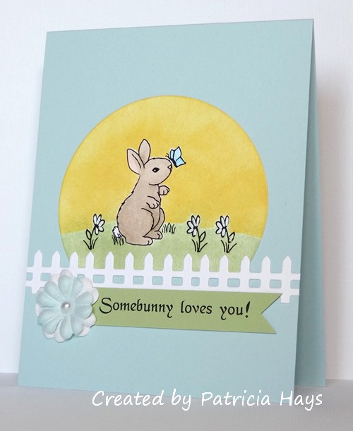
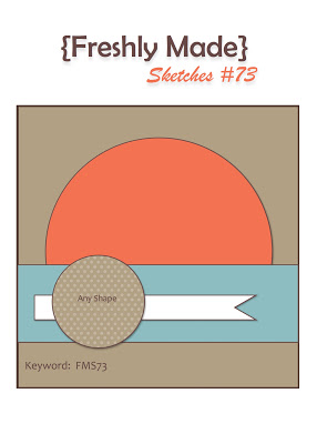
I’ve used the new image Bunny 1 and two of the images from Spring Add-ons – so the “3” part of my card is three different digital images.  My “2” things are two dies – the circle and the fence.  And I’ve used one pearl to embellish the center of the layered Prima flowers.  I played around with resizing and rotating the images so I could have the butterfly lighting on the bunny’s nose, and so that the flowers would be facing in different directions.  Because the deadline for submitting Easter cards to Operation Write Home has passed, I opted to create a non-seasonal sentiment in Microsoft Word and printed that out to use.  I was trying to go for the look of the bunny and the flowers against a backdrop of the rising sun.  I’m not sure I’ve accomplished that successfully, but I’m OK with how the card turned out.  Once again, I’ve used Freshly Made Sketches #73 for the layout, but this time I’ve turned it into a tall rectangle.

Thanks so much for stopping by today!  Comments are always welcome.  To show my appreciation to my visitors, I’m offering some Spring-y blog candy to one person who leaves a comment on this blog post by 9:00 pm eastern time on Thursday, February 21!  Want to see?

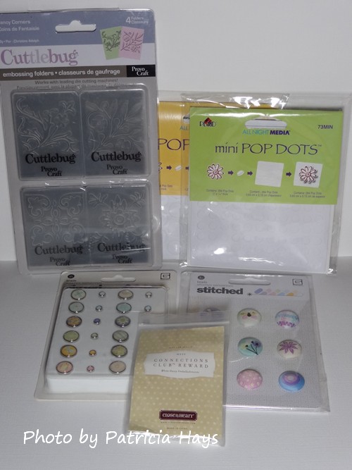
There’s a set of Fancy Corners embossing folders, two packages of Pop Dots, a package of Basic Grey stitched brads, a package of Basic Grey glazed brads, and a package of white daisy embellishments from Close to My Heart.  The Basic Grey products coordinate with their Kioshi papers.  If this blog post receives more than 25 comments, I’ll add in a few other goodies.  I’ll be monitoring comments for spam, so only legitimate comments will be counted for the random drawing.  The winner will be announced in my Sweet ‘n Sassy Digi Challenge post on Friday, February 22, 2013.  Be sure to leave your email address in the email input field so I’ll have a way to contact you if you’re the winner! 🙂

Supplies:
Digital Images: Bunny 1, Spring Add-ons (Sweet ‘n Sassy Stamps)
Cardstock: Soft Sky, Certainly Celery (Stampin’ Up); Pure Luxury White (Gina K. Designs)
Ink: printer ink; Certainly Celery, Daffodil Delight (SU)
Other: fence die (SNSS); standard circle Nestabilities die (Spellbinders); flowers (Prima); half pearl (KaiserCraft); markers (Copic); white gel pen (Uni-ball)

Happy Valentine’s Day!  I hope you’ve been able to share the day with those you love and who love you.

Today I’m sharing a card I actually made yesterday so I could pop it in the mail to my parents.  (They live close enough to me that usually if I get to the post office by 4:30 in the afternoon, they get my mail the next day.)  I’d been thinking of using this stamp image on their Valentine anyway, but yesterday morning when I saw the newly released Freshly Made Sketches layout, it gave me the push to go with that idea.  The color scheme comes from this week’s challenge at ABC Challenges.  I’d been hesitating about participating in the ABC Challenge because I’d struggled with these colors in last week’s Dynamic Duos challenge.  But the colors came together almost naturally for the Medallion image this time.

I stretched the sketch out into a rectangle.  The heart element didn’t quite turn out the way I wanted.  I wanted it to have some embossed texture, but I worried that embossing would distort the heart shape.  So I embossed my red scrap of cardstock and then cut it with the die.  However, when I ran the cardstock through my Big Kick with the die, the pressure flattened the embossing!  Ooops.  So it ended up being a lot more subtle than I really wanted it to be – however, I think I like it better subtle than if it were more distinct!  It was hard to capture it in the photo but if you look closely you should be able to see it.

Thanks for stopping by today!

Supplies:
Stamps: Medallion (Stampin’ Up); So Much Love (Lizzie Anne Designs)
Cardstock: Pretty in Pink, Real Red, Very Vanilla (SU)
Ink: Pretty in Pink, Real Red (SU)
Other: heart die (Sizzix); Victoria embossing folder (ProvoCraft)

This week’s color challenge at 52 {Christmas} Card Throwdown is a bit unusual – brown, yellow and white.  I had originally thought I’d try to make something with some of my scenic stamps.  But when I was putting away my stamps used for the card in my last blog post, my eye stopped on the teddy bear included in one of the stamp sets.  And the proverbial light bulb went on in my head.

It’s hard to see in the photo, but the bear has a bit of fuzzy texture.  I achieved that by working with a scrap of chocolate brown cardstock to loosen the fibers in it, and then gently pulling the front and back apart into two pieces.  The fuzziness was left behind where the paper was separated.  I wanted the main image panel to have some texture too, to give the card more visual interest.  None of my embossing folders nor texture plates seemed to be the right thing, so I decided to use textured cardstock.  The layout of this card is this week’s OWH Stars & Stamps sketch.


So hooray – there’s another Christmas card to stockpile and send to Operation Write Home later this year.  I think this one would be cute to send home to a child, don’t you?  Thanks for stopping by today!

Supplies:
Stamps: Pa-Rum-Pa-Pum-Pum (Lawn Fawn)
Cardstock: So Saffron, Chocolate Chip, Whisper White textured (Stampin’ Up)
Ink: Chocolate Chip (SU)
Other: Seaside Ribbon Originals, square punch [for notching the banner] (SU); standard circle and petite scalloped circle Nestabilities dies (Spellbinders)

Last weekend I found a new challenge blog called Cards in Envy.  I thought the idea of it was pretty smart:  cards made for this challenge must be able to fit easily into a standard envelope, with no big, bulky embellishments.  Since most of the cards I make fall into that category, I thought I’d play along.  This time their challenge is a sketch to follow.  I’d also been throwing different ideas for this week’s Inkspirational color challenge around in my mind for several days.  The idea of kraft and plum didn’t bother me, and kraft and a not-really-navy type of blue didn’t bother me, but the idea of the blue and plum together threw me off.  Finally I decided to combine them all into a birthday card using the Cards in Envy sketch, tweaking it into the usual A2 size.  Here’s the result:

I used Stampin’ Up’s Vintage Violet for my plum color so it would match the ribbon.  The blue brads are a good match to Not Quite Navy, although they appear lighter in the photo.  I had to play around with my Copics a little to find colors to match to the Vintage Violet and Not Quite Navy when colored onto kraft cardstock, since kraft is darker than white.  I did a little masking on the small presents – the actual stamp has a smiley face on it, but I decided not to go with the cutesy look for this card. Although both of the present images come from Christmas-themed stamp sets, I think they work well for year-round use, too.

Thanks for stopping by today!  Just so you know – all comments are read and appreciated.

Supplies:
Stamps: Bows and Holly, Pa-Rum-Pa-Pum-Pum, Hats Off to You (Lawn Fawn)
Cardstock: Vintage Violet, Kraft (Stampin’ Up)
Ink: Tuxedo Black (Memento)
Other: markers (Copic); dimensionals, Vintage Violet stitched ribbon (SU); brads (Making Memories)

I’ve combined the most current Freshly Made Sketches and Dynamic Duos challenges for today’s card.  The pastel colors seemed to lend themselves well to another Mother’s Day card for my next shipment to Operation Write Home.  I hadn’t done any ribbon ruffling for a while, so it was fun to do that to add a feminine touch to the card.  And it felt good to use some more of my designer papers that are several years old.


Thanks for stopping by today!

Supplies for this card:
Stamps: Critters in the ‘Burbs, Happy Everything (Lawn Fawn)
Cardstock: Pure Luxury White (Gina K. Designs); Pool Party, Berry Bliss designer papers (Stampin’ Up)
Ink: Pool Party (SU)
other: Pool Party seam binding (SU); markers (Copic); Labels Nine Nestabilities die (Spellbinders)

Hello! It’s Friday, which means it’s time for a new Sweet ‘n Sassy Digi Challenge! This week we have a color challenge: Pink and Black. You’ll need to create a card using a digital image and showcasing the colors pink and black! You may also use white or cream/ivory cardstock and embellishments. You don’t have to use a Sweet ‘n Sassy digital image, but we really enjoy seeing our participants use them (and you get the chance for extra perks if you do – see the Digi Challenge site for more details!).

I decided to get a start on Mother’s Day cards for Operation Write Home, so that’s how I chose the sentiment and the feminine feel of my card.  The layout is a Sweet Stop sketch from several weeks ago, turned on its side.  In retrospect considering the challenge theme, I probably should have used more pink and black and less ivory, but I’m happy with how the card turned out.

Now it’s your turn to show us what you can create!  Link your card at the Sweet ‘n Sassy Digi Challenge site by midnight eastern time Thursday, February 14.  Be sure to see what the rest of the  Design Team has created and give them some comment love, too.  Links to their blogs are in the left sidebar.  Thanks for stopping by today!

Supplies:
Digital Images: Lotus Flower, Mother’s Day Sentiments (Sweet ‘n Sassy Stamps)
Cardstock: Blushing Bride, Basic Black, Very Vanilla (Stampin’ Up)
Ink: printer ink
Other: Premier colored pencils (Prismacolor); odorless mineral spirits (Houston Arts); Victoria embossing folder (ProvoCraft); half pearls (KaiserCraft)

© 2019 Suffusion theme by Sayontan Sinha