welcome, little girl

Comments Off on welcome, little girl
Sep 302011

Today was a happy card making day because I needed to make a card for a happy occasion.  One of my friends recently gave birth to a little girl.  I know how excited her family is to have this new addition to their family, and how much that baby girl is truly loved by her parents and siblings.

I decided to use papers from Basic Grey’s Two Scoops 6″ x 6″ paper pad and the layout for the September Sketch For You To Try.  I paper pieced the birds, the star and the moon from Two Scoops scraps.  I think it turned out pretty cute, if I say so myself.  😉

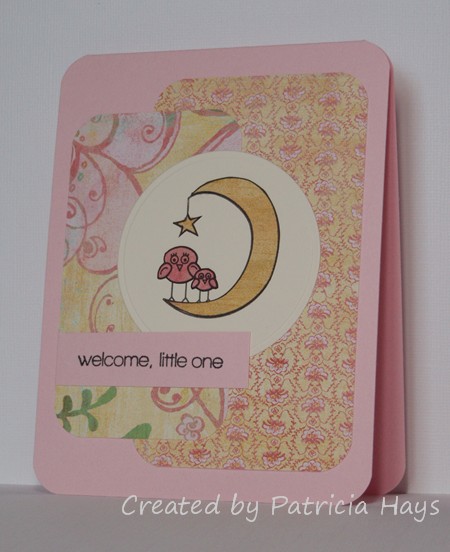
I stayed pretty true to the sketch for this one – no major manipulations, mirror imaging, etc.  I did round the corners of the card itself. Here’s what the sketch looks like:

Thanks for visiting today!  Be sure to come back tomorrow for the Operation Write Home Holiday Blog Hop!

Supplies:
Stamps: Dream Big (Lizzie Anne Designs)
Cardstock: Pink Pirouette, Very Vanilla (Stampin’ Up); various papers from Two Scoops 6″ x 6″ paper pad (Basic Grey)
Ink: Onyx Black (VersaFine)
Other: corner rounder, Cutterbee scissors (EK Success)

rock my world

Comments Off on rock my world
Aug 152011

I’m finally getting around to posting this card that I made earlier this month.  I used the August 2011 Sketch For You To Try sketch layout to create a card for some of the Splitcoaststampers Dare To Get Dirty challenges.

The sentiment strip is Very Vanilla cardstock sponged with Marina Mist ink. I did a little bit of very simple paper piecing on the globe because I wanted the oceans to look like water. I stamped it on the designer paper, colored the continents with a Copic marker, and then cut out and pieced the Earth to the globe stand. The hand stitching is four strands of DMC embroidery floss – 2 strands of blue and 2 strands of green, to coordinate with Marina Mist and Wild Wasabi.

Remember the TV show “In Living Color”?  There was a character on there named Wanda, and one of her frequent lines was “I’m goin’ ROCK yo’ world!”  My husband and I jokingly say that to each other every now and then.  So I think I’m going to hang on to this card and give it to him on our anniversary.

Supplies:
Stamps: School Days (Lizzie Anne Designs)
Cardstock: Marina Mist, Wild Wasabi, Very Vanilla (Stampin’ Up); Cannon, Nathan and Larkspur from Oh Baby! Boy collection (Basic Grey)
Ink: Tuxedo Black (Memento); Marina Mist (SU)
Other: embroidery floss (DMC); dimensionals (SU); sponge

Oh yeah – here’s the actual sketch:

hello chickadee

Comments Off on hello chickadee
Jul 162011

Here’s a quick, simple card I made for the July Sketch For You To Try challenge.  I rotated the sketch 180° for my card.  I pulled out some pretty old designer papers for this one but I thought they fit the farm country feel of the card.  (It’s hard to see, but the strip with the sentiment is speckled.)  The only difficult thing about this card was making sure I didn’t cut off the little chicks’ feet!

Here’s what the original sketch looks like:

Supplies:
Stamps: Critters on the Farm (Lawn Fawn)
Cardstock: Barely Banana textured, Very Vanilla (Stampin’ Up); designer papers from Cottage Papers strips (Keeping Memories Alive)
Ink: Tuxedo Black (Memento)
Other: Premier colored pencils (Prismacolor); odorless mineral spirits (Houston Arts)

It’s time for another Paper Therapy Design Team challenge!  We have a pretty easy, timely challenge for the next two weeks.  Since Father’s Day is just 9 days away, we’d like for you to share a Father’s Day project you’ve made.  It can be a card, a scrapbooking layout, a mini album, whatever – so long as it has a Father’s Day theme, it’s good.  Just be sure to share it at Paper Therapy by Wednesday, June 22.

I decided to use the June Sketch For You To Try sketch for my card’s layout.  I kept the color scheme nearly monochromatic with several Basic Grey designer papers and Stampin’ Up cardstock. I thought the scene would look too “busy” if I colored it.  The sentiment has a kind of scratchy, sketchy look to it that I think coordinates well with the sketchy scene image. I also didn’t fuss with any embellishments, keeping the card as simple as possible while retaining the sketch elements.  I’m pleased with how it turned out.

Supplies:
Stamps: Seaside Sketches (Stampin’ Up); Father’s Day sentiment (Purple Onion Designs)
Cardstock: Bordering Blue, Early Espresso (SU); “Quince”, “Entice” and “Rind” from Ambrosia 6″ x 6″ paper pad (Basic Grey)
Ink: Early Espresso (SU)
Other: standard circle Nestabilities die (Spellbinders)

Here’s the original sketch:

Hi everyone!  Are you ready for another Paper Therapy Design Team challenge?  This time we have an inspiration challenge:  find an ad and let it be the inspiration for your creation. You have until June 8 to share your challenge project at the Paper Therapy website.

I fudged the “ad” part a little bitty bit.  I don’t have any recent magazines here to browse through for ads, so I did some web surfing to search for my inspiration photo.  I found this one:

As soon as I saw it, it reminded me of my Basic Grey Ambrosia papers.  I pulled out that paper pad and sure enough, the colors of several of the papers coordinated perfectly with the colors in this photo.  I liked the gentle curves in the photo too.  I didn’t replicate them exactly, but I did use some rounded elements in my card’s layout, which is this month’s Sketch For You To Try.  I just received this Lawn Fawn stamp set yesterday and it’s *so* adorable, I couldn’t wait to use it.  So, here’s my card:

I’m planning to send this one to Operation Write Home.  Don’t you think it’ll make someone’s day brighter when their favorite military member stationed overseas sends it home?

Supplies:
Stamps: My Silly Valentine (Lawn Fawn)
Cardstock: Marigold Morning, Naturals White (Stampin’ Up); Marmalade, Chutney and Smoke papers from Ambrosia 6″ x 6″ paper pad (Basic Grey)
Ink: Onyx Black (VersaFine)
Other: Premier colored pencils (Prismacolor); odorless mineral spirits (Houston Arts)

At the risk of bogging this post down with graphics, here’s the original sketch:

This is my card for the April Sketch for You to Try challenge.  I took the liberty of squooshing the original square sketch layout into a rectangle. I combined it with the third of the Splitcoaststampers challenges for their Mini Virtual Stamp Night.  The beachy scene for the SCS VSN inspiration challenge made me think of my cattails stamp.  So I tried to create a scene of cattails on a sand dune.

Supplies:
Stamps: Where You Should Be (Ippity by Unity); Treasured Trinkets (Lizzie Anne Designs); Sanded (Stampin’ Up)
Cardstock: Naturals Ivory, Baja Breeze, Chocolate Chip, Spring Flowers designer series paper (SU)
Ink: Chocolate Chip, Baja Breeze (SU)
Other: Chocolate Chip and Garden Green markers, Chocolate Chip buttons, linen thread (SU); sponge

Here’s what the original sketch looks like:

When I was reading the comments I received on my Bunny Blog Hop card, I noticed several people mentioned how sad the bunny looked.  I have to admit I was kind of surprised that people would write that.  Since I’d made the card for Operation Write Home, in my mind I’d kind of personified the bunny on the card as being representative of the military member overseas who will be sending the card home to his or her loved one(s).  I imagine if I were stationed overseas away from my family, I’d be pretty darn sad thinking of them and missing them.

So I’ll warn you now that today’s card has another sad bunny on it because it’s also going to be donated to Operation Write Home.  Because I’m such a technological whiz kid (ROFL!) I used Microsoft Word to print off my image and added in the sentiment along with it.  This time I did some masking and sponged some grass and sky as background before coloring the image.  I added some Liquid Applique to give the bunny the appearance of a fluffy tail.  The color scheme is from this week’s Paper Therapy challenge, and the layout is the March Sketch For You To Try sketch.

My apologies for the quality of the photo.  I had a really hard time getting enough natural light when taking the photo, and I couldn’t get it adjusted all that well with my photo editing software.

Oh, here’s what the sketch looks like:

And here are the supplies I used for today’s card:
Digital Image: Love Bunny – Contemplative (Amber Ink.)
Cardstock: Basics White (Papertrey Ink); Chocolate Chip, Petal Patch designer series paper, Certainly Celery Prints designer series paper (Stampin’ Up)
Ink: Bashful Blue, Certainly Celery (SU)
Other: Premier colored pencils (Prismacolor); odorless mineral spirits (Houston Arts); sponge; Liquid Applique (Marvy)

My 12-year-old son groaned when he saw the sentiment on this card.  I don’t think he enjoys puns on cards very much.  I can’t claim credit for this one, though.  My friend Victoria helped me out with it.

I used a digital image called Lil Car from InStyle Stamps for my focal point.  One thing that’s great about digital images vs. rubber stamps is that it’s really easy to manipulate the image if you want to.  For this card layout I thought the car would look better facing left than right, so I flipped the image horizontally.  I used the February Sketch for You to Try sketch for the layout.  I also wanted to join in the Desert Island Crafts Challenge and fit in 5 of their required elements for the challenge: buttons, only one patterned paper, the color red, no flowers, and swirls.  I guess I could even stretch the “movie or book inspired” element by claiming this was inspired by the movie Cars since Lightning McQueen is mostly red.  LOL

For the image panel, I printed out the car twice.  I colored the road and puffs of smoke on the one I used for the background using Copic markers and used a Nestabilities die to cut it into the circular shape.  On the second image, I colored the body and windows of the car with Copics and then cut out that much of the car with my Cutterbee scissors.  I glued a couple of buttons in place for the tires, and then I used pop dots to adhere the cut out car to the panel. The sentiment was printed using a font called Chinacat.

Supplies:
Digital Image: Lil Car (InStyle Stamps)
Cardstock: Marigold Morning, Real Red, Naturals White (Stampin’ Up); “Marmalade” from Ambrosia 6″ x 6″ paper pad (Basic Grey)
Other: markers R29, R46, C3 and C5 (Copic); buttons (Bazzill); embroidery floss (DMC); standard circle Nestabilities die (Spellbinders); pop dots (Plaid)

Here’s what the original sketch looks like:


In the spirit of full disclosure, the image used on today’s project was provided to me by InStyle Stamps to aid in promoting their products.

happy o'birthday

Comments Off on happy o’birthday
Jan 262011

Just a quick post today to show off a birthday card I made for a friend who celebrated her birthday last week.  She’s of Irish descent, and when I saw this sentiment in the Stampin’ Up catalog, I immediately thought of her.  I used this month’s Sketch For You To Try for the layout and some retired Stampin’ Up products for the card.  The balloon is popped up with dimensional adhesive.

All supplies are from Stampin’ Up except as noted:
Stamps: Birthday Whimsy, On Your Birthday
Cardstock: Cool Caribbean, Whisper White, Bali Breeze designer paper
Ink: Cool Caribbean, Purely Pomegranate
Other: embroidery floss (DMC)

Here’s the actual sketch.  For my card, I turned the sketch sideways and stretched it out into a rectangle.

Ever since I made my purple elephant card, I’ve been wanting to make a more boyish one to kind of go along with it.  This morning I finally did.   

I thought it would be more fun to make both the cards whimsical rather than realistic.  As with the purple card, I have a certain person in mind to send this card to.  I understand that green is that person’s favorite color, which is why I chose it for the elephant and the long panel.  I paired some papers from the Basic Grey “Oh Baby! Boy” collection with this week’s Sketch For You To Try

sfytt-green-elephant.jpg

Supplies:
Stamps: Animal Wishes (Amuse)
Cardstock: Naturals White (Stampin’ Up); Garic, Ivy and Blue Bonnet from Oh Baby! Boy collection (Basic Grey)
Ink: Onyx Black (VersaFine)
Other: Premier colored pencils and blender pencil (Prismacolor); Small and Large Labels dies (Nestabilities); Spots & Dots embossing folder (Cuttlebug)

This week I decided to try a new-to-me challenge called Sketch For You To Try.  I thought this was a pretty neat looking layout.  I had fun making a rather girly card with it even though I didn’t use any pink.  I pulled out a set of Amuse clear stamps that I’ve had for a while but never used.  It has some super cute animal images in it, and I especially like the elephants.  I couldn’t fit them both on the card so I chose the elephant with the bow.  I had to turn the sketch on its side to make it work with the images. 

Now that I’m looking at the card more carefully, I think I should have rounded the inner corners of the floral panels.  Oh well.  Too late now.  I don’t want to risk wrecking everything if I try to take the card apart to round them.  What do you think?

I do have a recipient in mind for this card, but I can’t say who it is yet.  I have to leave the element of surprise intact for when the card arrives at its eventual destination! 

ag.jpg

Supplies:
Stamps: Animal Wishes (Amuse)
Cardstock: Certainly Celery, Naturals Ivory (Stampin’ Up); papers from Kioshi 6″ x 6″ pad (Basic Grey)
Ink: Onyx Black (VersaFine)
Other: Premier colored pencils and blender pencil (Prismacolor); flowers (Prima); Labels Six and petite ovals dies (Nestabilities); micro brads (Recollections); Certainly Celery grosgrain ribbon (SU)

© 2019 Suffusion theme by Sayontan Sinha