Hello!  Welcome to my stop on the Operation Write Home World Card Making Day Blog Hop! I’m excited to be joining over 100 other card makers in celebrating the fun and joy of creating cards by sharing cards made for the purpose of sending to our military members stationed overseas.  Most of these cards are blank inside so that our service members may write to their family and friends back at home.  Others contain notes from the cardmakers to thank these men and women for serving our country.

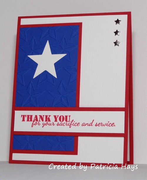
This year, the blog hop is showcasing a theme of thanks.  The card makers were also asked to use one of the many OWH Stars and Stamps sketches to guide them in designing their cards.  I’ve chosen sketch #183 and decided to make an AnyHero card using it.  So later on, I’ll use this card to write a note to a service member stating my appreciation for their dedication to our country.  I did add an extra layer to the sketch so that the star shaped brads wouldn’t poke through the card front to the inside of the card.  After seeing this star design embossing folder used for so many cards in previous OWH blog hops, I finally decided a few months ago that I should get one, too.  The white background panel and the large white star are made from a textured cardstock with a subtle linen weave appearance that’s often difficult for me to capture on film.

Thanks for stopping by today!  I hope you enjoy the hop and come back to visit my blog again, and that you’ll join me in creating cards for this wonderful cause!  Click on the OWH badge at the top of this post to find out where you should hop next.

Supplies:
Stamp: Thank You for your Sacrifice and Service (Unity)
Cardstock: Real Red, Brilliant Blue, Whisper White, Whisper White textured (Stampin’ Up)
Ink: Real Red (SU)
Other: mini star brads (The Paper Studio); Stars dies (Sweet ‘n Sassy Stamps); Stars embossing folder (ProvoCraft)

some CAS stuff

Comments Off on some CAS stuff
Nov 182011

Hi there!  Sorry for the hiatus lately.  I’m back today with a couple CAS cards that I created for the Hope You Can Cling To challenges.

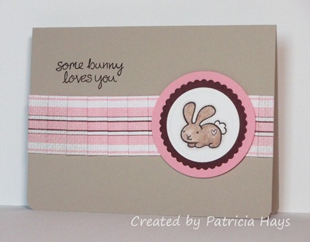
For this card, the challenge was to create a ribbon-like embellishment from paper.  I cut a strip of designer paper and pleated it.  Yes, I’ve used this layout before, but it’s quick and easy and usually turns out a nice-looking card (if I say so myself).  I used one of my favorite Lawn Fawn sets, too.

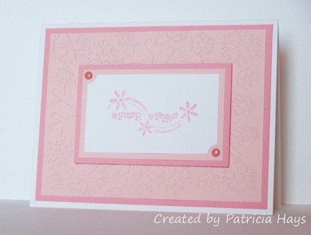
Another challenge called for creating a Christmas or winter themed card using pink as a dominant color.  I decided to go monochromatic with a couple shades of pink against a white background.   The embossing folder I used frustrates me sometimes because the embossed design is smaller than what most folders produce.  But I do like the snowflake pattern a lot.

Supplies for the bunny card:
Stamps: My Silly Valentine (Lawn Fawn)
Cardstock: Sahara Sand, Pretty in Pink, Chocolate Chip, Whisper White, Tea & Crumpets designer paper (Stampin’ Up)
Ink: Onyx Black (VersaFine)
Other: Premier colored pencils (Prismacolor); odorless mineral spirits (Houston Arts); standard circle and petite scalloped circle Nestabilities dies (Spellbinders); corner rounder punch (SU)

Supplies for the winter card:
Stamps: Winter Wishes (Unity)
Cardstock: Pink Pirouette, Pretty in Pink (SU); Luxury White (Gina K. Designs)
Ink: Pretty in Pink (SU)
Other: ticket corner punch (SU); Snowflake embossing folder (QuicKutz); brads (Bazzill)

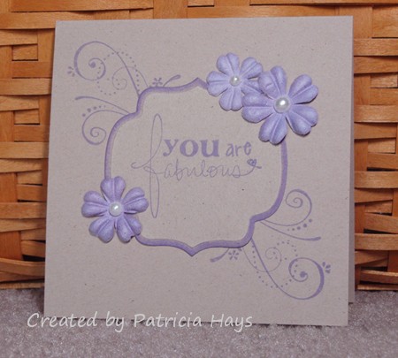
This week’s Clean and Simple challenge at Splitcoaststampers.com is to use flourishes in your creation.  In the past when I’ve tried to use flourish stamps, I rarely felt like I did them justice, so I wanted to push myself a little by doing this challenge.  I combined the Clean and Simple challenge with one of the Mini Virtual Stamp Night challenges and came up with the card I’m showing today.  I’m pleased with the way it turned out!  The only problem is, I can’t decide whether to keep it to send to one of my friends, or to donate it to Operation Write Home!

Supplies:
Stamps: Where You Should Be (Ippity by Unity); Priceless (Stampin’ Up)
Cardstock: Kraft (SU)
Ink: Wisteria chalk ink (ColorBox)
Other: flowers (Prima Marketing); half pearls (KaiserCraft); Labels Nine Nestabilities die (Spellbinders); sponge

I have some exciting news today! I was selected as a Guest Designer for Splitcoaststampers’ Clean and Simple challenges, and this is my week to serve in that capacity! I’m thrilled to have been chosen from the many people who tried out for the winter design team.

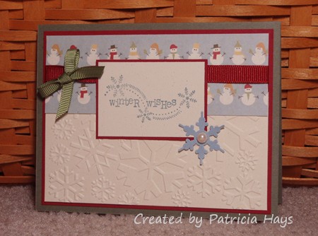
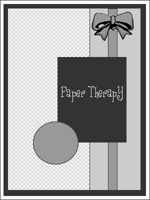
Since it’s Monday, it’s also time for a new weekly challenge at Paper Therapy!  We have a sketch challenge this week.  I combined the sketch with this week’s SCS Clean and Simple theme, “A Day in the Snow.” 

When I learned the CAS challenge theme, I knew I wanted to use this snowman designer paper. Isn’t it darling?  I had originally planned to use a different sentiment.  Then in Friday’s mail I received this stamp, which I’d won as a trivia contest prize.  It was perfect for the theme so I decided to use it instead of my first choice.  I turned the sketch sideways – here’s how it was originally drawn:

I hope that my readers will join in the challenges this week at both Paper Therapy and Splitcoaststampers!  I’d love to see what y’all create!

Here are the supplies for today’s card:
Stamps: Winter Wishes (Unity)
Cardstock: Always Artichoke, Cherry Cobbler, Naturals Ivory, Bordering Blue (Stampin’ Up); snowman designer paper from Winter Wonderland paper pack (Lizzie Anne Designs)
Ink: Bordering Blue (SU)
Other: Always Artichoke grosgrain ribbon (SU); Bordeaux grosgrain ribbon (Offray); snowflake punch (EK Success); half pearl (KaiserCraft); Snowflake embossing folder (QuicKutz)

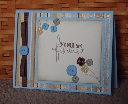
Today’s card is another one for the Splitcoaststampers.com Hope You Can Cling To challenges. This challenge was to use buttons.

I like buttons. I have quite a few of them in my craft supplies. Unfortunately, I don’t often think to use them as embellishments. So this challenge was a good one for me.

A while back I’d seen a card in the Splitcoast gallery that I really liked, and I used a lot of its design elements for my card.  I used the same stamp set.  The layout is pretty much the same, except that I stretched it out for a rectangular card base vs. the original square shape and placed the branches differently.  I also changed the color scheme and simplified the ribbon treatment.  I used less buttons because I didn’t have any really tiny ones.

I have to admit that I’m pleased with my results. I hope you like it, too.

Supplies:
Stamps: Where You Should Be (Ippity by Unity)
Cardstock: Bashful Blue, Spring Showers designer paper (Stampin’ Up); Vintage Cream (Papertrey Ink)
Ink: Chocolate Chip (SU)
Other: buttons, Chocolate Chip grosgrain ribbon (SU); sponge

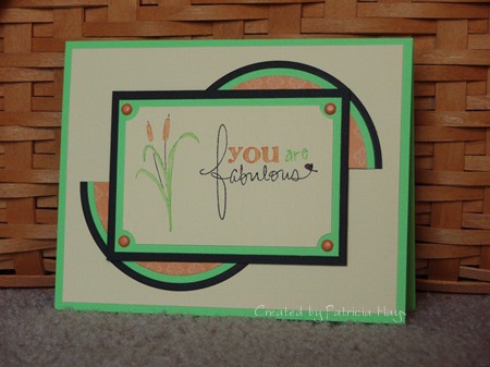
This week’s Paper Therapy challenge is a color combination challenge.  We were to use colors similar to Stampin’ Up’s Basic Black, Green Galore, Pumpkin Pie and So Saffron. 

Matching the colors wasn’t a problem for me because I have lots of Stampin’ Up cardstock.  But I decided to substitute Barely Banana for So Saffron because I wanted to use textured cardstock.  Unfortunately, I don’t think the texture shows very well in the photo.  I used an old Splitcoaststampers sketch challenge for the layout. 

Please come join us at Paper Therapy and show us what you can do with these colors!

Supplies:
Stamps: Where You Should Be (Ippity by Unity)
Cardstock: Barely Banana textured, Green Galore, Basic Black, Baja Breeze designer paper (Stampin’ Up)
Ink: Pumpkin Pie, Green Galore, and Basic Black markers (SU)
Other: ticket corner punch (SU); mini brads (Making Memories)

© 2019 Suffusion theme by Sayontan Sinha