I like cupcakes.  So, what better way to start off a Monday than with a card showcasing not one, but two cupcakes?  🙂

This week’s Paper Therapy challenge is a sketch challenge.  This cupcake stamp fit perfectly into the diamond shaped elements on the sketch, so I decided to make a birthday card featuring that image.  I used some Shimmerz paints to color the cupcake and its wrapper.  I had a hard time capturing the shimmer when I took the photo, but trust me, it’s there.

And now I have another card to send to Operation Write Home.

Here is the sketch:

And here is the list of supplies for today’s card. 

Stamps: Bitty Basics, Birthday Whimsy (Stampin’ Up)
Cardstock: Purely Pomegranate, Whisper White, Berry Bliss designer series paper (SU)
Ink: Purely Pomegranate (SU); Onyx Black (VersaFine)
Other: Purely Pomegranate ribbon, Chocolate Chip corduroy brad (SU); Choc-o-lot and Opal paints (Shimmerz); square punches (EK Success)

My 12-year-old son groaned when he saw the sentiment on this card.  I don’t think he enjoys puns on cards very much.  I can’t claim credit for this one, though.  My friend Victoria helped me out with it.

I used a digital image called Lil Car from InStyle Stamps for my focal point.  One thing that’s great about digital images vs. rubber stamps is that it’s really easy to manipulate the image if you want to.  For this card layout I thought the car would look better facing left than right, so I flipped the image horizontally.  I used the February Sketch for You to Try sketch for the layout.  I also wanted to join in the Desert Island Crafts Challenge and fit in 5 of their required elements for the challenge: buttons, only one patterned paper, the color red, no flowers, and swirls.  I guess I could even stretch the “movie or book inspired” element by claiming this was inspired by the movie Cars since Lightning McQueen is mostly red.  LOL

For the image panel, I printed out the car twice.  I colored the road and puffs of smoke on the one I used for the background using Copic markers and used a Nestabilities die to cut it into the circular shape.  On the second image, I colored the body and windows of the car with Copics and then cut out that much of the car with my Cutterbee scissors.  I glued a couple of buttons in place for the tires, and then I used pop dots to adhere the cut out car to the panel. The sentiment was printed using a font called Chinacat.

Supplies:
Digital Image: Lil Car (InStyle Stamps)
Cardstock: Marigold Morning, Real Red, Naturals White (Stampin’ Up); “Marmalade” from Ambrosia 6″ x 6″ paper pad (Basic Grey)
Other: markers R29, R46, C3 and C5 (Copic); buttons (Bazzill); embroidery floss (DMC); standard circle Nestabilities die (Spellbinders); pop dots (Plaid)

Here’s what the original sketch looks like:


In the spirit of full disclosure, the image used on today’s project was provided to me by InStyle Stamps to aid in promoting their products.

It’s Monday!  Are you ready for another Paper Therapy challenge?  This week the challenge is to use the negative part left over from a die cut.

The card I made for this challenge was a really quick and easy one.  I used the frame left over from cutting out the So Saffron oval on my “quick as a bunny” card.  To give some depth to the card, I used dimensional adhesive to attach the frame to the card base.  The flowers and sentiment are stamped directly onto the card base.  I used my Stampin’ Up markers to add a bit of shading to the flowers. I chose the sentiment with Operation Write Home in mind.  I’m trying to build up a stash of cards to send to them by the end of March.

Supplies:
Stamps: Spring Garden (Stampin’ Up); Tag Lines (Gina K. Designs)
Cardstock: Very Vanilla, So Saffron (SU)
Ink: So Saffron, Mellow Moss (SU)
Other: Stampin’ Write markers, dimensional adhesive (SU); petite oval Nestabilities die (Spellbinders)

Be sure to check out the other Paper Therapy Design Team members’ work on their blogs, listed in the sidebar on the left.  They’ve done some great stuff this week!

How’s that for an attention-grabbing post title?  Ha ha!  I’ll be honest – for me, sometimes the hardest part of writing blog posts is coming up with a catchy title that I haven’t already used and that fits with the card.

Today’s card follows this week’s sketch over at the Operation Write Home Stars & Stamps blog.  For the week of February 7, the Clean & Simple challenge at Splitcoaststampers.com was to use the colors Daffodil Delight, Peach Parfait, Poppy Parade, and white.   I don’t have inks in all of those colors, but I do have cardstock, so I knew I’d have to use the cardstock to create the majority of my image.  I decided to punch flowers out of the cardstock, so I added some green ink for the leaves and stems.  Some half pearls perked up the flowers’ centers, and I used the same green ink to add a simple sentiment that’ll be suitable for one of our military members to send home to his or her loved ones.

Supplies:
Stamps: Watercolor Garden II, Trendy Trees (Stampin’ Up)
Cardstock: Daffodil Delight, Poppy Parade, Peach Parfait, Whisper White (SU)
Ink: Garden Green (SU)
Other: half pearls (KaiserCraft); Spring Bouquet punch (SU)

AND… I have an announcement! One of the people who commented on my Virtual Valentine’s Day Blog Hop post was chosen to win a prize! Congratulations to Jessi Myers – you’ve won 4 cling rubber stamps from Stampendous’ new release! Jessi, be sure to visit Taylor’s blog, The Quiet Moments, for the details on how to claim your prize.

Hello!  Today I’ll be sharing the last of the Valentine-type projects I’ve made this year.  If you’re looking for the Virtual Valentine’s Day Blog Hop, you’ll want to click here: BLOG HOP post

Being on the InStyle Stamps design team has given me the chance recently to work with some really neat products from Plaid.  I received an assortment of Mod Podge glues, two colors of Extreme Glitter, Pop Dots and Mini Pop Dots.  Because I was feeling under the weather when I was working on these projects I didn’t get too adventuresome with the products, but hopefully soon I’ll be able to play with them some more.

Before I show you my projects, I want to talk about the Extreme Glitter.  I have to admit that for years I’ve stayed as far away from glitter as humanly possible.  I really despise the way it gets all over the place and sticks to everything and flakes off your project and you can’t get rid of it.  Well, Extreme Glitter is very different. It’s like a cross between a glue and a paint with lots of glitter mixed into it.  You simply brush it onto your project with a paint brush and let it dry. When I was just playing with the Extreme Glitter to try it out, I painted a reasonably thick (about 1/16″) coat of it on a scrap piece of cardstock. I gave it about an hour to dry, per the directions on the bottle.  Then I took my glittered scrap of cardstock and I rubbed my fingers over the glitter.  And I bent the cardstock.  And I cut into the painted part.   And the glitter seriously DID NOT FLAKE OFF!!!  I am SO impressed by that!  I thought, “WOW – this gives Operation Write Home cardmakers a way to use glitter safely on their cards!” (Glitter that flakes off onto our heroes’ clothing can be detected by night vision equipment, putting them at higher risk of danger – so glitter is generally a big no-no on OWH cards.)  I never thought I’d like glitter, but Extreme Glitter is helping me see it in a whole new light.

So now, here’s the card I made.  Because I plan to donate it to Operation Write Home and their Valentine’s Day deadline is long past, I wanted to keep it a kind of generic “love” theme.  The layout for the card is this month’s InStyle Stamps sketch challenge.  I used the InStyle Stamps Kissing Birds image.  Isn’t it adorable?  After I colored the birds with Copic markers, I painted their wings with red Extreme Glitter.  (I love that the wings are heart shaped.  TOO CUTE!) I added some designer papers from Basic Grey’s Sugar Rush 6″ x 6″ paper pad and a sentiment from Lizzie Anne Designs’ stamp set So Much Love.  The circle and scalloped circle were cut with Nestabilities dies and attached to the card with mini Pop Dots. I didn’t have a very good photography day so I don’t know how well you’ll be able to see the glitter in the photo.

Next… Several months ago, I found an 8″ x 6″ rectangular tin on clearance at Michael’s for only $1.99 (the original price was something like $7.99).   I knew I’d be able to decorate it and put it to use some day – and the Plaid products gave me the opportunity to do it.  I decided to make it a kind of a treasure box to put special things in, like the birthday cards my sons give me.  I chose some papers from Basic Grey’s Blush collection, cut them to the size needed to cover the sides and top of the tin, and used Matte Mod Podge to adhere the papers to the tin.  Mom Love, one of InStyle Stamps’ newest digital images, is gracing the top of the tin.  She’s on a Nestabilities Labels Eight die cut.  I colored much of her with Copic markers, but decided to paper piece her dress and hair bow with another paper from the BG Blush collection.  Her string of hearts is also paper pieced from one of the Blush papers.  The paper for the hearts is red, and I brushed a thin coat of iridescent Extreme Glitter over the hearts before I cut them out.  (And no glitter flaked off when I cut them!)  I added the phrase “Things I Love” with the sticker letters from the Blush collection.  I considered adding some Prima flowers to the top of the tin because it looks a little plain to me, but my 12-year-old son told me it looked good the way it was.  I may just go back and add some anyway.  😉

Here’s another photo that shows the side of the tin better, so you can see how the colors of the papers really do coordinate.  (Did I mention that I had a bad photography day when I was working on these projects?)

Thanks for looking at my projects today!  If you have any questions about them, feel welcome to ask in a comment!


In the spirit of full disclosure, the images used on today’s projects were provided to me by InStyle Stamps to aid in promoting their products.

If you are here for the Virtual Valentine’s Day Blog Hop, please click here – BLOG HOP POST.  Thanks!

I recently discovered a new challenge blog, Desert Islands Crafts Challenge.  Those of you who know me well know that I have a difficult time resisting cardmaking challenges!  This one sounded pretty neat so I decided to play along – and then I realized the challenge ended in 2 and a half hours!  YIKES!

So here’s what I very quickly came up with.  The challenge blog listed 10 different elements, of which a minimum of three were required to be on the project to qualify for the challenge.  I had the bunny image from Amber Ink printed out as an “extra” from my blog hop card posted earlier today, and I colored it with Prismacolor pencils and odorless mineral spirits.  I embossed the white background panel with a Cuttlebug folder, added some ribbon and some Prima flowers, and added pearls for the flower centers.  I would consider the Nestabilities shapes to be die cuts, too – so that gave me four of the required elements.  Hooray!

I hope you’ll check out the Desert Islands Craft Challenge and help make their new venture a success!

Supplies:
Digital Image: Bunny Hug (Amber Ink)
Cardstock: So Saffron, Groovy Guava, Whisper White (Stampin’ Up)
Other: Premier colored pencils (Prismacolor); odorless mineral spirits (Houston Arts); flowers (Prima Marketing); pearls (Kaisercraft); Groovy Guava ribbon (SU); petite oval scalloped and petite oval plain Nestabilities dies (Spellbinders); Paisley embossing folder (Cuttlebug)

Today I’m super excited to be participating in the Virtual Valentine’s Day Blog Hop!  A group of over 50 crafters has been organized by the fabulous Taylor Usry and we are all showcasing Valentine projects on our blogs today!  If you’ve just arrived from Wendy Price’s awesome blog, welcome!  If you came here for my weekly Paper Therapy challenge post, I hope you’ll take the time to hop to at least some of the other blogs in the group because you’ll be in for a real treat for your eyes.

Before I get to my card, I thought you’d want to know that there is a terrific assortment of 21 prizes from 19 different sponsors being given away in connection with the Hop.  Prize winners will be drawn from random comments on the participating blog hop posts – so, the more blogs you visit and comment on, the more chances for you to win!  You can comment until 6:00 pm EST on Thursday, February 17 to be eligible for a prize, and winners will be announced on Friday, February 18.  What kind of prizes are being awarded?  Check out this list:

Stamp Insanity –  1 digital stamp set of the winner’s choice
Meljens Designs – 4 digital images of the winner’s choice
Pixie Dust Studio – 2 digital images of the winner’s choice
Lizzie Anne Designs – $10 gift certificate to the Lizzie Anne Designs store (donated by Taylor Usry)
Christian Paper Crafts – 1 year general membership
Paper Pretties – 3 total winners: 1 person will receive Timeless Love acrylic stamp set; 2 people will receive 5 digital images of their choice from the store
Karber Digital Images – winner’s choice of 2 digital images
Di’s Digi Downloads – 5 digital images of the winner’s choice
The Scrappychick Boutique – 2 6″x6″ Cosmo Cricket paper pads to one winner
Stampendous – 4 cling rubber stamps from their new release to one winner
Pink Cat Studio – 5 digital images of the winner’s choice
Amber Ink – $10 gift certificate to the Amber Ink store
Simply Betty Stamps – 3 digital images of the winner’s choice
Mark’s Finest Papers – 1 stamp set of the company’s choice to the winner
Dreamweaver Stencils – 1 “love” stencil, 1 rose stencil, pearlescent embossing paste and a palette knife
Chi Chi Memories Designs – Meaning of Love Digital Stamp Set to one winner
Little Potato House – $20 gift certificate to the Little Potato House store
Kenny K digis: 4 digis to one winner
Kraftin’ Kimmie Stamps: winner’s choice of 2 rubber stamps

So… now, on to today’s card.  This week’s Paper Therapy challenge is to make a Valentine – and that played into this blog hop perfectly!  Like a lot of my cards, today’s has a story behind it.  Remember a few weeks ago I shared the card I planned to give my husband?  That didn’t pan out.  I got hit with the flu the middle of last week, which messed up my plans for making cards for my family to send to my parents and my husband’s parents.  Because I was under a time crunch and the card I’d made for my husband was so quick and easy to make, I ended up making a twin of it and mailed them out Friday afternoon.  Unfortunately, that left me back at the drawing board for my husband’s card.

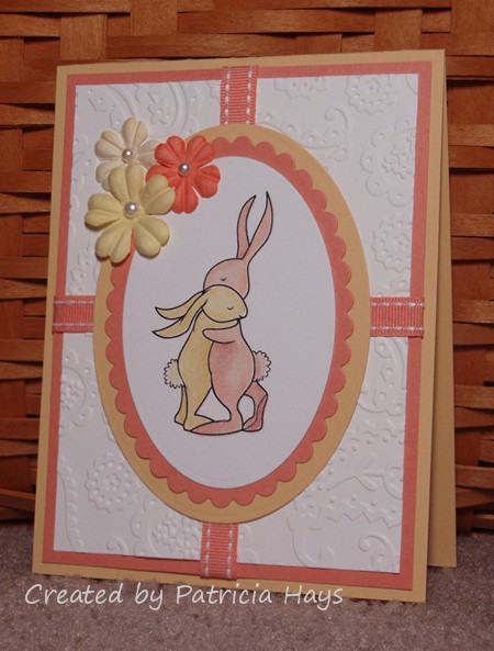
I didn’t think I should use a tree image again – and besides, I’d used a tree image on the Valentine I gave him last year.  He’s not into the red and pink thing, with hearts and lots of mushy stuff.  Love birds didn’t seem “right.”

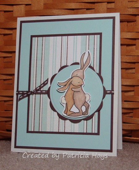
Then I remembered I had a sweet bunny image from Amber Ink.  Oh yes – that would work.  And I decided to color the bunnies brown rather than grey, because we don’t need any additional reminders of our grey hares, um, hairs.  The Chocolate Chip and Soft Sky striped paper seemed like a good idea, to stay away from the traditional girly looking Valentine colors.  My first attempt at printing out a sentiment didn’t go very well so I decided I’d just scrap that idea and write something about hugs or snuggle bunnies inside.  Then I thought about using Liquid Applique on the bunnies’ tails to make them look fluffy. The bunnies are popped up from the background with dimensional adhesive.

And the card gradually came to life:

And of course there’s the additional pun of bunnies on a card for a blog hop.  🙂

Thanks for stopping by today and reading through this really long post.  The next stop on this tour of Valentines is Maria Levine’s lovely blog.  However, if you somehow get stuck or lost, you can always go back to Taylor’s blog and find your way again.  Be sure to thank Taylor for organizing this hop!  Enjoy a happy Valentine’s Day!

Supplies for today’s card:
Digital image: Bunny Hug (Amber Ink)
Cardstock: Naturals White, Chocolate Chip, Soft Sky, Afternoon Tea designer paper (Stampin’ Up)
Other: Seaside Ribbon Originals ribbon, dimensionals (SU); Premier colored pencils (Prismacolor); odorless mineral spirits (Houston Arts); Liquid Applique (Marvy Uchida)

what's up in the barnyard

Comments Off on what’s up in the barnyard
Feb 102011

Hi there! Just a short post today because I’m feeling a little under the weather. Bleah.

Today’s card incorporates several challenges from the Operation Write Home Stars and Stamps blog. I used two recent Midweek Throwdown Challenges – one to make a card that a hero could send home to his or her child, and one to make a card using a barnyard theme.  I combined those ideas with their sketch challenge #54.  These cute little animals from A Muse always make me grin, and I hope they bring a smile to your face, too.

Supplies:
Stamps: Animal Wishes (A Muse)
Cardstock: Confetti White (Stampin’ Up); various papers from “Green at Heart” 6″ x 6″ paper pad (Basic Grey)
Ink: Onyx Black (VersaFine)
Other: Threading Water punch (Fiskars); linen thread (SU); standard circle and petite scalloped circle Nestabilities dies (Spellbinders); markers (Copic)

Hey everyone. I’m sorry for the lack of posts during my recent blog makeover.  There’s still one kink that needs to be worked out regarding the calendar, but otherwise, I’m back.

Today’s card is for this week’s Paper Therapy challenge.  This time it’s a color challenge – rose red, pink, lavendar and white.  The colors made me think of flowers, and I took the liberty of adding a bit of green for leaves.  Unfortunately the photo doesn’t capture the shimmer of the white cardstock. I decided to keep the card relatively simple, without adding embellishments, because of the shimmer.

All supplies are from Stampin’ Up.
Stamps: Roses in Winter
Cardstock: Shimmery White, Rose Red, Pretty in Pink
Ink: Pretty in Pink, Rose Red, Almost Amethyst, Mellow Moss

© 2019 Suffusion theme by Sayontan Sinha