Sorry for the corny post title but I couldn’t think of anything better.  Today’s card is what I created for the 10th Desert Islands Crafts Challenge.  I doubled up on two of the itinerary elements – one was a “found object” (not a specific craft item) and one was something metal.  Well, I found some metal things: bottle caps.  I had saved these for a while from my husband’s Starr Hill Northern Lights Pale Ale, and I flattened them in my Big Kick.  I guess they could count as another one of the required elements: a handmade embellishment. I also chose three different designer papers – the red star paper, the striped paper behind the bottle caps, and the different striped scrap for the sentiment panel. I dove way back into the Stars & Stamps blog archives and found sketch #3 for my layout. I’m not sure if the “thanks” stamp belongs to a set – I received it as a freebie in an order from Lawn Fawn.

Supplies:
Stamps: Lawn Fawn
Cardstock: River Rock, Western Sky designer papers (Stampin’ Up)
Ink: Tuxedo Black (Memento)
Other: bottle caps

can't stop thinking of you

Comments Off on can’t stop thinking of you
Jun 272011

Whew – I did it!  My goal for the Operation Write Home Start the Second Million Challenge was to send 50 cards to them.  I finished making card #50 Sunday night!  Now I need to box them all up so I can get them in today’s mail.  Priority Mail should get them to my shipper before the June 30 deadline.  Of course, this doesn’t bring an end to my making cards for OWH.  It just means that now I’ll be starting on another box of cards to send them! 🙂

Today I’m sharing a couple of the Thinking of You themed cards that are in this shipment.  I created both of them with the idea that our heroes overseas could send them home to their child.

The first card uses a digital image from InStyle Stamps and a sentiment stamp I found in the dollar bin at Michael’s.  I thought it was a great sentiment for OWH cards. You can see some of the liner cardstock peeking out on the inside back of the card.  Since our heroes generally don’t have access to ink that will show up on dark cardstock, dark cards need to be lined with a light color. The layout is based on the Stars & Stamps blog sketch #74; I’ve simply changed the circle in the sketch to an oval.

The next card uses some more of those adorable Lawn Fawn stamps.  This whole scene is created from scraps of Basic Grey designer papers, except for the sky because that needed a kind of large piece.

I imagine it would be really difficult to be stationed overseas far away from my children – even more so if they were younger than they are now.  Making these cards is my way of telling our military members “thank you” for the sacrifices they make in order to make our world a safer place.

Supplies for the first card:
Digital image: Jacob (InStyle Stamps)
Sentiment stamp: Studio G
Cardstock: Close to Cocoa, Baja Breeze (Stampin’ Up); Basics White (Papertrey Ink); designer paper from Memoirs 6″ x 6″ paper pad (Inque Boutique)
Ink: Close to Cocoa (SU – for sentiment); printer ink
Other: markers (Copic); petite oval Nestabilities die (Spellbinders)

Supplies for the second card:
Stamps: Critters in the ‘Burbs, Sophie’s Sentiments (Lawn Fawn)
Cardstock: Vintage Cream (Papertrey Ink – for card base); designer papers from Ambrosia, Kioshi, and Phoebe 6″ x 6″ paper pads (Basic Grey)
Ink: Tuxedo Black (Memento); Green Galore (SU)
Other: sponge

birthday balloons

Comments Off on birthday balloons
Jun 242011

Good morning!  It’s the fourth Friday of the month – which means it’s time for another Paper Therapy Design Team challenge!  This time, because Canada Day and Independence Day are quickly approaching, the challenge is to use red, white, and/or blue in your project.  That’s pretty easy, right?  Be sure to share your project in the Paper Therapy challenge forum by July 6 to be considered for a prize!

I did a little fudging with my project so that it would also work for a couple of this week’s challenges at Splitcoaststampers.  The CAS challenge is to make a tall, narrow card.  I kept mine the standard 5.5″ height but cut the width down to 3.5″.  I wanted my card to be able to fit into a standard envelope for Operation Write Home.  The color challenge is for the colors Cherry Cobbler, Night of Navy, and Crumb Cake.  That gave me variations on the usual patriotic red and blue.  I added white with the twine and by stamping the balloons onto white cardstock before cutting them out and adhering them to the card. The cherry one is attached with dimensional adhesive.

There’s a reason why I decided to make a birthday card rather than something overtly patriotic.  Both of my grandfathers were born on the 4th of July.  Although they were both born in Europe and emigrated to the United States with their families while they were children, they embraced their new country as their home.  My childhood memories of 4th of July celebrations are of birthday parties for them, as well as for the United States.  Sadly, both of my grandfathers are deceased now, but there hasn’t been an Independence Day that I haven’t thought of them and how brave their parents were to start a new life here in Virginia, not knowing for certain what they’d face when they arrived here.

Supplies:
Stamps: Birthday Whimsy (Stampin’ Up)
Cardstock: Crumb Cake, Whisper White (SU)
Ink: Cherry Cobbler, Night of Navy
Other: dimensionals (SU); twine (Really Reasonable Ribbon)

Late last night I noticed that this week’s Midweek Throwdown challenge on the OWH Stars & Stamps blog is for cards with a “love you” theme.  Well, that was easy to meet since I’ve been making several for the Start the Second Million Challenge.  I’ve already shared my simply love you card.  Here are some more that I’ll be sending to Operation Write Home in the next few days.

First is another starburst card.  I did it as a mirror image of the Father’s Day cards I shared earlier this week because I get bored making too many near-duplicate cards.  Isn’t this bunny from Lawn Fawn adorable?  I just love him.

The next card uses the layout from OWH Stars & Stamps sketch #73.  Well, actually, it’s a mirror image too because I’d already used this sketch for a few “miss you” cards before I started on this one.  I also changed the sizes of the blocks a bit to add a couple layers.  Here I was trying for something more masculine that one of our military women could send home to her husband or boyfriend.

The next card twists the sentiment a bit but it still says the same basic thing.  I used OWH Stars & Stamps sketch #66 for this one.  Once again I was going for something that could work as a masculine card, but I think maybe this one really ended up more gender neutral.  Those are love birds, yes?


Even though my perfect pear card, my apple card, and my chairished card don’t specifically use the words “love you” I think they fit the theme too.  There are lots of ways to convey thoughts of love!

Supply lists:

The bunny card:
Stamps: My Silly Valentine (Lawn Fawn)
Cardstock: Barely Banana, Very Vanilla, Always Amethyst (Stampin’ Up); designer papers from Sugar Rush 6″ x 6″ paper pad (Basic Grey)
Ink: Onyx Black (VersaFine)
Other: Always Amethyst marker (SU); standard circle and big scalloped circle Nestabilities dies (Spellbinders)

The blue card:
Stamps: Everyday Sayings (Lizzie Anne Designs)
Cardstock: Wild Wasabi (Stampin’ Up); designer papers from Two Scoops 6″ x 6″ paper pad (Basic Grey)
Ink: Blue Bayou (SU)
Other: Heart #3 Sizzlits die (Sizzix); chipboard; sponge

The bird card:
Stamps: Riveting (Stampin’ Up)
Cardstock: Kiwi Kiss, Baja Breeze, Whisper White (SU); designer papers from Offbeat 6″ x 6″ paper pad (Basic Grey)
Ink: Baja Breeze (SU)
Other: standard circle and big scalloped circle Nestabilities dies (Spellbinders)

It’s starting to get down to the wire for me to be finishing up the cards I want to make for the Operation Write Home Second Million Challenge!  The shippers need to receive the challenge cards by June 30, which means that the latest to mail them using Priority Mail is Monday, June 27.  I’ve been working slowly but surely to meet my goal of sending 50 cards for the troops.

Sketch challenges come in really handy for me when I’m trying to make a lot of cards in a short amount of time.  I love being able to get different looks simply by changing color schemes or by flipping the layout.

The cards I have today are based on the Stars & Stamps Blog sketch #74 layout.  I’ve tweaked the layout a little for both of my cards.  In the first one, I substituted a die cut butterfly for the circular shape.  I also accidentally misaligned the horizontal strip – it’s centered on the sketch, but mine is a bit high.  Oops.  I had a difficult time photographing this card and the colors are a little off.  The card base looks much whiter and brighter on the photo than it should – it’s cream in real life.  But the picture is good enough to give an idea of what the card is supposed to look like. The body of the butterfly is attached directly to the card base, but the wings are popped up slightly and attached with dimensional adhesive, to keep the card from looking so flat.

For the second card, I substituted floral Nestabilities dies for circles, and I decided to use the mirror image of the sketch.

And now I’d better get back to creating!

Supplies for the butterfly card:
Stamps: Tag Lines (Gina K. Designs)
Cardstock: Vintage Cream (Papertrey Ink); designer papers from Two Scoops 6″ x 6″ paper pad (Basic Grey)
Ink: Rose Red (Stampin’ Up)
Other: Beautiful Butterflies die (SU); half pearls (KaiserCraft); sponge

Supplies for the dahlia card:
Stamps: Riveting (Stampin’ Up)
Cardstock: Pink Pirouette, Pretty in Pink, Rose Red, Raspberry Tart designer paper (SU)
Ink: Rose Red (SU)
Other: Pink Pirouette striped ribbon (SU); Dahlia Nestabilities dies (Spellbinders)

Since I started the Father’s Day card making several months ago because of Operation Write Home‘s deadline, it seems like Father’s Day has gone on for quite a while!  Today I’m sharing two last cards for the occasion. The starburst technique used on these was featured on the Stars & Stamps blog last week.  Even though it looks kind of difficult, it really isn’t when you follow the tutorial.  I found it to be a fun way to use several designer papers in one card.

The first card is the one my family gave to my dad. I had stamped the sentiment with Crumb Cake ink first and then decided it looked too light. So I overstamped it with Night of Navy at a slight angle so the Crumb Cake looks like a shadow. All the edges of the designer papers, the sentiment circle, and the panel itself are sponged with Crumb Cake ink.

Supplies:
Stamps: All Year Cheer II (Stampin’ Up)
Cardstock: Night of Navy, Crumb Cake (SU); designer papers from Boxer 6″ x 6″ paper pad (Basic Grey)
Ink: Crumb Cake, Night of Navy (SU)
Other: standard circle Nestabilities die (Spellbinders); sponge

Because I enjoyed making the first card, I decided to use the same technique on the card I gave my husband. I just changed up the color scheme.

Supplies:
Stamps: All Year Cheer II (Stampin’ Up)
Cardstock: Baja Breeze, Chocolate Chip, Very Vanilla (SU); designer papers from Offbeat 6″ x 6″ paper pad (Basic Grey)
Ink: Baja Breeze, Chocolate Chip (SU)
Other: standard circle Nestabilities die (Spellbinders); sponge

simply love you

Comments Off on simply love you
Jun 172011

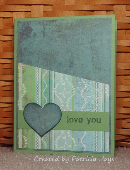
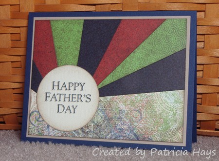
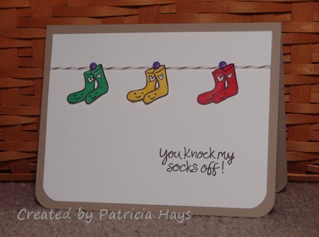
This week’s CAS challenge at Splitcoaststampers proved to really be a challenge for me.  It’s a sketch challenge, and I usually enjoy doing those.  But the crafting mojo just wasn’t flowing this week.

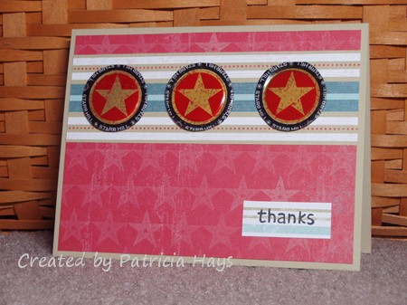
My first attempt turned out all right for the most part, but after I had the card all assembled I felt it would have looked better if I’d stamped the sentiment in a different color.  I was afraid I’d mess up the whole thing if I tried overstamping it so that the first color looked like a shadow.  Oh well.  But the card is still good enough for Operation Write Home, so it’s in my box of cards waiting to be shipped later this month.

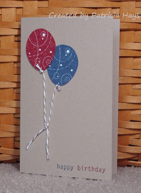
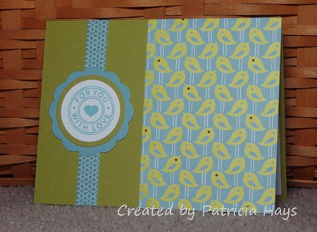
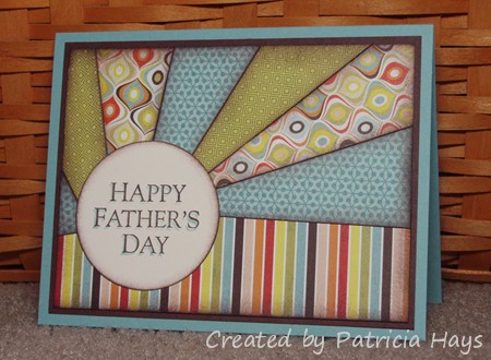
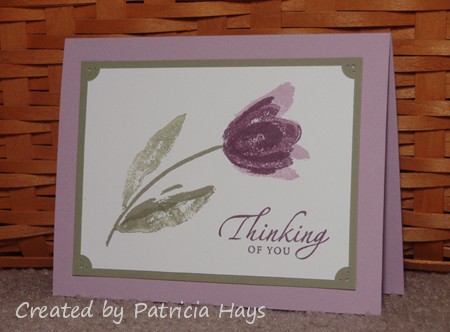
For my second attempt, I thought I’d try using the colors from this week’s Splitcoaststampers color challenge.  But because I re-inked my ink pads recently, the colors turned out pretty dark on the cardstock and didn’t have as much contrast as I thought they should.  So even though the card itself is basically OK, it’s definitely not one of my better creations.  So I just put it in my OWH box and moved on.

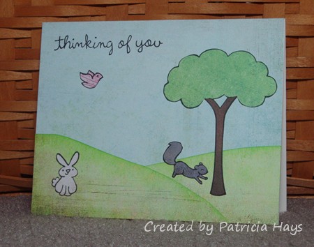
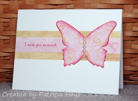
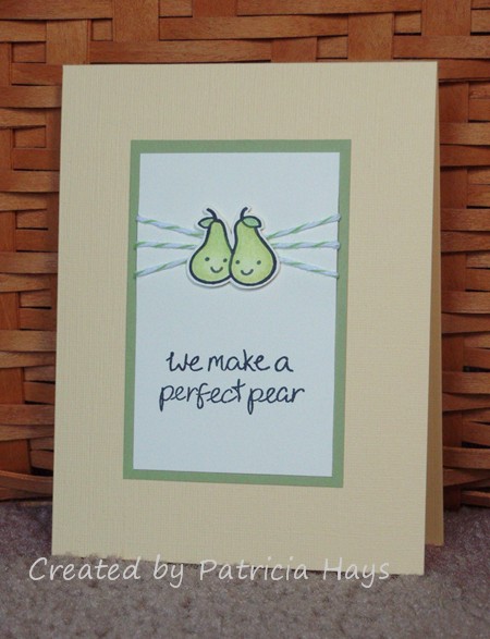
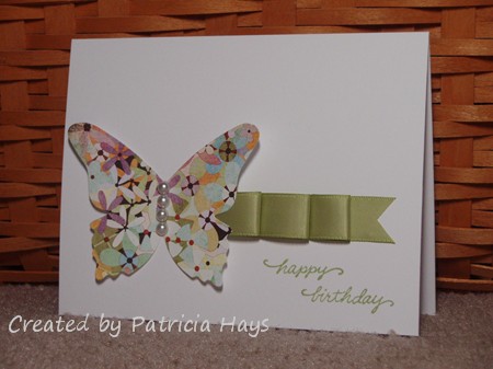
I tried stepping out of my color comfort zone for my third attempt.  Once again, it’s not one of my best looking cards but it isn’t so bad it needed to be trashed.  So it’ll be going to OWH too.

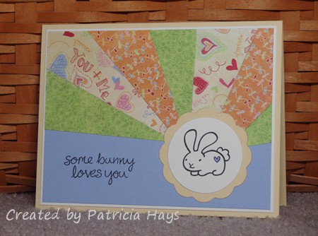
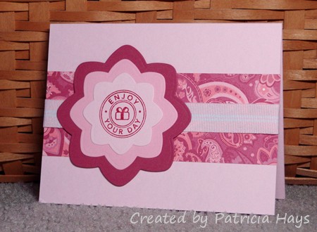
Even after three cards I wasn’t happy with, I wasn’t ready to give up on this sketch yet.  I decided to give it one more shot.  This time I decided to use heart-shaped punches in place of the square elements on the sketch, and I chose three coordinating shades of pink cardstock.  A white Prima flower with a half pearl added to its center worked out nicely for the embellishment.  And finally I was happy with what I created for the sketch.

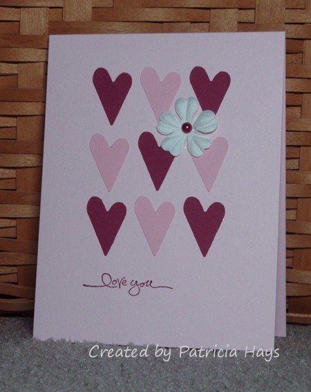
I’ll concede that it looks very Valentine-ish for the middle of June, but it’s definitely my favorite of the four attempts.  I haven’t decided yet whether I’ll go ahead and include it in my box for OWH as part of the Start the Second Million Challenge, or whether I’ll hold on to it until it’s time to send them Valentines. What do you think – send it now, or save it for later?

Supplies:
Stamps: Short & Sweet (Stampin’ Up)
Cardstock: Pink Pirouette, Pretty in Pink, Purely Pomegranate (SU)
Ink: Purely Pomegranate (SU)
Other: flower (Prima Marketing); half pearl (KaiserCraft); heart punch (EK Success)

Here’s another card I made for last week’s Splitcoaststampers Clean and Simple play on words challenge.  Once again, the Lawn Fawn “My Silly Valentine” stamp set was a perfect set to use.  I stamped the pears on a scrap of cardstock, colored them, cut them out, and then adhered them over the twine.  Unfortunately, the texture of the cardstock I used for the card base doesn’t really show in the photo.

And that’s one more card for the Operation Write Home Start the Second Million Challenge!  Click on the button in the right sidebar for more information on that.  Please consider sending some handmade cards to OWH!

Supplies:
Stamps: My Silly Valentine (Lawn Fawn)
Cardstock: Barely Banana textured, Pear Pizzazz, Very Vanilla (Stampin’ Up)
Ink: Tuxedo Black (Memento)
Other: twine (Really Reasonable Ribbon); Premier colored pencils (Prismacolor); odorless mineral spirits (Houston Arts); pop dots

The theme for last week’s CAS challenge at Splitcoaststampers was puns, and the idea for today’s card popped into my head as I was trying to fall asleep last Monday night. I finally was able to get it all out on designer paper and cardstock this weekend.

I combined the CAS challenge with the current Desert Islands Crafts Challenge.  All of the designer paper and cardstock I used were scraps.  Even the card base was “the other half” of an 8.5″ x 11″ sheet of cardstock, left over from another card I’ve made.  The cow, lamb and bird are all separate images, filling the “2+  images” requirement.  I think the grass qualifies as a handmade embellishment because I made it by using my Cutterbee scissors to snip into the edges of the green cardstocks.  For the clouds, I cut two cloud-shaped openings into a post-it note, used them as reverse masks with white craft ink, and then dabbed white chalk over the ink to “pop” the color.  (The cloud on the right is just an upside-down version of the cloud on the left.)  One of the other itinerary items on the list was “orange” so that’s why the bird is that color.  (Orioles are mostly orange, right?)  The sentiment is computer generated using a font called Chinacat. The cow, lamb and the front strip of grass are attached with dimensional adhesive, to give some visual depth to the card.

I’ll admit that this card is probably toeing the lines of Clean and Simple.  It’s pretty much “clean” but it was pretty time consuming to really be considered “simple”.  I guess I tend to equate “simple” with “quick and easy”.  But anyway, I think it turned out really cute.  This card will be included in my next shipment to Operation Write Home, for one of our heroes overseas to use to write home to his or her child.  I only wish that Lawn Fawn had made a goat as part of their farm themed set because that would have been perfect for the “kid” part of the sentiment!

Supplies:
Stamps: Critters on the Farm, Critters in the ‘Burbs (Lawn Fawn)
Cardstock: Bashful Blue, Wild Wasabi, Certainly Celery (Stampin’ Up); scraps from Ambrosia 6″ x 6″ paper pad (Basic Grey)
Ink: Tuxedo Black (Memento); White Craft (SU)
Other: Stampin’ Pastels (SU); Cutterbee scissors

It’s time for another Paper Therapy Design Team challenge!  We have a pretty easy, timely challenge for the next two weeks.  Since Father’s Day is just 9 days away, we’d like for you to share a Father’s Day project you’ve made.  It can be a card, a scrapbooking layout, a mini album, whatever – so long as it has a Father’s Day theme, it’s good.  Just be sure to share it at Paper Therapy by Wednesday, June 22.

I decided to use the June Sketch For You To Try sketch for my card’s layout.  I kept the color scheme nearly monochromatic with several Basic Grey designer papers and Stampin’ Up cardstock. I thought the scene would look too “busy” if I colored it.  The sentiment has a kind of scratchy, sketchy look to it that I think coordinates well with the sketchy scene image. I also didn’t fuss with any embellishments, keeping the card as simple as possible while retaining the sketch elements.  I’m pleased with how it turned out.

Supplies:
Stamps: Seaside Sketches (Stampin’ Up); Father’s Day sentiment (Purple Onion Designs)
Cardstock: Bordering Blue, Early Espresso (SU); “Quince”, “Entice” and “Rind” from Ambrosia 6″ x 6″ paper pad (Basic Grey)
Ink: Early Espresso (SU)
Other: standard circle Nestabilities die (Spellbinders)

Here’s the original sketch:

Here’s another card made with those adorable Lawn Fawn stamps.  This one didn’t turn out quite the way I’d originally envisioned it.

A few years ago, I received some very tiny wooden clothespins from a secret sister.  They were small enough to be used as embellishments on cards – in fact, probably the perfect size for the images on today’s card.  Unfortunately, I have no idea where they are.  I looked everywhere in my crafting supplies that I could think to look, but I couldn’t find them anywhere.  So I went to Michael’s and browsed through their entire papercrafting department and found nothing.  I had better luck in the section where they have miniature wooden items, like for dollhouses and such, so I bought a pack.

They would have stuck up from the card’s surface about 3/8 inches  – much too big to put on a card and still be able to easily mail it.

So I looked all over my craft room again.  Still no sign of the secret sister gift.

But the card must go on, or something like that.  I ended up using brads where I wanted to use the clothespins.  This card was for a challenge where the colors were red, green, and yellow with a hint of purple, so that’s why I chose the colors I used.

I think it’s still a pretty cute card.  It’s a nice little addition to the shipment for Operation Write Home that I’m putting together.  But it would have been so much better with the itty bitty clothespins.  *sigh*  Oh well.

Supplies:
Stamps: My Silly Valentine (Lawn Fawn)
Cardstock: Whisper White, Kraft (Stampin’ Up)
Ink: Onyx Black (VersaFine)
Other: markers (Copic); mini brads (Making Memories); twine (Really Reasonable Ribbon); corner rounder (EK Success)

I know, it’s late in the season for tulips, but I think this stamp set is so pretty and I haven’t used it for a long time.

I made today’s card for Operation Write Home, using the green and purple color scheme from last week’s Midweek Throwdown Challenge on the Stars & Stamps blog.  I chose shades of plum for my purples.  Because I’d used this basic idea a few years ago, this was a quick and easy card to make.  The piercing in the corners of the green mat doesn’t show up well – one larger hole flanked by two smaller ones – but I think it makes a nice effect on the actual card.

All supplies for this card are from Stampin’ Up unless otherwise noted.
Stamps: Terrific Tulips, Sincere Salutations
Cardstock: Pale Plum, Mellow Moss, Whisper White
Ink: Pale Plum, Perfect Plum, Mellow Moss
Other: piercing tool (Making Memories); ticket corner punch

My mom’s birthday was yesterday, and today I’m sharing the card my family sent her.  I got myself into a time crunch for working on it so I just reworked a card from a few months ago, changing up the designer paper, ribbon, and sentiment.  She said that she liked it, so that’s what’s important to me!  🙂 Once again, the folded ribbon worked for this week’s CAS challenge at Splitcoaststampers.

Supplies:
Stamps: Everyday Messages (Stampendous)
Cardstock: Basics White (Papertrey Ink); paper from Kioshi 6″ x 6″ paper pad (Basic Grey)
Ink: Certainly Celery (Stampin’ Up)
Other: Beautiful Butterflies die, Certainly Celery satin ribbon (SU); half pearls (KaiserCraft)

Did you know that in May, Operation Write Home shipped its ONE MILLIONTH card overseas for one of our military heroes to send home to his or her loved ones?  WOW – that’s a LOT of cards!  Now the drive is on for card number 2,000,000!  Right now the organization needs cards with themes such as love you, missing you, thinking of you, and happy birthday.  Blank cards without any sentiments are welcome, too.  If you’d like to help OWH reach their next milestone, click on the announcement in the right sidebar for more information.  The regional shippers need to receive cards for this drive by June 30, 2011.

Here’s one of the cards I’ll be sending to my shipper near the end of the month.  I used this week’s Stars & Stamps blog sketch.  I combined it with this week’s Splitcoaststampers CAS challenge, to use scrunched or folded ribbon on a project.   I put three little ribbon pleats on each side of the focal panel.  Once again, I’ve used the darling My Silly Valentine stamp set from Lawn Fawn.  I love everything about this set – the super cute images and the sweet punny sentiments are right up my alley.  Trust me, you’ll be seeing more of it as the month goes on – especially since it’s perfect for OWH’s Second Million challenge!  I just might use this sketch again too.   I really like how simple and straightforward it is.

OH!  Before I forget… I need to announce the winner of my Memorial Day Blog Hop blog candy!  I asked my son to choose a number for me and he picked 35.  That’s Darlene Armstrong, who wrote, “I would have never thought to lift the U out of the alpha and place it over by missing. WTG. Thank you for sharing on the blog hop.” Congratulations, Darlene!  I’ll be emailing you today to get your mailing information.

And here is the supply list for today’s card:
Stamps: My Silly Valentine (Lawn Fawn)
Cardstock: Kiwi Kiss, Chocolate Chip, Riding Hood Red (Stampin’ Up); Basics White (Papertrey Ink); Autumn Mix digital paper (Lizzie Anne Designs)
Ink: Chocolate Chip (SU)
Other: Chocolate Chip twill ribbon (SU); Premier colored pencils (Prismacolor); odorless mineral spirits (Houston Arts)

© 2019 Suffusion theme by Sayontan Sinha