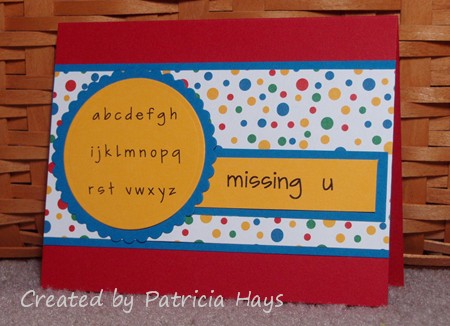
Hello!  If you’re looking for my OWH Memorial Day blog hop post, please click here –> missing u

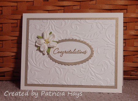
Today is Memorial Day – a day to remember those who have sacrificed their lives while serving our country.  It’s also my husband’s parents’ 50th wedding anniversary.  So instead of going patriotic, I’m sharing the card I made for our family to give to my inlaws.  It’s a simple layout that I will admit to using before.  This time I used Stampin’ Up’s Shimmery White cardstock for the dry embossed layer.  It wasn’t easy to catch the shimmer in it when I took the photo, but it looks really nice in real life (if I say so myself), especially next to the glistening gold cardstock.

Supplies:
Stamps: Warmest Regards (Stampin’ Up)
Cardstock: Shimmery White, Brushed Gold (SU); Vintage Cream (Papertrey Ink)
Ink: Gold (ColorBox)
Other: gold detail embossing powder (SU); flower (Prima); Victoria embossing folder (ProvoCraft); petite oval and petite scalloped oval Nestabilities dies (Spellbinders)

Hello!  I’m helping Operation Write Home observe Memorial Day this weekend by participating in their blog hop.  If you’ve been hopping along, you should have arrived here from Corinna’s blog, My Scrapbook Life.  If you’d like to start at the beginning of the hop, you can click on the above graphic.

Because OWH’s mission is to help our military members overseas stay in touch with their family and friends at home, the theme for this blog hop is “missing you.”  Sometime within the last month I saw a really cute card somewhere in the blogosphere that suited that theme.  I put my own spin on that idea with today’s card.  I used the mirror image of OWH Sketch #68 for the layout. In a rare change of events for me, lol, I didn’t use any stamps on this card! The alphabet and sentiment are printed from my computer.

Supplies for today’s card:
Stamps: None
Cardstock: Real Red, Pacific Point, Summer Sun (Stampin’ Up); polka dotted paper (Creative Memories)
Ink: printer ink
Other: standard circle and petite scalloped circle Nestabilities dies (Spellbinders)

I’m offering a little blog candy to one lucky person (spammers NOT included) who comments on today’s post.  Because this is a *really big* blog hop, you have until 10:00 pm eastern time Tuesday, May 31, 2011 to comment in order to qualify.  I’ll announce the winner in my post on Wednesday, June 1.  Just what is going to be included in the prize?

That’s a package of 8.5″ x 5.5″ paper from Creative Memories (which includes the polka dotted paper used on today’s card); two packages of star-shaped buttons, a package of pleated ribbon, and a cling-mounted rubber stamp proclaiming “Freedom”.  (The basket is only for background display purposes – sorry!)  If 50 or more different people comment, I’ll surprise the winner with a few additional small things.

Thanks for visiting today and supporting Operation Write Home!  Your next stop is Stampin’ and Scrappin’ with Stasia.  Enjoy the rest of your weekend, and be sure to take some time to remember our heroes who have died in service in order to make our country and world a better place.

Hi everyone!  Are you ready for another Paper Therapy Design Team challenge?  This time we have an inspiration challenge:  find an ad and let it be the inspiration for your creation. You have until June 8 to share your challenge project at the Paper Therapy website.

I fudged the “ad” part a little bitty bit.  I don’t have any recent magazines here to browse through for ads, so I did some web surfing to search for my inspiration photo.  I found this one:

As soon as I saw it, it reminded me of my Basic Grey Ambrosia papers.  I pulled out that paper pad and sure enough, the colors of several of the papers coordinated perfectly with the colors in this photo.  I liked the gentle curves in the photo too.  I didn’t replicate them exactly, but I did use some rounded elements in my card’s layout, which is this month’s Sketch For You To Try.  I just received this Lawn Fawn stamp set yesterday and it’s *so* adorable, I couldn’t wait to use it.  So, here’s my card:

I’m planning to send this one to Operation Write Home.  Don’t you think it’ll make someone’s day brighter when their favorite military member stationed overseas sends it home?

Supplies:
Stamps: My Silly Valentine (Lawn Fawn)
Cardstock: Marigold Morning, Naturals White (Stampin’ Up); Marmalade, Chutney and Smoke papers from Ambrosia 6″ x 6″ paper pad (Basic Grey)
Ink: Onyx Black (VersaFine)
Other: Premier colored pencils (Prismacolor); odorless mineral spirits (Houston Arts)

At the risk of bogging this post down with graphics, here’s the original sketch:

chairished

Comments Off on chairished
May 252011

Today I’m sharing a clean and simple card I made recently.  I’ve had this stamp set for several years and I honestly think this is the first time I’ve ever used it.  I was aiming for a weathered look to the chair and I hope I managed to accomplish that.  I’m still working at getting the hang of my Copic markers.  Using them on the Naturals Ivory cardstock was different because it isn’t as smooth as white or cream cardstock tend to be.  The peach card base looked kind of stark so I decided to add a subtle background stamp with Versamark ink.

Supplies:
Stamps: Please Be Seated, Sanded (Stampin’ Up)
Cardstock: Peach Parfait, Chocolate Chip, Naturals Ivory (SU)
Ink: Chocolate Chip (SU); Versamark
Other: markers (Copic); mini brads (Recollections)

My niece graduated from college last weekend, and today’s card is the one I made for my family to give her.  I don’t have any graduation themed stamps or digital images, so I went with something that I thought would be feminine, pretty and elegant.   The school’s colors are blue and white, and I added a bit of silver for some shimmer.  I raised the wings of the largest butterfly to give a little extra dimension to the card.

Three of the required elements for the current Desert Islands Crafts Challenge are included in this card: flowers, embossing, and die cuts.

Supplies:
Stamps: Warmest Regards (Stampin’ Up)
Cardstock: Ballet Blue, Brushed Silver, Whisper White (SU)
Ink: Ballet Blue (SU)
Other: silver paint pen (Zig); Elegant Bouquet embossing folder, Beautiful Wings embossing die (SU)

hi there, puppy

Comments Off on hi there, puppy
May 212011

Just in the nick of time before the deadline, here’s my card for this week’s sketch challenge at Card Positioning Systems.  Their sponsor this week is Lawn Fawn, a stamp company I recently discovered.  Lawn Fawn offers some totally adorable images, and I decided to use them for my CPS card.

I wanted to make this a kind of boyish card for Operation Write Home.  I originally planned to use some brighter colors.  I have some red buttons I wanted to use, but I was having a hard time finding patterned papers that coordinated well with them.  On a desperate whim, I pulled out the Kioshi paper pad to try to find some masculine papers.  I liked the way these patterned papers worked together and I had buttons that coordinated with them. So I figured I’d go with this color scheme instead.  The striped paper is kind of a cheat on going masculine because the other half of that sheet of paper has a large spray of flowers!

Supplies:
Stamps: Critters in the ‘Burbs, Sophie’s Sentiments (Lawn Fawn)
Cardstock: Soft Sky, Mellow Moss (Stampin’ Up); Basics White (Papertrey Ink); papers from Kioshi 6″ x 6″ paper pad (Basic Grey)
Ink: Onyx Black (VersaFine); Mellow Moss, Soft Sky (SU)
Other: Mellow Moss buttons (SU); markers (Copic); sponge

return of the sad bunny

Comments Off on return of the sad bunny
May 202011

The image is named “Contemplative Bunny”, but so many people thought he looked sad when I used him earlier this year that I think of him as the “sad” bunny now. (Yes, I’m taking the liberty of assuming the bunny is male.) Here he is again in a card that I sent to Operation Write Home earlier this week. This was a really quick and easy card featuring the OWH sketch #68 layout. I used a font called Film Cryptic Oblique to print out the sentiment. The bunny is popped up with dimensional adhesive.

Supplies:
Digital Image: Contemplative Bunny (Amber Ink)
Cardstock: Soft Sky, Chocolate Chip, Afternoon Tea designer series paper (Stampin’ Up); Basics White (Papertrey Ink)
Ink: printer ink
Other: Premier colored pencils (Prismacolor); odorless mineral spirits (Houston Arts)

Father's Day tree

Comments Off on Father’s Day tree
May 182011

I did it – I mailed off a box of cards to Operation Write Home on Monday.  Remember, if you’d like to send them some handcrafted cards for our military heroes overseas to mail home for Father’s Day, your shipper needs to receive them by this Saturday, May 21.

Here’s one of the Father’s Day cards I included.  I used Stampin’ Up markers to ink up the tree stamp so I could add some shading to the leaves.  I also used the markers to draw the grass.  The sentiment stamp actually has brackets around the words, but I didn’t think the brackets would look right on this card, so I used another marker to ink only the words.

Supplies:
Stamps: Dream Big, Father Saying (Lizzie Anne Designs)
Cardstock: River Rock, Soft Sky, Whisper White, Western Sky designer paper (Stampin’ Up)
Ink: Sage Shadow, Certainly Celery, and Chocolate Chip markers (SU)
Other: Soft Sky ribbon (SU)

peaceful birthday

Comments Off on peaceful birthday
May 162011

I have two friends who celebrated their birthday a week ago – Helen, who posts some wonderful creations at All Things Stampy, and Elizabeth, who’s been super duper busy getting her teaching certification and hasn’t been posting lately at Shadow’s Stamping Spot.  Both of them are Stampin’ Up demonstrators, so I like to challenge myself to use only SU products on the birthday cards I send them.  It’s a bit more difficult for Helen because she lives in England and SU offers different products in Europe.

I started off by using the Splitcoaststampers Clean and Simple challenge #117 guidelines, to use the colors baby blue, chocolate, sand, and white, and some current SU stamp sets.  I wanted to create a scene on the card.  After a bit of thought considering what supplies I have, I decided the easiest way to do that would be to swipe my Stampin’ Spot ink pads on glossy cardstock, and blend the ink with a tissue.  Everything was going great until I stamped the sentiment – and I smudged the “y” in “birthday” a little bit.  In retrospect it wasn’t all that bad, but it was enough for my perfectionist self to not want to take a photo of it.

So I made another one.  This time I got the sentiment looking good.  But I felt the background looked better on the first card (with the messy sentiment).

*Sigh*.  Murphy’s Law strikes again.

So, here’s the second of the two cards.  I think the scene looks very peaceful.  What do you think?

Helen, Elizabeth and I have already had a lighthearted conversation about dodgy backgrounds and jacked up sentiments, and everything’s cool between us… I think.  It remains to be seen if I’m still on their ignore lists.  LOL!

All supplies for this card are from Stampin’ Up.
Stamps: Thoughts & Prayers, Fundamental Phrases
Cardstock: Naturals Ivory, Chocolate Chip, Whisper White, Glossy White
Ink: Chocolate Chip, Bashful Blue, Baja Breeze

Remember how I said a few days ago not to be surprised if you see me use the OWH Stars & Stamps sketch #68 layout again?

I let this week’s Paper Therapy Design Team challenge sneak up on me and remembered just in the nick of time that I needed to make a card for it.  This time it’s a color challenge – bright yellow, pink and blue with a neutral.  I also needed a birthday card for a family friend.  So I combined the colors with the sketch and some stamps that hadn’t seen ink for a while, and about 25 minutes later I ended up with this:

Even though the flowers are from two different stamp sets, I think they coordinate pretty well.  The large flower was stamped on a scrap piece of cardstock and then cut out.  Looking at it as I’m writing this post, before I mail this card I think I’m going to try curling the petals a bit to give that flower a little extra dimension.  The bright colors seem fitting for our friend’s bright, bubbly personality.

Go check out what the other Paper Therapy DT members have made  – links to their blogs are over in the left sidebar.  Then make something and share it over on the Paper Therapy website.  We’d love to have you join in our challenge!

All supplies for today’s card are from Stampin’ Up.
Stamps: Bitty Basics, Petal Prints, On Your Birthday
Cardstock: Daffodil Delight, Pacific Point, Melon Mambo, Whisper White
Ink: Daffodil Delight, Pacific Point, Melon Mambo

black cherry crumbs birthday

Comments Off on black cherry crumbs birthday
May 112011

I needed a quick birthday card for a family friend.  Y’all should know by now how much I enjoy participating in challenges, so of course I managed to make this card work for a few.  I used last week’s color challenge from Splitcoaststampers.com as my starting point.  The black from the color challenge tied in with one of the element choices for the current Desert Islands Craft Challenge, and I continued with that challenge by distressing the edges of the sentiment panel, using words, inking something other than a stamp, using stripes, and using no flowers.  The layout is a sketch introduced a couple months ago on the OWH Stars & Stamps Blog.

The striped middle panel is my “inking something other than a stamp” element.  I created it by swiping the edge of my Cherry Cobbler and Crumb Cake ink pads along a strip of Very Vanilla cardstock.  What an easy way to make one-of-a-kind designer paper, yes?

All visible supplies for today’s card are from Stampin’ Up.
Stamp: It’s Your Birthday
Cardstock: Crumb Cake, Basic Black, Cherry Cobbler, Very Vanilla
Ink: Cherry Cobbler, Crumb Cake
Other: distressing tool (Making Memories)

It’s the start of a new week, which means the Operation Write Home Stars & Stamps blog has a new sketch challenge.  This week’s is a nice simple one that I think can lend itself to lots of possibilities.  I chose to make a lighthearted card using some stamps from the Lizzie Anne Designs Winter Mix set. I think it could be sent to almost anyone from age 3 to 103!  🙂

I don’t know if you can tell from the photo, but the yellow cardstock is textured.  The popcorn bag is attached with dimensional adhesive so it kind of “pops” off the card.

Don’t be too surprised if you see me use this sketch again!

Supplies:
Stamps: Lucky in Love (Lizzie Anne Designs)
Cardstock: Whisper White, Riding Hood Red, Barely Banana textured (Stampin’ Up)
Ink: Onyx Black (VersaFine)
Other: markers (Copic)

Happy Mother's Day!

Comments Off on Happy Mother’s Day!
May 062011

I know I shared several Mother’s Day cards already in March and April.  Here’s one last one for Mother’s Day weekend.

I first made a card like this last fall for the Hope You Can Cling To challenges at Splitcoaststampers.com.  I just changed the sentiment for Mother’s Day and included this card in my Mother’s Day shipment to Operation Write Home.  All of the blossoms were stamped, cut out, and added to the card with dimensional adhesive.  Cutting out the flowers was the most time consuming part of creating this card – otherwise, it was really quick and easy.  A couple of the flowers are Perfect Plum stamped off once.

I hope all the moms out there have a fabulous Mother’s Day weekend!

Supplies:
Stamps: Best Blossoms (Stampin’ Up)
Cardstock: Pale Plum, Perfect Plum, Whisper White (SU)
Ink: Perfect Plum, Pale Plum, Mellow Moss (SU)
Other: dimensional adhesive (SU)

Today’s post could be titled the same thing as Monday’s post:  “OWH sketch meets mini VSN challenge.”  But this time I’ve used a different sketch and a different VSN challenge.

This VSN challenge was to use the colors you’d see in a parrot: green, orange, yellow, and a little blue.  I knew I had this designer paper that’s mostly orange with a little bit of green and yellow, so using it for this card was an easy choice.  There are even some hints of blue in the bottom right corner.  I really wanted to use a brighter solid yellow with it, like Stampin’ Up’s Daffodil Delight, but More Mustard proved to be a better color match.  The layout is OWH sketch #66.  Hmmm… maybe I should add another white circle behind the orange scalloped one, to set that medallion off from the background better.  What do you think?

So now I have another Father’s Day card to send to OWH within the next few weeks.  If you’re interested in sending them some of your own cards, the deadline for sending Father’s Day cards is March 21.  But OWH welcomes birthday, thinking of you, any occasion, love, and “missing you” themed cards at all times.

Supplies:
Stamps: Dream Big (Lizzie Anne Designs)
Cardstock: More Mustard, Pacific Point, Whisper White (Stampin’ Up); designer papers from Green at Heart 6″ x 6″ paper pad (Basic Grey)
Ink: More Mustard (SU)
Other: standard circle and big scalloped circle Nestabilities dies (Spellbinders)

Today I have two cards for you using OWH sketch #67.

For the first card, I combined the sketch with Splitcoaststampers Mini VSN challenge #5, to use wood or something wood-like on your card.  Several years ago I bought a package of wooden tags for a ridiculously low price, thinking I could use them on cards.  I found them recently when I was doing some reorganizing but still didn’t do anything with them.  Then when I read the requirements for the Mini VSN challenge, I knew it was time to put one to use.  I didn’t originally plan to use this shape (with the rounded corners) on a masculine card, but after testing out how the ink would work on the wood, I didn’t want to waste my efforts.  And I guess it coordinates with the circles in the designer paper.  I sponged and smeared some River Rock ink on the tag first, then stamped the sentiment and sponged the edges with Blue Bayou ink.  I didn’t realize the letters would bleed so much but I suppose it adds to the weathered look and coordinate better with the background stamp on the bottom portion of the card. Where the tag is attached to the ribbon, I tried a ribbon loop first, but it seemed too bulky.  But the way it is now seems a little too plain.  I dunno.  It’ll be OK.  I’m sending this card to Operation Write Home so I’m hoping some service member will appreciate it even though I’m not thrilled with it.


I did the second card just kind of for fun, to show how one sketch can yield different results just by using different colors.  The bright, cheery colors on this one make me smile, and I just love the softness of the velvet ribbon.  This one is going to Operation Write Home, too.

Supplies for the first card:
Stamps: Good Alphabet (Hero Arts); Weathered (Stampin’ Up)
Cardstock: River Rock, Blue Bayou, Western Sky designer series paper (SU)
Ink: River Rock, Blue Bayou (SU)
Other: River Rock ribbon (SU); mini brad (Making Memories); Woodsies tag (Forster)

Supplies for the second card:
Stamps: Wonderful Words, Too Terrific Tags (SU)
Cardstock: Pear Pizzazz, Peach Parfait (SU); designer paper from Sugar Rush 6″ x 6″ paper pad (Basic Grey)
Ink: Riding Hood Red (SU)
Other: tag punches (SU); ribbon (Prima Marketing); apple and orange twine (Really Reasonable Ribbon); eyelet (source unknown)

© 2019 Suffusion theme by Sayontan Sinha