This is my card for the April Sketch for You to Try challenge.  I took the liberty of squooshing the original square sketch layout into a rectangle. I combined it with the third of the Splitcoaststampers challenges for their Mini Virtual Stamp Night.  The beachy scene for the SCS VSN inspiration challenge made me think of my cattails stamp.  So I tried to create a scene of cattails on a sand dune.

Supplies:
Stamps: Where You Should Be (Ippity by Unity); Treasured Trinkets (Lizzie Anne Designs); Sanded (Stampin’ Up)
Cardstock: Naturals Ivory, Baja Breeze, Chocolate Chip, Spring Flowers designer series paper (SU)
Ink: Chocolate Chip, Baja Breeze (SU)
Other: Chocolate Chip and Garden Green markers, Chocolate Chip buttons, linen thread (SU); sponge

Here’s what the original sketch looks like:

I think y’all know by now how much I enjoy doing crafting challenges.  This card is no exception.  I was looking at different sites last night and pulled together three different challenges for it.

Splitcoaststampers is having a mini Virtual Stamp Night weekend, and the first challenge, to use fabric on your card, caught my eye.  I had some denim handy from when I turned a pair of my son’s jeans into cutoff shorts for him.  The challenge was how to get a design to appear on the denim.  I was happily surprised to discover how well rub ons worked on the fabric.  I pulled together three of the requirements for the current Desert Islands Crafts Challenge – to use the colors red, white and blue, to use ribbon, and to use jewels.  The layout I chose is one of the OWH Stars & Stamps blog sketches.

And now it’s time for me to get back to creating more cards. There are a lot more challenges for me to try!  🙂

Supplies:
Cardstock: Cherry Cobbler (Stampin’ Up); Basics White (Papertrey Ink)
Other: Love & Happiness rub ons (SU); grosgrain ribbon (Offray); crystal brads (Making Memories); denim fabric (Wrangler)

When the Paper Therapy Design Team chose to change our challenge schedule to the 2nd and 4th Fridays of the month, with the Paper Therapy Mix It Up Challenges running on the 1st and 3rd Fridays, we realized that because a few months had 5 Fridays, there would be some Fridays without challenges.  The Design Team didn’t like that.  So we decided that we’d offer “Freaky Friday” challenges on those “extra” Fridays.  Today marks the first of them.

This week the challenge is to “CASE” (Copy And Selectively Edit) a project made by another Paper Therapy member.  Ashlee T‘s typically clean and simple style is right up my alley, and I decided to choose her card from her March 16, 2011 blog post as my project.  I had to use slightly different shades of green and orange because I don’t have designer papers in the exact colors Ashlee used.  I could have used a polka dotted paper like she used, but I didn’t want my card to be an exact duplicate, so I chose a fine pindot stripe instead.  I also used a different stamp set, and I modified her layout from a square card to a rectangular one.  I wanted to elevate the green present just slightly from the two orange ones.  A dimensional adhesive, such as a pop dot, would have given it more height than I wanted.  So I took a scrap of white cardstock, cut two narrow pieces from it, stacked them, and adhered them to the bottom of the present.

Thank you, Ashlee, for the inspiration!  🙂

All supplies for today’s card are from Stampin’ Up unless otherwise indicated.
Stamps: Birthday Whimsy
Cardstock: Sahara Sand, Pumpkin Pie, Whisper White, Certainly Celery Prints designer paper, Baja Breeze designer paper
Ink: Certainly Celery, Pumpkin Pie
Other: corner rounder punch; distressing tool (Making Memories)

I’ll admit it: even though I love crafting challenges, the inspiration challenges – where you are assigned a photo from which to draw inspiration for your creation – tend to be the most difficult for me.  I can’t really explain why that’s so.  I guess I feel a little overwhelmed by the choices – do I use the colors, or something from the layout, or does the photo remind me of something?

That wasn’t the case with this month’s InStyle Stamps Inspiration Challenge.  When I saw the inspiration photo, I knew right away that I wanted to use the yummy colors with this cupcake image.  I tweaked the OWH Stars & Stamps sketch #63 for the layout by rotating the card 90°, widening the image panel, and shifting the panel and the embellishment to the center of the card. Here’s my finished creation:

I dug out my bottle of Crystal Lacquer and added some to the dome to make it look more like glass. I haven’t used that stuff in a long time and it was pretty thick, so I had to use a paintbrush to apply it to the image.

Oh, here’s the inspiration photo:

This week’s OWH Stars & Stamps Midweek Throwdown is to make an Any Hero card – one with a note of appreciation and encouragement that would be delivered to a service member overseas to pick up his or her spirits.  I think if I can get over my shyness about what to write in an Any Hero card, I’m going to use this card for that purpose in my next shipment to Operation Write Home.

The supply list for today’s card:
Stamps: Tia’s Appreciation (InStyle Stamps)
Cardstock: Marina Mist (Stampin’ Up); Basics White (Papertrey Ink); designer paper from Cabana 6″ x 6″ paper pad (Inque Boutique)
Ink: printer ink
Other: markers (Copic); Crystal Lacquer (Sakura); Buttercup grosgrain ribbon (Really Reasonable Ribbon)


In the spirit of full disclosure, the image used on today’s project was provided to me by InStyle Stamps to aid in promoting their products.

covered bridge

Comments Off on covered bridge
Apr 252011

This is one of the cards I sent to Operation Write Home in last month’s shipment.  I’d had the bridge image stamped here for a while – in fact, long enough that the background colors faded a bit.  Ooops.  But I finally managed to get it made into a card, using OWH sketch #59 for the layout.  I added the sentiment to the focal panel and matted it on black cardstock.  I decided to use a background stamp on the green strip to add some visual texture.   I’m pleased with the final result.

Supplies:
Stamps: Changing Seasons, Sanded (Stampin’ Up); Everyday Sayings (Lizzie Anne Designs)
Cardstock: Naturals Ivory, Mellow Moss, Basic Black, Glossy White [for focal panel] (SU)
Ink: Jet Black (StazOn); Taffy Kaleidacolor (SU)
Other: brayer

Easter is almost here, and Mother’s Day is right around the corner! So the Paper Therapy Design Team challenge for the next two weeks is to make a project for a special woman in your life.

I decided to use some of my retired Stampin’ Up designer paper that I haven’t done anything with recently.  I put it together with a Lizzie Anne Designs sketch challenge layout from January 2010.  I didn’t have floral embellishments in the same color as the blue cardstock, so I dyed some of my Primas with reinker mixed with a bit of water.

Supplies:
Stamps: Wonderful Mother (Lizzie Anne Designs)
Cardstock: Blue Bayou, Wild Wasabi, Naturals Ivory, Porcelain Prints designer paper (Stampin’ Up)
Ink: Blue Bayou (SU)
Other: Blue Bayou and River Rock stitched ribbons (SU); flowers (Prima Marketing); self adhesive pearls (KaiserCraft); sponge

I needed to make a birthday card, and I decided to try my hand at a couple of the challenges going on right now at Splitcoaststampers.com.  The layout for this card is the sketch for the Clean and Simple challenge.  The colors for this week’s Color Combination challenge are Concord Crush, Crumb Cake, and ivory.  I substituted the retired color Vintage Violet for the Concord Crush because I had the ribbon to match. Crumb Cake was formerly known as Kraft. I changed it up in the title of this post because 1) my cardstock is old enough that it was labeled “Kraft” and b) I just couldn’t bring myself to say “crumby vintage butterfly” or “cakey vintage butterfly”, LOL.

I stamped the butterfly twice – once directly on top of the flourish, and once on a scrap piece of cardstock. Then I cut the one out from the scrap, gently bent it to raise up the wings and give a little dimension to the card, and attached the body of it to the first butterfly. The flourishes are the two flourish stamps from Stampin’ Up’s Priceless stamp set, but each flourish is stamped twice.  Here’s my tip for getting the images to line up together perfectly.  I stamped each image on two Stamp-a-ma-jig sheets.  Then I arranged the SAMJ sheets on the cardstock to find the most pleasing composition of the stamped images.  Once I had that figured out, it was easy to use the SAMJ to stamp the images on the cardstock.

Supplies:
Stamps: Priceless, It’s Your Birthday (Stampin’ Up)
Cardstock: Vintage Violet, Kraft (SU); Vintage Cream (Papertrey Ink)
Ink: Vintage Violet, Creamy Caramel (SU)
Other: Vintage Violet stitched ribbon (SU); corner rounder punch (EK Success); Stamp-a-ma-jig

Stickers.  Nearly every papercrafter has them.  Goodness knows there are oodles of different types of stickers available to use in papercrafting. There are 3-D ones, realistic photo images, and plain flat ones, in pretty much every conceivable design – animals, people, landmarks, flowers, you name it.  I admit it – I have a LOT of stickers that I’d collected when I was scrapbooking, thinking ahead to the projects where I could use them.

My stickers haven’t been touched much, other than to move them from one spot in my craft area to another, since my scrapbooking activities took a back seat to my cardmaking about 6 or 7 years ago.

Over the weekend, Operation Write Home’s Stars & Stamps blog sponsored a “blog skip” – a mini blog hop – challenging its participants to use stickers to create the focal point of their cards.   I was interested in seeing what the participants created so I made my way through the circuit. I have to confess that I was very nicely surprised by what I found – enough that I was inspired to browse through my stickers and see what kind of card I could create with them to donate to Operation Write Home.

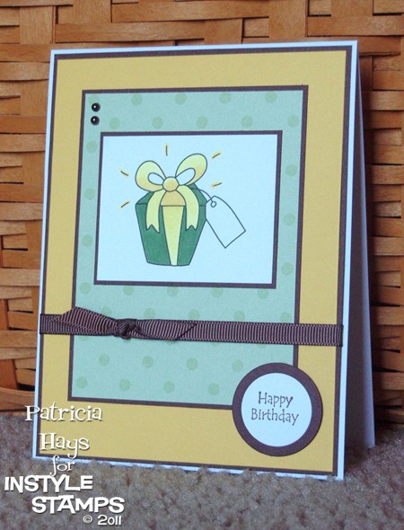
Going through my stickers was interesting.  Most of them are the plain flat ones (think Mrs. Grossman’s) and made me wonder why I’d purchased them in the first place (oops).  Then I found a package of floral stickers that I’d received as part of a secret sister swap.  One of them looked like it would work in this week’s OWH sketch challenge layout.  I decided to give it a try.  I found some coordinating cardstock and designer paper.  Although the flowers had a yellow background as part of the sticker, I put it on a base of white so it would stand out from the background.  That’s when I ran into a small problem.  The sticker was a bit longer than the dimensions specified in the sketch, and adding the base just added more length to it – which made me run out of room for the bow.  So I decided to squoosh the sketch (yes, that’s a technical term) from a horizontal to a vertical layout.  Ta-da.

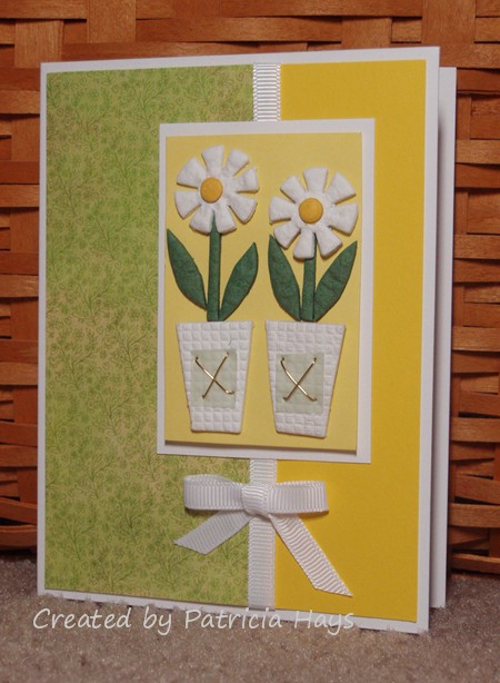
Please excuse the lighting. The yellow cardstock in the background matches the sticker better in real life.

And – can you believe it – I didn’t use any stamps or digital images on this card!  Amazing!

Supplies:
Cardstock: Basics White (Papertrey Ink); Yoyo Yellow (Stampin’ Up); designer paper from Sugar Rush 6″ x 6″ paper pad (Basic Grey)
Other: Delicate Daisies sticker (Paper Bliss); white grosgrain ribbon (SU)

Happy Thursday!  The weekend is almost here, hooray!  It’s hard to believe April is about halfway over already.

Today’s card was made with three challenges in mind.  I used the April InStyle Stamps sketch challenge for the layout and the April InStyle Stamps color challenge for the color scheme.  I also used the following elements from Desert Islands Crafters Challenge #5: ribbon, a birthday theme, a bow, dots, pearls, and bright colors.

Supplies:
Stamps: present from Patty’s Appreciation (InStyle Stamps); Friendly Greetings (Hero Arts)
Cardstock: Basics White (Papertrey Ink); Daffodil Delight, Chocolate Chip, Prints designer series paper (Stampin’ Up)
Ink: Chocolate Chip (SU); printer ink
Other: markers (Copic); Chocolate Chip grosgrain ribbon (SU); standard circles Nestabilities dies (Spellbinders); self-adhesive pearls (KaiserCraft)


In the spirit of full disclosure, the present image used on today’s project was provided to me by InStyle Stamps to aid in promoting their products.

still catching up

Comments Off on still catching up
Apr 112011

Here’s another of the cards I sent to Operation Write Home last month.  It seems like so many “thinking of you” cards are rather feminine looking, so I thought this would be a good design if one of our heroes wanted to send home a “thinking of you” card to a man.

This was a quick and easy one to make.  I had cut an oval out of an index card to use for a mask on another project a while ago, and I used it again for this card.  I adhered the mask with temporary adhesive and sponged inside the oval.  Then I removed the mask, stamped the trees and the sentiment, and assembled the layers together.

Supplies:
Stamps: Lovely As A Tree (Stampin’ Up); Everyday Sayings (Lizzie Anne Designs)
Cardstock: Confetti Cream, Always Artichoke (SU)
Ink: Always Artichoke (SU)
Other: sponge

Hello!  It’s time for the all-new second round of Paper Therapy Design Team challenges!  This time, a new challenge will be presented on the second and fourth Friday of each month.  If you’d like to participate in the challenge, you then have two weeks to create something and post a photo of it in the Paper Therapy challenge forum. Participants will have their names entered into a prize drawing at the end of the month, making them eligible to win some fun crafting goodies!

Since Easter is quickly approaching, today’s challenge is for you to use a basket on your project.  I decided to use one of my retired Stampin’ Up stamp sets for this.  I stamped the basket and the flowers separately on Whisper White cardstock, fussy cut both images after coloring them, and used dimensional adhesive to let the flowers pop up a bit over the edge of the basket.  The layout is inspired by this week’s Operation Write Home sketch challenge.  Because of the way the flowers were arranged on the designer paper I used, I had to use a mirror image of the original sketch.  I also took the liberty of adding a few layers to help bring out the colors in the designer paper.

I hope you’ll give my fellow Paper Therapy Design Team members some love by commenting on their blogs, and I hope you’ll play along and share your own creations with us!

Supplies for today’s card:
Stamps: Basket Full of Fun (Stampin’ Up)
Cardstock: Crumb Cake, Marina Mist (SU); designer paper from “Memoirs” 6″ x 6″ paper pad (Inque Boutique)
Ink: Onyx Black (VersaFine)
Other: grosgrain ribbon (Really Reasonable Ribbon); Premier colored pencils (Prismacolor); odorless mineral spirits (Houston Arts); standard circle and big scalloped circle Nestabilities dies (Spellbinders)

three little piggies

Comments Off on three little piggies
Apr 042011

Good morning! It seems a little odd not to have a Paper Therapy challenge to post today, after having them every Monday for the last six months. Be sure to tune in this Friday for the first challenge of the new bi-weekly challenge format!

Today I’m sharing another card I sent to Operation Write Home last month.  I got the idea for it several years ago from the Splitcoaststampers.com gallery and I thought it would be cute for the recent OWH challenge to make cards for kids.  It felt good to pull a retired Stampin’ Up stamp set out and put it to use, along with bright pink cardstock that I rarely touch.  I drew in the eyes.

Supplies:
Stamps: Fun With Shapes (Stampin’ Up)
Cardstock: Positively Pink, Pretty in Pink, Whisper White (SU)
Ink: Positively Pink, Pretty in Pink
Other: Pretty in Pink buttons (SU); black pen (Sakura)

trying to catch up

Comments Off on trying to catch up
Apr 022011

I feel like I’ve been missing a lot of craft and blog time lately!  I’ve had a busy two weeks of substitute teaching at our elementary school.  It gets a little tiring sometimes, but I enjoy it.  Where else would I have the chance for a preschooler to teach me the yoga positions she does with her mom?  🙂

I did manage to get a box of cards mailed off to Operation Write Home earlier this week.  I try not to send them all exact duplicate cards (although I might use the same layout but switch up colors and sentiments).  So I do have a variety of cards to share here on my blog over the next few weeks.

Today’s card is one of the Father’s Day cards I made.  I used Operation Write Home sketch challenge #62 for the layout.  I thought this designer paper looked like water and that it would go well with the seashell image. I’ve had this paper for at least 4 or 5 years; I think I bought it during one of my trips to the Salt Lake City area. I honestly don’t recall what manufacturer made it.

Supplies:
Stamps: Stipple Shells (Stampin’ Up); Dream Big (Lizzie Anne Designs)
Cardstock: Naturals Ivory, Close to Cocoa (SU); designer paper from an unknown source
Ink: Close to Cocoa (SU)
Other: twill (SU)

© 2019 Suffusion theme by Sayontan Sinha