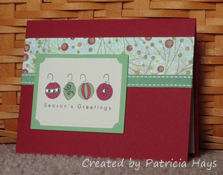
Hopefully a Christmas card will help provide a mental break from the heat and humidity.  It’s not too early to start making winter holiday cards for Operation Write Home!

Today’s card uses five of the ten elements from the current Desert Islands Crafts Challenge itinerary.  I cut the focal panel and its mat with Nestabilities dies. The ornaments are colored with Copic markers, with just a touch of a silver pen for the thingies where the hook attaches to the ornament.  I added a few crystals to two of the ornaments.  The focal panel is attached with pop dots so that the ribbon fits nicely underneath it. The layout is based off an older Lizzie Anne Designs sketch.

It’s so cloudy today that it was hard to get a good photo of the card, so you’ll just have to trust me that the green cardstock and ribbon match the designer paper better in real life than in the picture.

Supplies:
Stamps: The Key to Happiness (Lizzie Anne Designs)
Cardstock: Cherry Cobbler, Wild Wasabi, Naturals Ivory (Stampin’ Up); Berry Branch designer paper from Fruitcake collection (Basic Grey)
Ink: Onyx Black (VersaFine)
Other: markers (Copic); classic rectangles plain and small labels Nestabilities dies (Spellbinders); clear crystals (Bazzill); Wild Wasabi ribbon, dimensionals (SU); silver Precious Element pen (Creative Memories)

birthday fishes

Comments Off on birthday fishes
Jul 112011

Here’s another card I made for the OWH Virtual Cardmaking Party last week.  Sheila at 2 Paw Prints presented the challenge of making a card with a fishbowl on it.  That was the perfect opportunity for me to pull out one of my Stampin’ Up stamp sets that I hadn’t used in a long time.  I decided to use some bright colors to make this card suitable for any person of any age.  I used an old Lizzie Anne Designs sketch for the layout.

Supplies:
Stamps: Little Hellos, Birthday Whimsy (Stampin’ Up)
Cardstock: Daffodil Delight, Tangerine Tango, Pacific Point, Whisper White (SU)
Ink: Onyx Black (VersaFine)
Other: Premier colored pencils (Prismacolor); odorless mineral spirits (Houston Arts); standard circle and big scalloped circle Nestabilities dies (Spellbinders); Spots & Dots embossing folder (Cuttlebug); ribbon (Really Reasonable Ribbon); piercing tool (Making Memories)

Easter is almost here, and Mother’s Day is right around the corner! So the Paper Therapy Design Team challenge for the next two weeks is to make a project for a special woman in your life.

I decided to use some of my retired Stampin’ Up designer paper that I haven’t done anything with recently.  I put it together with a Lizzie Anne Designs sketch challenge layout from January 2010.  I didn’t have floral embellishments in the same color as the blue cardstock, so I dyed some of my Primas with reinker mixed with a bit of water.

Supplies:
Stamps: Wonderful Mother (Lizzie Anne Designs)
Cardstock: Blue Bayou, Wild Wasabi, Naturals Ivory, Porcelain Prints designer paper (Stampin’ Up)
Ink: Blue Bayou (SU)
Other: Blue Bayou and River Rock stitched ribbons (SU); flowers (Prima Marketing); self adhesive pearls (KaiserCraft); sponge

This week’s Lizzie Anne Designs sketch challenge forced me to think out of the box, quite literally.  Joslyn Nielson came up with a sketch for a round card.  Although I’ve made a few shaped cards in the past, doing them is not within my comfort zone.  I finally came up with this:

None of my Nestabilities circle dies seemed large enough for a card, so I pulled out my old Creative Memories Cutting System stuff so I could create a 4.25″ diameter card. Instead of a plain circular element for the focal panel, I decided to fussy cut the butterfly.  I even got daring and cut around the antennae.  (Have I ever mentioned how much I love my Cutterbee scissors?) I gently turned up the butterfly’s wings and attached only its body to the card, to give some dimension.  I’m no butterfly expert so I don’t know if there really is a yellow and coral pink butterfly in nature, but I have to admit I like the way it turned out.  I used textured cardstock for the card base for some subtle visual interest, and I hope that shows up on your monitor.

I made this card with a certain recipient in mind – my sister!  Today is her birthday, and she really likes butterflies.  I hope she has a wonderful birthday!  (And I hope the actual card gets to her in today’s mail!)

Supplies for today’s card:
Stamps: Au Naturale, Everyday Sayings (Lizzie Anne Designs)
Cardstock: Barely Banana textured, Whisper White {for stamping the butterfly}, Spring Flowers designer paper (Stampin’ Up)
Ink: Onyx Black (VersaFine)
Other: Premier colored pencils and blender pencil (Prismacolor)

I couldn’t help but think of a certain blog post on Hyperbole and a Half while I was making this card. If you’ve never seen Hyperbole and a Half, go check it out after you’re done reading this post.

Today’s card uses this week’s Lizzie Anne Designs sketch challenge layout.   The flower images above the designer paper panel were stamped and colored with markers.  The half pearls match better in real life than they appear in the photo.

You’re probably wondering why I’m showing a Mother’s Day card at the beginning of March, when Mother’s Day isn’t until May here in the United States.  It’s because I’m trying to get a start on my next shipment for Operation Write Home.  They need Mother’s Day cards by the end of March so there’s enough time to send them to our heroes overseas so they can send the cards to their loved ones here at home.

Speaking of Operation Write Home… you’ll want to be sure to tune in tomorrow, because OWH is hosting a HUGE Bunny Blog Hop tomorrow!  Over 130 blogs are participating!  WOW!

Here’s the supply list for today’s card:
Stamps: It’s Good to be Queen (Lizzie Anne Designs)
Cardstock: Vintage Cream (Papertrey Ink); Blush Blossom, Bashful Blue, Petal Patch designer series paper (Stampin’ Up)
Ink: Close to Cocoa (SU)
Other: Blush Blossom, Bashful Blue, and Certainly Celery markers (SU); pewter half pearls (KaiserCraft)

Today I’m sharing a birthday card that I sent to a friend recently.  I used Lizzie Anne Designs sketch challenge #153 for the layout.  I don’t often use colors this bright, but I was wanting to do something different that day and this designer paper seemed to be saying “Make something with me!”  I decided to paper piece the present to match the designer paper.

Supplies:
Stamps: Happy Birthday, Party Animals (Lizzie Anne Designs)
Cardstock: Melon Mambo, Crushed Curry, Very Vanilla, Razzleberry Lemonade designer paper (Stampin’ Up)
Ink: Melon Mambo
Other: standard circle and petite scalloped circle Nestabilities dies (Spellbinders)

a piece of cake

Comments Off on a piece of cake
Nov 192010

Here’s a quick and easy card I made for a friend who’s celebrating her birthday this week. It actually uses the same layout I used on my last card, but this time it’s turned sideways and the focal point is an oval instead of a rectangle. I cut the Nestabilities ovals, did a little sponging on the white one, stamped the cake image, ran the white cardstock through my Big Kick with an embossing folder, layered some ribbons, and assembled the whole thing.  Ta-da… a birthday card.

Supplies:
Stamps: Vintage Birthday (Lizzie Anne Designs)
Cardstock: Purely Pomegranate, Chocolate Chip, Whisper White (Stampin’ Up)
Ink: Purely Pomegranate, Chocolate Chip (SU)
Other: Chocolate Chip satin ribbon, Purely Pomegranate stitched ribbon (SU); Victoria embossing folder (Provo Craft); petite oval and petite scalloped oval Nestabilities (Spellbinders); sponges

We’ve had a lot of rain and dreary weather the last few days, so it’s great to see the sun peeking out from behind the clouds this morning. Today’s card seems to fit that mood too. I think the sentiment on it, “wishing you a day full of sunshine”, could be used for most any occasion – thinking of you, encouragement, birthday, or even just because. The layout is an adaptation of Lizzie Anne Designs sketch challenge #150.

Supplies:
Stamps: Turn Toward the Sun (Lizzie Anne Designs)
Cardstock: Basics White (Papertrey Ink); Larkspur, Marigold, Blue Bonnet and Buttercup from Oh Baby! Boy collection (Basic Grey)
Ink: Onyx Black (VersaFine)
Other: markers (Copic); rectangle and scalloped rectangle Nestabilities dies (Spellbinders)

I thought that the swooping design of this week’s Lizzie Anne Designs sketch challenge was really neat, and I’ve had time to make two cards with it already. I’ll share them with you today. They both use the Vintage Birthday stamp set, which is one of Lizzie Anne Designs’ newest sets. I normally don’t get into the vintage theme but I really do like this set and I can see myself using it often. I chose to keep these cards pretty simple, without bling or bulky embellishments, so I can add them to the package I’m getting together for Operation Write Home.

The first card also uses some LAD digital paper. I spent a lot of time searching through my supplies trying to find a shade of blue cardstock to coordinate with the digital paper. Finally I decided to try something completely different and went with a sunshiny yellow instead. Everything seemed to fall into place after that.

The second card is a little simpler, with one less layer. I wanted to keep this one monochromatic, kind of like the vintage sepia-tone photographs. I decided to make this one as a mirror image of the original sketch, just for something a little different. The sentiment, “Birthdays are nature’s way of telling us to eat more cake”, makes me smile every time I read it. Seriously.

Supplies – balloon card:
Stamps: Vintage Birthday (Lizzie Anne Designs)
Cardstock: Daffodil Delight, Whisper White (Stampin’ Up); Vintage Birthday digital paper (LAD)
Ink: Onyx Black (VersaFine)
Other: Premier colored pencils (Prismacolor); petite oval and petite scalloped oval dies (Nestabilities)

Supplies – cake card:
Stamps: Vintage Birthday (LAD)
Cardstock: Naturals Ivory, Chocolate Chip, Afternoon Tea designer paper (SU)
Ink: Chocolate Chip (SU)
Other: petite oval and petite scalloped oval dies (Nestabilities); sponge

It’s time for another Lizzie Anne Designs Monthly Mix Blog Hop! Tricia and Meridith, the company owners, have been kind enough to let the Monthly Mix members join in with their Design Team in posting cards made with Monthly Mix stamps on the 15th of the month.  This time they’ve surprised me by tagging me as a “guest Design Team stamper” for the day.  I’m feeling genuinely honored!  Their Design Team is an incredibly talented group of ladies!  If I’d known in advance I would have tried to make something more original and less simple.  But I’m still very flattered to be considered an honorary LAD Design Team member today.  

My card uses this week’s Lizzie Anne Designs sketch challenge, some of my favorite colors, and a stamp and sentiment pair that always makes me smile. This shark always seems just too friendly to me to be a killer for real. He’s part of the July 2010 Monthly Mix set. For this card, I stamped him on a scrap of designer paper and cut him out before adhering him to the circle. Oh – this is actually a mirror image of the sketch – I thought it looked better this way, so the shark wouldn’t seem like he’s swimming off the edge of the card, kwim?  This card is going to be donated to Operation Write Home so I wanted to keep it pretty simple and easy to mail.

Be sure to visit the Lizzie Anne Designs blog for links to the other participants’ blogs.  Check out what the other ladies have been doing and give them some blog love, too!

Supplies:
Stamps: Simply Sweet (Lizzie Anne Designs)
Cardstock: Basics White (Papertrey Ink); Soft Sky, Sahara Sand, Fall Flowers designer paper, Spring Flowers designer paper (Stampin’ Up)
Ink: Onyx Black (VersaFine)
Other: Soft Sky ribbon (SU); standard circles dies (Nestabilities); brad (Making Memories)

It’s Monday, which means it’s time for a new Paper Therapy weekly challenge!  This week’s challenge is to create something using the first stamp(s) you purchased, or using your oldest stamp if you no longer have the first one.

I still have the first set I bought in 2002, which was retired by Stampin’ Up shortly afterwards.  Because the image and sentiment are pretty small and simple, I decided to go super simple with the layout and follow along with the Lizzie Anne Designs weekly sketch.  I used the Splitcoaststampers color combination challenge for my color scheme.  Quick, easy and simple.  An added bonus is that the relatively flat design will make this card a good one to donate to Operation Write Home for a soldier stationed overseas to send home to a loved one.

One thing I really like about this ribbon is that it can be two-sided. The “back side” that doesn’t show in this photo is polka dotted. If I don’t want the dots to show, like for this card, I can just flip the ribbon over to get the solid color. It’s kind of like having two different ribbons on one roll!

Supplies:
Stamps: Just a Note Mini (Stampin’ Up)
Cardstock: So Saffron, Rich Razzleberry, Tangerine Tango, Whisper White (SU)
Ink: Onyx Black (VersaFine)
Other: Rich Razzleberry grosgrain ribbon (SU); Premier colored pencils (Prismacolor); odorless mineral spirits (Houston Arts)

Today’s card started off from this week’s Clean and Simple challenge at Splitcoaststampers.com.  Although I used the color scheme for the challenge I’m not so sure it still qualifies as “clean and simple”.  What do you think?  The layout is this week’s Lizzie Anne Designs sketch challenge.

Thanks for visiting today!  I have some exciting news to share with you this weekend… I can’t wait!  🙂

lad-143.jpg

Supplies:
Stamps: Au Naturale, Simply Sweet (Lizzie Anne Designs)
Cardstock: Kraft (Stampin’ Up); Vintage Cream (Papertrey Ink)
Ink: Chocolate Chip (SU)
Other: premier colored pencils (Prismacolor); Chocolate Chip satin ribbon (SU); Bordeaux grosgrain ribbon (Offray), petite oval die (Nestabilities); sponge

It’s the 15th, so that means it’s time for another Monthly Mix Blog Hop with the ladies of Lizzie Anne Designs.  This month, I used the current LAD sketch challenge and stamps from two different Monthly Mix stamp sets.  I just felt this sentiment from the July 2010 set worked really well with this image from the September 2010 set.  I’ll admit that I was happy to use some of my really old Stampin’ Up buttons to embellish this card.  How old are they?  Well, the color is labelled as Bliss Blue, so that means I bought them before the 2005 color revision.  I do believe it’s time to use them up!

As I was waiting for the black ink to dry before coloring the quilt, I browsed through the LAD Sketchbook.  There’s a lot of fantastic stuff in there!  I noticed, however, that the sentiment stamp I used today isn’t inking the same as the projects in the Sketchbook were showing.  I looked more closely at my stamp and saw that it has a few little indentations in the “R”, the “i”, and the “N” that prevent the ink from contacting the cardstock.  It did the same thing on my “What was I thinking?” card back in August but back then I just reasoned it was because I’d sponged the ink onto the stamp.  How about that?  I kind of like it this way because it gives the letters a more eclectic look.  I think it’s pretty cool.  And it’s more unique!  🙂

Thanks for stopping by today!  If you have time, I strongly suggest visiting the Sketchbook linked above to see what awesomeness Lizzie Anne fans have been creating!  Or, if you only have a little bit of time, go visit the other Blog Hop participants’ blogs listed here and give them a little blog love. 

lad-142-sept-mix.jpg

Supplies:
Stamps: Treasured Trinkets, Simply Sweet (Lizzie Anne Designs)
Cardstock: Whisper White, Barely Banana textured (Stampin’ Up)
Ink: Bliss Blue, Certainly Celery (SU); Onyx Black (VersaFine)
Other: Bliss Blue buttons, Certainly Celery twill ribbon (SU); Premier colored pencils (Prismacolor); white embroidery floss (DMC); classic scalloped rectangle die (Nestabilities)

Today’s card is my take on Lizzie Anne Designs sketch challenge #141.  I literally turned it upside down!  I decided to incorporate the circle elements into the stamped image, rather than using embellishments for them.  I hadn’t used my embossing gun for a long time so it was neat to play with that again.  Even after 8 years of stamping, I still think it’s really cool to watch embossing powder melt into an image.  OK, so I’m a goof.  LOL

The color scheme for this card is taken from the current InStyle Stamps InSpiration challenge.  I really like the look of the light blue and brown together so I focused on that aspect of the inspiration photo. 

And here it is.

lad-141-iss-aug10-inspiration.jpg

Supplies:
Stamps: In the Meadow, Treasured Trinkets (Lizzie Anne Designs)
Cardstock: Naturals White, Soft Suede, Soft Sky (Stampin’ Up)
Ink: Craft White (SU)
Other: twill tape, Hodgepodge Hardware (SU); white embossing powder (Stampendous)

I don’t know about you, but I’m starting to feel tired of the hot weather and I’ll be glad when the temperatures start getting a little cooler.  I thought that maybe making a card with autumn-like colors would help my attitude a little.

Today’s card layout is this week’s Lizzie Anne Designs sketch challenge.  I still had this stamp set on my desk from using it last week and thought this tree could pass as a sugar maple with leaves that have already turned yellow and orange.  I didn’t originally intend to sponge the sentiment panel so much, but I like how it turned out. 

lad-140.jpg

Supplies:
Stamps: In the Treetop (Lizzie Anne Designs)
Cardstock: Summer Sun, Pumpkin Pie, Very Vanilla (Stampin’ Up), “Fresh Squeezed” from Ambrosia 6″ x 6″ paper pad (Basic Grey)
Ink: Summer Sun, Pumpkin Pie, Chocolate Chip (SU)
Other: petite ovals plain and Labels One dies (Nestabilities); sponge

© 2019 Suffusion theme by Sayontan Sinha