Squeaking in under the wire, here is the card I made for the April Sketch For You to Try challenge.  I actually made this one a couple weeks ago but kept thinking I’d have time to make “something better” to submit for the challenge. Well, that didn’t happen, so what I have is this very clean and simple version of the sketch.  I inadvertently swapped the long panels when I assembled the card so this is actually a mirror image of the sketch.


This card also uses several of the Desert Islands Crafts Challenge itinerary #29 items: no flowers, red and black, pressure embossing, gray, and rounded corners.

Thanks for stopping by today!

Supplies:
Digital Image: Kolar’s Simple Sayings (K ‘n K Designs)
Cardstock: Going Gray, Real Red, Basic Black, Naturals White (Stampin’ Up)
Ink: printer ink
Other: markers (Copic); Spots and Dots embossing folder (ProvoCraft); standard circle Nestabilities die (Spellbinders); corner rounder punch (EK Success)

ice cream cone? yes, please

Comments Off on ice cream cone? yes, please
Apr 272012

Here’s the card I made for the Sweet Stop sketch challenge that ends tonight.  (One day I hope to be able to get my sketch challenge completed several days before the deadline, and not right at the last minute!)  This is my take on Sweet Stop sketch #120.  I rotated the sketch for a vertical layout and simplified it by not matting each layer.  I have to admit I’m a little disappointed in the photo because I thought I’d done a better job blending the browns when I was coloring the bear.  But I’ve already sent the card off to Operation Write Home so I can’t take another picture of it.  I did enjoy using some of my Prima flowers to dress up this card a bit.  I’ve been making so many Father’s Day cards lately, it was nice to create something more feminine for a change of pace.

Supplies used:
Digital Image: Rhubarb’s Ice Cream Cone (Sweet ‘n Sassy Stamps)
Sentiment Stamp: Everyday Sayings (Lizzie Anne Designs)
Cardstock: Pretty in Pink (Stampin’ Up); Luxury White (Gina K. Designs); “Lombard Street” from Phoebe 6″ x 6″ paper pad (Basic Grey)
Ink: Tuxedo Black (Memento); printer ink
Other: white grosgrain ribbon (SU); flowers (Prima Marketing); micro brads (Recollections); Labels Nestabilities die (Spellbinders)

This week I’ve been working on finishing up a box of cards to send to Operation Write Home for their Muscle Card Challenge.  Here are a few of the cards I’ve created for dads.  I know I’m pushing the deadline for getting Father’s Day cards to my shipper, so instead of using “Happy Father’s Day” sentiments, I went with some less time-sensitive phrases.

OWH’s Scrap Wrangler is challenging us this week to use up those scrap pieces of cardstock and designer paper that crafters tend to have lying around.  So first off is what I created for that challenge.  The Scrap Wrangler was kind enough to include some sketches that incorporated small strips of papers, so I used one of the sketches to create this card. One nice thing about the Stampin’ Up designer paper packages is that the papers in each are all made to coordinate with each other.  I added a few brads to go along with the rustic feel.


For the next card, I decided to recreate a card I’d made several years ago.  I changed the sentiment and I changed the colors a little bit.  Instead of tearing the edges of the cardstock mat, I used a border die. The leaf stamps are from a long-retired Stampin’ Up set called Autumn, and the sentiment is from Gina K. Designs.


Finally, I made a couple one-layer cards that are very similar.  For a bit of variation I swapped the tree and the sentiment from left to right on them.  I’ll only show you one card because I’m not a fan of redundancy.  I used large post-it notes to mask off the area I wanted to sponge.  I thought the image of the tall tree worked well with this Lizzie Anne Designs sentiment.


If you have any questions about any of the supplies or techniques used on these cards, please feel welcome to ask!  Since this post is photo-heavy I didn’t want to bog it down with a lot of text.  Thanks for stopping by today!  🙂


This week’s CAS challenge at Splitcoaststampers is “At the Zoo”.  I do have a few elephant stamps and a set that includes a giraffe, a monkey, and a hippo, but for some reason I always seem to have a hard time creating with them.  So I went a different route with my zoo thinking and decided to use a seal.  After all, I think the seals are fun to watch at the zoo.  I combined the CAS challenge with the current Desert Islands Crafts Challenge, using 6 of the 10 itinerary elements: no flowers, red and black (the red shows up rather orange-y in my photo, though), embossing, kraft, gray, and rounded corners. It might be hard to see, but the black strip is embossed with a dotted design to coordinate with the seal’s party hat.  I used a black brush pen to color in the polka dots on the hat.

And now I have another birthday card to send to Operation Write Home!

Supplies:
Stamps: Critters in the Snow, Hats Off to You (Lawn Fawn)
Cardstock: Kraft, Basic Black (Stampin’ Up); scraps from Ambrosia 6″ x 6″ paper pad (Basic Grey)
Ink: Tuxedo Black (Memento)
Other: Just My Type embossing folder (ProvoCraft); multiliner brush pen (Copic); corner rounder punch (EK Success)

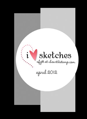
I’m excited and honored to be this week’s sample maker for the OWH Stars and Stamps Sketch Challenge!  This week’s sketch is pretty simple and straightforward, but flexible enough to be used for “clean and simple” styled cards as well as more embellished ones.

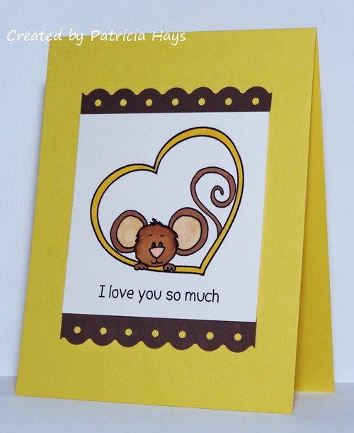
I’ve made two cards for this sketch.  The first one follows the sketch nearly exactly; the scallops are just a bit different than what the sketch shows.  My goal for this card was to create something with a “love” theme that did not use the color red because I didn’t want it to look like a Valentine. The sentiment was created with Microsoft Word when I was preparing the digital image. I feel this card is pretty age and gender neutral, which is something I like to do often for my OWH cards since I never know who is going to be sending or receiving them.


For my second card, I used a love theme once again.  I think I kept this one age and gender neutral too.  This time I turned the sketch on its side for a horizontal layout. It’s hard to see, but I did sponge some blue ink for a sky.  Now I’m able to include “sidewalk” into my sparse repertoire of things I can draw!  LOL  I wanted to add some dimension to this scene to make it seem a little more realistic, but I didn’t want the card to be too bulky for OWH.  So I attached a scrap piece of cardstock to the back side of the mailbox to lift it just slightly from the background, and the bird is adhered with pop dots.  I stamped another bird on the card liner to add a little splash of color inside.

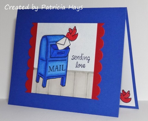
I didn’t set out with the current Lawnscaping challenge in mind when I created the second card, but it does fit, so I’ll be linking it there.

Thanks for stopping by my blog today!  I’m looking forward to seeing what my fellow crafters create with this OWH sketch!

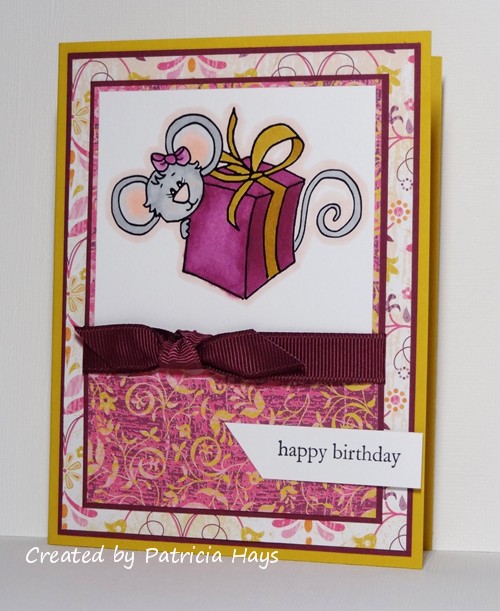
Supplies for the mouse card:
Digital Image: Cocoa’s Heart (Sweet ‘n Sassy Stamps)
Cardstock: Daffodil Delight, Chocolate Chip (Stampin’ Up); Luxury White (Gina K. Designs)
Ink: printer ink
Other: markers (Copic); Threading Water punch (Fiskars)

Supplies for the mailbox card:
Stamps: You’ve Got Mail, Bannerific (Lawn Fawn)
Cardstock: Brilliant Blue, Real Red (Stampin’ Up); Luxury White (Gina K. Designs)
Ink: Bashful Blue, Soft Sky (SU); Tuxedo Black (Memento)
Other: dimensionals (SU); markers (Copic); sponge

I incorporated a lot of challenges into today’s card!   First of all, this week’s Sweet Stop Sketch challenge was to follow a previous Sweet Stop sketch for your project’s layout.  It took me a while to decide because there are so many awesome choices there, but I finally picked sketch #118 and stretched it out for an A2 portrait-oriented card.  The current Sweet ‘n Sassy Digi Challenge is to create a project with a vintage or antique look; I think I accomplished that with the sponging I added to the different panels on the card.  The OWH Midweek Throwdown challenge is to use the colors brown and turquoise; those are the dominant colors here even though I’ve added some splashes of yellow.  I’ve also fit in this week’s Splitcoaststampers Free For All challenge to mix and match two or more designer papers (I’ve used three – the turquoise background, the turquoise and brown stripe, and the yellow scalloped border is also a designer paper scrap).

Enough talk… here’s the card:

Supplies:
Digital Image: Butterfly & Flower (Sweet ‘n Sassy Stamps)
Sentiment Stamp: Everyday Sayings (Lizzie Anne Designs)
Cardstock: So Saffron, Chocolate Chip, Very Vanilla (Stampin’ Up); designer papers from Blush and Two Scoops 6″ x 6″ paper pads (Basic Grey)
Ink: Chocolate Chip, Cool Caribbean, Soft Sky (SU); printer ink
Other: Chocolate Chip twill ribbon (SU); Premier colored pencils (Prismacolor); odorless mineral spirits (Houston Arts); small scalloped border die (Papertrey Ink); sponge

When my friend Taylor asked me if I’d consider making a sample for this week’s Splitcoaststampers.com sketch challenge, I happily agreed.  Sketch challenges are some of my favorite challenges.

Then I saw the sketch.

I froze.  I thought, “Oh my gosh.  WHAT am I going to do with this?!?”

But I printed it out, and turned it around to view it from different angles, and finally an idea popped into my head.  I decided to turn the sketch on its side and make a scene in the area that the sketch showed as empty space, incorporating the banner-like and circle elements of the sketch into the scene.  Lawn Fawn’s barn and fence seemed well-proportioned for the sketch, so I just needed to add in some other things to create a farm scene.  The cow seemed like a good choice to me, and the bird was a simple little extra touch.  I was stumped for a little bit on how to make the sentiment stand off from the rest of the card but then I thought about a quote balloon.  I figured even someone with my drawing skills (read: or lack thereof) could draw a quote balloon!  There is a lot of fussy cutting and paper piecing on this card – the cow is all paper pieced, and the fence was pretty tricky to cut.  But overall I’m pleased with the end result.  And I have to say I was amused (or maybe a-moo-sed?) by the idea of looking through my designer paper scraps for something that could be considered “cow udder pink”.

Creating a scene with stamped images is the current Lawnscaping challenge, so my card fits in there, too!

And I have a cute any occasion card to add to the box I’m filling for Operation Write Home.

Supplies for today’s card:
Stamps: Critters on the Farm, Bannerific (Lawn Fawn)
Cardstock: Luxury White (Gina K. Designs); Basic Black (SU); scraps from Ambrosia, Two Scoops and Blitzen collections (Basic Grey)
Ink: Tuxedo Black (Memento)
Other: multiliner pen (Copic)

It’s April, which means it’s time to get working on Father’s Day cards for Operation Write Home.  Shippers need to receive them by the end of this month!  Father’s Day cards are also the theme for this week’s OWH Stars & Stamps Midweek Throwdown, so I have a couple to share with you today.

First off is one using this week’s OWH Stars & Stamps blog sketch.  I turned the sketch sideways for something a little different.  I decided to let the designer paper do most of the work for me.


For my second card, I used this week’s Splitcoaststampers Sketch Challenge layout.  The only thing I changed on this one is I made sure the circle with the sentiment was on top of all the others.  I also rounded the outside corners of the card to go along with the circle theme.  It felt nice to put some of my retired cardstock and designer papers to good use!


Supplies for the mathematical card:
Stamps: All Year Cheer II (Stampin’ Up)
Cardstock: Naturals Ivory, Cherry Cobbler (SU); papers from Oxford 6″ x 6″ paper pad (Basic Grey)
Ink: Cherry Cobbler (SU)
Other: standard circle Nestabilities dies (Spellbinders)

Supplies for the many circles card:
Stamps: All Year Cheer II (Stampin’ Up)
Cardstock: Sage Shadow, Chocolate Chip, Autumn Vine designer papers (SU)
Ink: Chocolate Chip (SU)
Other: standard circle Nestabilities dies (Spellbinders); corner punch (EK Success)

Yes, I know the post title seems out of place because today is Tuesday.  Today I’m sharing cards I made yesterday for the Sweet ‘n Sassy Stamps April release party challenges at Splitcoaststampers.com.  Sweet ‘n Sassy sponsored three challenges to celebrate their new products.

Since I don’t always do things in order, LOL, the first card I created was for the third challenge, to make a monochromatic card.  This idea came to me pretty quickly; I’ve seen this general card idea done by several people who share their work in the Splitcoaststampers gallery.  The only hesitation I had was in choosing white or Soft Sky cardstock for the base of this one layer card.  I decided to hoard the Soft Sky and go with white. I used large Post-It notes to mask off the area I wanted to ink.


The second challenge was to use the theme of “April showers” as your inspiration.  I wasn’t easily coming up with any ideas for that, so I went on with the first challenge and made a birthday card.  I decided to combine this with the current Sweet Stop sketch challenge – to use any of the previous Sweet Stop sketches.  I chose sketch #145 to show off one of my newest digital images.  I took the color scheme from the designer papers.

And now I have two more cards for the box I’m planning to send to Operation Write Home at the end of the month.  Now I need to get working on Father’s Day cards to include in that shipment!

Supplies for the monochromatic card:
Stamps: Butterfly Flourish, Love From Cocoa (Sweet ‘n Sassy Stamps)
Cardstock: Luxury White (Gina K. Designs)
Ink: Soft Sky, Baja Breeze, Blue Bayou (Stampin’ Up)
Other: post-it notes; sponges

Supplies for the birthday card:
Digital Image: Cookie’s Gift (Sweet ‘n Sassy Stamps)
Stamps: Everyday Sayings (Lizzie Anne Designs)
Cardstock: Crushed Curry, Rich Razzleberry, Razzleberry Lemonade designer paper (Stampin’ Up); Solar White (Neenah)
Ink: Tuxedo Black (Memento); printer ink
Other: Rich Razzleberry ribbon (SU); markers (Copic)

Hi there!  I’m excited to be participating in the Spring Lawnscaping Blog Hop!

You should have come here after viewing Eve’s creative goodness.  If you’ve just lucked into finding the hop or think you’ve gotten lost somewhere, you can always go back to the Lawnscaping blog to figure out your way.

Spring always makes me think of butterflies and the color yellow, so I knew I wanted to use those things on my card.  I decided to go the “KISS” route for the card design – “Keep It Simple, Stamper!”  LOL  To create the butterflies, first I colored a scrap of white cardstock by watercoloring it with ink refills.  After I let it dry, I stamped the butterflies, colored in their bodies, and cut them out.  As a last minute thought, I decided to paint them with a sheer coat of Shimmerz paint so they would glisten.  The butterflies curled up from the combination of watercoloring and paint, so their bodies are attached directly to the white layer, and their wings are attached with dimensional adhesive for a 3-D effect.

You’re going to want to make sure to comment on all the blogs in this hop by 11:59 pm EST Sunday, April 8, 2012 because there are some great prizes to be won!  All the details can be found on the Lawnscaping home page linked up above.  Thank you to the hop’s generous sponsors – Lawn Fawn and Sweet Stamp Shop – for the fabby giveaways.

Thanks for stopping by here today!  Your next stop is Handmade Creations by Stephanie.  I hope you have fun seeing what everyone else has created, and I hope you’ll come back to visit again!

Supplies for today’s card:
Stamps: Flutter By, Sophie’s Sentiments (Lawn Fawn)
Cardstock: Daffodil Delight (Stampin’ Up); Luxury White (Gina K. Designs)
Ink: Tuxedo Black (Memento)
Other: Daffodil Delight and Marina Mist ink refills, corner rounder punch, dimensionals (SU); multiliner brush marker (Copic); Angel Wings paint (Shimmerz); paintbrush

I’ve been trying to get some masculine cards made for the Operation Write Home Muscle Card Challenge.  This one uses the Sweet Stop sketch #152 layout.  I’m not sure I like the contrast of the white background in the designer paper against the darker colors, but it was the best designer paper I had to match the colors and scene of my focal point. The focal point is stamped on glossy paper brayered with ink from a rainbow pad. I’ve had it done up for so long that I have to confess I’m not 100% sure which rainbow pad I used, and I think the colors have mellowed a bit. I *think* it’s Adirondack’s Wildflower pad. This week’s OWH Stars and Stamps Midweek Throwdown challenge is to create “thinking of you” cards, so that was the inspiration for the sentiment I chose.  (I was hurrying to get this blogged, but don’t worry – I’ll go back and put a white liner inside the card!)

Supplies:
Stamps: Serene Silhouettes, Thoughtful Rhubarb (Sweet ‘n Sassy Stamps); Sanded (Stampin’ Up)
Cardstock: Chocolate Chip, Not Quite Navy, Whisper White, Glossy White, Autumn Vine designer paper (SU)
Ink: Chocolate Chip, Not Quite Navy (SU); rainbow ink pad (source unsure)
Other: standard circle Nestabilities dies (Spellbinders); brayer

Winner alert!

Comments Off on Winner alert!
Apr 042012

Congratulations to Laura, who commented on my Forget Me Not post.  She’s the winner of my 1500 comments blog candy!  I’ll be sending an email to the address she provided when she left her kind comment.

And now on to the next 1500 comments!  Woo-hoo!


I was honored and delighted recently to be asked to create a crafty itinerary for the Desert Islands Crafts Challenge blog!  If you’re not familiar with DICC, they present a new challenge on the 1st and the 15th of every month.  They provide a list of 10 items, and you must use a minimum of three of those items on your creation, which can be a card, layout, or other crafty project.  My itinerary is up now through April 14, 2012.  I’d love to see what you can create from it!  Here’s the list:

1. humorous or punny sentiment
2. no glitter
3. suitable for a child under the age of 10
4. 2 or more patterned papers
5. sponging
6. masculine
7. clean and simple
8. pearls
9. punched or die cut embellishments
10. brown

I used items 1, 2, 3, 4, 5, 6 and 10 for my card.  I was trying for #7, too, but I think it’s stretching the limits of “clean and simple” a bit. I used the mirror image of the March 2012 Sketch For You To Try for the layout. Item #2 is in honor of Operation Write Home. If you have handmade cards that need a home, I encourage you to consider donating them to OWH.  Cute Rhubarb the bear makes this card work for the current OWH Stars & Stamps blog Midweek Throwdown Challenge, too.

Thanks again to Taylor and the rest of the Desert Islands Design Team for letting me be a part of them for this challenge!

Supplies for this card:
Stamps: Thoughtful Rhubarb (Sweet ‘n Sassy Stamps)
Cardstock: Close to Cocoa (Stampin’ Up); Vintage Cream (Papertrey Ink); papers from Oxford 6″ x 6″ paper pad (Basic Grey)
Ink: Tuxedo Black (Memento); Close to Cocoa (SU)
Other: standard circle Nestabilities die (Spellbinders); markers (Copic); sponge

© 2019 Suffusion theme by Sayontan Sinha