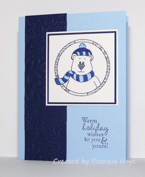
Saturday means it’s time for another 52 {Christmas} Card Throwdown challenge! This week we have a fun theme that I guess is kind of a cross between a technique challenge and an embellishment challenge – punch art. You can join in by making a Christmas or winter card using punches to create your focal point, and linking it to the 52{C}CT website by 1:00 pm Eastern time Friday, May 2. Check out the challenge site for all the details.

I saw a darling snowman card in the Splitcoaststampers.com gallery a couple years ago and have wanted to give it a try.  I thought the perspective of looking down at the snowman was a fun alternative to looking at him at something nearer to eye level.  This challenge was just the nudge I needed to go ahead and try it.  I confess that I fudged a little on the “punch” aspect with regard to the circles for the snowman – my punches were either too large or too small, so I used my Nestabilities dies to cut them.  The edges of them are very lightly sponged with blue ink to add some visual dimension (so very lightly that it doesn’t really show in the photo.  Ooops.).  The top part of the hat (the crown?) was made with a square punch, and the brim is just a narrow scrap of cardstock that I cut to fit.  I also cut the arms and nose from scraps of cardstock.  I used my 1/4″ circle punch for the eyes and buttons, and the circles for the mouth were done with my old “anywhere punch” from setting eyelets.  I chose the ribbon to decorate the hat by color coordinating it with the snowman’s “carrot” nose, and that’s also how I chose the color for the card base.   I used my shimmer paint on the snow for the ground.  I didn’t have a whole lot of room for a sentiment, so I chose a short one that will make this a cute “any reason” card to donate to Operation Write Home for one of our heroes to use this coming winter.  (I know I still need to put a light-colored liner inside of it.)  Even though the different parts of the snowman are raised up with dimensional adhesive, I think the card will smoosh flat enough to go through the mail all right.  In real life, the dimension helps prevent the hat from visually blending into the black mat so much.

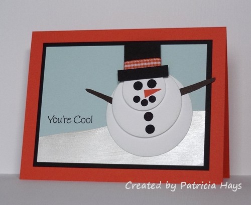
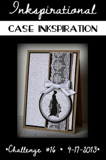
The layout for my card was taken from this week’s Inkspirational challenge.

So, there you have it.  Thanks for stopping by today!  I hope you’ll join us and play along with 52{C}CT this week!

Supplies:
Stamps: Two Scoops for Flopsey (My Favorite Things)
Cardstock: Tangerine Tango, Basic Black, Soft Sky, Early Espresso, Whisper White (Stampin’ Up)
Ink: Tuxedo Black (Memento)
Other: standard circle Nestabilities dies (Spellbinders); 1″ square punch (Creative Memories); 1/4″ circle handheld punch (source unknown); 3/16″ hole punch (Making Memories); Frost White shimmer paint (SU); orange gingham ribbon (Offray)

I’ve needed to make a few sympathy cards lately.  Today I’m sharing one of them.  It uses the color scheme for this week’s Dynamic Duos challenge, gray and black.  The idea is very similar to some of the one-layer cards I’ve made recently, but this time I’ve added a mat to the focal panel and layered them onto a card base of a third color.

Thanks for stopping by today!

Supplies:
Stamps: Lovely as a Tree (Stampin’ Up); Everyday Sayings (Lizzie Anne Designs)
Cardstock: Whisper White, Basic Black, Basic Gray (SU)
Ink: Basic Gray (SU); Tuxedo Black (Memento)
Other: sponge

I’ve been having a hard time feeling creative the last few weeks, but I wanted to give the CAS – Colours and Sketches challenge a try because I thought they were offering up some really pretty colors this week.  So I pulled that together with the current SCS CAS challenge, which is a sketch challenge.  And here’s the end result.

The pearls were an afterthought.  I had already taken a few photos of the card but felt that it was still missing something.  I had just enough of these tiny half pearls to put one in the center of each flower.  It’s not much, but it really does help dress up the card. And now I have another one for Operation Write Home.

Thanks for stopping by today!

All supplies for this card, except the pearls, are from Stampin’ Up:
Stamps: Just Vine, Trendy Trees
Cardstock: Whisper White, Rich Razzleberry, Primrose Petals, Pool Party
Ink: Rich Razzleberry, Primrose Petals, Pool Party
Other: half pearls (KaiserCraft)

Hello, and happy Saturday!  This week is “theme week” at 52 {Christmas} Card Throwdown.  The challenge this week is to create a card depicting Santa Claus (or Father Christmas, or however he is known in your country).  How fun is that?  🙂

I was so looking forward to this challenge until I realized late last week that – GASP – I did not own any Santa stamps.  Seriously.  So, a girl’s gotta do what a girl’s gotta do, which meant that this girl made a trip to Michael’s.  Thankfully, the store had a couple of Christmas stamp sets in stock, and I had a 50% off coupon, and I found a few other things I needed, and it worked out that the amount I saved using the coupon equaled the price of the stamp set I chose.  So it was kind of like getting this stamp set for free.  Gotta love that! 🙂  I thought the whimsical Santa in this stamp set was pretty cute, and the set has several other darling images.

I decided to use the current Inkspirational challenge for the layout of my card.  Although the designer paper isn’t a typical Christmasy print, it came from a wintry/Christmasy Basic Grey paper pad.  I liked the contrast of the light blue with the bright red.  I had made the ribbon bow for a project a long time ago, but didn’t like the way it turned out, so a few weeks ago I tossed the other creation and kept the bow.  It worked out perfectly for this card layout!  As I was playing around with fitting the bow and the focal point on the card, it struck me that the circle with the bow on top resembled a Christmas ornament.  So I thought, why not turn it into an ornament?  I started to cut an ornament hook from silvery cardstock, but that was a disaster.  Then I remembered I had some ornament hooks here in my craft room and as serendipity would have it, they were silver wire (rather than the green vinyl coated ones that we actually use on our tree) so they coordinated nicely.  In order to accommodate the bow without covering up a lot of the image, I had to place the ornament so that Santa was at an angle, and in the midst of all the arranging I decided that the card would look better if I used a mirror image of the layout.  And I also forgot until after I’d photographed the card that I had intended to put the red strip through one of my embossing folders.  Ooops.  But since the hook and the bow provide a bit of bulk, and I had to use dimensional adhesive to attach the circle, it’s probably just as well that I didn’t add even more dimension with embossing.


So, now it’s time for you to go to the 52{C}CT site and check out the great stuff that the rest of the design team has created!  (While you’re at it, I’m sure they’d appreciate any comments you’d like to give them.)  Then make a card showing off ol’ St. Nick, and share it at the 52{C}CT site by noon eastern time Friday, April 26.  We’d love to see what you come up with!  🙂

Supplies:
Stamps: Christmas Characters (Inkadinkado)
Cardstock: Soft Sky, Real Red (Stampin’ Up); Basics White (Papertrey Ink); designer paper from Aspen Frost 6″ x 6″ paper pad (Basic Grey)
Ink: Onyx Black (VersaFine)
Other: markers (Copic); Soft Sky ribbon, dimensionals (SU); ornament hook (source unknown)

This week’s Dynamic Duos color challenge had me stumped for several days.  Although I know from art class back in junior high school that complementary colors (across the color wheel from each other) are supposed to work together, blue and orange still proves to be a difficult combination for me.  In my head, I tossed around the possibility of flowers – but then I would have wanted to add green stems and leaves and that wouldn’t work for the challenge.  I also thought about birthday presents but nothing really seemed to click.  Eventually my brain came back to nature, and I thought of autumn leaves against a blue sky.  Which, of course, seems really out of season right now since spring has finally arrived.  LOL  But I figured, I’m frequently working seasons ahead of time for Operation Write Home, so an autumn-ish card shouldn’t look too out of place here on my blog.

So here’s what I’ve created.  I sponged the blue ink onto the image panel first.  Then I stamped the leaves.  I wanted to add a little extra orange to the leaves, so I took a slightly damp paintbrush and “painted” water over the stamped leaves to spread the ink.  I didn’t want to blur the edges of the leaves, but just soften and spread the color inside of them.  I scored lines on the card base to frame the image panel, added a simple sentiment, and attached the panel.  Clean, simple, and fairly quick – and almost a one-layer card, too!


Thanks for stopping by today!  I do read and appreciate all comments – they brighten my day!

Supplies:
Stamps: unnamed leaf stamp (StampCraft); Everyday Messages (Stampendous)
Cardstock: Pure Luxury Ivory (Gina K. Designs)
Ink: Bashful Blue, Pumpkin Pie (Stampin’ Up)
Other: scoring board (Martha Stewart); sponge; paintbrush & water

Hello!  It’s the second Saturday of the month, which means it’s time for another color challenge at 52 {Christmas} Card Throwdown.  It’s a monochromatic scheme of navy, light blue, and white, which is a good combination for wintry cards!  It’s all right to use black for a sentiment or for an outline image, but otherwise the colors used in your card need to stick to the color scheme.

It took me a while to figure out what to create.  My in-laws have been visiting this week and I’ve been spending time with them, so I needed to keep my card pretty quick and simple.  I decided to go with this older layout from the OWH Stars & Stamps sketches archive.  I chose this bear image because it would be quick to color and easy to put with the challenge color scheme.  (I did take a little liberty with the colors to make the bear’s nose dark gray; I felt black would be a bit too harsh.)  The navy vertical panel is embossed with snowflakes.

So, now it’s time for you to check out the other design team members’ creations, and then make a card with these colors to link to the challenge site!  We’d love to see what you can do!  Thanks for stopping by today.

Supplies:
Stamps: Cozy Friends (Sweet ‘n Sassy Stamps)
Cardstock: Bashful Blue, Night of Navy (Stampin’ Up); Pure Luxury White (Gina K. Designs)
Ink: Night of Navy (SU); Tuxedo Black (Memento)
Other: markers (Copic); Snowflakes embossing folder (Sizzix)

Sweet 'n Sassy Digi Challenge #100

Comments Off on Sweet ‘n Sassy Digi Challenge #100
Apr 122013

Hello!  It’s time for the 100th weekly challenge at Sweet ‘n Sassy Digi Challenge! This week’s challenge, unfortunately, comes with some bittersweet news.  Because the clear stamps and dies part of the Sweet ‘n Sassy Stamps business is booming, Korin (the owner) is needing to let some things in her life go – and sadly, this challenge blog is one of those things.  This week’s challenge will be the last Sweet ‘n Sassy Digi Challenge.  All the current Sweet ‘n Sassy digital images will continue to be sold in the Sweet ‘n Sassy Stamps online store, but there will be no more regularly scheduled new digi releases.

However, since 100 challenges is still a major milestone, we are going out with a celebratory bang!  One participant in this week’s challenge will receive 3 Sweet ‘n Sassy digital images of his/her choice.  Participants who use a SNSS digital image in their work may link their project twice, for an additional chance to win.  Please see the SNSDC site for all the details on how you can win this fun prize.

This week’s challenge is Pick Your Favorite!  Take a look through the previous Sweet ‘n Sassy Digi Challenges and choose one of them to inspire your project.  When you write your challenge description, please share which challenge you used.  Remember to use a digital image as the main focal point of your creation!

I had a really hard time settling on one previous challenge, and I didn’t have time to make multiple cards.  So I’ve combined three of my favorite challenges into this one card.  Those of you who have been reading my blog for some time know how much I enjoy making cards for Operation Write Home – for our country’s military men and women who are stationed overseas to be able to write to their loved ones at home.  A lot of those heroes have children waiting at home for them.  So I felt compelled to use SNSDC93, a card for a child.  I just love all the cute Sweet ‘n Sassy critters, so that tied SNSDC99 into today’s card.  I also like stitching on my cards (even though I don’t do it very often) so that incorporated SNSDC77.  I was also aiming for SNSDC58, to make a clean and simple card, but I used one of the OWH Stars & Stamps bonus sketches for the layout and it turned out more accurately described as clean and layered.

Thank you to everyone who has supported the Sweet ‘n Sassy Digi Challenge blog through their participation in the challenges.  I know I’ll miss being part of the SNSDC design team.

Supplies:
Digital Image: Bunny Love (Sweet ‘n Sassy Stamps)
Cardstock: Pure Luxury White (Gina K. Designs); designer papers from Sugar Rush 6″ x 6″ paper pad (Basic Grey)
Ink: printer ink
Other: markers (Copic); standard and big scalloped circle Nestabilities dies (Spellbinders); embroidery floss (DMC)

My crafting time this week is just in fits and spurts, so today’s card is another quick and easy one.  I had printed out this digital image a few months ago, and today I colored it to fit the Dynamic Duos color challenge.  I trimmed the image panel, added a mat and a card base, and called it done.  I did consider adding a bow at the top of the card, but decided against it to keep the card easy to mail for Operation Write Home.

Supplies:
Digital Image: Pure Innocence 22 (Heather Ellis)
Cardstock: Pure Luxury White (Gina K. Designs); Pool Party, Cherry Cobbler (Stampin’ Up)
Ink: printer ink
Other: markers (Copic); corner rounder punch (SU)

Here’s a card I put together pretty quickly this morning, just in time to enter into the Inkspirational color challenge of pink, banana and slate.  I used Stampin’ Up’s retired color Going Gray for my slate color.  The layout for this card is this week’s OWH Stars & Stamps sketch, substituting the bunny for the circle.  I fussy cut the bunny after I colored him, and he’s attached to the card with dimensional adhesive. I also incorporated the OWH Midweek Throwdown challenge of using tags and twine.

Thanks for stopping by today!

Supplies:
Stamps: Two Scoops for Flopsey (My Favorite Things)
Cardstock: Going Gray (Stampin’ Up); Pure Luxury White (Gina K. Designs) [for the bunny]; designer papers from Two Scoops 6″ x 6″ paper pad (Basic Grey)
Ink: Tuxedo Black (Memento)
Other: markers (Copic); dimensionals (SU); Oyster twine (Really Reasonable Ribbon); petite oval Nestabilities die (Spellbinders)

Hello!  It’s the first Saturday of the month, so that means it’s time for another sketch challenge at 52 {Christmas} Card Throwdown!

I put a little spin on the sketch by rotating it 90° counterclockwise.  Instead of the scalloped border shown in the sketch, I used a ruffled ribbon (it was already ruffled when I bought it).  I picked out several coordinating designer papers and let them do much of the work for me.  I couldn’t decide on an image to use for the focal panel, so I chose a wordy sentiment to fill the space.

And there’s another Christmas card to add to the ones I’m setting aside to send to Operation Write Home in the late summer or early fall.

I hope you’ll check out the challenge details at the 52{C}CT site and play along with us this week!  Be sure to visit the rest of the design team members’ blogs for some more inspiration.  Thanks for stopping by today!

Supplies:
Stamps: More Merry Messages (Stampin’ Up)
Cardstock: Riding Hood Red (SU); designer papers from Nordic Holiday 6″ x 6″ paper pad (Basic Grey)
Ink: Riding Hood Red (SU)
Other: Riding Hood Red ruffled ribbon (SU); red half pearls (KaiserCraft)

Hello! It’s Friday, which means it’s time for a new Sweet ‘n Sassy Digi Challenge! This week we have a theme challenge: Cute & Cuddly. You’ll need to create a project using a digital image of a cute, cuddly animal. You don’t have to use a Sweet ‘n Sassy digital image, but we really enjoy seeing our participants use them.

For my card, I’ve turned to one of my favorite Sweet ‘n Sassy images. Rhubarb the bear is holding a heart full of love for someone special. Because crafting time has been in short supply for me this week, I knew it would be quicker to paper piece Rhubarb rather than to color him. (However, I did color in his ears, eyes and nose with a marker.)  Although the bow is kind of a feminine touch, I am hoping that the color scheme gives this card a gender neutral vibe. The layout is the current one from Freshly Made Sketches, but stretched into a rectangle.


Now it’s your turn to show us what you can create! Link your card at the Sweet ‘n Sassy Digi Challenge site by midnight eastern time Thursday, April 11. Be sure to see what the rest of the Design Team has created and give them some comment love, too. Links to their blogs are in the left sidebar. Thanks for stopping by today!

Supplies:
Digital Images: Rhubarb’s Heart, Valentine’s Day Greetings (Sweet ‘n Sassy Stamps)
Cardstock: Soft Sky, Chocolate Chip, Soft Sky Prints designer series papers, Afternoon Tea designer series paper (Stampin’ Up)
Ink: printer ink
Other: Chocolate Chip grosgrain ribbon, Basic Black marker (SU)

Hello!  I hope you had a nice Easter.  Mine was good, but it’s been a busy week which made it necessary for me to take a little break from crafting.  But today I wanted to get back in the swing of card making and create something for this week’s Dynamic Duos challenge.

Because March had 5 Saturdays, for this week’s challenge the Dynamic Duos girls gave an open option color combo that let the participants choose one of the two colors.  They provided us with a deep pink, and each participant was allowed to choose the other color, plus use any neutrals.  I decided to use a blue in an attempt to make a gender-neutral card for Operation Write Home. The layout is this week’s OWH Stars & Stamps sketch, turned on its side to put it in portrait orientation.  I accidentally cut the image panel too short, which didn’t leave room for the sentiment to go below the bunny the way I’d planned.  So I carefully inked it up to separate the words into three lines beside the bunny.

Supplies:
Stamps: Flopsey Bunch of Hearts (My Favorite Things)
Cardstock: Kraft, Primrose Petals, Not Quite Navy (Stampin’ Up); Pure Luxury Ivory (Gina K. Designs)
Ink: Tuxedo Black (Memento)
Other: Hearts embossing folder (ProvoCraft); markers (Copic); Hearts dies (Sweet ‘n Sassy Stamps)

© 2019 Suffusion theme by Sayontan Sinha