Hello!  I hope the summer heat isn’t getting you down.  Thinking about Christmas is a good way to beat it!  The team at 52 {Christmas} Card Throwdown has a rare fifth Saturday of the month in June, so we’ve come up with a new challenge idea – “Pick a Previous”.  This time we’d like you to choose one of the previous sketch challenges that have been presented at 52{C}CT, and use it to create a Christmas card.  A listing showing all of the previous sketches can be found at the Sketches Archive tab on the challenge website.

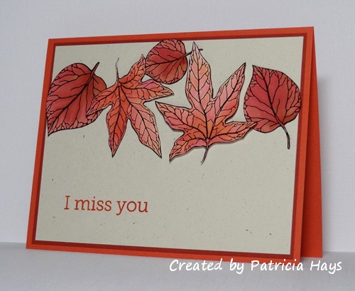
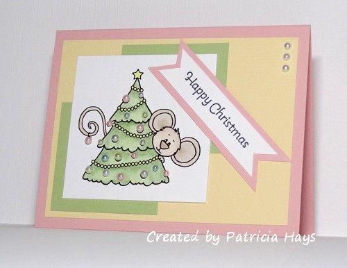
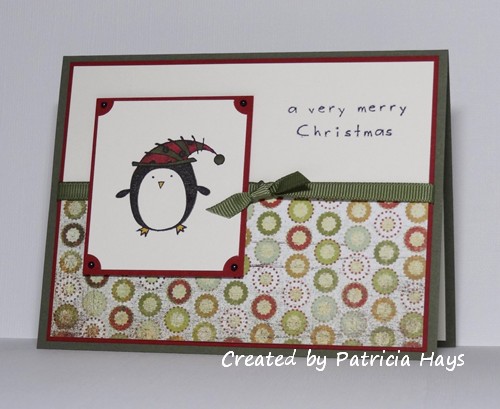
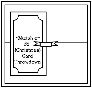
I’ve chosen Sketch #6 from June 2012 for my card.  I’ve stretched it out into a rectangular format.  I’ve been wanting to use this roly-poly penguin image for a while, and he’s finally making his debut on my blog today. The pearls in the corners of the image panel started out white, but I used my black Copic marker to make them better color-coordinate with the card.  And now I have another Christmas card to add to the pile I’m accumulating to send to Operation Write Home.

Thanks for stopping by today!  Go check out what the other design team members have created and give them a little blog love, too.  Then join us in our challenge!  You can link your work at the 52{C}CT website until 1:00 pm eastern time Friday, July 5.  We’d love to see what you make!

Supplies:
Stamps: Christmas Characters (Inkadinkado)
Cardstock: Always Artichoke, Cherry Cobbler (Stampin’ Up); Pure Luxury White (Gina K. Designs); “Sleigh Bells” from Fruitcake collection (Basic Grey)
Ink: Onyx Black (VersaFine)
Other: Always Artichoke ribbon (SU); pearls (KaiserCraft); markers (Copic)

Good morning!  This week’s CAS – Colours and Sketches challenge is a sketch challenge.  I’ve combined it with the Dynamic Duos deep oranges color challenge.  I’ve taken the liberty of adding in a mat to highlight the color challenge combo, as well as turning the sketch on its side.  The leaves are digital images that I’ve colored using a watercoloring technique.  I used Tangerine Tango on the maple leaves and Cajun Craze on the other leaves (they look more like redbud leaves to me than any other kind, but feel welcome to leave me a comment to correct me if I’m wrong).  However, once they dried, they all ended up looking pretty similar in color.  Oh well.  After all the fussy cutting was done, it still made a nice autumn-looking card for Operation Write Home.  The maple leaf on the left has a cardstock shim under it, and the maple leaf on the right is adhered with pop dots, to give a little bit of dimension to the card.


Thanks for stopping by today!  I hope you’ll join us over at CAS – Colours and Sketches with your own take on this sketch!  You have until noon eastern time Wednesday, July 3 to link your card at the challenge website.

Supplies:
Digital Images: Autumn Leaves (Sweet ‘n Sassy Stamps)
Sentiment Stamp: Year Round Sentiments (Hero Arts)
Cardstock: Tangerine Tango, Cajun Craze, Naturals Ivory (Stampin’ Up); Solar White (Neenah) [for the leaves]
Ink: printer ink; Tangerine Tango (SU)
Other: Tangerine Tango and Cajun Craze ink refills, dimensionals (SU)

Hello!  It’s the fourth Saturday of the month, which means it’s time for an embellishment or a technique challenge at 52 {Christmas} Card Throwdown.  This week our hostess, Jacqueline, is challenging us to use sequins and/or pearls to embellish our Christmas cards.

I’ve chosen to use pearls on my card – mainly because I don’t own any sequins.  I decided to use them as the ornaments on the tree in this digital image.  The pastel colors of the pearls dictated my color choices for the card.  The layout is a fairly recent OWH Stars & Stamps sketch that I hadn’t yet used.  I originally planned to turn the sketch on its side to make this a portrait-oriented card, with the sentiment banner across the bottom, below the image panel.  However, as I opened one of my green markers to color the image, it splattered green ink on the cardstock, right above Cocoa Mouse’s head.  I tried using colorless blender to “erase” it, but I wasn’t completely successful at that.  I didn’t want to take the time to print another image and color it, especially since I’d already colored Cocoa and the garland.  So I ended up turning the card back to a landscape layout, and angled the sentiment banner to cover up the ink spot.  I guess that’s making the best of a bummer situation.  It’s hard to tell in the photo, but the yellow cardstock is textured, to give the card a little more visual interest in real life.

I hope you’ll check out the challenge details at the 52{C}CT site and play along with us this week!  Be sure to visit the rest of the design team members’ blogs for some more inspiration.  Thanks for stopping by today!

Supplies:
Digital Image: Cocoa’s Christmas Tree (Sweet ‘n Sassy Stamps)
Sentiment Stamp: More Merry Messages (Stampin’ Up)
Cardstock: Blushing Bride, Barely Banana textured, Certainly Celery (SU); Pure Luxury White (Gina K. Designs)
Ink: printer ink; Tuxedo Black (Memento)
Other: half pearls (KaiserCraft and Basic Grey); markers (Copic)

Hello!  I have some happy news today:  I was recently asked to join the Design Team for the CAS – Colours and Sketches Challenge blog!  I’ve been participating in their challenges as frequently as possible over the last few months, and I was honored and thrilled to be asked if I wanted to join the team.  I’m looking forward to working with this group of ladies and creating some more clean and simple cards!

This week’s challenge is a color challenge.  I have to admit that I was stumped on this one for a while.  My first attempt turned into a coloring disaster.  So I switched gears and decided to use solid image stamps that didn’t require coloring.  Rather than layering cardstock to mat the image, I opted to go with a colorblocked look. And I’ve ended up with another card for the box I’m filling for Operation Write Home.

For all the details of this challenge, please check out the blog at CAS – Colours and Sketches.  I hope you’ll join us!  Thanks for stopping by today.

Supplies:
Stamps: Trendy Trees, Branch Out (Stampin’ Up)
Cardstock: Cajun Craze, Gumball Green, Primrose Petals (SU); Pure Luxury Ivory (Gina K. Designs)
Ink: Cajun Craze, Gumball Green, Primrose Petals (SU)

I’ve just realized that I’ve used the same stamp set for this week’s Dynamic Duos challenge as I used last week.  That wasn’t intentional!  But what can I say – it’s a very versatile set that I really like.

This week the challenge colors are Pear Pizzazz and Basic Black, with an option to use a plant theme.  I originally thought about trying to do something with leaves, but in the end I came back to this tree stamp.  The layout comes from this week’s Freshly Made Sketches challenge.  I’ve used ruffled seam binding in place of the scalloped element, and added a layer to the sketch so I could tuck the ends of the binding underneath.  Even though the ruffles add dimension to the card, they are soft and squishable so they’ll be easy to mail, so I think this card will still be suitable for Operation Write Home.

Thanks for stopping by today!  As always, all comments are read and appreciated.

Edited on 6/21/13 to add:  Thank you, Hayley, for choosing this card as a Dynamic Duos Dynamic Darling!  I’m so honored! 🙂

All supplies except the black ink are from Stampin’ Up.
Stamps: Branch Out, Itty Bitty Banners
Cardstock: Pear Pizzazz, Basic Black, Naturals White
Ink: Tuxedo Black (Memento); Pear Pizzazz
Other: Pear Pizzazz seam binding, Bitty Banners Framelits die

Hello, and happy Saturday! This week is “theme week” at 52 {Christmas} Card Throwdown.  We have a very festive theme this time.  Jacqueline, our challenge hostess, is asking us to feature ornaments on our cards.

For my card, I dug into my stash and found these ornament charms that were left over from a card swap I participated in back in – believe it or not – 2003!  Yes – these things are 10 years old.  The “happy holidays” plaque dates back to the same time.  So finally using these items felt good.  I was pleasantly surprised by how well the charms coordinated with this designer paper.  This week’s Freshly Made Sketches layout pulled everything together, although I stretched the card out to a rectangle rather than keeping it a square like the original sketch. The garland on the focal panel is a product of my incredibly challenged drawing skills. LOL


I tied this card into the June OWH Design Bootcamp lesson of repetition and variation, too.  The ornament charms repeat the ornaments on the designer paper, and the cardstock colors I chose are featured in the designer paper.  The variation occurs with the different colored strings attaching the ornament charms to the “garland”, in both texture and color.  I’ve also evoked the Rule of Odds from a previous Bootcamp by using 3 ornament charms.

Although the ornaments are pretty flat, they do add a fair amount of weight to the card.  So instead of including this in the supply of Christmas cards I’m building for our military heroes to use to write home on during the holiday season, I’m going to use this one as an AnyHero card to brighten a hero’s day.

So, now it’s time for you to go to the 52{C}CT site and check out the great stuff that the rest of the design team has created! (While you’re at it, I’m sure they’d appreciate any comments you’d like to give them.) Then make a card showing off ornaments and share it at the 52{C}CT site by noon eastern time Friday, June 21. We’d love to see what you come up with! 🙂

Supplies:
Stamps: none
Cardstock: Always Artichoke, Early Espresso, Naturals Ivory (Stampin’ Up); designer paper from Very Merry Christmas 6″ x 6″ paper pad (Echo Park)
Ink: none
Other: ornament charms; holiday sentiment eyelet (Making Memories); embroidery floss (DMC); marker (Copic)

When I saw that this week’s colors for the Dynamic Duos challenge were Blushing Bride and Soft Suede, I was super happy because I really like the combination of pink and brown.  I toyed with different ideas of what to do with them, and finally had a chance to sit down last night and start working with them.

I decided to go quick and easy, and I am low on love-themed cards for the box I’m preparing for Operation Write Home, so those factors decided my card theme and design.  I picked sketch #29 from the OWH Stars & Stamps blog for my layout.  It’s an older one, but I hadn’t used it before, so it feels good to check another one off the list.  I stamped the long vertical panel with a subtle design in the same color ink and added a ribbon to give it more visual interest.

I have to admit that I didn’t care for the Blushing Bride color when it was first introduced.  But it’s grown on me in the last year or so.  I like that it isn’t “little girlie pink” and doesn’t look overly feminine.

Thanks for stopping by today!  I hope you’ve been having a good week.

All supplies for this card are from Stampin’ Up.
Stamps: Branch Out, Small Sayings, Sanded, Three Little Words
Cardstock: Blushing Bride, Soft Suede, Very Vanilla
Ink: Blushing Bride, Soft Suede
Other: Blushing Bride ribbon, dimensionals

This week we have a very simple color challenge for you at 52 {Christmas} Card Throwdown – shades of green.  That’s it.  Just green.  You may use one neutral color, such as white, black, cream, or kraft.  For the full challenge details, please see the 52{C}CT site.

I admit I had to really think to figure out what to create for this challenge.  I considered doing something with a tree image, but wasn’t really feeling it.  Finally I decided to fall back on a clean and simple design, and make a card with a wreath on it.  I chose my large medallion stamp for the wreath and added a die cut circle to the center to give it a wreath shape.  I inked the stamp with two shades of green ink and tried sponging to blend them together.  I was hoping that would result in a third shade of green, which unfortunately didn’t work quite as well as I’d hoped it would, but it still turned out okay.  An ivory bow and pearl “mistletoe berries” complete the card.  I first planned to use velvet ribbon for the bow, but opted for the taffeta instead because it lies flatter, making it a better choice for Operation Write Home.

Go over to the 52 {Christmas} Card Throwdown challenge site to get some more inspiration from the rest of the design team, make a card of your own, and share it with us using the linky tool at the site!  You have until 1:00 p.m. eastern time Friday, June 14 to link your work.  We hope you’ll join us!

All supplies are from Stampin’ Up unless otherwise noted:
Stamps: Medallion, Fundamental Phrases
Cardstock: Certainly Celery, Garden Green, Very Vanilla
Ink: Certainly Celery, Garden Green
Other: pearls (Queen & Co.); petite scalloped circle Nestabilities die (Spellbinders); Very Vanilla taffeta ribbon

I have to admit I had a really difficult time with this week’s Dynamic Duos color challenge.  All I could think about was how much my mom has always disliked seeing red and purple together, even though this challenge calls for a kind of purpley red.  It’s taken me almost right up to the deadline for linking my card, but I finally came through with something.

I didn’t want to do anything really flowery. I originally thought I was going to go with something geometric, maybe using hexagons since they’re pretty trendy right now.  But in the end I decided to rework a design I’d originally come up with back in 2006.  I just changed up the colors.  The sand-colored cardstock is textured, and the holes are punched out of it so that the light purple piece shows through.  In retrospect, a sentiment with a bolder font would have shown up better against its background, but I think this will still be good enough to include in my next shipment to Operation Write Home.  I just need to add a light-colored liner inside the card so handwriting will show up in it better.

All supplies except the hole punch are from Stampin’ Up.
Stamps: Fun With Shapes, So Happy For You, Paisley
Cardstock: Raspberry Ripple, Wisteria Wonder, Sahara Sand textured, Whisper White
Ink: Raspberry Ripple, Wisteria Wonder
Other: hole punch (Creative Memories)

My mom just celebrated her birthday, and today I’m sharing the card my family gave her.  I used the CAS – Colours and Sketches double challenge #27 as my inspiration for the layout and color scheme.  It’s been a long time since I’ve made a square card, so it was nice to work with that smaller size for something a little different (the card is 4.25″ square).  The card base is textured cardstock, but the texture unfortunately doesn’t show well in the photo.  For the darkest flowers, I inked the stamp with my red marker, then pulled off a bit of the ink with a tissue, and then ran the brush tip of the marker against the edges of the rubber to add a bit more darkness around the edges of the flower.  The lighter flowers are just second and third generation stampings – where I stamped the image again without reinking the stamp.  I hope that still keeps the card in qualification for the color part of the challenge.  For the small squares, I stamped the red flourish on white cardstock.  The white still looked a bit too bright against the card base, so I sponged some ink in the same color as the card base to tone it down.


I’m not going to embarrass my mom by putting her picture on here, but she said that her family made her birthday the best one she’s had.  I hope she has many more happy years!

Supplies:
Stamps: A Real Wild Poppy (Hero Arts); Filigree and It’s Your Birthday (Stampin’ Up)
Cardstock: Sahara Sand textured, Always Artichoke, Whisper White (SU)
Ink: Real Red, Sahara Sand (SU)
Other: Real Red and Always Artichoke markers (SU); standard circle and petite scalloped circle Nestabilities dies (Spellbinders); sponge

Over the years we’ve become friends with several of the other families from our high school who are involved in the marching, symphonic and concert bands.  Today’s card was made for one band girl extraordinaire who is graduating this year.  She is an excellent flautist, she’s a bunch of fun and joy to be around, and we’ll miss her when she is off to college next year.

I used Freshly Made Sketches #88 for the layout, but turned it on its side.  I made an attempt to have the graduate image resemble our friend.  I added length to the hair on the image, but I wasn’t brave enough to draw in eyeglasses.  The school’s colors are bright blue and white, but the marching band uniforms and sports teams’ uniforms also have a lot of black on them.  So I chose blue, black and white for my color scheme.  I had to do some tweaking with my photo editing software, but the embossing I did on the black strip shows on the photo now.  I had the pieces of the card all laid out before adhering them down to the card base, and it seemed like something was missing.  I called my older son over because he’s good friends with the graduate, and I asked for his thoughts.  We decided together that a little bit of red would help brighten everything – and it also ties in with the red cording accents on the marching band uniforms.  Here is the final result:

I’ve decided to go ahead and enter this in this week’s Inkspirational “Anything Goes” challenge, too.

Thanks for stopping by today!  I hope you’ll join me in wishing all the best to Emilie and to all the other members of the class of 2013!

Supplies:

Digital Image: Pure Innocence 028 (Heather Ellis)
Stamp: Itty Bitty Banners (Stampin’ Up)
Cardstock: Brilliant Blue, Basic Black, Real Red (SU); Pure Luxury White (Gina K. Designs)
Ink: printer ink; Real Red (SU)
Other: Victoria embossing folder (ProvoCraft); Bitty Banners Framelits dies (SU/Sizzix)

Wow – it’s June already!  The year really seems to be going by quickly.

Since it’s the first Saturday of the month, it’s time for a sketch challenge at 52 {Christmas} Card Throwdown.  I’ve stretched the layout from a square into a rectangle.  Instead of circles, I thought I’d try snowflakes.  I’ve had this snowflake embossing die for a while and it was calling out to be used.  Even though the embossing adds some texture and dimension, the card is still flat enough to be easily mailed, so it’ll be a good one to add to the stash I’m creating for Operation Write Home. The strip of designer paper was a scrap from a previous card.  After finding a cardstock color that matched it pretty well, I decided to give the card a pop of color with the cherry red.

I hope you’ll go see what the rest of the design team did with this sketch, and that you’ll be inspired to use it to make a Christmas card of your own!  Be sure to share it at the 52{C}CT site by 1:00 p.m. eastern time Friday, June 7.  Thanks for stopping by today!

Supplies:
Stamps: More Merry Messages (Stampin’ Up); Snowmen and Snowflakes (Hero Arts)
Cardstock: Sage Shadow, Cherry Cobbler, Naturals White (SU); designer paper from Aspen Frost 6″ x 6″ paper pad (Basic Grey)
Ink: Cherry Cobbler (SU)
Other: Snowflake Embosslits die (Sizzix); small scallop border die (Papertrey Ink)

© 2019 Suffusion theme by Sayontan Sinha