I’ve combined Dynamic Duos color challenge #63 with the current Freshly Made Sketches layout for today’s card.  I did take the liberty of turning the sketch on its side.  It doesn’t show well in the photo, but the two little banners have been stamped with a subtle linen design. The layers make this card eligible for the current Cards in Envy challenge, too.

And there’s another any occasion card for my Operation Write Home stash.

Thanks for stopping by today!  As always, all comments are read and appreciated!

Supplies:
Stamps: Punny Fruits & Veggies (Sweet ‘n Sassy Stamps); Linen (Stampin’ Up)
Cardstock: Pure Luxury Ivory (Gina K. Designs); River Rock, Pear Pizzazz, Garden Green, Spice Cake designer series paper (SU)
Ink: Tuxedo Black (Memento); Pear Pizzazz (SU)
Other: markers (Copic)

Wow – where has July gone?  It’s hard to believe the month is almost over – which means that my month of hosting the challenges at 52 {Christmas} Card Throwdown is nearly over, too.  I’ve had a lot of fun creating the challenges this month.

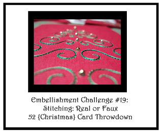
This week’s challenge is really kind of a cross between an embellishment and a technique challenge.  We’d like to see stitching on your cards!  You may use hand sewing, machine sewing, or use a marker or pen to draw some faux stitches on your card.  So long as we can easily see your stitching, it’s good – although we really would love to see something more creative than simply sewing on a button, ok?  🙂

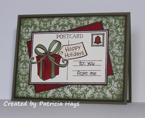
I will admit I went a little overboard on my card for the challenge.  I’ve dabbled in various crafts pretty much my entire life.  Between my teens and late twenties, until I had a curious toddler who loved to crawl into my lap, I enjoyed counted cross stitch.  Unfortunately, needles and little boys don’t mix very well, so I had to put my stitching things away.  I decided to give it a go again for this card.  I wasn’t able to find all of my old patterns, but I did come across a design for a wreath that didn’t look too complicated.  I have been pleasantly delighted to discover that many of the colors of embroidery floss I bought back in the day coordinate well with many of my cardstock colors!  So I chose a shade of green that is a color match for Wild Wasabi, added in the floss shade that was just one color number away from it, and picked a bright red that works with Real Red.  And after a little while, I ended up with this card:

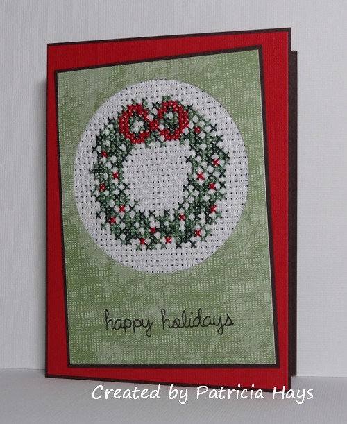
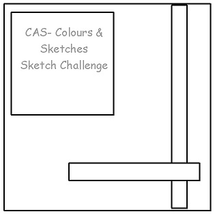
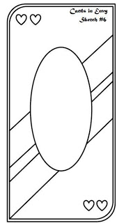
I was aiming for the 52{C}CT July sketch layout again, but the size of the panels was too large to allow the tilted panel to be put far enough askew to show underneath the focal panel.  So I decided to just tilt the focal panel and call it done.

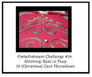
Here’s our challenge graphic:

The stitching makes this card fit into the OWH/Our Daily Bread Designs July challenge – and this card is actually quite flat and very do-able for OWH!  I’m also including it in the layers challenge at Cards in Envy.

And now it’s your turn to show us what you can create!  We’d love it if you joined our challenge this week.  You have until 1:00 pm Eastern time Friday, August 2 to link your card at the 52{C}CT site.

Thanks for stopping by today!  I hope you’ll come back again soon.

Supplies:
Stamps: Happy Everything (Lawn Fawn)
Cardstock: Early Espresso, Real Red Core’dinations, Afternoon Tea designer series paper (Stampin’ Up)
Ink: Early Espresso (SU)
Other: embroidery floss (DMC); 11-count Aida cloth (Charles Craft)

Hello there!  It’s time for another CAS – Colours and Sketches challenge.  Louise has one more sketch for us during her month of hosting our challenges.

I’ll admit that yesterday’s card followed the sketch pretty much, but it didn’t seem really clean and simple to me when it was all finished, so I went back to the figurative drawing board for my sample card for this challenge.  I decided to use a lighter color scheme and less cardstock layers.  I did, however, choose to layer two ribbons.  In retrospect I probably should have done the two pieces of pear seam binding first, and then the narrow blue ribbon over both.  But I suppose this looks all right.  I used my Xyron to adhere the ribbons.  What a timesaver that proved to be, rather than trying to use glue dots or my most narrow sticky tape.  I briefly considered keeping my card a square like the sketch, but opted against it so I’d have more open space in which to stamp the sentiment.  The focal panel is adhered with dimensional adhesive.

What will you create with this sketch? Share your work via the linky tool on the CAS – Colours and Sketches blog by noon eastern time on July 31.  Thanks for stopping by today!

Supplies:
Stamps: Peeking Posies (Hero Arts); Everyday Messages (Stampendous)
Cardstock: Pear Pizzazz (Stampin’ Up); Pure Luxury White (Gina K. Designs)
Ink: Smoky Slate (SU)
Other: Pear Pizazz seam binding, Baja Breeze taffeta ribbon, dimensionals (SU); markers (Copic)

The Dynamic Duos color combination this week definitely was a challenge for me – Calypso Coral and Basic Black, with the option of using a butterfly theme.  I’m not a huge fan of Calypso Coral, so that put a little damper on my enthusiasm to work on this challenge.  But I plugged along with it anyway and finally came up with a card that I’ll be donating to Operation Write Home:

I used a die to cut the fancy window from the black textured cardstock.  (Yes, it’s textured, even if it doesn’t show in the photo.)  I wanted to leave some definition between the images and the black cardstock, so I opted to leave a bit of a border around them when I fussy cut them.  That was kinda tricky, although it did make trimming around the antennae easier!  I had bought the coral twine several months ago thinking that having an embellishment would help encourage me to use this color.  Well, I finally had the chance to use the twine for the first time.  LOL And now I’m thinking the card would have looked just as good (if not better) without it. Oh well.

Here’s the challenge graphic, before I forget:

Thanks for stopping by today!  And hooray, I am not having the internet problems that plagued me when I was trying to enter last week’s Dynamic Duos challenge!

Supplies:
Stamps: Flutter By, Bannerific, Sophie’s Sentiments (Lawn Fawn)
Cardstock: Naturals White, Calypso Coral, Basic Black textured (Stampin’ Up)
Ink: Tuxedo Black (Memento)
Other: markers (Copic); Holiday Windows Movers & Shapers die, Calypso Coral baker’s twine (SU)

Hello!  The month of July seems to be flying by.  It’s hard to believe it’s the 20th already!

Over at 52 {Christmas} Card Throwdown, the challenge hostess gets to choose either a theme challenge or a recipe challenge for the third Saturday of the month.  I’m hosting this month, and I’ve decided to cook up a recipe challenge.  Don’t worry, it’s easy as 1, 2, 3!  That means using 1 ribbon, 2 patterned papers, and 3 gems on your card.

I’ve stayed with the 52{C}CT July sketch for the layout of my card, but turned it on its side.  For the one ribbon requirement, I made a tiny fork bow with the toddler fork my son used when he was little, and used it to dress up the larger penguin.  One of my designer papers is the falling snow design on the focal panel, and the other is the red snowflake pattern on the middle panel.  I’ve added a tiny pearl to the center of each of the three stamped snowflakes.  And there it is – 1, 2, 3!  I used shimmer paint on the white cardstock to make it look like light glistening on the snow.   It’s not one of my best coloring jobs on the penguins, but oh well.

This card fits into several other current challenges, too – the OWH Midweek Throwdown “Christmas in July” challenge, the Cards In Envy layers challenge, and the Merry Monday “Anything Christmas Goes” challenge.

I do have to acknowledge and thank my 14-year-old son for the input he gave on this card.  He preferred the look of pearls to rhinestones.  He also tickled my funny bone with his comments about the smaller penguin:  “That is THE most thoughtful penguin ever.  He has such a thoughtful look on his face.  It’s like he’s looking at nothing, but he sees everything.” 🙂

OK – that about wraps things up for this post!  Thanks for stopping by today!  Be sure to check out the samples the rest of the 52{C}CT design team has made.  Then go try the recipe yourself!  You have until 1:00 p.m. eastern time Friday, July 26 to link your card to the challenge post on the 52{C}CT website.

Supplies:
Stamps: Critters in the Snow, Pa-Rum-Pa-Pum-Pum, A Birdie Told Me (Lawn Fawn)
Cardstock: Baja Breeze, Basic Black (Stampin’ Up); Pure Luxury White (Gina K. Designs); designer papers from Fa La La collection petite paper pack (Lawn Fawn)
Ink: Tuxedo Black (Memento); Baja Breeze (SU)
Other: Frost White shimmer paint (Tsukineko); markers (Copic); ribbon (Offray); half pearls (KaiserCraft)

dynamic - crash

Comments Off on dynamic – crash
Jul 182013

I was trying to get this post written and published earlier this afternoon, but my internet crashed.  So it’s now past the deadline to link to the most recent Dynamic Duos color challenge.  But since I’d already made the card and drafted most of this post in Word when the internet wasn’t working, I figured I might as well go ahead and let it go live now that the ‘net is up and running again.  I’ve participated in every previous Dynamic Duos challenge and I didn’t want to let one internet failure stop me.

The color combination this time was Pink Pirouette and Sahara Sand.  I didn’t really want to do anything too flowery with the pink, but then I wasn’t sure what to do with the colors.  Finally I decided to use this designer paper that has a Sahara Sand background, and pair it with one of my cute little animal stamps.  I used alphabet stamps to create the sentiment.  The layout is OWH Stars & Stamps sketch #63, and the card will be donated to Operation Write Home.  I’m imagining that one of our military heroes stationed overseas might send this card home to his or her young daughter.

Thanks for stopping by today!

Supplies:
Stamps:  Mini Critters (Sweet ‘n Sassy Stamps); Jessie’s ABCs (Lawn Fawn)
Cardstock:  Pink Pirouette, Delicate Dots designer series paper (Stampin’ Up); Pure Luxury White (Gina K. Designs)
Ink:  Tuxedo Black (Memento)
Other:  Pink Pirouette ribbon, dimensionals (SU); markers (Copic); hexagon Nestabilities die (Spellbinders)

Hello all!  It’s Thursday again, which means it’s time for another CAS – Colours and Sketches challenge.  This week we have another color combination for you to use as inspiration.

I have to admit I struggled with this one – Chocolate Chip, Crumb Cake, and Summer Starfruit.  I had no problems with the thought of using either of the two browns, but I have had a really hard time warming up to Summer Starfruit.  Finally I decided to tackle my hesitation about this color head on and use it for the card base, and use the other two colors as accent colors.  I made some fun chevron stripes with the browns.  My original plan was to adhere them directly to the card base, but then I thought adding a panel would kick it up a notch.  So I went that route but sponged the edges of the panel first.  I also wanted to give the panel a little bit of dimension – more than just adhering the panel directly to the card base, but not raised as much as dimensional adhesive would make it.  So I cut the pieces I’d trimmed when I cut the panel down to its size and stuck them to the corners on the back of the panel, and used them as shims to raise the panel just the thickness of a piece of cardstock.  The sentiment I chose is one that I really like for Operation Write Home cards.

The July Operation Write Home Design Boot Camp lesson is on applying the “60-30-10” rule to colors.  I think I’ve accomplished that here, with 60% Summer Starfruit, 30% Chocolate Chip, and 10% Crumb Cake.  (OK, so my cardstock is old enough that the “Crumb Cake” is labeled “Kraft” – but it’s pretty much the same thing!)

Here’s a funny.  When my older son saw this card, he told me it reminded him of Charlie Brown, from the “Peanuts” comic strip!  I hadn’t thought about it until then, but the colors and stripes really are reminiscent of Charlie Brown’s shirt.

I hope you won’t be intimidated by Summer Starfruit as I was, and that you’ll join in the fun at CAS – Colours and Sketches this week!

Supplies:
Stamp: Studio G (Michael’s)
Cardstock: Summer Starfruit, Chocolate Chip, Kraft (Stampin’ Up)
Ink: Chocolate Chip (SU)
Other: scoring board (Martha Stewart); sponge

Lately I haven’t been making time to participate in as many different cardmaking challenges as I used to, and I’ve missed the fun of the variety.  This morning I decided I’d try to get back in the swing of some of them, and I’m starting off on that with the Cards in Envy sketch challenge that closes tonight. The premise of Cards in Envy is to make standard A2 sized cards that don’t need additional postage for mailing.

I stretched the layout for this sketch into a landscape-oriented rectangle, and I used a rectangle with rounded corners for my focal panel instead of an oval.  Using washi tape for the angled strips kept the card flatter than ribbon or cardstock would have.  The washi tape lent itself to a monochromatic color scheme.  The “naturals” cardstock has little flecks in it that give more visual interest than a plain solid white or ivory would have.  The brads in the corners are the most flat ones I own.  I decided not to put a sentiment on this card, so it could be used as an any occasion card for Operation Write Home.  Sometimes I need to remind myself that not every card needs a sentiment on the front.

Thanks for stopping by today!  For me, now it’s on to another challenge…  well, maybe bedtime first, and then a challenge tomorrow. 🙂

Supplies:
Stamp: All I Have Seen (Stampin’ Up)
Cardstock: Basic Black, Naturals White (SU)
Ink: Tuxedo Black (Memento)
Other: washi tape (W R Memory Keepers); brads, small corner rounder punch (SU); corner rounder punch (EK Success)

Hi there!  It’s the second Saturday of the month, which means it’s time for another color challenge at 52 {Christmas} Card Throwdown!  Since I’m hosting the challenges there this month, I got to choose the colors for this week’s challenge.

I went with a color scheme that I consider to be “vintage traditional”.  Instead of the typical bright red and green with white, I’ve chosen deep cherry red and dark leafy green with ivory.  Instead of black, I’ve opted for chocolate brown.  I originally had a completely different idea in mind for my sample card, but thanks to an Amazon.com dealer’s failure to send my order within the estimated delivery time, I was forced to come up with another idea.  I flipped through my Lawn Fawn stamps for inspiration and realized that even though I have a gift image in the Bows and Holly Christmas-themed set, I’ve only used it on birthday cards.  So I started thinking of how I could use some of the other Lawn Fawn images with it, and figured out that the gift fit on the postcard image, and then the whole card idea took off from there.

I ended up using the layout from last week’s 52{C}CT sketch challenge but turning it on its side.  The postcard image is an excellent size to fit the sketch.  I stamped the gift, masked it, then stamped the tag, masked it, and then stamped the postcard around them.  I wanted the ribbon to extend beyond the edge of the postcard, but I also needed to make sure the tag wouldn’t cover up the lines for the “address” part of the postcard.  I finished the stamping with the sentiments and the postage stamp, and colored the images with my Copic markers.  The designer paper for the background of the card was a late decision.  I hesitated because of the color challenge, but the swirls look like ivory to me and the background would have been too plain if I just left it as the card base, so I decided to use it.  And finally the card all came together.

I’m going to enter this card in the Merry Monday challenge and in this week’s ‘ABC’ Challenge, too.  Like all the other Christmas cards I’ve made this year, this one is going to be sent to Operation Write Home.

Now it’s your turn to show us what you can make with these colors!  If you need more inspiration first, go visit the 52{C}CT site and see what the rest of the design team has created.  Be sure to link your card at the 52{C}CT site by 1:00 p.m. Eastern time on Friday, July 19.  We look forward to having you join us!

Supplies:
Stamps: Bows and Holly, You’ve Got Mail (Lawn Fawn)
Cardstock: Always Artichoke, Chocolate Chip, Cherry Cobbler (Stampin’ Up); Pure Luxury Ivory (Gina K. Designs); designer paper from “Very Merry Christmas” 6″ x 6″ paper pad (Echo Park)
Ink: Chocolate Chip (SU)
Other: markers (Copic)

Hello!  This week at CAS – Colours and Sketches Louise has drafted a very simple little sketch for us to follow.  It’s a good one for quick cards!  I’ve combined the sketch with the OWH Midweek Throwdown challenges from this week (make a masculine card) and last week (use the color scheme of red, white, blue and kraft).  Actually, I guess this card really could be gender neutral.  But I’m calling it masculine for the sake of the challenge.  😉  I’ve stretched the sketch from a square to a portrait-oriented rectangle.

I haven’t decided yet if I’ll use this card as an AnyHero card to lift the spirits of one of our military men or women stationed overseas, or to let one of them use it to send a note of thanks to someone.  Maybe I’ll just have to make a twin for it so I can have one card for each purpose. 

I hope you’ll show us what you can do with this sketch!  Link your card at the CAS – Colours and Sketches site by noon eastern time Wednesday, July 17.  Thanks for stopping by today!

Supplies:
Stamp: Year-Round Sentiments (Hero Arts)
Cardstock: Pure Luxury White (Gina K. Designs); Kraft, Brilliant Blue, Real Red textured (Stampin’ Up)
Ink: Brilliant Blue (SU)
Other: corner rounder punch (EK Success); Stars embossing folder (ProvoCraft)

Today I’ve combined the current Dynamic Duos color challenge with the current Freshly Made Sketches layout.  The result is this clean and simple card that I’ll be donating to Operation Write Home.  Lining up the scallops took a little planning, but I’m liking the end result.


Thanks for stopping by today!  Your comments are read and greatly appreciated!  Advance apologies to those of you outside the United States whose comments get caught by my blog’s spam catcher program.  If I knew how to relax those settings, I’d do it in a heartbeat.  However, please be assured that all comments marked as spam sit in a folder until I can read them and decide whether they are legitimate or junk.

Supplies:
Stamp: Masculine Messages (Gina K. Designs)
Cardstock: Pure Luxury White (GKD); Gumball Green, Summer Starfruit (Stampin’ Up)
Ink: Gumball Green, Summer Starfruit (SU)
Other: Five-Petal Flower punch, Spring Bouquet punch (SU); small scalloped border die (Papertrey Ink); 1/4″ circle hole punch; sponge

Hello there!  It’s Christmas in July!  🙂  I’m excited to say that I’m hosting the challenges this month at 52 {Christmas} Card Throwdown!  I hope that you’ll give the challenges a try and have fun with them!

This week is sketch challenge week.  I’ve come up with a sketch that can be kept clean and layered, or dressed up with embellishments and such.  I’ve chosen to stay true to the original sketch and keep my card pretty clean and layered.  I toyed with two other colors for the card base before deciding to go with the red.  I’m not sure how well it shows in the photo, but the red card base is textured cardstock, just for a little more visual interest.  I ran the green panel through an embossing folder that mimics the textured cardstock.  The mistletoe berries are half pearls.  I used alphabet stamps to create the punny sentiment, and added in the hyphen with a black pen.

Don’t let those triangular areas intimidate you.  That’s simply a rectangle, the same size as the focal (top) panel, just turned askew.  (Stepping off on a related tangent for a moment – Google the word askew.  Go on, just do it.  Hopefully it will make you smile!)

I’ll be adding a light colored liner to the inside of the card, and then it will be ready to include with the Christmas cards I’ve been collecting all year for Operation Write Home.   Because I’ve participated in each 52{C}CT challenge since the beginning of 2013, I now have 25 Christmas and winter themed cards ready to send OWH – mostly ones that our military men and women stationed overseas will send home to their loved ones, but also a few that will be better suited as AnyHero cards to remind our heroes that they are appreciated.  That’s 25 more Christmas cards than I had this time last year!  By making one a week, I’m not feeling crunched for time to make some to send to my shipper before the Christmas deadline in October.

I’m also going to include this in the Merry Monday Challenge – it’s an “Anything Goes” Christmas challenge this month.

So now it’s time for you to check out all the challenge details at the 52{C}CT site, and visit the rest of the design team members’ blogs for more inspiration.  Then create your own card and link it at the 52{C}CT site by 1:00 pm Eastern time Friday, July 12.  I’d love to see what you do with my sketch!

Supplies:
Stamps: Bows and Holly, Jessie’s ABCs (Lawn Fawn)
Cardstock: Real Red textured, Chocolate Chip, Garden Green, Naturals White (Stampin’ Up)
Ink: Tuxedo Black (Memento)
Other: markers (Copic); half pearls (KaiserCraft); Plaid embossing folder (Sizzix)

Hello there!  It’s time for a new month of challenges at CAS – Colours and Sketches!  Louise is our hostess this month, and I can tell you that she has some fun ideas planned for the next four weeks!

This week we have a color challenge for you.  Louise is British, so she’s not thinking about red, white and blue on the 4th of July.  Nothing wrong with that!  🙂  Instead, she’s presented some colors that I thought worked for a little autumn scene.  I sponged white ink on the embossed clouds to help them stand out from the sky background. I discovered that a sponge dauber did a much better job of that than a traditional sponge.  The pumpkins are punch art, and the stretch of grass in front of them is adhered with dimensional adhesive to accommodate the thickness of the punched layers making up the pumpkins.  This is a 4″ square card, and the die I used for the grass is about 5.5″ long, so I had to trim some from the edges of the focal panel.  I used a few bits of the trimmings to create the pumpkin stems.  There wasn’t really a good place to put a sentiment on the front of the card, so I figured I’d let it go without.  In retrospect, I probably should have added one more pumpkin at the right of the card to hide that really low-lying cloud.

Now it’s your turn to go see what the rest of the design team has created, and show us what you can do with these colors.  Although Stampin’ Up color names are listed for reference, you may use any other company’s products that are similar in color.  Share your work via the linky tool on the CAS – Colours and Sketches blog by noon eastern time on July 10.  Thanks for stopping by today!

Supplies:
Stamps: none
Cardstock: Lucky Limeade, Pumpkin Pie, Pool Party, Basic Black (Stampin’ Up)
Ink: Whisper White craft (SU)
Other: Cloudy Sky embossing folder (Darice); Circle Trio and Oval Trio Sizzlits dies (Sizzix); Grass die (Sweet ‘n Sassy Stamps); sponge; sponge dauber

I made some time tonight to whip up a couple of cards for the box I’m compiling for Operation Write Home.  I’ve combined this week’s layout from Freshly Made Sketches with the soon-to-end color challenge from Dynamic Duos.

Since Dynamic Duos had a fifth Saturday in June, they chose one color – Basic Gray – and let each challenge participant pick their own second color to make the duo.  I decided to go with Rich Razzleberry for my second color.  I kept both my cards rather clean and simple, so they would be easy to mail.  I let one card focus on the gray part of the color duo, and dressed up the other card by adding a knot bow.  The ribbon on both cards came from the same spool.  The polka dots are printed on only one side, so I opted to let them show on one card but hide them on the other.  It’s been quite a while since I’ve used this sweet little bunny on a card, so it felt good to give him some inky love again.


So there you have ’em – two rather quick and easy cards!  Thanks for stopping by today.

Supplies:
Stamps: My Silly Valentine (Lawn Fawn)
Cardstock: Rich Razzleberry, Basic Gray (Stampin’ Up); Pure Luxury White (Gina K. Designs)
Ink: Tuxedo Black (Memento)
Other: markers (Copic); Rich Razzleberry ribbon (SU)

© 2019 Suffusion theme by Sayontan Sinha