Hello!  Happy Saturday!  I hope your weekend has gotten off to a good start.  Here in the United States it’s Labor Day weekend.  Locally, it’s the start of the high school and college football seasons, as well as the start of marching band season!  Although I don’t talk about my personal life much on this blog, my readers who know me well know that I enjoy a good football game, and that I’m very proud of my two sons who are active in their high school’s marching band.  I’m happy to report that our team won their season opener last night, and our marching band was featured as the “Band of the Week” on our local TV station’s football highlights show.  Woo-hoo!!!  🙂

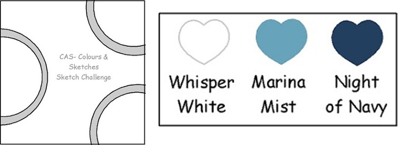
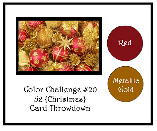
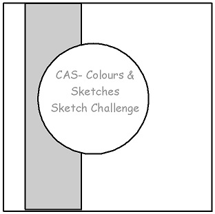
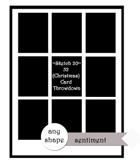
Since it’s the fifth Saturday of August, the 52 {Christmas} Card Throwdown challenge this week is “Pick a Previous”!  This time it’s a double challenge.  Our challenge participants will need to pick a previous sketch and a previous color combination from the 52{C}CT archives and use both together for their challenge card.

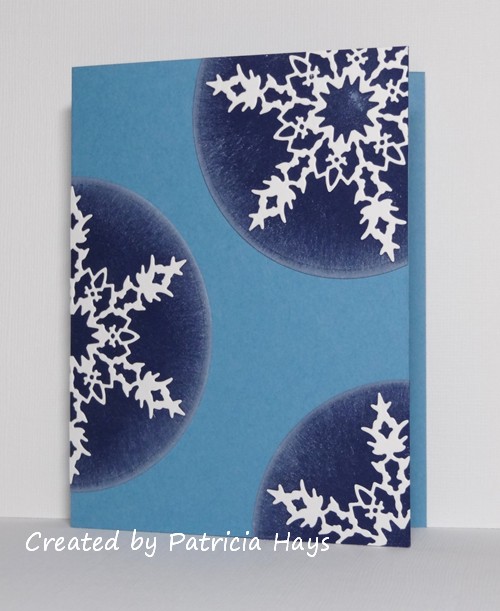
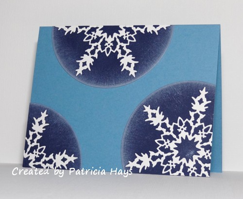
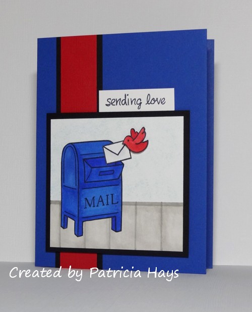
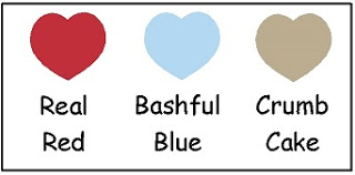
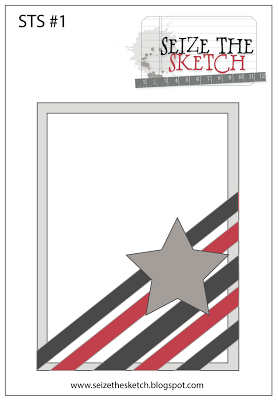
For my card I wanted to use some of the challenges I hadn’t participated in, so I chose sketch #1 from January 2012 and color combo #7 from July 2012.   I couldn’t help but pick these colors because they are a nod to our high school’s colors (officially blue and white, but the various sports teams and the marching band have a lot of black on their uniforms).  I used my snowflake embossing folder to add some interest to the narrow vertical strip.  I chose the cute penguin image because it was easy to leave black and white, with a few touches of blue on his hat.

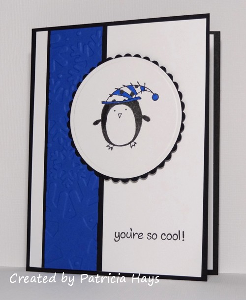
In retrospect I guess technically this is more of a winter card than a Christmas card.  I had “winter” in the back of my mind for adding to my Operation Write Home stockpile.  It’s close enough, you think?  😉  At any rate, it does qualify for the “no flowers” challenge going on at ‘ABC’ Challenges.

Thanks for stopping by today!  Go check out what the other design team members have created and give them a little blog love, too.  Then join us in our challenge!  You can link your work at the 52{C}CT website until 1:00 pm eastern time Friday, September 6.  We’d love to see what you make!

Supplies:
Stamps: Christmas Characters (Inkadinkado); Critters in the Snow (Lawn Fawn)
Cardstock: Basic Black, Whisper White, Brilliant Blue (Stampin’ Up)
Ink: Onyx Black (VersaFine)
Other: Snowflakes embossing folder (Sizzix); marker (Copic); standard circle and petite scalloped circle Nestabilities dies (Spellbinders); dimensionals (SU)

Hello! Because today is a relatively rare fifth Thursday of the month, we have a special double challenge for you at CAS – Colours and Sketches this week!  Kylie is our hostess, and she has drafted a really neat sketch for us to pair with a great monochromatic color combo.

I took an inventory of the cards I’ve been accumulating for my next shipment to Operation Write Home and noticed that I didn’t have many winter themed cards, as opposed to Christmas or holiday cards.  I thought that this week’s challenge colors would work well for a winter card and that I could somehow incorporate snowflakes into the circular elements.  I stretched the sketch into an A2 rectangle and here’s what I came up with:

Although the sponged ink along the edges of the circles looks rather grey, it’s actually from my Whisper White ink pad.  The sponging was an afterthought just before I assembled the card.  I’m glad I did it because the card was too stark without it, and because I think it lends a more wintery feel to the card.  I opted not to put a sentiment on the card so that way the hero who chooses to send it home can make it a “thinking of you” or “I miss you” or whatever other type of card he or she wants.  And without a sentiment on the front, the card could also be used as a top fold card, like this:

Oh, I suppose I ought to include the challenge rubrics:

Although the colors listed are Stampin’ Up color names, you do not need to use Stampin’ Up products to create your card.  Simply use whatever you have that is closest to those colors.

Be sure to see what the rest of the design team has made!  Then we’d love it if you join in our challenge by making a clean and simple styled card of your own using this sketch and these colors.  Share your card at the CAS – Colours and Sketches site by noon eastern time Wednesday, September 4.

This card fits into the current ‘ABC’ Challenge, so I’m entering it there, too.

Thanks for stopping by today!  All comments are welcome and appreciated.

Supplies:
Stamps: none
Cardstock: Marina Mist, Night of Navy, Whisper White (Stampin’ Up)
Ink: Whisper White (SU)
Other: Bianca snowflake die (Memory Box); standard circle Nestabilities die (Spellbinders); sponge

Today’s card uses the color combination for Dynamic Duos challenge #67.  I wasn’t sure what to do with this monochromatic scheme at first, but then I decided to simply rework a card I made earlier this year.  It all came together pretty quickly after that.  Because this card is going to be included in my next shipment to Operation Write Home, I chose one of their most desired card themes when I was considering what sentiment to use.  A few rhinestones add a bit of sparkly fun.

Thanks for stopping by today!

Supplies for this card:
Stamps: Year Round Sentiments (Hero Arts)
Cardstock: Crisp Cantaloupe, Calypso Coral, Whisper White (Stampin’ Up)
Ink: Calypso Coral (SU)
Other: Boho Blossoms punch, Spring Bouquet punch, rhinestones (SU); Paisley embossing folder (ProvoCraft)

Hello!  It’s the fourth Saturday of the month, which brings us to embellishment/technique week at 52 {Christmas} Card Throwdown.  Our hostess Sarah is challenging everyone to try using canvas as an embellishment on their Christmasy creations.

The first several things I tried with my canvas didn’t work out well, so finally I decided to simply die cut it.  In the learning process with that, I discovered that the canvas cuts more cleanly if you run it through a Xyron machine first.  (Upon more thought, it’s possible that using a temporary adhesive to attach the canvas to a piece of printer/copy paper would work, too.)  I’ve used OWH Stars & Stamps sketch #186 for the layout, but substituted the die cut canvas dove for the rectangle in the sketch.  My original plan was to stitch around the edges of the bird, but handstitching through the canvas and cardstock and designer paper proved to be too tedious with not so nice looking results.  I’m not quite sure how I got stuck on this color combination with the blues, but I think it turned out all right.

Go check out the 52{C}CT blog for more inspiration from the rest of the design team, and then share your own creations using canvas with us!  You have until 1:00 p.m. eastern time Friday, August 30 to link your artwork.  We’d love to see what you can do!  Thanks for stopping by today.

Supplies:
Stamps: Warmest Wishes (Lizzie Anne Designs)
Cardstock: Naturals Ivory, Night of Navy (Stampin’ Up); Soft Marble – Parlor Blue designer paper (ProvoCraft)
Ink: Night of Navy (SU)
Other: Holiday Windows Movers & Shapers dies (SU); canvas (7 Gypsies); Victoria embossing folder (PC)

Hello!  This week at CAS – Colours and Sketches Kylie has created a sketch for you to use in designing your card.

I needed a card for a couple who is celebrating their 50th wedding anniversary, so that’s how I decided on the ivory and gold color scheme.  The tilted panel is dry embossed, although it ended up not showing too much.  Oh well.  None of my “happy anniversary” stamps seemed to fit the available space well, so I decided to use “congratulations” for the sentiment.  I was glad I had these matte finish gold brads for the flower centers because they coordinate with the brushed gold cardstock better than shiny brads would.

Be sure to visit the CAS – Colours and Sketches challenge blog to see the fantastic cards made by my fellow design team members!  Then show us what you can do with this sketch by linking your own card to the challenge blog.  You have until noon eastern time on August 30 to share your work.

Supplies:
Stamps: Delightful Dozen (Stampin’ Up)
Cardstock: Pure Luxury Ivory (Gina K. Designs); Brushed Gold Metallic (SU)
Ink: Gold (ColorBox)
Other: paper flowers (Prima Marketing); gold brads (Making Memories); D’Vine Swirls embossing folder (ProvoCraft)

I’ve combined this week’s Dynamic Duos color challenge, Pool Party and Basic Black, with the current Seize the Sketch layout for today’s card.  I let some designer paper and seam binding help me out with the Pool Party part of the color combo.  I like this sketch because it can be kept clean and simple, layered a bit like I’ve done it, or really dressed up with embellishments.  Gotta love versatility!

Thanks for stopping by today!

All supplies for this card are from Stampin’ Up.
Stamps: One of a Kind, Short & Sweet
Cardstock: Basic Black, Very Vanilla, Spice Cake designer series paper
Ink: Pool Party, Basic Black
Other: Large Scallop Edgelits die, Pool Party seam binding, black brad, Boho Blossoms punch

Hello!  Today I’m excited to announce that I was recently invited to join the Design Team at the Cards in Envy challenge blog!  The main objective of Cards in Envy is “making cards that fit in envelopes” – in other words, creating A2 sized cards with no lumpy, bumpy embellishments, that can be mailed without additional postage.  Since this fits in so well with the cards I make for Operation Write Home, it was pretty much a no-brainer for me to accept the invitation!

So the challenge being introduced today is my first challenge as part of the CIE Design Team.  The challenges are presented on the first and third Mondays of each month, so there is plenty of time to join in!  This time, the challenge theme is “For the Birds”, which means the cards have to have at least one bird on them.

I’ve had this mailbox image stamped and colored and sitting on my desk for probably about a year.  Yes, really.  I’m fairly certain it started out as an idea for a card to fulfill some crafty challenge.  It was on a die-cut oval.  I figured since I haven’t used it in that form for so long, maybe I needed to do something else with it.  So I looked through the OWH Stars and Stamps sketches for a sketch I hadn’t yet used that had a space on it large enough to accommodate the mailbox.  I started with Sketch #1, and scored with Sketch #30.  I turned the sketch on its side.  I drew the sidewalk (no comments from the peanut gallery about my drawing skillz, please, LOL!) and used a light shade of blue to sponge in some sky.  The bird and envelope were stamped on scrap cardstock, colored, and fussy cut.  Then I fussy cut the mailbox from the oval background and attached it to its new background.  I added the envelope, and then I used dimensional adhesive to attach the bird.  Although it doesn’t really show in the photo, the red strip in the background is textured cardstock.  The sentiment is one that I think works really well for OWH cards.

So now it’s your turn!  Check out the Cards in Envy site for all the challenge details, and share your birdie creation(s) with us by Sunday, September 1.  We’d love to have you play along with us!

Supplies:
Stamps: You’ve Got Mail (Lawn Fawn)
Cardstock: Brilliant Blue, Basic Black, Real Red Core’dinations (Stampin’ Up); Pure Luxury White (Gina K. Designs)
Ink: Tuxedo Black (Memento); Soft Sky (SU)
Other: markers (Copic); dimensionals (SU); sponge

Hello!  I hope you’re having a great weekend so far.

This week at 52 {Christmas} Card Throwdown we are celebrating the “holly-days” with a holly themed challenge!  The design team has made some great cards with various holly images. You can go to the 52{C}CT site to see what they’ve created, and if you love what you see, feel welcome to comment on their work – I know they’d really appreciate it!

For my card, I used designer paper with a holly pattern as well as a stamped holly image.  This designer paper is old stuff, LOL.  I bought it back in the early 2000s when I was a Longaberger consultant because the paper matches one of the fabrics that the company used for some of their basket liners.  The colors in the designer paper helped me choose some of my retired Stampin’ Up cardstock colors for the rest of the card.  I used a hole punch to cut out the berries in the stamped image so that the cranberry colored paper would show through and give the berries a more realistic color.   The layout for this card is OWH Stars & Stamps sketch #185.

All right – now it’s your turn to get creating!  We’d love it if you share your holly-riffic cards on our challenge blog.  You can link your card until 1:00 p.m. Eastern time Friday, August 23.  Thanks for stopping by today!

Supplies:
Stamps: Happiest of Holidays (Stampin’ Up); Seasonal Sayings (Gina K. Designs)
Cardstock: Mellow Moss, Cranberry Crisp (SU); American Holly designer paper (The Longaberger Company)
Ink: Garden Green (SU)
Other: Cranberry Crisp stitched ribbon (SU)

Hello!  Holy cow, this week has gone by quickly!  It’s Thursday again, which means it’s time for a new challenge at CAS – Colours and Sketches.

Since it’s the third Thursday of the month, we have a color challenge this time.  Kylie has chosen the colors Real Red, Bashful Blue, and Crumb Cake.  After a couple of false starts, I finally settled down on a Christmas theme, even though this isn’t a typical color combination for the holidays.  I guess I’m still pretty firmly entrenched in Christmas mode for Operation Write Home.  I decided to give the layout from Seize the Sketch another try.  I had to use the mirror image of the sketch so the little teddy bear wouldn’t seem to be looking off the edge of the card.   I stamped the bear and his bow on scraps of cardstock, fussy cut them, and then glued the bow onto the bear.  I wanted to give him just a little bit of “lift” from the card, so he’s raised up from the card front with a cardstock shim.  Even though this isn’t one of my favorite cards ever, I do like it a lot better than last week’s attempt at this sketch.

I’m also entering this card into this week’s ‘ABC’ Challenge.  Their theme this week is “SIP – Stamps, Ink, Paper”.

Now it’s your turn to go see what the rest of the design team has created, and show us what you can do with these colors.  Although Stampin’ Up color names are listed for reference, you may use any other company’s products that are similar in color.  Share your work via the linky tool on the CAS – Colours and Sketches blog by noon eastern time on August 21.  Thanks for stopping by today!

Supplies:
Stamps: Pa-Rum-Pa-Pum-Pum, Belinda’s Borders (Lawn Fawn)
Cardstock: Kraft, Real Red, Bashful Blue (Stampin’ Up)
Ink: Real Red (SU); Tuxedo Black (Memento)

If you’ve been reading my blog for a while, you know that I frequently combine a few online challenges into one card.  Once again, I came up with an idea for the Dynamic Duos challenge that worked nicely with the Freshly Made Sketches challenge.  It also fits in with the August OWH Our Daily Bread Designs challenge.  So here it is…

I had embossed the kraft cardstock a while ago but ended up not using it for an earlier project.  So today I cut the round windows out of it and used it for this card.  The foliage is stamped onto a piece of white cardstock cut slightly smaller than the kraft piece.  I stamped the blossoms onto a scrap piece of white cardstock and fussy cut them, to give them a little dimension and so some of them could “peek” from the window openings.  I turned the sketch on its side to accommodate the sentiment.

Thanks for stopping by today!

All supplies are from Stampin’ Up unless otherwise noted:
Stamps: Best Blossoms
Cardstock: Blushing Bride, Whisper White, Kraft
Ink: Pistachio Pudding, Blushing Bride, Crumb Cake
Other: Woodgrain embossing folder; standard circle Nestabilities die (Spellbinders)

When I’m working on a card, I usually have a mental picture going on of how I think the card will look when it’s completed.  Often the mental picture and the completed card match up pretty well.  However, today’s card is one where the finished card never quite got on track with the mental picture.  I didn’t have time for a do-over so even though I’m not exactly pleased with the card, I have to share it anyway.

This week’s challenge at 52 {Christmas} Card Throwdown is a color challenge – red and metallic gold.  Black and white (or ivory) may also be used.  So I figured I’d end up heat embossing an image with gold embossing powder.  I tossed around a few different ideas for images but my mind kept coming back to this Madonna and child image I haven’t used for quite a while.  I discovered a new sketch challenge blog earlier this week and wanted to give their sketch a try.  I had some long, narrow scrap strips of gold cardstock that I thought would be put to good use with the sketch, so I decided to use red for the background of my embossed image.

In retrospect I probably should have also done the sentiment in gold, to visually balance with the strips.  But at that point I was already not really thrilled with the way the card was turning out and wasn’t in a mood to fuss with embossing the image and risking getting stray gold embossing powder flecks on the white cardstock.

I have to admit that I’m so much underwhelmed with this card that I’m hoping to have time to make something better for that sketch challenge and link the new card instead of this one.  LOL  I do have several more days in which to do that.

And yes – I know I’m my own worst critic.  The card really isn’t awful.  I’m just disappointed in the way it turned out.  It’s still going to be all right to send to Operation Write Home (once I line it with white cardstock so handwriting will show up more easily inside the card).

Anyway – here’s your chance to make a better card with these colors than I did!  🙂  The design team at 52{C}CT would love to see what you can create!  Use the linky tool at the challenge blog to share your card by 1:00 p.m. Eastern time Friday, August 16.

Thanks for stopping by today!

All supplies for this card are from Stampin’ Up unless otherwise noted:
Stamps: Madonna and Child
Cardstock: Real Red, Whisper White, Brushed Gold
Ink: Real Red; Gold (Colorbox)
Other: detail gold embossing powder; Labels Nine Nestabilities die (Spellbinders)

Hello!  Thursday means it’s time for a new challenge at CAS – Colours and Sketches!

Kylie has a really nice clean and simple sketch for us this week.  It’s great for quick cards, and it’s easily adaptable for any occasion.  I’ve tweaked it by stretching it into a 4.25″ x 5.5″ rectangle and by using a die cut butterfly in place of the circular element. The middle of the butterfly is attached directly to the card base, but I’ve used dimensional adhesive under the wings to pop them up.

Be sure to check out the CAS – Colours and Sketches blog to see what the rest of the design team has done with this sketch!  Then create your own card and link it to the challenge site.  We’d love to see how you interpret this layout!

Supplies:
Stamps: Everyday Messages (Stampendous)
Cardstock: Pure Luxury White (Gina K. Designs); designer papers from Blush 6″ x 6″ paper pad (Basic Grey)
Ink: Baja Breeze (Stampin’ Up)
Other: half pearls (KaiserCraft); Beautiful Butterflies die (SU)

It’s been a long time since I’ve made the time to play along in one of the Lawnscaping challenges, and I’ve missed doing them.  So I decided to get my act together for the current one, which is to create a one layer card.  I figured I could combine it with the current Dynamic Duos color challenge of pink and bright yellow.

So I looked through my Lawn Fawn stamps and came up with this:


Even though the card was pretty cute just like that, I felt it was missing something, particularly something to help bring out the yellow bird.  So I thought, why not fussy cut along the bottom of the heart border and add a strip of yellow cardstock to it?  I had a scrap of Daffodil Delight that was the perfect size to accomplish the look I pictured in my mind.  And after a little cutting and gluing, my card changed to this:


Ah, yes.  Much better.  And now it’s a cheery little any-age, gender-neutral card to include in my stash for Operation Write Home.

Thanks for stopping by today!

Supplies:
Stamps: A Birdie Told Me, Belinda’s Borders, Love ‘n Breakfast (Lawn Fawn)
Cardstock: Pure Luxury White (Gina K. Designs); Daffodil Delight (Stampin’ Up)
Ink: Tuxedo Black (Memento)
Other: Premier colored pencils (Prismacolor); odorless mineral spirits (Houston Arts)

Hello there!  It’s the first Saturday of the month, which means at 52 {Christmas} Card Throwdown we have a new hostess and a new sketch challenge for you.  Sarah is our hostess this time, and she’s created a sketch that can be interpreted several different ways.

Before I settled on my card design, in my head I tossed around a few different options for the small boxes in the sketch.  I considered stamping them with a small solid rectangle stamp as a background for either a small snowman or snowflake image.  I thought about switching the boxes out for circles.  Then I noticed that this week’s theme at ‘ABC’ Challenges is to use scraps.  That sounded perfect!  Goodness knows I have lots of scraps!  🙂  Everything about this card was a “leftover”.  The card base is the remaining half of a sheet of cardstock used for a previous card.  The kraft panel was already cut down to the size of a quarter sheet, so I just trimmed it enough to leave a border of the card base showing.  The designer papers and the sentiment banner were all scraps.  And the poinsettia is the last one from a package I’d opened quite some time ago.


Be sure to see what the rest of the design team has created!  Then show us what you can do with this sketch.  Link your card to the 52 {Christmas} Card Throwdown site by 1:00 pm Eastern time Friday, August 9.  We’d love to see what you make!

Supplies:
Stamps: More Merry Messages (Stampin’ Up)
Cardstock: Soft Sky, Kraft (SU); designer paper scraps from Aspen Frost 6″ x 6″ paper pad (Basic Grey)
Ink: Cherry Cobbler
Other: paper poinsettia (Making Memories)

Hello!  It’s time for another month of challenges at CAS – Colours and SketchesKylie is our hostess for August, and she brings some bold, bright colors to our challenge this week.

These colors had me stumped for a bit.  I really didn’t want to use the pink and green to create something typical like a floral scene.  But the colors seemed a little too disparate to work into a more graphic design.  So I ended up reaching for a mostly floral stamp set that I hadn’t used in a long time.  My creativity is stuck on this sketch, I think, but in my opinion it works for a clean and simple card here.


I’ll add white cardstock inside the card, and then I’ll have another one to add to my stash for Operation Write Home.

As always, although Stampin’ Up color names are used to describe the colors, you do not need to use SU products to create your card for the challenge.  Just use whatever product you have that is closest.  For all the details of this challenge, please check out the blog at CAS – Colours and Sketches.  I hope you’ll join us!  Thanks for stopping by today.

All supplies are from Stampin’ Up:
Stamps: Heartfelt Thanks, Always in My Thoughts
Cardstock: Melon Mambo, Old Olive, Basic Gray, Whisper White
Ink: Melon Mambo, Old Olive, Basic Gray
Other: ticket corner punch, half pearls

© 2019 Suffusion theme by Sayontan Sinha