Hello!  We have a fifth Saturday in the month of August, which means it’s time for a Pick a Previous challenge at 52 {Christmas} Card Throwdown!  Gill, our challenge hostess, is asking us to choose a previous 52{C}CT sketch for our inspiration this time.  Go to the 52{C}CT site, click on the “Sketches Archive” tab, and select one of the 30+ sketches to use in creating your Christmas or wintry card.

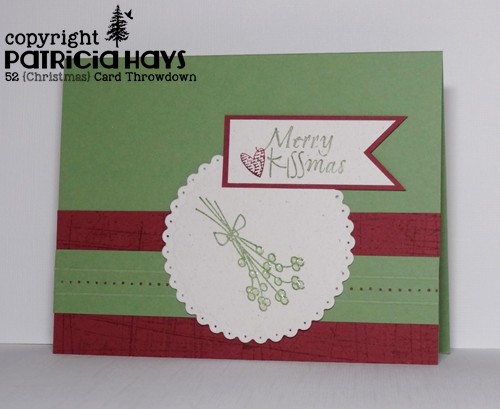
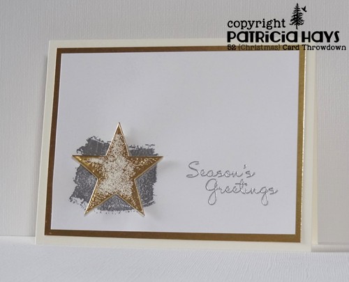
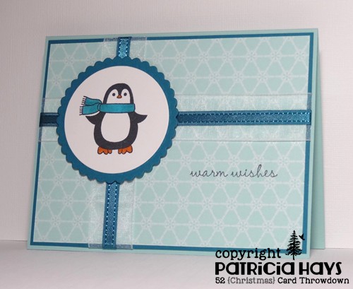
I’ve chosen the June 2014 sketch for my card this week.  It’s been a while since I’ve used this penguin image so I thought I’d get him inky again.  For the horizontal and vertical crossing elements, I’ve layered two different ribbons – a very sheer white one, and a satin one to match the darker blue-green cardstock.  The penguin panel is adhered with dimensional adhesive to accommodate the thickness of the ribbons.

52CCT 08-30-2014

Which sketch will you choose?  Link your creation at the 52{C}CT site by 1:00 p.m. Eastern time/6:00 p.m. GMT Friday, September 5.  We’d really appreciate it if you join us!  Thanks for stopping by here today.

Supplies:
Stamps: Warm Penguin (Lizzie Anne Designs for Gourmet Rubber Stamps)
Cardstock: Pool Party, Island Indigo, Winter Frost designer paper stack (Stampin’ Up)
Ink: Tuxedo Black (Memento)
Other: markers (Copic); standard circle and petite scalloped circle Nestabilities dies (Spellbinders); white Simply Sheer ribbon (Offray); Island Indigo satin ribbon, dimensionals (SU)

Hello!  It’s time for another sketch challenge at CAS – Colours and Sketches!   As always, the sketch can be rotated or flipped or stretched – so long as we can see the basic elements of the original sketch, it’s all good!

I dressed up the sketch a bit with an embossed panel and an extra mat for the entire card, and a mat for the oval element.  The cat’s birthday hat was stamped on a scrap of cardstock, colored, fussy cut, and then adhered to the cat’s head. I drew in the little frilly things on top of the hat because they are just too fussy for me to try to cut!  The sentiment is all stretched out in one line on the stamp, but I broke it into two lines so it would fit better on the card.  I had the darnedest time working with this photo to get the fuchsia color to show true while having the white look white, but in the end I figure you can imagine what it’s supposed to look like.

CASCAS89

Aug sketch 2

Thanks for stopping by today!  I hope you’ll join us over at CAS – Colours and Sketches with your own take on this sketch!  You have until 1:00 p.m. eastern time Wednesday, September 3 to link your card at the challenge website.

Supplies:
Stamps: Critters in the ‘Burbs, Hats Off to You, Year Three (Lawn Fawn)
Cardstock: Pure Luxury White (Gina K. Designs); Basic Black, Rich Razzleberry (Stampin’ Up)
Ink: Tuxedo Black (Memento)
Other: markers, multiliner pen (Copic); petite oval and petite scalloped oval Nestabilities dies (Spellbinders); D’Vine Swirls embossing folder (ProvoCraft)

Hello!  It’s time for stash challenge week at 52 {Christmas} Card Throwdown!  Our August hostess, Gill, has thrown a double doozy at us this week – our challenge cards must use both glitter and bling.  Now, those of you who know my crafting habits know that I tend to avoid glitter whenever possible – so this was indeed a challenge for me!  But I was able to work it in with the current Freshly Made Sketches challenge, and I have to admit I’m pretty pleased with the result.  I did take the liberty of turning the sketch on its side.  I couldn’t decide on a sentiment to add to the card front, so I decided to just go without, so that way it can be either a Christmas card or a wintertime “thinking of you” or any other occasion card.

52CCT 08-23-2014

What will you make with your glitter and bling?  Be sure to share your card with us at the 52{C}CT blog by 1:00 p.m. Eastern time/6:00 p.m. GMT Friday, August 29.  While you’re at it, be sure to check out the cards the rest of the design team has created.  We look forward to having you join us!

All supplies for this card are from Stampin’ Up.
Stamps: Festive Flurry, Season of Joy
Cardstock: Soft Sky, Whisper White, silver glimmer
Ink: Soft Sky
Other: Festive Flurry dies, rhinestones

Hello there!  This week at CAS – Colours and Sketches we have a soft color palette for you to work with.  The pastel green color is called Pistachio Pudding, but it reminded me of mint chocolate chip ice cream (without the chocolate chips).  So I decided to go with an ice cream themed card.  I figured it makes a cute card for Operation Write Home.

CASCAS88

The Stampin’ Up color names are only for reference; you do NOT need to use Stampin’ Up products to make your card for this challenge.  Simply use whatever you have in your craft supplies that is closest to these colors.  We’ll also allow white, cream, or black for your card base and black ink for outlines and sentiments. 

Now it’s your turn! You have until 6:00 p.m. GMT/1:00 p.m. EST Wednesday, August 27 to share your artwork with us. We’d love to see what you create!

Supplies:
Stamps: Here’s the Scoop (Lawn Fawn)
Cardstock: So Saffron, Baked Brown Sugar, Pistachio Pudding, Very Vanilla (Stampin’ Up)
Ink: Tuxedo Black (Memento)
Other: Plaid embossing folder (Sizzix); Classic Rectangles Plain and Classic Rectangles Scalloped Nestabilities dies (Spellbinders)

Hello, and welcome to another Monday!  Since it’s the third Monday of the month, it’s time for a new challenge at Cards in Envy.  For the next couple of weeks we’re focusing on a theme of “Best Friends”.

I went through my stamps trying to figure out just what I would make for my design team sample card for this challenge, and I wasn’t coming up with anything I liked.  Finally I browsed through my digital images and landed upon this cute digi set that had several different images of foods that always seem to go together – salt & pepper, milk & cookies, you get the idea.  I decided to go with coffee & doughnuts.  (OK, so the actual image says “donuts”, but I prefer the longer spelling.)  I remembered I had this designer paper with lots of circles against the brown background, and thought that might work well with the image.  I borrowed the layout idea from the current Freshly Made Sketches challenge, added a few mats and embossed the horizontal strips, and colored the image to coordinate with the designer paper.  Once I had all my pieces completed, it didn’t take long to assemble.

CIE 08-18-2014

FMS Final 149I just realized as I’m typing this that the designer paper I used is from the very first 6″ x 6″ paper pad I bought… back in 2007!  Eeep!  I guess it’s about time I used it, LOL!

So, how will you interpret our Best of Friends theme?  Create an A2 sized card, being sure not to use any lumpy, bumpy embellishments that would prevent your card from fitting into an envelope and being mailed at the standard postage rate.  Share it with us at the Cards in Envy site by 7:00 p.m. Eastern time Sunday, August 31.  We’d love to see what you create!

Supplies:
Digital Images: You & Me (Sweet ‘n Sassy Stamps)
Cardstock: Blushing Bride, Cool Caribbean (Stampin’ Up); Pure Luxury Ivory (Gina K. Designs); designer paper from Blush 6″ x 6″ paper pad (Basic Grey)
Ink: printer ink
Other: markers (Copic); Swiss Dots embossing folder (ProvoCraft)

This is just a quick post to share a card for the current AEIHeartU challenge to use kraft cardstock.  Really, the card is pretty self-explanatory.  I die cut the red and blue cardstock and the “hello” sentiment, added a stamped sentiment, and assembled the whole thing together.  I figure it’s a good any-time-of-year, gender-neutral and age-neutral card for Operation Write Home.  I have to admit that I was pretty heavily inspired by this card and I’ve been wanting to do something similar to it for a while now.

AEIHeartU 13

Challenge 13

Thanks for stopping by today!  🙂

Supplies:
Stamps: Handwritten Notes (Avery Elle)
Cardstock: Kraft, Very Vanilla, Pacific Point, Real Red (Stampin’ Up)
Ink: Crumb Cake (SU)
Other: Simply Said Hello die and Custom Panels die (Avery Elle)

Hello, and happy Saturday to you!  I hope your weekend has gotten off to a good start.

This week is theme week at 52 {Christmas} Card ThrowdownGill, our hostess, has chosen an interesting one: mistletoe and wine.  I knew I had a couple of mistletoe images, but I had to think about the wine… and I finally settled on using burgundy cardstock for it.  (Get it?  Burgundy?  Wine?  OK, maybe that’s a stretch, but going by Gill’s rules it works!)  The mistletoe berries have been covered with crystal lacquer so they have a bit of shine to them in real life.  I used a subtle background stamp on the burgundy strip of cardstock to give it a little more visual interest.  The narrow green strip has a scored line above and below the piercing – I’m not sure how well that shows in the photo.

52CCT 08-16-2014

If you need more ideas, go check out the 52{C}CT blog and see what the rest of the design team has made.  Then link your card at the challenge site by 1:00 p.m. Eastern time Friday, August 22.  We’d love to see how you interpret this challenge!

Supplies:
Stamps: Kissmas & Mistletoe (Unity Stamp Company); Sanded (Stampin’ Up)
Cardstock: Wild Wasabi, Bravo Burgundy, Naturals White (SU)
Ink: Wild Wasabi, Bravo Burgundy (SU)
Other: petite scalloped circle Nestabilities die (Spellbinders); Crystal Lacquer (Sakura); piercing tool; score board

Hello again!  This week is sketch week at CAS Colours and Sketches.  I hope you’ll consider joining in the fun and creativity there by creating a card of your own with this sketch!

I couldn’t decide between making the tilted rectangular portion of the sketch into a window of sorts or more like a Polaroid photograph.  It ended up kind of a combination of both ideas.  This stamp set has been wanting to be inked, so I figured I’d make it look like the little angel is leaning on a windowsill. First I die cut the window and added designer paper to create the sky background. I stamped the angel on a scrap of cardstock, colored him, fussy cut him, and glued him to the sky so his arm slightly overlaps the die cut. The wing and the heart have a bit of glitter on them from a new-to-me product called a Wink of Stella pen.  It was super easy to use, but I’m disappointed in how easily the glitter rubs off.

CASCAS87

Aug sketch 1

Be sure to visit the CAS – Colours and Sketches blog to see the terrific cards the rest of the design team has made.  I’m sure they’d love it if you left them comments, too.  Then show us what you can do with this sketch!  Link your card to the CAS – Colours and Sketches site by 1:00 p.m. Eastern time Wednesday, August 20.

Supplies:
Stamps: Love From Above (Mama Elephant)
Cardstock: Naturals White (Stampin’ Up); Pure Luxury White (Gina K Designs); designer papers from Blitzen collection (Basic Grey)
Ink: Tuxedo Black (Memento)
Other: markers (Copic); Say Cheese and Critters in Costume dies (Lawn Fawn); Wink of Stella pen (Zig)

Hello there!  It’s time for another color challenge this week at 52 {Christmas} Card ThrowdownGill, our hostess for the month of August, is asking us to create our Christmas or wintry cards using only four colors – white, cream, silver and gold – and all four of those colors must be used.

I tossed a few different ideas around in my head for this week’s card.  I finally settled on a rather clean and simple design using the current sketch from Seize the Sketch.  For the star, I die cut cream textured cardstock, dabbed it onto my Versamark ink pad, sprinkled gold embossing powder on it, and heated up the embossing powder.  I repeated the inking and embossing several times until I achieved the grungy effect I wanted.  I used a stamp from one of my newest stamp sets for the background behind the star, and heat embossed that with silver embossing powder.  The sentiment is also heat embossed in silver.  I used dimensionals to adhere the star, attached the panel to a mat of gold foil cardstock, and then put it on a cream colored base.  The grunge look is something I haven’t really tried, but I’m pleased with the final result.

52CCT 08-09-2014

Now it’s your turn to show us what you can make with these colors!  If you need more inspiration first, go visit the 52{C}CT site and see what the rest of the design team has created.  Be sure to link your card at the 52{C}CT site by 1:00 p.m. Eastern time on Friday, August 15.  We look forward to having you join us!

Supplies:
Stamps: Work of Art, More Merry Messages (Stampin’ Up)
Cardstock: Pure Luxury Ivory, Pure Luxury White (Gina K. Designs); gold foil, Very Vanilla textured (SU)
Ink: silver (Colorbox); VersaMark
Other: Stars die (Sweet ‘n Sassy Stamps); dimensionals (SU); gold and silver embossing powders (Ranger)

Well hi there!  Thursdays this month will be especially fun for me because I’m the August challenge hostess at CAS – Colours and Sketches!  I hope our challenge participants will enjoy the color and sketch ideas I’ve come up with.

We’re starting the month off with a color challenge.  When I was thinking up challenge ideas several weeks ago, I must have had the summer patriotic holidays in the back of my mind because this challenge is a slightly different take on the traditional red, white and blue.  Instead, we’re using a deep cherry red, ivory (or cream), and navy blue.  I went browsing online for layout ideas and decided to try out the current CAS(E) this Sketch! challenge.  The ladies there are combining their challenge with a new-to-me challenge blog, Tag You’re It!  So today’s card works for three challenges.  Woo-hoo!

CASCAS86

The navy star print designer paper and the navy star eyelet are both some pretty old stuff that I’ve had for years. The image is stamped in deep red ink, and I used a navy blue marker to color in the stars and the letters.  The tag ended up being a little bigger than I would have liked, but I couldn’t really do much else to accommodate this fun sentiment stamp.  This card is a little less “simple” than most of my CAS cards, but I think it still can be considered CAS.

(Sorry that graphic is SO HUGE!  I just got upgraded to a new version of WordPress and haven’t yet figured out how to resize images like I used to in the old version. 🙁 )

So – if you need further inspiration for the CAS – Colours and Sketches challenge, go see what the rest of the design team has made!  Then create your own clean and simple card using this week’s colors, and link it to the challenge blog by 1:00 p.m. Eastern time Wednesday, August 13.  We’d love to see what you can do!

Supplies:
Stamps: Cake & Candles (Avery Elle)
Cardstock: Cherry Cobbler (Stampin’ Up); Pure Luxury Ivory (Gina K. Designs); Circles ‘n Stars Pretty Paper Pack (Creative Memories)
Ink: Cherry Cobbler (SU)
Other: marker (Copic); Cherry Cobbler seam binding, Navy grosgrain ribbon (SU); Airmail twine (Really Reasonable Ribbon); star eyelet (source unknown)

Hello!  It’s the first Monday of the month, which means it’s time for a new challenge at Cards in Envy!  For the next two weeks we have a nice summery theme for our challenge – “Toes in the Sand”.  The design team has come up with some great cards showing off a beach theme – go check them all out at the challenge site!

I don’t own many beach related stamps, but I have had this digital image for a while now.  I’ve always felt somewhat intimidated by coloring it.  I don’t mind coloring things, but scenes are a different ball game.  But I decided it was time to give it a go with a sunset look.  Because it’s a digital image, I was able to flip it and use the mirror image of it.  I felt the mirror image worked better so the sentiment banner wouldn’t cover up the umbrella.  The layout for this card is from OWH Stars & Stamps sketch challenge #227. The strip of designer paper is a scrap of some I bought at a craft store many years ago, and I’m no longer sure of the manufacturer.

Now it’s time for you to create your own beach themed card and share it with us at the Cards in Envy site!  Remember that cards for our challenges must be A2 sized (4.25″ x 5.5″) with no lumpy, bumpy embellishments that would prevent them from being mailed with a regular first-class postage stamp.  We can’t wait to see what you make!

Supplies:
Digital Images: Ocean Paradise, Masculine Birthday Greetings (Sweet ‘n Sassy Stamps)
Cardstock: Naturals Ivory, Basic Black (Stampin’ Up); Pure Luxury White (Gina K. Designs); designer paper (source unknown, but possibly from ProvoCraft)
Ink: printer ink
Other: markers (Copic)

Just a quick post to share the card I’ve made for the current AEIHeartU challenge.  This time they’re asking challenge participants to use dies.  I had fun with this one. I figure it makes a good any occasion card for Operation Write Home.  In retrospect, I wish I’d thought to die cut the stars from the blue cardstock so that the yellow showed through, rather than cutting the stars from the yellow and adhering them to the blue.  Oh well.  The card just looked too plain without the stars.

Challenge 12

Thanks for stopping by today!

Supplies:
Stamps: Simply Said Hello (Avery Elle)
Cardstock: Sahara Sand, Crushed Curry, Island Indigo (Stampin’ Up)
Ink: Island Indigo (Stampin’ Up)
Other: Simply Said Hello die, Storybook dies, Custom Panels Dies (Avery Elle)

Hello!  It’s time for a new month of challenges at 52 {Christmas} Card Throwdown!  Our Christmas in July blog hop was loads of fun, and the prize winners will be announced on the 52{C}CT blog on Wednesday, August 6.  But now we’re getting back into our normal challenge routine with a sketch challenge.

This is a pretty fun sketch showcasing banners that are so the thing right now.  I had done some online shopping while the 52{C}CT design team had its break, and some of my new stamps were begging to be used.  The set I used for today’s card is from Technique Tuesday, and it’s actually been retired, so I guess I was pretty lucky finding it when I did.  I thought if I rotated the sketch and stretched it out to a rectangle, the long sentiments would work well on the banners.  These sentiments are done in an outline font, and I decided to color in the letters with a black marker to make them more legible since the banners are fairly dark colors.  (I also added in an apostrophe at the beginning of the word “’tis” – yes, I am *that* grammar fanatic, LOL.)   I chose words that I felt worked best with one of the scripty sentiments in the set.  The two snowflake stamps were perfect for the little embellishment parts of the sketch.  I added rhinestones to the centers of the snowflakes and a line of hand stitching down the left side of the card.

What will you do with our sketch?  Please show us by linking your own Christmas or wintry card at the 52{C}CT site by 1:00 p.m. Eastern time Friday, August 8.  Be sure to see what the rest of the design team has made, too.  Thanks for stopping by today!

Supplies:
Stamps: Magic of Christmas (Technique Tuesday)
Cardstock: Smoky Slate (Stampin’ Up); designer papers from Blitzen collection and Aspen Frost 6″ x 6″ paper pad (Basic Grey)
Ink: Tuxedo Black (Memento)
Other: rhinestones (SU); Multiliner brush pen (Copic); embroidery floss (DMC)

© 2019 Suffusion theme by Sayontan Sinha