CAS Colours & Sketches #389

Comments Off on CAS Colours & Sketches #389
Sep 222020

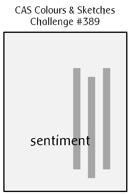
Hello there!  It’s the fourth Tuesday of the month, which means we have a new sketch challenge to present to you today at CAS Colours & Sketches.

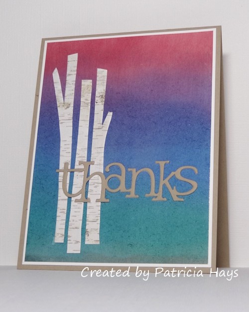
Some time ago I had used a tree embossing folder on some designer paper that had a birch-like pattern, and cut the trees out from it.  Then I decided not to use them for that project, and they just sat in one of my folders of cardstock, where I would see them occasionally.  Today’s card finally puts them to use.  I ended up trimming the trees down further, both in height and width, so they would fit better onto the card front.  For the background, I brushed ink onto glossy white cardstock and blended the colors together, first with the brushes, and then with a tissue.  I took the color inspiration from an old “rainbow” ink pad that has four colors of ink, but I added a bit of brown to the bottom edge to help make it look more like ground.  I added a simple small white mat because it looked too bare-bones without one.  For the sentiment, I die-cut the “thanks” from both white and kraft cardstock because I wanted to stack them for depth.  I originally planned to have the white layer on top, thinking that the kraft would add more shadow below it, but the kraft showed up better against the tree trunks so I ended up reversing the layers.  And yes, I’ve used the mirror image of the sketch, although I can’t say I did that for any particular reason.

What will you do with this sketch?  I hope you’ll try out something and share what you create with us!  Link your work to the CAS Colours & Sketches blog by 6:00 p.m. Eastern time Monday, September 28.  Thanks for stopping by today!

Supplies:
Cardstock: Crumb Cake, Whisper White, Glossy White (Stampin’ Up); designer paper from Aspen Frost 6″ x 6″ paper pad (Basic Grey)
Ink: Cranberry, Eggplant, Denim, Bottle, and Espresso (Adirondack)
Other: tree embossing folder (Darice); Olivia alphabet die (ProvoCraft); stencil brushes
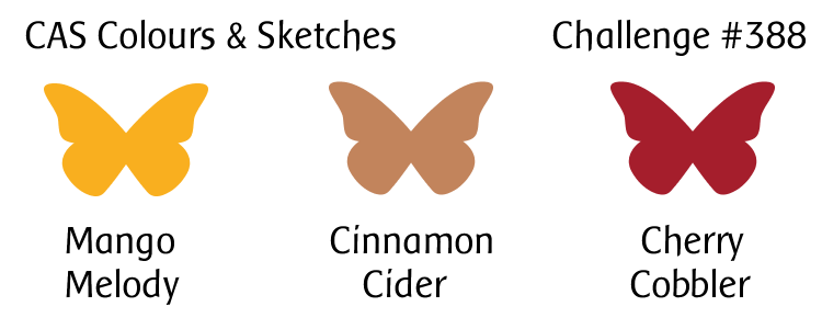
Hello there!  It’s another Tuesday, which means it’s new challenge day at CAS Colours & Sketches!  This week we have a trio of colors for you to work with that should start helping you think about autumn.  Of course, if you live in the southern hemisphere, you’re probably thinking about spring about now, so we hope you’ll show us a springtime way to use them.  As always, if you don’t own the exact colors named in the graphic, just use whatever product you have that closely matches them.

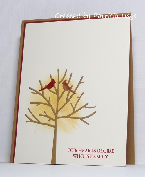
I wasn’t in the mood for coloring an image, so I opted to use some dies to create a little scene on my card.  The challenge colors made it pretty easy to decide which to use for the tree trunk, the leaves, and a couple of cardinals.  After I die cut the bare tree, I laid it on the card front to figure out where I wanted to position it.  I didn’t want to fiddle with cutting and gluing a bunch of leaves, so I used a gel stick in a color that seemed to match the challenge yellow and blended it out to add some color for the “leaves”.  I cut the male cardinal from cherry cardstock and the female cardinal from the same brown as the tree, adding a little cherry ink to her to make her look more realistic.  Offsetting the card front on the mat and the card base allows a little extra color to show. I think the cardinal pair and the sentiment I picked will make this a decent enough anniversary card to give to my husband next month.

We’d love to see what you can create with this week’s colors! Share your card at the CC&S website by 6:00 p.m. Eastern time Monday, September 21. Thanks for stopping by today!

Supplies:
Stamp: Picture Perfect (Stampin’ Up)
Cardstock: Baked Brown Sugar, Cherry Cobbler, Very Vanilla (SU)
Ink: Cherry Cobbler (SU)
Other: Winter Trees dies (Penny Black); gel stick (Faber Castell)

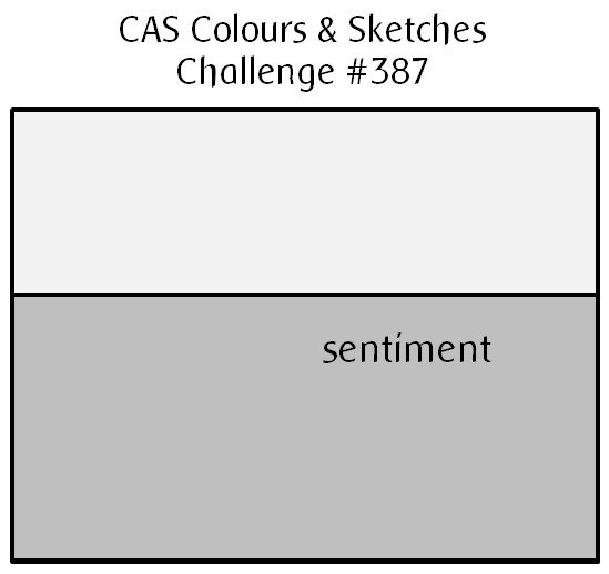
Hello!  Today starts sketch challenge week at CAS Colours & Sketches and YoonYoung has drawn up a very nice clean and simple one for us!

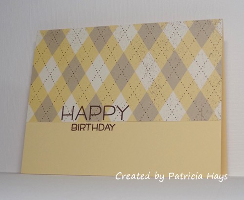
When I first saw the sketch, I thought it would make a good opportunity to use some designer paper.  I have a huge variety of papers to choose from, so to narrow it down, I took a look at some of my other favorite challenge blogs and saw that The Paper Players is having a theme challenge to create masculine birthday cards.  I picked an argyle print from, I must admit, one of my very oldest packs of designer paper.  I knew this pattern would allow for a sentiment to still be easily read.  The difficult thing about using this pattern is making sure to line it up so that it’s centered on the card front, but after some careful measuring, I think I’ve accomplished that.  I also took the liberty of turning the sketch 180° so that the wider rectangular portion is at the top of the card, and I let the sentiment straddle the line dividing the two parts of the sketch.


So, there you have it!  What will you create with this sketch?  Share your work with us at the CAS Colours & Sketches site by 6:00 p.m. Eastern time Monday, September 14. Be sure to check out what the other design team members have made, too!  Thanks for stopping by today!

Supplies:
Stamps: Happy Happy Happy (Lawn Fawn)
Cardstock: Barely Banana, Spring Flowers designer paper (Stampin’ Up)
Ink: Chocolate Chip (SU)

© 2019 Suffusion theme by Sayontan Sinha