Hello there! It’s the start of a new year of challenges at CAS Colours & Sketches!

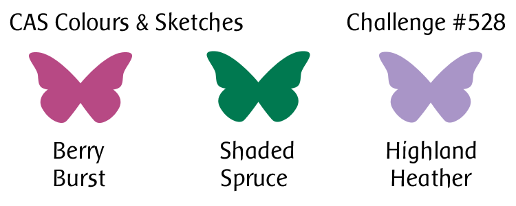
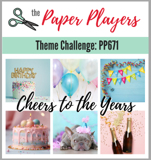
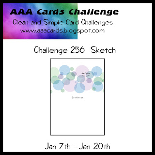
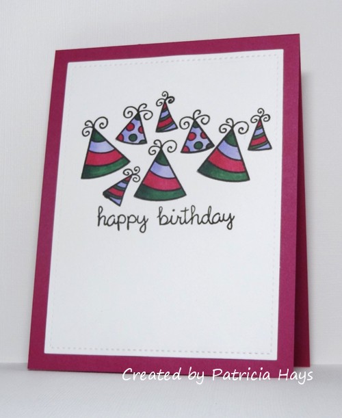
As usual, we’re starting off with a color challenge. Jeanne, our host for the month of January, has chosen some lovely bright, rich colors for us to work with. My brain toyed with the idea of doing something with florals, but I wasn’t completely sold on that, so I decided to browse through some of the other online challenges to see what they had going on. The Paper Players is asking participants to create a birthday card, and AAA Cards has a sketch challenge. The proverbial light bulb went off in my head, and I came up with this:

OK, it may not be the most conventional color trio to see on party hats, but I thought it worked all right.  Grouping the hats was tricky, and I realize that viewing the hats as one whole image, it’s not centered, but oh well.  I know I’m picky about that kind of thing. 

I hope you’ll join in the fun and creativity at CC&S! You have until 6:00 p.m. Eastern U.S. time Monday, January 22 to link your card to the challenge post. Thanks for stopping by today!

Supplies:
Stamps: Hats Off to You, So Much to Say, Happy Everything (Lawn Fawn)
Cardstock: Solar White (Neenah); Berry Burst (Stampin’ Up)
Ink: Onyx Black (VersaFine)
Other: markers (Copic); Stitched Rectangle die (Lawn Fawn)
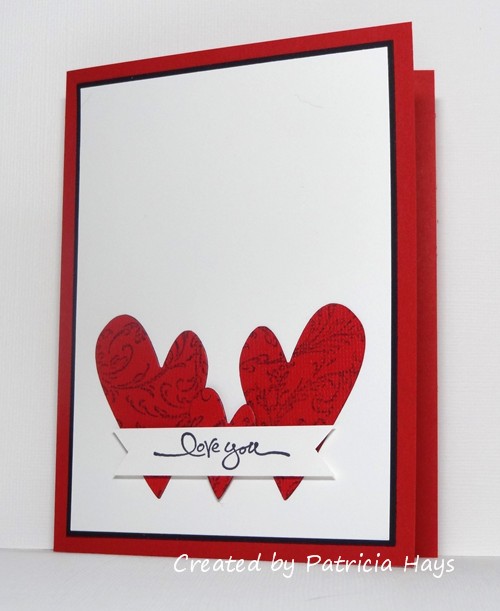
Hello!  There are so many awesome card making challenges out there, and not enough time in a day, so I’ve combined four challenges into one card for today’s post.  I do have to say that as I was creating it, I had a mental picture in my head of how the finished card would look… and then when I finished the actual card, I looked at it and thought, “meh”, because it didn’t quite turn out as nicely as my mental picture card.  Oh well. 

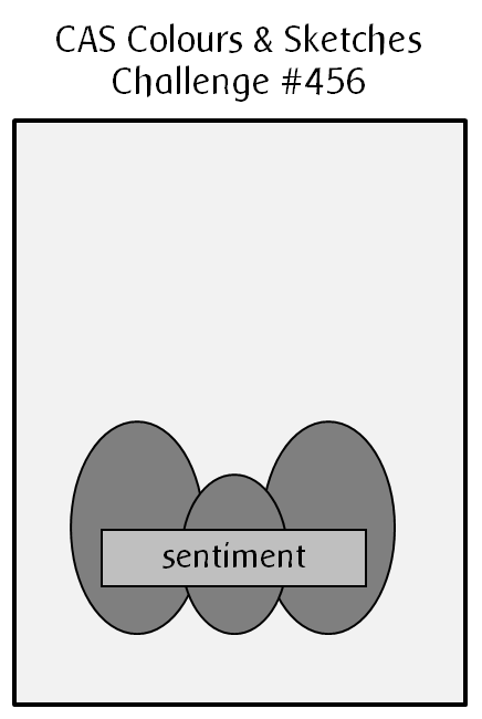
Anyway… I’ve used this week’s sketch from CAS Colours & Sketches with the color scheme from Color Hues.  The themes from The Paper Players and Addicted to CAS are similar enough to work together.  I stamped a filigree design on a scrap of textured red cardstock and die cut the hearts from it.  I stamped the sentiment on a scrap strip of cardstock and trimmed the ends into a banner shape.  The small heart and the banner are attached with dimensional adhesive in an attempt to keep them from blending into the large hearts and white background.  I added a narrow mat to the focal panel to give an extra pop of black for the color scheme.

The CC&S sketch challenge is open until 6:00 p.m. Eastern U.S. time Monday, February 14, and we’d love to have you join in!  Thanks for stopping by today.

All supplies are from Stampin’ Up unless otherwise noted:
Stamps: Filigree, Short & Sweet
Cardstock: Real Red, Basic Black, Whisper White, Real Red textured
Ink: Tuxedo Black (Memento)
Other: dimensionals; heart dies (Sweet ‘n Sassy Stamps)

Hello hello!  At CAS Colours & Sketches, we’re celebrating our challenge blog’s 400th challenge this week!  To thank our challenge participants for helping us to reach this milestone, we’re offering up a prize from Uniko to one lucky player in this week’s challenge.  You won’t want to miss out on this event!  All the details are at the challenge site.

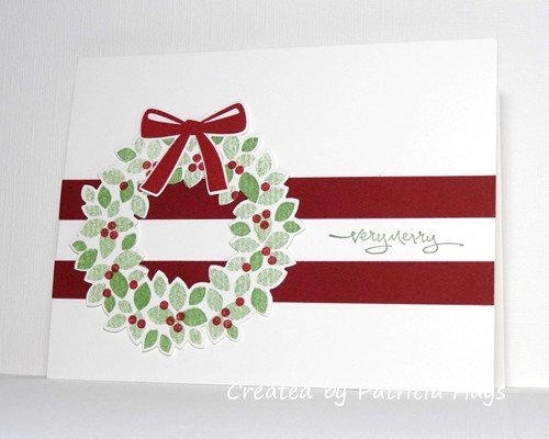
We’re also getting into the holiday spirit by asking our challenge participants to choose any CC&S challenge from 2020 and turn it into a seasonal card.  I ended up using the mirror image of sketch challenge #381.  To get the variegated lighter shade of green for the leaves on the wreath, I inked up the stamp and then pressed a paper towel against the ink, to lift some of the ink off the stamp.  Then I stamped onto the cardstock.

We’d love to see what you can create with this week’s colors, and to have you join in celebrating with us!  Share your card at the CC&S website by 6:00 p.m. Eastern time Monday, December 14, 2020.  We hope you’ll continue to join in our challenges.  Thank you to our fantastic sponsor for this week, Uniko!

https://uniko.co.uk/blog

I’m joining in the challenges at AAA Cards and The Paper Players with today’s card, too!

All supplies for this card are from Stampin’ Up:
Stamps: Wondrous Wreath, Short & Sweet
Cardstock: Cherry Cobbler, Thick Whisper White
Ink: Wild Wasabi, Cherry Cobbler
Other: Wonderful Wreath Framelits dies

Wow!  It’s already the third Tuesday in November, and that means it’s color challenge time again at CAS Colours & Sketches.

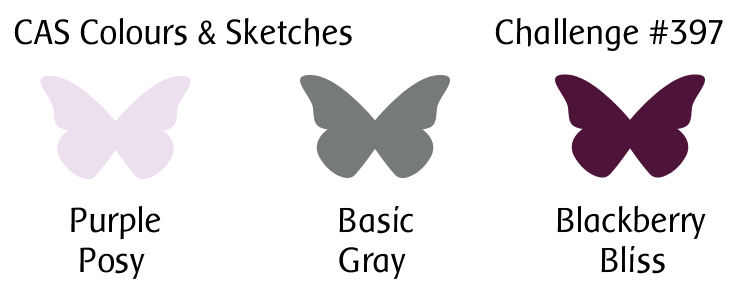
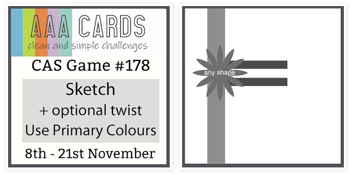
I decided to combine the colors with the sketch from the current AAA Cards challenge and the theme from this week’s challenge at The Paper Players.  I used a tree die for the vertical and horizontal elements of the sketch, and I hope with the wash of color for the sky behind it, that I’m not taking too many liberties with the sketch idea.  The little birdie fills in for the “any shape” element.  I stamped the birdie onto a scrap of cardstock, colored him in the grey and darker purple of the challenge colors, and fussy cut him (even around his tiny little legs!) so I could glue him in place on his perch.  Then I used my stamping platform to help me add the sentiment precisely in place.  I opted to use the grey from the challenge color trio for the card base because it’s neutral and it matched my coloring the best.


What will the CC&S colors inspire you to create?  We’d love to see your clean and simple card in our challenge gallery!  You have until 6:00 p.m. Eastern U.S. time Monday, November 23 to link your card to the challenge post.  Thanks for stopping by today!

Supplies:
Stamps: Winter Sparrows (Lawn Fawn)
Cardstock: Basic Gray (Stampin’ Up); The Langton Prestige Extra Smooth Hot Press watercolor paper (Daler-Rowney); Pure Luxury White (Gina K. Designs)
Ink: Tuxedo Black (Memento)
Other: Almost Amethyst reinker (SU); markers (Copic); Winter Trees die (Penny Black)

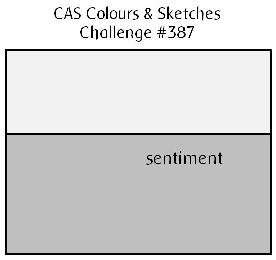
Hello!  Today starts sketch challenge week at CAS Colours & Sketches and YoonYoung has drawn up a very nice clean and simple one for us!

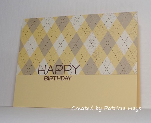
When I first saw the sketch, I thought it would make a good opportunity to use some designer paper.  I have a huge variety of papers to choose from, so to narrow it down, I took a look at some of my other favorite challenge blogs and saw that The Paper Players is having a theme challenge to create masculine birthday cards.  I picked an argyle print from, I must admit, one of my very oldest packs of designer paper.  I knew this pattern would allow for a sentiment to still be easily read.  The difficult thing about using this pattern is making sure to line it up so that it’s centered on the card front, but after some careful measuring, I think I’ve accomplished that.  I also took the liberty of turning the sketch 180° so that the wider rectangular portion is at the top of the card, and I let the sentiment straddle the line dividing the two parts of the sketch.


So, there you have it!  What will you create with this sketch?  Share your work with us at the CAS Colours & Sketches site by 6:00 p.m. Eastern time Monday, September 14. Be sure to check out what the other design team members have made, too!  Thanks for stopping by today!

Supplies:
Stamps: Happy Happy Happy (Lawn Fawn)
Cardstock: Barely Banana, Spring Flowers designer paper (Stampin’ Up)
Ink: Chocolate Chip (SU)

Well hello there!  We’re starting a new month of challenges at CAS Colours & Sketches today, and with it, the design team is doing something a little bit different.  Instead of having one team member being the hostess for the entire month, we have five team members each hosting one challenge this month, and the other four members will each host a challenge in July.

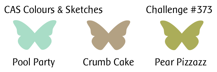
As always, the challenge for the first week of the month is a color challenge.  I’ll admit it took me a little while to settle on what kind of design to use with these week’s colors.  In the end I figured one can pretty much never go wrong with florals.  The green in the challenge combo worked perfectly for the stems and leaves, and the light aqua made some pretty blossoms.  The kraft cardstock is a nice neutral to ground the elements together.  In retrospect I probably should have had the stems extend off the base of the card so they’re not “floating” so much, but it’s too late now – the card is in the mail to its recipient already!

This card works into the top row of the current Tic-Tac-Toe challenge at The Paper Players.  OK, maybe it’s not THE most girly card, but it’s definitely more feminine than masculine!  I’m also going to use this card to join in the celebration at AAA Cards.  Happy 6th birthday to their challenge!


Thanks so much for stopping by today!  I hope you’ll make a card with these challenge colors and share it with us at CC&S.  You have until 6:00 p.m. Eastern U.S. time Monday, June 8 to link your card at the challenge site.

Supplies:
Stamps: Painted Petals (Stampin’ Up); Birthday Greetings (Gina K. Designs)
Cardstock: Pool Party, Crumb Cake, Very Vanilla (SU)
Ink: Pool Party, Pear Pizzazz, Crumb Cake (SU)

As usual for me in January, I start out the year thinking that I’m going to join in more cardmaking challenges throughout the year like I used to, and then something happens that takes the proverbial wind out of my sails.  Oh well.  Anyway, here’s this year’s first attempt at this endeavor.

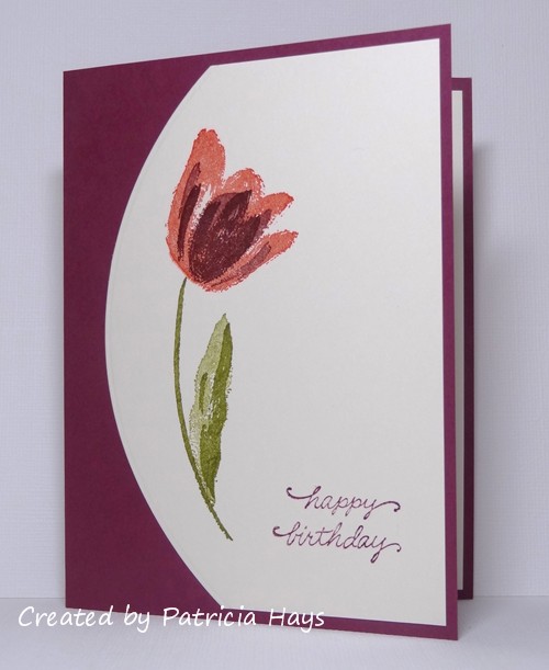
I’ve combined the sketch from Freshly Made Sketches with the color scheme provided by The Paper Players.  I felt like the tulip followed the lines of the mirror image of the sketch pretty well, and I stamped it using the colors from the color challenge.  Unfortunately, my Poppy Parade ink pad wasn’t as inky as I thought, and that’s the darkest I could get that color ink to work with just one impression from the stamp.  (I needed to get the card in the mail so I didn’t take the time to re-ink the ink pad or do multiple impressions with the stamp.)  It’s not one of my best cards but I really do like the sketch.


Thanks for stopping by today! Comments are always welcome and appreciated!

Edited on January 24, 2020 to add:  Thank you to Claire at The Paper Players for choosing my card as “A Cut Above”!  What an awesome surprise!


Supplies:
Stamps: Terrific Tulips (Stampin’ Up); Everyday Messages (Stampendous)
Cardstock: Pure Luxury Ivory (Gina K. Designs); Rich Razzleberry (SU)
Ink: Old Olive, Poppy Parade, Rich Razzleberry (SU)
Other: Custom Panels die (Avery Elle)

I feel like I’ve been in a creative slump for quite a while, not creating as many cards as I used to.  I’m not one for making New Year’s resolutions per se, but I do want to get back into a cardmaking groove again in 2019.  I miss playing along in some of the various challenges I’ve participated in in the past.  So today’s post is an effort to get back into the swing of things.

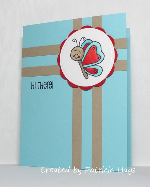
The Paper Players challenge that is closing shortly is to use any sort of animal on a card.  I’ve combined that with a recent sketch challenge from Splitcoaststampers.   I had the butterfly already colored and mounted to the red scalloped circle, left over from a long-ago cardmaking session, and I thought pairing it with the sketch would make a quick and easy start onto using up some of my “UFOs” (UnFinished Objects).  Because of the way the butterfly is oriented, I thought it looked better to flip the sketch mirror-image.  The narrow strips were cut from a scrap of cardstock.  It’s definitely not one of the most amazing cards I’ve ever made, but it’s cute and perfectly suitable for Send a Smile 4 Kids.


Thanks for stopping by today!  Comments are always welcome and appreciated.

Supplies:
Stamps: Somebuggy Loves You (Sweet ‘n Sassy Stamps)
Cardstock: Cool Caribbean, Crumb Cake, Real Red (Stampin’ Up); Solar White (Neenah)
Ink: Tuxedo Black (Memento)
Other: markers (Copic); big scalloped circle Nestabilities die (Spellbinders); dimensionals (SU)

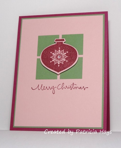
Hello there!  We are getting into the holiday spirit at CAS Colours & Sketches this month!  Our color challenge this week is to take one of our CC&S color combinations from 2018 and make a seasonal card with it.

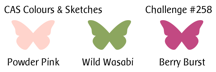
I decided to revisit challenge #258 since it had a green and a red that seemed Christmassy to me.  I had a brief thought of using the colors for a poinsettia but my plans for a coloring session got interrupted.  So I went back to the proverbial drawing board and figured I could rework a card I made in 2015 with the different color scheme.  The card came together pretty quickly once I got started with this layout.  A couple of small changes that I made for today’s card are that I cut the squares from a scrap of green cardstock, rather than die-cutting them, and I used dimensional adhesive to pop up the ornament over top the squares.

CASCAS301

CC&S color301-001

CC&S color258-001

Since it’s the time of year for holiday themed cards, I’m submitting this card for the current challenges at The Paper Players and Cards in Envy.

Which of our CC&S color combinations from 2018 will you use?  You can check all of them out on the CAS Colours & Sketches blog using the Past Colour Challenges tab.  Be sure to see what the rest of the design team has made, too!  Then link your card to the challenge site by 6:00 p.m. Eastern time Monday, December 10.  We’d love to see what you come up with!  Thanks for stopping by today.

All supplies for today’s card are from Stampin’ Up unless otherwise noted.
Stamps: Delightful Decorations, Christmas Greetings
Cardstock: Berry Burst, Wild Wasabi, Powder Pink
Ink: Berry Burst
Other: rhinestone (Recollections)

Hello!  It’s time for a new month of challenges at CAS Colours & Sketches, and for November, I get to be your challenge hostess!  I hope you’ll enjoy the cards the design team and I make this month, and I hope you’ll join in and make some cards, too.

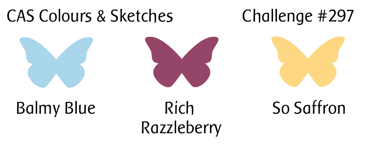
A new month always gets started off with a color challenge.  I chose a trio that I often see in our autumn days of November here in Virginia – a sky blue and the yellow and purplish-red of fallen leaves.  That’s the idea I tried to convey in my card for this challenge.  I stamped the leaves onto a scrap of watercolor paper.  Then I used a damp paintbrush to activate the ink inside the leaves, softening the lines of the veining and giving the leaves a watercolored look.  When it was fully dry, I trimmed the watercolor paper down to the length of the card and the width that I wanted.  After I cut the cardstock base to size, I lay the watercolor panel on it to determine where I wanted to place it, and then scored a line on each side of it just to give a little extra definition to it.  I added the sentiment and attached the panel to the card.  Really, it was a quite easy card to make.

CASCAS297

CC&S color297-001

I’m going to enter this into the “Give Thanks” theme challenge at The Paper Players.

Go check out the other design team members’ cards at the CAS Colours & Sketches blog.  They’ve done an amazing job this week!  Then show us what you’re inspired to create using these colors.  If you don’t have the exact Stampin’ Up colors, that’s all right; simply use whatever you have that matches them closely. You have until 6:00 p.m. Eastern time Monday, November 12 to link your card at the challenge post.  Happy crafting!

Supplies:
Stamps: unnamed leaf stamps (StampCraft); Short & Sweet (Stampin’ Up)
Cardstock: Bashful Blue (SU); The Langton Prestige Extra Smooth Hot Press watercolor paper (Daler-Rowney)
Ink: Rich Razzleberry, So Saffron (SU)
Other: paintbrush and water

I managed to squeeze in some time today to get a card made for a couple of challenges.  I’ve combined the sketch from The Paper Players with the technique from Shopping Our Stash.

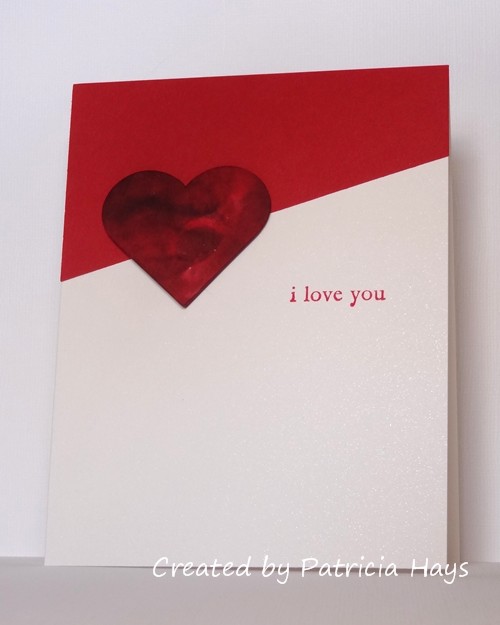
I started by die cutting a heart from white cardstock.  I dripped some pink and red inks onto a piece of acetate and pushed the heart into the puddles for the smooshing technique.  While the ink was drying, I cut a few more hearts so I could stack them all for dimension.  I decided to keep the card base very clean and simple by not embellishing the red cardstock for the top of the sketch, but I used shimmery white cardstock for the card base to give a subtle hint of something special.

PP411

Sweet and simple and pretty quick to make!  Don’t tell my husband, but he’ll be getting this card on our anniversary next week.

Thanks for stopping by my blog!  Comments are always welcome and appreciated.

Supplies are from Stampin’ Up unless otherwise noted.
Stamp: Three Little Words
Cardstock: Real Red, Thick Whisper White, Shimmery White
Ink: Real Red
Other: Pink Pirouette, Real Red, Cherry Cobbler reinkers; heart die (Sizzix)

Hello!  It’s the third Tuesday of the month, which means it’s color challenge time again at CAS Colours & Sketches.

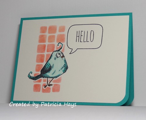
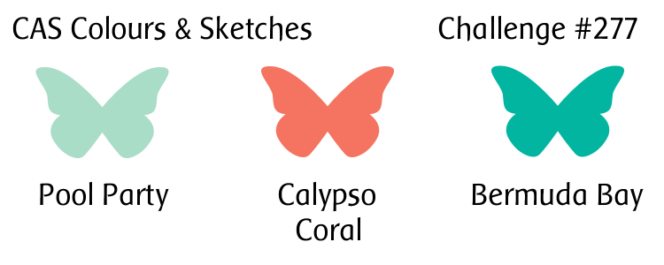
Despite the cheeriness of the colors, I seem to have a hard time working with both Bermuda Bay and Calypso Coral whenever they come up separately in our challenges – so having them together had me puzzled for a while.  I noticed that the current Paper Players challenge is to use birds on a clean and simple card, so I finally decided that the Bermuda Bay and Pool Party could work together to color this bird image I haven’t used yet.  After I stamped the bird on the focal panel, I covered it with a mask and then stenciled blocks in the coral color for a background.  The stamps and the stencil were purchased together as a set.  The blocks should fit the geometric challenge currently going on at AAA Cards.  After I peeled off the mask, I colored the bird with Copics and added in a speech balloon for the sentiment.  I trimmed the bottom corner to mimic the shape of the bird’s body, and mounted the focal panel to a Bermuda Bay card base.

CASCAS277

CC&S color277-001

Now it’s your turn to create a clean and simple styled card using these colors, and share it with us at the CC&S site!  You have until 6:00 p.m. Eastern time Monday, June 25 to link your card.  We hope you’ll join us!

Supplies:
Stamps: THMM108 (Tim Holtz/Stampers Anonymous); A Birdie Told Me (Lawn Fawn)
Cardstock: Bermuda Bay (Stampin’ Up); Pure Luxury Ivory (Gina K. Designs)
Ink: Calypso Coral (SU); Tuxedo Black (Memento)
Other: markers (Copic); corner rounder (EK Success); THMM108 stencil (Tim Holtz); sponge dauber

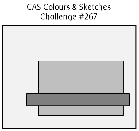
Hello there!  It’s time for another sketch challenge at CAS Colours & Sketches.  This week’s offering is a rather clean and simple design that I think is really versatile for lots of different occasions.

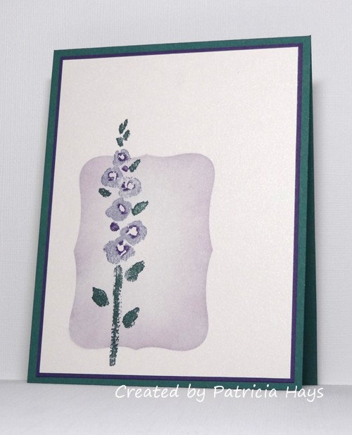
As a subconscious play into my last sentence, I opted not to put a sentiment on the card I made using this sketch.  I’ve turned the sketch on its side.  I cut a fancy rectangular shape from an index card and used that as a mask, brushing some lavender and some purple ink into it.  Then I stamped the flower using the same two colors of ink for the blossoms.  After playing around with the cardstock, I finally chose to use the darker purple for a mat and the green for the card base.  The color scheme is taken from the current challenge at The Paper Players.  It doesn’t show in the photo, but the white cardstock has a subtle shimmer to it.

CASCAS267

sketch 267


Why don’t you check out what the rest of the design team has done with this sketch?  I’m sure they’d enjoy it if you stop by their blogs.  Then create a card of your own and share it with us at the CC&S site.  You have until 6:00 p.m. Eastern time Monday, April 16 to link your card.  We’d love to have you join in the fun and creativity!

Edited on April 16, 2018 to add:  Thank you to Elizabeth from The Paper Players for choosing this card as A Cut Above!  It’s an honor!

All supplies for today’s card are from Stampin’ Up.
Stamps: Spring Garden
Cardstock: Tranquil Tide, Elegant Eggplant, Shimmery White
Ink: Tranquil Tide, Wisteria Wonder, Elegant Eggplant

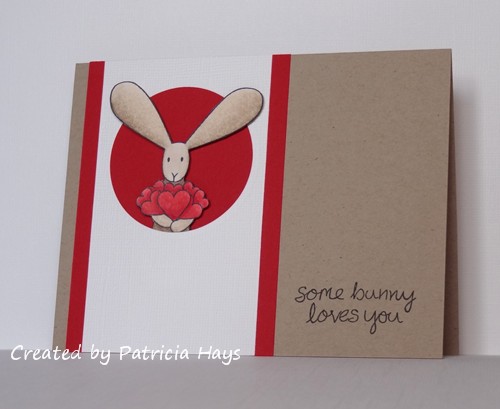
Hello!  This is just a quick post to share one last valentine for this season.  I made this one for my husband, using the colors from the current challenge at The Paper Players.

The bunny was stamped, colored, and fussy cut.  I cut a circle from white textured cardstock and backed it with a piece of red cardstock.   When I inserted the bunny in the hole, I used dimensional adhesive behind his ears to really pop them out from the circle.  A cute little sentiment finished the card.

PP380

I’m also going to enter this at Addicted to Stamps and More, where the theme this week is Clean and Simple.

Thanks for stopping by and checking out my card!

Supplies:
Stamps: Flopsey Bunch of Hearts (My Favorite Things); My Silly Valentine (Lawn Fawn)
Cardstock: Kraft, Real Red, Whisper White textured (Stampin’ Up); Solar White (Neenah)
Ink: Tuxedo Black (Memento)
Other: markers (Copic); dimensionals (SU)

Hello there!  This month it’s my turn to create the color combinations and sketches for the challenges at CAS Colours & Sketches! I’m excited about it, and I hope you’ll join in and share your artwork with us!

For this week’s color challenge, I decided to put an updated spin on a card I made back in 2007, before I had a blog.  (It’s a little embarrassing to admit that the link is for a scan of the card, because this also was before I started using a camera to take photos of my cards!)  I’ve swapped out the colors used on that card for colors that are currently offered by Stampin’ Up.  Of course, as with all of our CC&S challenges, you don’t need to use Stampin’ Up products – we just use their color names as a point of reference.

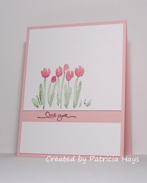
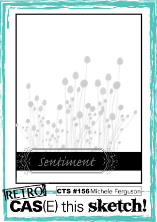
I decided to use the current sketch from CAS(E) this Sketch! for the layout of my card.  Instead of putting the sentiment on its own strip, I split the focal panel and stamped the sentiment in the gap, directly on the card base.  I used a few pieces of scrap cardstock as shims to give a little dimension to the white panels.  To get the two-tone effect on the blossoms, I inked the stamp with the lighter pink first, and then sponged some of the darker pink ink onto the stamp, before pressing the stamp on the cardstock.

CASCAS258

CC&S color258-001

Valentines and love are popular challenge themes going on right now, so I’m entering this card at AAA Cards, The Paper Players, and Cards in Envy, too.

So – if you need further inspiration for the CAS Colours & Sketches challenge, go see what the rest of the design team has made!  Then create your own clean and simple card using this week’s colors, and link it to the challenge blog by 6:00 p.m. Eastern time Monday, February 12.  We’d love to see what you can do!

Edited on February 11, 2017 to add:  Thank you to the team at CAS(E) this Sketch! for naming my card as an honorable mention!  What an awesome way to start my week!

All supplies for this card, except the white cardstock, are from Stampin’ Up.
Stamps: Spring Garden, Short & Sweet
Cardstock: Solar White (Neenah); Powder Pink
Ink: Powder Pink, Berry Burst, Wild Wasabi

© 2019 Suffusion theme by Sayontan Sinha