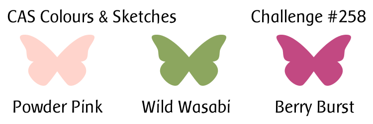
Hello there! This month it’s my turn to create the color combinations and sketches for the challenges at CAS Colours & Sketches! I’m excited about it, and I hope you’ll join in and share your artwork with us!
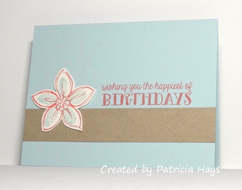
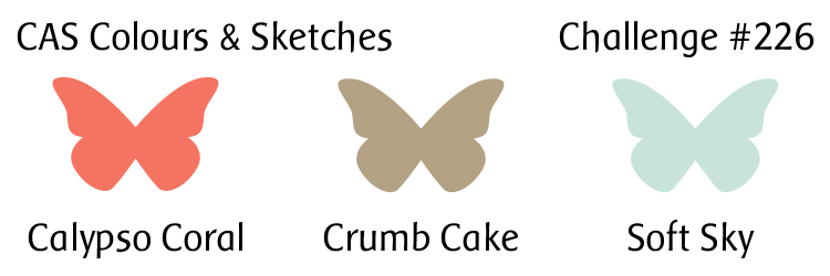
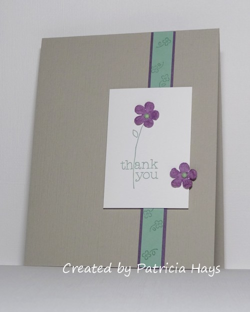
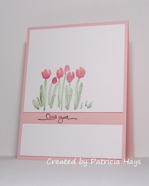
For this week’s color challenge, I decided to put an updated spin on a card I made back in 2007, before I had a blog. (It’s a little embarrassing to admit that the link is for a scan of the card, because this also was before I started using a camera to take photos of my cards!) I’ve swapped out the colors used on that card for colors that are currently offered by Stampin’ Up. Of course, as with all of our CC&S challenges, you don’t need to use Stampin’ Up products – we just use their color names as a point of reference.
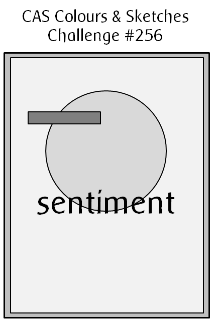
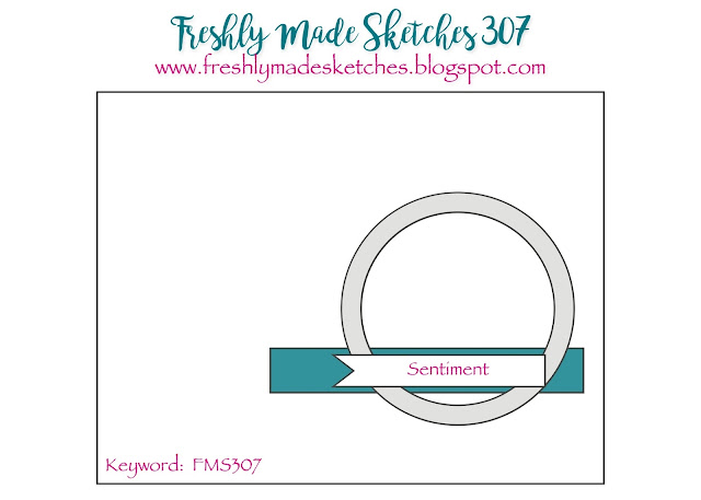
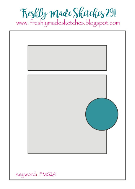
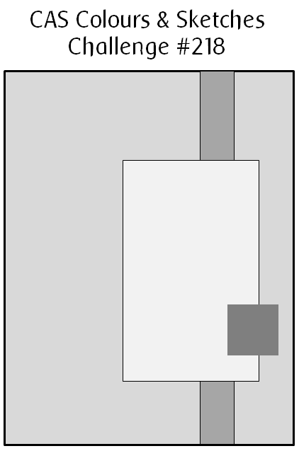
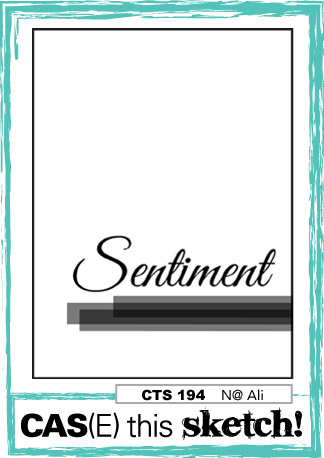
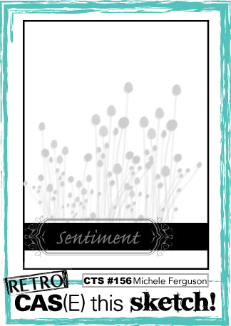
I decided to use the current sketch from CAS(E) this Sketch! for the layout of my card. Instead of putting the sentiment on its own strip, I split the focal panel and stamped the sentiment in the gap, directly on the card base. I used a few pieces of scrap cardstock as shims to give a little dimension to the white panels. To get the two-tone effect on the blossoms, I inked the stamp with the lighter pink first, and then sponged some of the darker pink ink onto the stamp, before pressing the stamp on the cardstock.
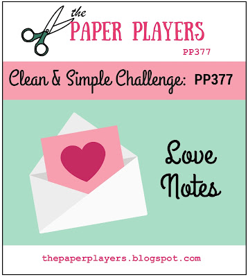
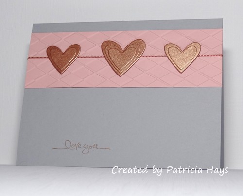
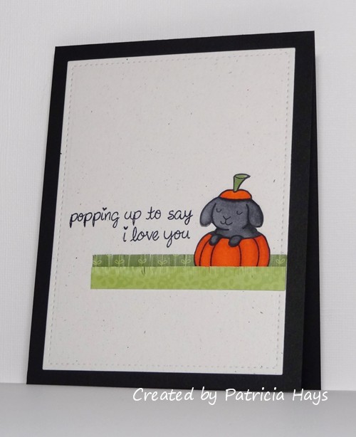
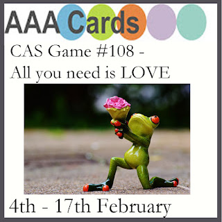
Valentines and love are popular challenge themes going on right now, so I’m entering this card at AAA Cards, The Paper Players, and Cards in Envy, too.

So – if you need further inspiration for the CAS Colours & Sketches challenge, go see what the rest of the design team has made! Then create your own clean and simple card using this week’s colors, and link it to the challenge blog by 6:00 p.m. Eastern time Monday, February 12. We’d love to see what you can do!
Edited on February 11, 2017 to add: Thank you to the team at CAS(E) this Sketch! for naming my card as an honorable mention! What an awesome way to start my week!
All supplies for this card, except the white cardstock, are from Stampin’ Up.
Stamps: Spring Garden, Short & Sweet
Cardstock: Solar White (Neenah); Powder Pink
Ink: Powder Pink, Berry Burst, Wild Wasabi