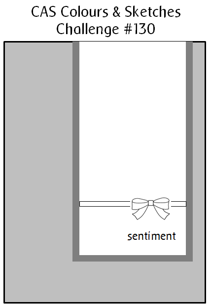
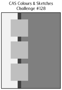
Hello!  It’s time for a new sketch challenge at CAS Colours & Sketches.  This week it’s an interesting one and I’m looking forward to seeing what our challenge participants do with it.

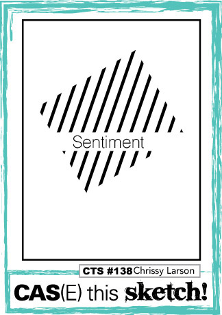
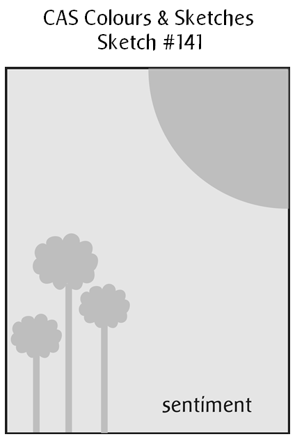
I’ve rotated the sketch 180° for my card and given it an autumn theme.  It’s not quite autumn yet here in the Shenandoah Valley – this week the afternoon high temperatures have been in the 90s, but we’ve had some nighttime low temperatures in the 50s.  A few trees are starting to have some changing leaves.  So I don’t think the fall season is too far away.  Anyway, back to the card.  For the leaves, I created a colorful wash with red and mustard yellow reinkers onto a scrap of watercolor paper.  After it dried, I die cut the leaves from it.  I attached the small leaves with temporary adhesive first so I could sketch in the lines with pencil to show movement.  Then I removed the leaves, went over the lines with a pen, erased the pencil marks, and finally attached the leaves permanently.  I used a set of alphabet stamps to create the sentiment.

CASCAS141

sketch 141

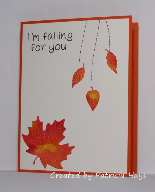
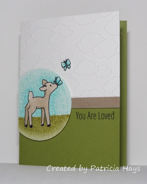
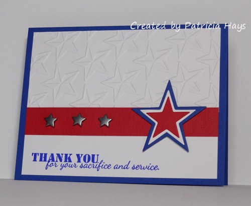
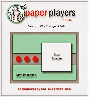
I have to admit, even though I wasn’t sure about the sketch at first, I’m pleased with how my card turned out!  I’m going to submit it for the current challenge at The Paper Players.  My teenage sons would die of embarrassment if I put notes in their lunchboxes now, LOL, but I can tuck this card into my husband’s laptop case.

Thanks for stopping by today!  Be sure to see what the rest of the CC&S Design Team has done with the sketch.  Then show us your own take on it by linking your card at the CC&S site by 6:00 p.m. Eastern time Wednesday, September 16.  We’d love to have you join us!

Supplies:
Stamps: Jesse’s ABCs (Lawn Fawn)
Cardstock: Tangelo Twist (Stampin’ Up); Pure Luxury Ivory (Gina K. Designs); watercolor paper (Artist’s Loft)
Ink: Tuxedo Black (Memento)
Other: Riding Hood Red and More Mustard reinkers (SU); Stitched Leaves dies (LF); multiliner pen (Copic)

Well hello there!  It’s the first Thursday of the month, which means we have a new hostess of the month over at CAS Colours & SketchesLizy has planned some fun things for us this time, and she’s starting us off with a really nice, soft, mostly pastel color challenge.

I had the current CAS(E) this Sketch! layout in mind when I was making this card, although I took a few liberties with it by adding a matted layer and changing the rectangular focal point to a circle.  The mint green color that Lizy chose tied into this week’s Paper Players challenge, and I chose the option of circle/embossing/Mint Macaron.  Since I don’t have any Mint Macaron cardstock or ink yet, I just used the colors that seemed closest. My first attempt at coloring this image with my Copic markers was a flop – the green ended up too dark, and I just wasn’t happy at all with the result.  So I started over again with my circular element and used my colored pencils with odorless mineral spirits.  I was much more pleased with the way it turned out.  Since I’m planning to send this card to Send a Smile 4 Kids, I chose a sentiment that hopefully will bring some cheer to a child of pretty much any age.

CASCAS140

CC&S color140-001

Thanks for stopping by today!  I hope you’ll share your own card with the CC&S challenge colors by linking it to the CC&S site by 6:00 p.m. Eastern time Wednesday, September 9.

Edited on September 8, 2015:  Thank you to Lisa of the Paper Players Design Team for choosing my card as “A Cut Above”!  What a nice surprise!

Supplies:
Stamps: Critters Ever After (Lawn Fawn); Simply Said: You (Avery Elle)
Cardstock: Pink Pirouette, Rose Red (Stampin’ Up); Pure Luxury White (Gina K. Designs)
Ink: Rose Red, Pink Pirouette, Sage Shadow (SU); Tuxedo Black (Memento)
Other: Premier colored pencils (Prismacolor); odorless mineral spirits (Hampton Arts); standard circle Nestabilities die (Spellbinders); D’Vine Swirls embossing folder (ProvoCraft); dimensionals (SU); sponge

Sorry… I just couldn’t resist the punny post title!  This is a card I created to combine a few different challenges.

I’ve taken the color scheme from the current challenge at The Paper Players.  I would not have thought to combine these colors, and I had a little trouble working with them, but I suppose it turned out OK in the end.  I will readily admit this wasn’t one of my best coloring jobs, but I think the marker colors match the specified colors pretty well.  The embossed clouds tie into the current AEIHeartU challenge.  The layout is from the CAS(E) this Sketch challenge that ends tomorrow morning.  The two butterflies are adhered with dimensional adhesive for a little visual separation from the background.  The narrow strip of kraft cardstock is stamped tone-on-tone with a subtle texture stamp.

CTS135

Challenge 27

Thanks for stopping by today!

Edited on August 15, 2015:  What a happy surprise it was to see that Nance of the Paper Players Design Team chose this card as “A Cut Above”!  Thank you so much!

Supplies:
Stamps: Storybook, Simply Said: You (Avery Elle); Linen (Stampin’ Up)
Cardstock: Old Olive, Kraft (SU); Pure Luxury White (Gina K. Designs)
Ink: Tuxedo Black (Memento)
Other: markers (Copic); clouds embossing folder, dimensionals (SU); standard circle Nestabilities die (Spellbinders)

Hello!  I just have a quick post today to share a card made for the current challenge at the Paper Players and for the Mid-Month Throwdown at the OWH Stars & Stamps blog.  It also fits into the current challenge at Addicted to Stamps and More.  The stitched square dies fit together easily and perfectly to cut the frame for the focal panel.  I discovered the clouds on my desk, leftovers from a previous project that had gotten hidden under an ink pad, so I added them to the scene.

PP254

Thanks for stopping by today! Your comments are always read and appreciated.

Edited on July 25, 2015:  I’m thrilled and honored that this card was selected as “A Cut Above” at The Paper Players!

Edited on August 4, 2015:  What a nice surprise – this card was chosen as an “Honourable Addict” at Addicted to Stamps and More!  Thank you!

Supplies:
Stamps: Love Quotes (Mama Elephant)
Cardstock: Sahara Sand textured, Soft Sky (Stampin’ Up); Pure Luxury White and Ivory (Gina K. Designs)
Ink: Tuxedo Black (Memento)
Other: markers and multiliner pen (Copic); Love Quotes dies (Mama Elephant); stitched square dies (Lawn Fawn); cloud dies (Sweet ‘n Sassy Stamps)

Hello there!  It’s the first Monday of the month, which means it’s time for a new challenge at Cards in Envy!  Our theme for the next two weeks is “Just Beachy”.  Make a card depicting whatever says “beach” to you – an ocean scene, beach balls, starfish, anything that you think of when you think of going to the beach.  Remember, though, that the main requirement for Cards in Envy challenges is that your card must be A2 sized and not have any lumpy, bumpy embellishments that could push it over the first class postage rate.

I’ve used the current CAS(E) this Sketch! layout for my card.  I paired some watery-looking designer paper with a lightly speckled cardstock that reminds me of sand on the beach.  I stamped various seashells and a sand dollar on scraps of speckled cardstock, fussy cut them, and arranged them on the front of the card.  The largest shell is raised up with cardstock shims to add a little dimension to the card.  A simple sentiment finishes off the card and makes it a suitable addition to the cards I’m compiling to send to Operation Write Home by the end of the month.  The beachy theme also makes this card suitable for the current Paper Players challenge.

CIE 07-06-2015

Be sure to check out the Cards in Envy site for all the challenge details and to see what the rest of the design team has created!  Then create a beachy card of your own and share it with us using the linky tool on the site.  You have until 7:00 p.m. Eastern time Sunday, July 19 to play along with us!

Edited on July 12, 2015:  Thank you to Joanne of the Paper Players Design Team for choosing this card as “A Cut Above”!  It was a wonderful surprise to start my week!

Supplies:
Stamps: Stipple Shells (Stampin’ Up); Year Round Sentiments (Hero Arts)
Cardstock: Naturals Ivory, Naturals White (SU); designer paper (source unknown – I’ve had this stuff for years!)
Ink: Soft Suede (SU)

Hi there!  It’s Thursday, which means it’s time for a new challenge at CAS Colours & SketchesLizy, our challenge hostess for June, has drawn up a nice little sketch for us to work with this week.

I stayed true to the sketch for my card, and I considered several different ideas for what images to use.  In the end, I decided to follow along with the Paper Players theme of “Summer Treats” and chose this cute little pea pod image.  My family has been enjoying the peas from our garden over the last few weeks, and I’ve been freezing packages of them for us to eat throughout the winter.  Home-grown veggies are definitely a treat in my opinion!  For my card, I originally planned to stamp the card base with a background stamp, but I didn’t like the way that looked.  So I decided to scrap that idea and just keep it plain.  A simple knot bow with the ribbon will smush flat enough to keep this card eligible for Operation Write Home.

CASCAS130

sketch 130

What will you do with this sketch?  There are so many possibilities!  Be sure to go see what the rest of the Design Team has made.  I hope you’ll try out something and share what you create with us!  Link your work to the CAS Colours & Sketches blog by 6:00 p.m. Eastern time Wednesday, July 1.  Thank you for stopping by today!  Comments are always welcome and appreciated!

Supplies:
Stamps: Punny Fruits & Veggies (Sweet ‘n Sassy Stamps)
Cardstock: Pear Pizzazz, Garden Green (Stampin’ Up); Pure Luxury Ivory (Gina K. Designs)
Ink: Tuxedo Black (Memento)
Other: markers (Copic); grosgrain ribbon (SU)

Hello there!  It’s time for another sketch challenge at CAS Colours & Sketches.  You’re welcome to manipulate the sketch, or change the small squares to another shape, so long as we can still easily recognize the main elements of the sketch.

As I mentioned in last week’s post, many high schools are closing out the school year now, and it’s been “graduation season” for us.  I’ve needed to make several graduation cards this year.  I used our CC&S sketch for two of them.  The colors are taken from the graduates’ schools’ colors – purple and golden yellow for one, and black and orange for the other.  For the purple and gold card, I turned the sketch on its side.  This is a larger than usual card for me, 5″ x 7″.  I did that for two reasons – because I wanted to include some photos in the card, and because of the size of the mortarboard stamp.  By positioning the stamp differently on each square, I was hoping to convey the idea of the cap being tossed into the air.  I didn’t really think about it until I was formatting the photo, but the diamond shapes in the argyle embossing somewhat mimic the mortarboard shape. It felt good to use some retired cardstock colors for this card!

CASCAS128 Amanda

I stayed true to the original sketch for the orange and black card, and kept it the usual A2 size.  The orange cardstock is stamped with a background stamp to give it some visual texture.  After I inked the background stamp, I stamped it off once onto a scrap piece of paper before stamping the cardstock, to lighten it up a bit.  A few areas of the stamp didn’t quite take to the scrap paper, so they showed up darker on the orange cardstock.  I think it turned out like a serendipitous accident to give a little more interest.

CASCAS128 Bradley

And here’s the sketch graphic:

sketch 128

Both of these cards are eligible for the current Retro Rubber challenge to use ribbon or twine.  Although the “Hats Off to You” stamp set I used on the purple and yellow card is one of the first Lawn Fawn sets I bought back about 4 years ago, this is the first time I’ve used the mortarboard stamp.  The “So Much to Say” set used on the orange and black card is newer but I’ve had it  for about 18 months.  And the “Just Jeans” background stamp there is an oldie but goodie from Stampin’ Up; I’ve had it for nearly 10 years!

RRCB16

Since the orange and black card went to a young man, I’m also submitting it into this week’s Masculine theme challenge at The Paper Players.

Thanks for stopping by today!  Be sure to see what the rest of the CC&S Design Team has done with the sketch.  Then show us your own take on it by linking your card at the CC&S site by 6:00 p.m. Eastern time Wednesday, June 17.  We’d love to have you join us!

Supplies for the purple and yellow card:
Stamps: Hats Off to You (Lawn Fawn)
Cardstock: Eggplant Envy, Summer Sun (Stampin’ Up); Pure Luxury White (Gina K. Designs)
Ink: Tuxedo Black (Memento)
Other: Small Stitched Square Stackables die (Lawn Fawn); markers (Copic); Argyle embossing folder (Darice); white twill ribbon (source unknown)

Supplies for the orange and black card:
Stamps: So Much to Say (Lawn Fawn); Just Jeans (Stampin’ Up)
Cardstock: Tangerine Tango, Basic Black (SU); Pure Luxury White (Gina K. Designs)
Ink: Tuxedo Black (Memento); Tangerine Tango (SU)
Other: Small Stitched Square Stackables die (Lawn Fawn); markers (Copic); white grosgrain ribbon (SU)

Here’s a quick card I made to enter into the challenges that are ending today at The Paper Players and Less is More.  I’ve used the Paper Players sketch to create an AnyHero card for Operation Write Home.  I’ve had these metal star snaps for a long time and haven’t used them much because they’re pretty thick, but the Less is More challenge to use metal gave me the incentive to use them.  Since the card isn’t going to be mailed, the thickness of the metal won’t cause any issues.

LIM PP

Thanks for stopping by today!  All comments are read and appreciated.

Supplies:
Stamp: Unity
Cardstock: Brilliant Blue, Real Red Core’dinations (Stampin’ Up); Pure Luxury White (Gina K. Designs)
Ink: Brilliant Blue (SU)
Other: Stars embossing folder (ProvoCraft); metal star snaps (Making Memories); Star dies (Sweet ‘n Sassy Stamps)

Hello!  The current challenge at The Paper Players has been intriguing me all week.  It’s to create a clean and simple styled card and incorporate watercoloring into it.  Since the challenge closes this afternoon, I figured this morning it was now or never if I wanted to join in.  The current CAS(E) this Sketch! layout seemed to lend itself well to including a watercolored background so I’ve combined the two challenges in today’s card.  I started off with a wash of green ink on watercolor paper, which turned out pretty light, but that was OK because I didn’t want it to obscure the image.  Once it was dry, I stamped the holly image.  Then I used a damp paintbrush to trace over the lines, blending in all the little shading lines and softening the edges of the image.  I stamped a cherry colored ink pad on acetate and used the ink from there to color in the berries.  I accidentally tapped the brush over the cardstock as I was finishing up the berries, splattering a bit of the watered-down red ink near the bottom edge of the watercolor paper.  So I made a last-minute decision to add some more splatters randomly over and around the image.  I chose a green cardstock for the base and here’s the final result:

CTS120

I realize it probably seems a little weird to have a Christmasy design in April, but none of the previous ideas I had came together very well for me.  It still makes a good card for me to stockpile for Operation Write Home.  Since there’s no sentiment on it, the person who chooses to send it can use it for any occasion during the holiday season.  And Christmas Eve is just 8 months away from today!

Thanks for stopping by my blog today.  All comments are read and appreciated!  (Well, not the spam comments.  They are read, but they are not appreciated unless the content or grammar strikes my funny bone – like the poorly worded one that talked about testing traffic lights.  LOL!)

Supplies:
Stamp: Christmas Blueprint 4 (Tim Holtz)
Cardstock: Garden Green (Stampin’ Up); watercolor paper (Artist’s Loft)
Ink: Garden Green, Cherry Cobbler (SU)
Other: paintbrush

I have just a quick post tonight to share the card I’ve made for the CAS(E) this Sketch! challenge that ends tomorrow morning.  I’ll admit I took a bit of liberty with the sketch by turning it 90° and adding a few panels, but I think you can still see the basics of the sketch within the focal panel.  I felt like the card looked too plain with just the focal panel on the base, so I added a punch of color with the textured red mat.  After I’d stamped the images on the ivory focal panel, I had a “DUH!” moment where I realized I needed white for the milk.  So I stamped all the elements on a scrap of white cardstock, colored them, fussy cut them, and then adhered them to the focal panel.  The straw in the milk glass took a little bit of finagling with my x-acto knife, but I finally got it to look kind of realistic.

CTS117

Since I used a die to cut the focal panel, I’m going to submit this into the current challenge at The Paper Players.  I’m also entering this into the “Anything Goes” challenge at Clear It Out challenge blog.

Thanks for stopping by today!  Comments are always read and appreciated!

Supplies:
Stamps: Milk and Cookies (Lawn Fawn)
Cardstock: Crumb Cake, Early Espresso, Real Red Core’dinations (Stampin’ Up); Pure Luxury White and Ivory (Gina K. Designs)
Ink: Tuxedo Black (Memento)
Other: markers (Copic); Stitched Journaling Card die (Lawn Fawn)

© 2019 Suffusion theme by Sayontan Sinha