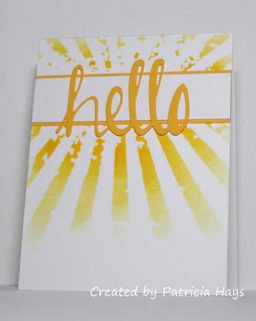
Hello!  It’s the third Tuesday of the month, which means it’s color challenge time again at CAS Colours & Sketches.

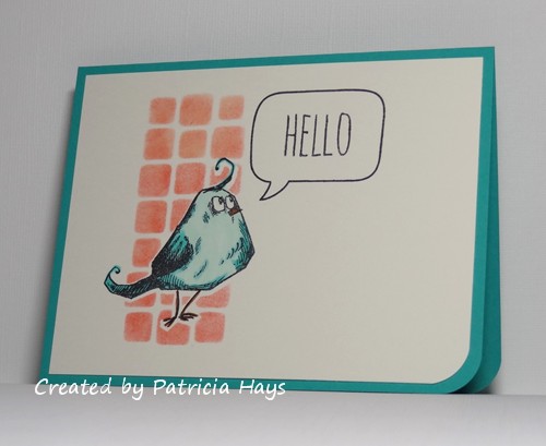
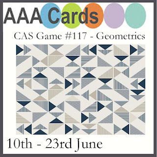
Despite the cheeriness of the colors, I seem to have a hard time working with both Bermuda Bay and Calypso Coral whenever they come up separately in our challenges – so having them together had me puzzled for a while.  I noticed that the current Paper Players challenge is to use birds on a clean and simple card, so I finally decided that the Bermuda Bay and Pool Party could work together to color this bird image I haven’t used yet.  After I stamped the bird on the focal panel, I covered it with a mask and then stenciled blocks in the coral color for a background.  The stamps and the stencil were purchased together as a set.  The blocks should fit the geometric challenge currently going on at AAA Cards.  After I peeled off the mask, I colored the bird with Copics and added in a speech balloon for the sentiment.  I trimmed the bottom corner to mimic the shape of the bird’s body, and mounted the focal panel to a Bermuda Bay card base.

CASCAS277

CC&S color277-001

Now it’s your turn to create a clean and simple styled card using these colors, and share it with us at the CC&S site!  You have until 6:00 p.m. Eastern time Monday, June 25 to link your card.  We hope you’ll join us!

Supplies:
Stamps: THMM108 (Tim Holtz/Stampers Anonymous); A Birdie Told Me (Lawn Fawn)
Cardstock: Bermuda Bay (Stampin’ Up); Pure Luxury Ivory (Gina K. Designs)
Ink: Calypso Coral (SU); Tuxedo Black (Memento)
Other: markers (Copic); corner rounder (EK Success); THMM108 stencil (Tim Holtz); sponge dauber

Hello there!  It’s sketch week at CAS Colours & Sketches and Bev, our January hostess, has come up with a nice one for us this week.

I tossed a few ideas around in my head but none of them were really appealing to me.  I decided to check out the card needs at Send a Smile 4 Kids and noticed that the shipper I frequently send to is still in need of Valentines.  So I looked through my Valentine stamps and thought I could make this cute cupid work with the sketch, with a few changes.  I’ve substituted a heart for the circle, and basically used the mirror image of the sketch so that the one arrow takes the place of the small rectangular element.

I started out by cutting a heart from an index card and using the card as a mask on my white cardstock panel.  I stamped the cupid into the center of the heart, covered it with a mask, and then blended pink ink into the heart shape.  Then I removed both masks so I could color the cupid and stamp the flying arrow and the sentiment.  I added some clear Wink of Stella pen to the cupid’s wing and to the heart-shaped points of the arrows for a little touch of magic.  If you look closely, you should be able to see it in the photo.  After I mounted the main panel onto a pink cardstock base, my card was finished.

CASCAS256

sketch 256

Since this clean and simple card fits into the “Love Notes” theme at The Paper Players, I’m entering it into that challenge.

What will you do with this sketch?  I hope you’ll try out something and share what you create with us!  If you need more inspiration, check out what the rest of the CC&S Design Team has made.  Then link your work to the CC&S blog by 6:00 p.m. Eastern time Monday, January 29.  Thanks for stopping by today!

Edited on January 28, 2018 to add:  Thank you to Claire at The Paper Players for selecting my card as “A Cut Above”!  It’s an honor!


Supplies:
Stamps: Love from Above (Mama Elephant)
Cardstock: Pink Pirouette (Stampin’ Up); Solar White (Neenah)
Ink: Tuxedo Black (Memento); Pink Pirouette (SU)
Other: markers (Copic); mini ink blending tool (Tim Holtz); clear Wink of Stella pen (Zig)

Hello!  Once again, it’s time for a new challenge at Christmas Card Throwdown.  For the next two weeks, we have a theme that we hope you’ll enjoy:  Nutcrackers or Toy Soldiers.  Since many depictions of nutcrackers around Christmastime feature them as soldiers, we thought we’d combine the two ideas into one theme challenge.

I have two versions of a toy soldier stamp.  It’s the same design, but two different sizes.  The smaller one seemed too diminutive, although I guess if I’d looked hard enough I could have found a good sketch to use it with.  However, I opted to use the larger stamp.  I went way back into the Operation Write Home sketch archives and decided to use sketch #38 since it had a large focal panel.  I had some strippy scraps of designer paper that worked perfectly for the background part of the sketch.  I pulled the colors from the designer paper to color the toy soldier image.  (The green matches better in real life.)  I’ve used some cardstock shims to raise the focal panel up from the background a bit.

52CCT 06-17-2017

What will you do with our theme?  Please show us by linking your own Christmas or wintry card at the CCT site by 7:00 p.m. Eastern time Friday, June 30.  We’d love to see your artwork!  Thanks for stopping by today.

Supplies:
Stamp: Christmas Blueprint (Tim Holtz)
Cardstock: Cherry Cobbler, Kraft, Season of Style designer series paper (Stampin’ Up)
Ink: Early Espresso (SU)
Other: Premier colored pencils (Prismacolor)

Yikes!  I’m a little late today with my post for this week’s challenge at CAS Colours & Sketches.  I made a card yesterday but I wasn’t very happy with it.  As I was trying to fall asleep last night, another idea popped up in my mind.  So I got up this morning and gave it a try… and as luck would have it, it didn’t go quite as easily as I’d hoped.  But anyway…

I wanted to combine this week’s sketch challenge with the ombre challenge at Less is More and the “hello” challenge at AAA Cards.  My first card had a large flourish that I inked in three shades of blue, but I just wasn’t pleased with the overall look of it.  For my second attempt, I thought of using the sentiment “hello, sunshine” with my sunburst stencil.  I used two different shades of yellow to ink the stencil design, layering the darker shade to make it bolder toward the center of the design and fading out the lighter shade toward the edges.  Then I went to my stamps, looking for what I thought was a “hello, sunshine” stamp… and was disappointed to discover that the stamp only says “sunshine”, and it’s made to be used with a “hello” die.  At that point I thought, “My ‘hello’ die is going to look too big.  I have alphabet stamps, so I can spell out the sentiment with them.”  That didn’t go too badly, other than trying to position an apostrophe stamp for the comma… until I stamped the sentiment.  The first two times, the sentiment came out splotchy and messy looking.  So I cleaned the stamps and tried again.  That was slightly better but the letters still looked fuzzy.  So I figured I’d try my “hello” die anyway.  It turned out that the die filled up some of the tiny areas of the stencil that didn’t ink up well.  So I went with it, using textured cardstock for the die cut.  And finally the card came together.

CASCAS205

sketch 205


Despite all the troubles I had putting this card together, it’s still a lot better than my first card!

I hope you’ll have better luck creating a card with this sketch, and that you’ll share it with us at CC&S!  You have until 6:00 p.m. Eastern time Monday, January 16 to link your card there.  Thanks for stopping by today!

Supplies:
Stamps: none
Cardstock: Solar White (Neenah); Summer Sun textured (Stampin’ Up)
Ink: Summer Sun, Daffodil Delight (SU)
Other: Simply Said Hello die (Avery Elle); Rays stencil (Tim Holtz)

Hello!  It’s theme week at 52 Christmas Card Throwdown.  Because I’m the hostess there for the month of April, I get to decide what the challenges will be, and I’ve chosen Christmas Foliage for this month’s theme.

My card ended up pretty much as a revision of a card I made about a year ago.  I started off by giving some watercolor paper a very light green wash of color.  When it was dry, I stamped the sketchy holly image with green ink.  Then I “colored” the leaves by going over them with a slightly wet watercolor brush.  The ink that I used to stamp the image provided the amount of color I wanted.  I colored the holly berries with a drop of cherry colored ink mixed with some water.  When I was done with the red ink, I mixed it in a bit of water, and splattered it around the image to give the background a little more color and interest.  Once the image was dry, I attached it to a mat of cherry cardstock, and then to a green card base.

52CCT 04-16-2016

Be sure to check out what the rest of the design team has made!  Then craft your own card showing off Christmas foliage and link it to our challenge post.  You have until 7:00 p.m. Eastern time Friday, April 22 to share your card.  We’re looking forward to seeing what you create!  Thanks for visiting my blog today.

Supplies:
Stamp: Christmas Blueprint 4 (Tim Holtz)
Cardstock: Garden Green, Cherry Cobbler (Stampin’ Up); watercolor paper (Artist’s Loft)
Ink: Garden Green, Cherry Cobbler (SU)
Other: paintbrush

Hello there!  The fourth Saturday of the month means it’s technique time at 52 Christmas Card Throwdown.  This week we’d like to see stenciling on a Christmas or wintry card.

This challenge was more difficult for me than I thought it would be.  I do have a few stencils, but none of them are Christmasy.  So it took me a while to figure out how I was going to meet this challenge.  I finally decided to sponge ink over the stencil to create a background for one of my blueprint stamps.  I stamped the image first.  Then I masked it, fixed the stencil in place, and sponged two shades of brown ink around the image.  After I carefully removed the stencil and the mask, I colored the image with my Copics.  I debated whether to use a red or a green mat for the image, and picked the red because it looked better against the kraft card base.

52CCT 02-27-2016

The current challenge at Addicted to Stamps and More is “Make Your Mark”, so I’m going to throw my card into the proverbial ring over there.

I’m really looking forward to seeing what our challenge participants at 52CCT create this week!  Be sure to link your card at the challenge post by 7:00 p.m. Eastern time Friday, March 4.  Thanks for stopping by today!

Supplies:
Stamp: Christmas Blueprint 2 (Tim Holtz)
Cardstock: Kraft, Real Red (Stampin’ Up); Pure Luxury Ivory (Gina K. Designs)
Ink: Early Espresso, Crumb Cake (SU)
Other: Burlap stencil (Tim Holtz); markers (Copic); sponge

I feel like I’ve gone into a rut of only creating cards for design team work, and not participating in as many of the other online challenges as I would like. After lunch today I told myself I was going to break out of that and try something new.  I saw that the Less is More challenge that’s ending in a little while was to use texture.  So I decided to give it a go.

Over the last few years I’ve seen a number of cards that use embossing paste for texture, and I like the way they look.  Unfortunately, embossing paste is not easy to find in the few craft stores in my area.  I’d read that drywall compound can be used in its place.  So a while ago when we were doing some small home repairs, I scooped some drywall compound out of the big bucket my husband had bought, and put it and a damp paper towel in a small container and set it aside in my craft room.  This afternoon it took me a few minutes to remember where I’d put that small container, but when I found it, I was glad to see that compound was still moist enough to be workable.  I decided to use a floral stencil with the compound.  Since the compound is white, I chose to put it on ivory cardstock for a subtle difference in color.  I had a sheet of ivory cardstock already cut in half, so I cut it to give me a piece 4″ x 5.25″ for the main panel of my card.  I planned out where to lay the stencil to allow for a sentiment.  On the actual stencil, the short flower on the right of my card is actually on the left side of the stencil, with the tallest flower in the middle of the stencil.  I knew I could move the stencil around, and putting the smallest flower on the right gave me room for the sentiment I wanted to use.  I stamped the sentiment in the corner before adding the floral design.  I used washi tape to hold the stencil in place and to mask off areas where I didn’t want the compound to go.  Then I set the panel aside for a while to allow the compound to dry.  That didn’t take as long as I thought it would, so that was a nice surprise.  However… when I picked up the panel to dry fit it to the card base, I realized I’d made an oops.  Instead of working with the 4″ x 5.25″ piece of cardstock I’d cut, I’d used the other half.  After saying “Oh, crap!” a few times, and figuring I didn’t have enough time before the challenge closes to try it again, I knew I’d have to trim down the piece.  I held my breath while doing it because I was afraid the compound would crack, but thankfully, it held.  Unfortunately, trimming it down left me with less margins around the design than I would have liked.  But I guess it still looks OK.  I made a last-minute decision to round the opposing corners of the panel and the card base, to soften the look a bit.  In the end I think the card turned out all right, considering I wasn’t sure how the compound was going to behave.

LIM264

I’m thinking I’m going to have to play with this technique again some time!  Thanks for stopping by today.

Supplies:
Stamps: Sincere Salutations (Stampin’ Up)
Cardstock: River Rock (SU); Pure Luxury Ivory (Gina K. Designs)
Ink: River Rock (SU)
Other: Wildflower stencil (Tim Holtz); drywall compound (source unknown); corner rounder punch (EK Success)

Hello!  This week is color challenge week at 52 Christmas Card Throwdown.  Our hostess, April, has given us the challenge of creating Christmas or wintry cards using the colors blue, cream, and gold.

I thought for a while about how I could best use these colors, and decided to give a second try to a card design I first used last fall.  I wanted to change it to a landscape-oriented card, but the image is a bit large to do that and allow a decent border around it on an A2 sized card.  Oh well.  I stamped the ornament image on watercolor paper with gold pigment ink and then heat embossed it with gold embossing powder.  I’d used detail embossing powder on my previous card, which didn’t work out very well, so I tried my regular embossing powder this time.  The end result was better, although still not great.  (After a little testing, I think the problem is my gold ink pad.)  I used a couple of drops of Brilliant Blue reinker plus a bit of water to watercolor the image.  The embossing resisted the ink and water and also acted as a barrier to prevent the color from spreading outside of the image.  A shiny gold mat and a matching blue card base later, and my card was finished.

52CCT 02-13-2016

 
Now it’s your turn to show us what you can make with these colors!  If you need more inspiration first, go visit the 52CCT site and see what the rest of the design team has created.  Be sure to link your card at the 52CCT site by 7:00 p.m. Eastern time on Friday, February 19.  We look forward to having you join us!

Supplies:
Stamp: Christmas Blueprint 2 (Tim Holtz)
Cardstock: Brilliant Blue, Gold Foil (Stampin’ Up); watercolor paper (Artist’s Loft)
Ink: Gold (ColorBox)
Other: Brilliant Blue reinker (SU); gold embossing powder (Ranger)

It’s a busy time of year, but we’re squeezing in one more challenge at Cards in Envy for the next two weeks.   This time our theme is “Let it Snow”.  Any images depicting snow, snowflakes, snowmen, etc. are suitable for the challenge.  Just remember to keep your card A2 sized (4.25″ x 5.5″) and flat enough to be mailed at the regular first-class postage rate.

I have to confess that I was running short on time before I needed to present my design team sample, so instead of making a card with a big snowy scene like I really wanted to do, I’ve simply used the Christmas card that my family is sending out this year… which, I must admit, is a revisit of a card I made earlier this year.  I’ve made a few changes, mainly to the color scheme.  This time I’ve heat embossed the sentiment in silver to coordinate with the silver snowflake eyelet.  I’m sharing two photos here; the second one does a little better job of showing the silver shimmer mist that I sprayed on the ivory layer.  In real life, when the light catches it just right, it really glistens.

CIE 12-21-2015

CIE 12-21-2105 2

I actually did the Christmas cards in two different shades of blue because I didn’t have quite enough of each color to make all of the card bases I needed.  On the bright side, I did not need to buy any new materials right before Christmas to make the cards this year!  And it felt good to use a lot of those snowflake eyelets – I’ve had them for a very long time!

Shopping Our Stash also has the “Let it Snow” theme going on, so I’m going to enter this card into their challenge.

The Cards in Envy team has come up with some other great snowy ideas, so be sure to check them out!  We hope you’ll share your own snowy card with us before the challenge closes.  You have until 7:00 p.m. Eastern time Sunday, January 3, 2016 to link your card at the challenge post.  Thanks for stopping by today!

Supplies:
Stamps: Christmas Blueprint (Tim Holtz); Wondrous Wreath (Stampin’ Up)
Cardstock: Baja Breeze (Stampin’ Up); Pure Luxury Ivory (Gina K. Designs)
Ink: Baja Breeze (SU); silver (ColorBox)
Other: silver embossing powder, pewter Perfect Pearls Mist (Ranger); snowflake eyelet (source unknown)

Hello there!  The first Monday of the month brings a new challenge at Cards in Envy.  For the next two weeks, we’d like to see cards based on the theme of “Very Vintage Christmas”.  So long as it’s vintage looking and Christmassy, it’ll work.  Be sure that your card is A2 sized (4.25″ x 5.5″) and has no lumpy, bumpy embellishments more than 1/4″ thick.

Some people create vintage styled cards that are gorgeous.  Unfortunately for me, I am not one of them.  I’m just not comfortable with the style.  But that’s why this is called a “challenge”, so I forged on with it anyway.  None of my Christmas stamp images looked particularly vintage to me, so I browsed through my designer papers, and I found a print of sheet music for a song called “The Christmas Tree”.  I looked back over my Christmas tree stamps, and something about the sketchiness of my blueprint stamps seemed a bit vintage to me.  I decided to try combining the stamp with the designer paper.  Since the stamp image is nearly the size of a card front, I had the thought of stamping the image on the designer paper.  I gave the image some translucent color with colored pencils blended with odorless mineral spirits, and I sponged the edges of the paper to add to the vintage look.  I added a mat, tilted to give some extra visual interest, attached it to a base of textured cardstock, and ended up with a card that I think is OK.  It doesn’t show well in the photo, but the star was colored with a gold pencil.

CIE 12-7-2015

I’m entering this card into the Holiday challenge at Addicted to Stamps and More.

How will you do vintage?  Share your work with us at the Cards in Envy site by 7:00 p.m. Eastern time Sunday, December 20.  Be sure to check out what the rest of the design team has made and give them some blog love, too!  Thanks for stopping by today!

Supplies:
Stamps: Christmas Blueprint (Tim Holtz)
Cardstock: Real Red textured, Mellow Moss (Stampin’ Up); designer paper from Very Merry Christmas 6″ x 6″ paper pad (Echo Park)
Ink: Vintage Sepia (VersaFine)
Other: Premier colored pencils (Prismacolor); odorless mineral spirits (Hampton Arts); sponge

Hello!  This week is color challenge week at 52 Christmas Card Throwdown, and our challenge this time allows for our challenge participants to do some choosing on their own.  We’d like to see your cards using the colors red and white plus any other color except green.

My card was pretty easy to make, but sadly, it turned out to be one unfortunate event after another.  I almost trashed it but then I decided to just go with it anyway.  I’m only human, and all of my cards aren’t going to turn out perfectly.  Life just doesn’t work that way.

To start out, I chose gold as my optional color.  I thought I’d heat emboss this ornament image and then watercolor it, with the embossing providing resist against the watercolor.  So I stamped the image with my gold pigment ink on my whitest watercolor paper, sprinkled it with detail embossing powder, heated it – and it seemed like the powder never melted the way it normally does.  I’d just used the embossing powder earlier in the day on regular cardstock and didn’t have any issues with it.  So maybe it’s something with the watercolor paper?  I don’t know.  Then I had some problems controlling the ink I was watercoloring with – partly because I’m still a beginner at watercoloring, and partly because the embossing powder wasn’t resisting the ink like I had thought it would do.  But I forged on and I guess it doesn’t look too awful.  I waffled back and forth between using brushed gold or shiny gold cardstock for the mat, and finally chose the brushed gold because it seemed to be the better match with the gold image.

52CCT 09-12-2015

What color will you use with red and white?  Remember, you can’t use green!  If you need additional ideas, go see what the rest of the 52CCT design team has made.  Then link your card to the challenge post by 7:00 p.m. Eastern time Friday, September 18.  We’d love to have you join us!

Supplies:
Stamp: Christmas Blueprint 2 (Tim Holtz)
Cardstock: Real Red, Brushed Gold (Stampin’ Up); Artistico Extra White Hot Pressed (Fabriano)
Ink: Gold (ColorBox)
Other: Real Red reinker, detail gold embossing powder (SU)

Hello there!  It’s time for another color challenge this week at 52 Christmas Card Throwdown.  Julie, our hostess for the month of August, is asking us to create our Christmas or wintry cards using traditional red and green as the dominant colors.

For my card, I chose to use a modern take on a traditional Christmas icon, using a sketchy blueprint image of a poinsettia.  I stamped it on watercolor paper and used reinkers to paint the image.  Using the reinkers made it easy for me to match colors of cardstock for the card base and a mat.  It’s one of my simpler cards, but I’m pleased with the way it turned out.

52CCT 08-08-2015

I’m going to enter this into the “Anything Goes” challenge at Addicted to Stamps and More… because hey, why not?

Now it’s your turn to show us what you can make with these colors!  If you need more inspiration first, go visit the 52CCT site and see what the rest of the design team has created.  Be sure to link your card at the 52CCT site by 7:00 p.m. Eastern time on Friday, August 14.  We look forward to having you join us!

Supplies:
Stamp: Christmas Blueprints 4 (Tim Holtz)
Cardstock: Baked Brown Sugar, Cherry Cobbler (Stampin’ Up); Langton Prestige hot pressed watercolor paper (Daler Rowney)
Ink: Onyx Black (VersaFine)
Other: Cherry Cobbler, Garden Green, and Baked Brown Sugar reinkers (SU); paintbrush and water

Hello there!  My American readers may be wondering why I’m posting a non-patriotic card on July 4th, but it’s because at 52 Christmas Card Throwdown, we celebrate Christmas all year round!  After all, why should the joy and love and magic of Christmas be limited only to December?

Since it’s the first Saturday of the month, we have a sketch challenge this week.  I’ve turned the sketch 90° to the left and worked with it sideways in relation to how it was drawn.  I’ve been trying to get some more wintry, non-holiday cards made to include in the box I’m preparing for Operation Write Home, so I decided to go with a snowman image and snowy designer paper.  I used some ink and blender pens to add a bit of color to the snowman.  The enamel dots were a last minute decision, but I’m glad I added them because the card seemed a little plain without them.

52CCT 07-04-2015

I’m going to enter this into the current Addicted to Stamps and More challenge, too.

Now it’s time for you to show us what you can do with this sketch.  If you need more inspiration first, be sure to check out the 52CCT site to see what the rest of the design team has made.  Then link your card there by 7:00 p.m. Eastern time Friday, July 10.  We’d love to have you join us!

Supplies:
Stamps: Mini Blueprints (Tim Holtz); Three Little Words (Stampin’ Up)
Cardstock: Pool Party, Whisper White (SU); designer paper from Fa La La petite paper pack (Lawn Fawn)
Ink: Tuxedo Black (Memento); Smoky Slate, Wild Wasabi, Pool Party, Soft Suede, Real Red, Pumpkin Pie [for coloring the image] (SU)
Other: blender pens, candy dots (SU); white twill ribbon (source unknown)

Hello there, and happy Saturday to you! It’s sketch challenge week at 52 Christmas Card Throwdown.  As with all of our sketches, you’re welcome to use the sketch as it’s drawn, flip it mirror image, or turn it on its side.  You may also change the shape of the tag area.  So long as we can see the “skeleton” of the sketch, it’s all good!

The only changes I made to the sketch were to add a few layers.  I decided to go with a snowflake theme.  Once I chose my designer paper, the card came together pretty easily, except for figuring out what sentiment to use.  Because I already have a bunch of holiday specific cards for Operation Write Home that say “Christmas” or “Happy Holidays”, now I’m trying to use sentiments that could be used throughout the winter.  I finally decided on this one that seemed to go well with the snowy theme, even though it’s actually from an ice cream themed stamp set.  The sentiment and the snowflake image are both heat embossed to add a little shine to the card.  I wanted something to reinforce the hole in the tags, but thought that a standard eyelet would be too small.  Then I remembered about 10 years ago I purchased a set of Stampin’ Up Metal Magic tags that had these little washer-like discs in it.  So yay – I finally got to put one to use!

52CCT 06-06-2015

Go see what the rest of the 52CCT design team has done with this sketch, and then show us your own take on it!  We’d love to have you link your card at the 52CCT site.  The challenge deadline is 7:00 p.m. Eastern time Friday, June 12.  Please join in the fun and creativity!

Supplies:
Stamps: Mini Blueprints (Tim Holtz); Here’s the Scoop (Lawn Fawn)
Cardstock: Kraft, Brushed Copper (Stampin’ Up); “Glisten/Avalache” designer paper from Fruitcake collection
Ink: Copper (ColorBox)
Other: copper embossing powder (Ranger); copper cording, Metal Magic washer (SU)

Hello!  I hope all the moms out there had a wonderful Mother’s Day yesterday.

Here’s the card I gave to my mom.  I didn’t want to share it before now so it would be a surprise when she opened the envelope.  🙂  I’ve used the current Freshly Made Sketches layout, but stretched it to a portrait-oriented rectangle.  The three flowers symbolize my mom’s three daughters.

FMS185

Thanks for stopping by today!  Your comments are always read and appreciated.

Supplies:
Stamps: Painted Petals (Stampin’ Up); Happy Everything (Lawn Fawn)
Cardstock: Rose Red (SU); Pure Luxury Ivory (Gina K. Designs)
Ink: Rose Red, Pear Pizzazz, and Pretty in Pink markers (SU)
Other: Candy Stripes embossing folder (Tim Holtz)

© 2019 Suffusion theme by Sayontan Sinha