Happy Monday!  I just have a quick post this morning to share one of the cards I created over the weekend for some of the Dare to Get Dirty challenges at Splitcoaststampers.  I used four of the required elements for the current Desert Islands Crafts Challenge, too: There are three different shapes (rectangle, oval, circle), it’s a masculine card, I’ve used an image of something alive (the ducks, the grasses, and the trees behind the bridge), and something with wings (the ducks).

I tried to keep it pretty simple so that it would work well for Operation Write Home.   I suppose one of our heroes overseas could send this home to a husband, adult brother, uncle, parents or grandparents.

Supplies:
Stamps: Changing Seasons, Weathered, Just Jeans (Stampin’ Up); Messages (Hero Arts)
Cardstock: Basic Black, Peach Parfait, Not Quite Navy, Cajun Craze, Glossy White (SU)
Ink: Peach Parfait, Not Quite Navy, Cajun Craze (SU); Wildflower rainbow pad (Adirondack); Tuxedo Black (Memento)
Other: petite ovals and standard circles Nestabilities dies (Spellbinders); black mini brads (SU); brayer

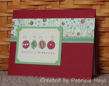
Hopefully a Christmas card will help provide a mental break from the heat and humidity.  It’s not too early to start making winter holiday cards for Operation Write Home!

Today’s card uses five of the ten elements from the current Desert Islands Crafts Challenge itinerary.  I cut the focal panel and its mat with Nestabilities dies. The ornaments are colored with Copic markers, with just a touch of a silver pen for the thingies where the hook attaches to the ornament.  I added a few crystals to two of the ornaments.  The focal panel is attached with pop dots so that the ribbon fits nicely underneath it. The layout is based off an older Lizzie Anne Designs sketch.

It’s so cloudy today that it was hard to get a good photo of the card, so you’ll just have to trust me that the green cardstock and ribbon match the designer paper better in real life than in the picture.

Supplies:
Stamps: The Key to Happiness (Lizzie Anne Designs)
Cardstock: Cherry Cobbler, Wild Wasabi, Naturals Ivory (Stampin’ Up); Berry Branch designer paper from Fruitcake collection (Basic Grey)
Ink: Onyx Black (VersaFine)
Other: markers (Copic); classic rectangles plain and small labels Nestabilities dies (Spellbinders); clear crystals (Bazzill); Wild Wasabi ribbon, dimensionals (SU); silver Precious Element pen (Creative Memories)

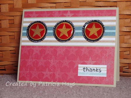
Sorry for the corny post title but I couldn’t think of anything better.  Today’s card is what I created for the 10th Desert Islands Crafts Challenge.  I doubled up on two of the itinerary elements – one was a “found object” (not a specific craft item) and one was something metal.  Well, I found some metal things: bottle caps.  I had saved these for a while from my husband’s Starr Hill Northern Lights Pale Ale, and I flattened them in my Big Kick.  I guess they could count as another one of the required elements: a handmade embellishment. I also chose three different designer papers – the red star paper, the striped paper behind the bottle caps, and the different striped scrap for the sentiment panel. I dove way back into the Stars & Stamps blog archives and found sketch #3 for my layout. I’m not sure if the “thanks” stamp belongs to a set – I received it as a freebie in an order from Lawn Fawn.

Supplies:
Stamps: Lawn Fawn
Cardstock: River Rock, Western Sky designer papers (Stampin’ Up)
Ink: Tuxedo Black (Memento)
Other: bottle caps

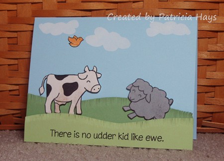
The theme for last week’s CAS challenge at Splitcoaststampers was puns, and the idea for today’s card popped into my head as I was trying to fall asleep last Monday night. I finally was able to get it all out on designer paper and cardstock this weekend.

I combined the CAS challenge with the current Desert Islands Crafts Challenge.  All of the designer paper and cardstock I used were scraps.  Even the card base was “the other half” of an 8.5″ x 11″ sheet of cardstock, left over from another card I’ve made.  The cow, lamb and bird are all separate images, filling the “2+  images” requirement.  I think the grass qualifies as a handmade embellishment because I made it by using my Cutterbee scissors to snip into the edges of the green cardstocks.  For the clouds, I cut two cloud-shaped openings into a post-it note, used them as reverse masks with white craft ink, and then dabbed white chalk over the ink to “pop” the color.  (The cloud on the right is just an upside-down version of the cloud on the left.)  One of the other itinerary items on the list was “orange” so that’s why the bird is that color.  (Orioles are mostly orange, right?)  The sentiment is computer generated using a font called Chinacat. The cow, lamb and the front strip of grass are attached with dimensional adhesive, to give some visual depth to the card.

I’ll admit that this card is probably toeing the lines of Clean and Simple.  It’s pretty much “clean” but it was pretty time consuming to really be considered “simple”.  I guess I tend to equate “simple” with “quick and easy”.  But anyway, I think it turned out really cute.  This card will be included in my next shipment to Operation Write Home, for one of our heroes overseas to use to write home to his or her child.  I only wish that Lawn Fawn had made a goat as part of their farm themed set because that would have been perfect for the “kid” part of the sentiment!

Supplies:
Stamps: Critters on the Farm, Critters in the ‘Burbs (Lawn Fawn)
Cardstock: Bashful Blue, Wild Wasabi, Certainly Celery (Stampin’ Up); scraps from Ambrosia 6″ x 6″ paper pad (Basic Grey)
Ink: Tuxedo Black (Memento); White Craft (SU)
Other: Stampin’ Pastels (SU); Cutterbee scissors

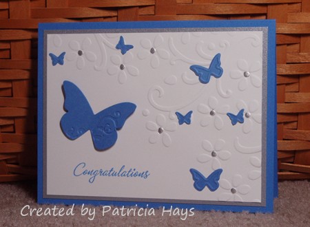
My niece graduated from college last weekend, and today’s card is the one I made for my family to give her.  I don’t have any graduation themed stamps or digital images, so I went with something that I thought would be feminine, pretty and elegant.   The school’s colors are blue and white, and I added a bit of silver for some shimmer.  I raised the wings of the largest butterfly to give a little extra dimension to the card.

Three of the required elements for the current Desert Islands Crafts Challenge are included in this card: flowers, embossing, and die cuts.

Supplies:
Stamps: Warmest Regards (Stampin’ Up)
Cardstock: Ballet Blue, Brushed Silver, Whisper White (SU)
Ink: Ballet Blue (SU)
Other: silver paint pen (Zig); Elegant Bouquet embossing folder, Beautiful Wings embossing die (SU)

black cherry crumbs birthday

Comments Off on black cherry crumbs birthday
May 112011

I needed a quick birthday card for a family friend.  Y’all should know by now how much I enjoy participating in challenges, so of course I managed to make this card work for a few.  I used last week’s color challenge from Splitcoaststampers.com as my starting point.  The black from the color challenge tied in with one of the element choices for the current Desert Islands Craft Challenge, and I continued with that challenge by distressing the edges of the sentiment panel, using words, inking something other than a stamp, using stripes, and using no flowers.  The layout is a sketch introduced a couple months ago on the OWH Stars & Stamps Blog.

The striped middle panel is my “inking something other than a stamp” element.  I created it by swiping the edge of my Cherry Cobbler and Crumb Cake ink pads along a strip of Very Vanilla cardstock.  What an easy way to make one-of-a-kind designer paper, yes?

All visible supplies for today’s card are from Stampin’ Up.
Stamp: It’s Your Birthday
Cardstock: Crumb Cake, Basic Black, Cherry Cobbler, Very Vanilla
Ink: Cherry Cobbler, Crumb Cake
Other: distressing tool (Making Memories)

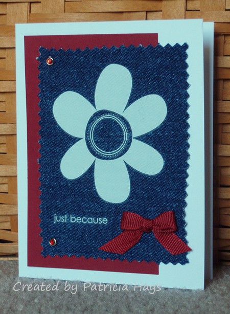
I think y’all know by now how much I enjoy doing crafting challenges.  This card is no exception.  I was looking at different sites last night and pulled together three different challenges for it.

Splitcoaststampers is having a mini Virtual Stamp Night weekend, and the first challenge, to use fabric on your card, caught my eye.  I had some denim handy from when I turned a pair of my son’s jeans into cutoff shorts for him.  The challenge was how to get a design to appear on the denim.  I was happily surprised to discover how well rub ons worked on the fabric.  I pulled together three of the requirements for the current Desert Islands Crafts Challenge – to use the colors red, white and blue, to use ribbon, and to use jewels.  The layout I chose is one of the OWH Stars & Stamps blog sketches.

And now it’s time for me to get back to creating more cards. There are a lot more challenges for me to try!  🙂

Supplies:
Cardstock: Cherry Cobbler (Stampin’ Up); Basics White (Papertrey Ink)
Other: Love & Happiness rub ons (SU); grosgrain ribbon (Offray); crystal brads (Making Memories); denim fabric (Wrangler)

Happy Thursday!  The weekend is almost here, hooray!  It’s hard to believe April is about halfway over already.

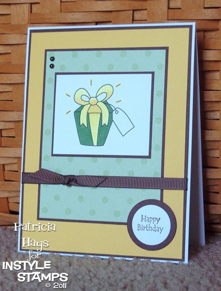
Today’s card was made with three challenges in mind.  I used the April InStyle Stamps sketch challenge for the layout and the April InStyle Stamps color challenge for the color scheme.  I also used the following elements from Desert Islands Crafters Challenge #5: ribbon, a birthday theme, a bow, dots, pearls, and bright colors.

Supplies:
Stamps: present from Patty’s Appreciation (InStyle Stamps); Friendly Greetings (Hero Arts)
Cardstock: Basics White (Papertrey Ink); Daffodil Delight, Chocolate Chip, Prints designer series paper (Stampin’ Up)
Ink: Chocolate Chip (SU); printer ink
Other: markers (Copic); Chocolate Chip grosgrain ribbon (SU); standard circles Nestabilities dies (Spellbinders); self-adhesive pearls (KaiserCraft)


In the spirit of full disclosure, the present image used on today’s project was provided to me by InStyle Stamps to aid in promoting their products.

Here in Virginia the weather keeps teasing us, going back and forth between warm sunny days and cold rainy ones. The mountains east of us had a dusting of snow on them Tuesday, and (yuck alert) yesterday morning we got a little sleet mixed in with the rain. Personally, I’m ready for more of the warm sunny days!

My daffodils and tulips are growing again, so I suppose Spring really is on its way. The daffodils have buds, but the stems are only about 8 inches tall so they still need to do some more growing before they’ll bloom.

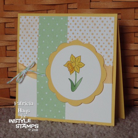
Today’s card brings a daffodil in full bloom.  The image is from one of InStyle Stamps‘ newest sets, Patty’s Bunny Wuv.  I used Copic markers to color the image and used Nestabilities to cut out the image panel and its mat.  The layout is a tweaked version of sketch #54 from the Operation Write Home Stars and Stamps blog.  I hadn’t made a square card for a long time so I just kind of scrunched up the rectangular layout to make it a square.  I added some designer papers and a ribbon cinched with some twine, and then assembled it all.  I used dimensional adhesive to pop up the daffodil panel.

I had the current Desert Islands Crafts Challenge in my mind as I was working on this card.  The elements I chose were making a square card, using nature as inspiration, having a hand colored image, using two or more patterned papers, using twine, and not putting a sentiment on the card.  The card also works into the Stars & Stamps blog’s Midweek Throwdown challenge to use polka dots on a card for a hero to send home.

Supplies:
Digital Image: daffodil from Patty’s Bunny Wuv (In Style Stamps)
Cardstock: Daffodil Delight, Tea Party designer paper, Prints series designer paper (Stampin’ Up); Vintage Cream (Papertrey Ink)
Other: markers (Copic); Buttercup ribbon and Apple baker’s twine (Really Reasonable Ribbon); standard circle and big scalloped circle Nestabilities dies (Spellbinders)


In the spirit of full disclosure, the image used on today’s project was provided to me by InStyle Stamps to aid in promoting their products.

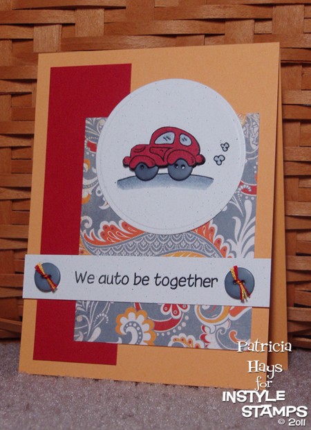
My 12-year-old son groaned when he saw the sentiment on this card.  I don’t think he enjoys puns on cards very much.  I can’t claim credit for this one, though.  My friend Victoria helped me out with it.

I used a digital image called Lil Car from InStyle Stamps for my focal point.  One thing that’s great about digital images vs. rubber stamps is that it’s really easy to manipulate the image if you want to.  For this card layout I thought the car would look better facing left than right, so I flipped the image horizontally.  I used the February Sketch for You to Try sketch for the layout.  I also wanted to join in the Desert Island Crafts Challenge and fit in 5 of their required elements for the challenge: buttons, only one patterned paper, the color red, no flowers, and swirls.  I guess I could even stretch the “movie or book inspired” element by claiming this was inspired by the movie Cars since Lightning McQueen is mostly red.  LOL

For the image panel, I printed out the car twice.  I colored the road and puffs of smoke on the one I used for the background using Copic markers and used a Nestabilities die to cut it into the circular shape.  On the second image, I colored the body and windows of the car with Copics and then cut out that much of the car with my Cutterbee scissors.  I glued a couple of buttons in place for the tires, and then I used pop dots to adhere the cut out car to the panel. The sentiment was printed using a font called Chinacat.

Supplies:
Digital Image: Lil Car (InStyle Stamps)
Cardstock: Marigold Morning, Real Red, Naturals White (Stampin’ Up); “Marmalade” from Ambrosia 6″ x 6″ paper pad (Basic Grey)
Other: markers R29, R46, C3 and C5 (Copic); buttons (Bazzill); embroidery floss (DMC); standard circle Nestabilities die (Spellbinders); pop dots (Plaid)

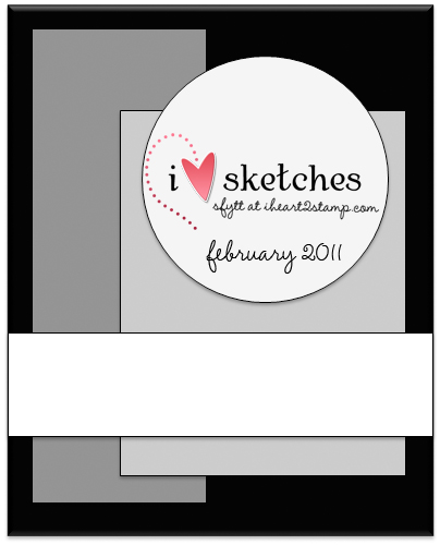
Here’s what the original sketch looks like:


In the spirit of full disclosure, the image used on today’s project was provided to me by InStyle Stamps to aid in promoting their products.

If you are here for the Virtual Valentine’s Day Blog Hop, please click here – BLOG HOP POST.  Thanks!

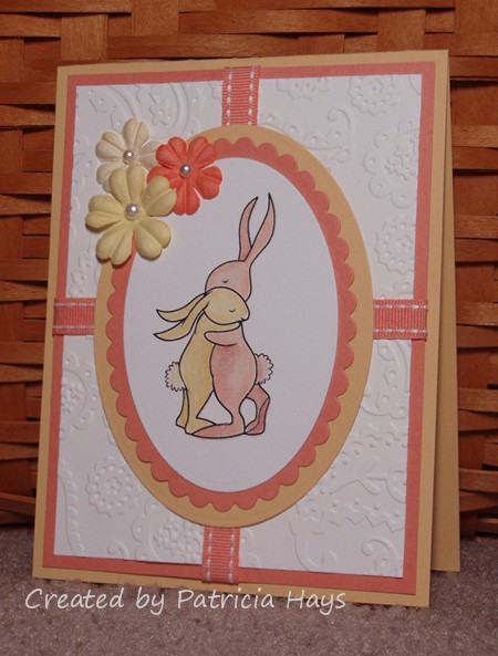
I recently discovered a new challenge blog, Desert Islands Crafts Challenge.  Those of you who know me well know that I have a difficult time resisting cardmaking challenges!  This one sounded pretty neat so I decided to play along – and then I realized the challenge ended in 2 and a half hours!  YIKES!

So here’s what I very quickly came up with.  The challenge blog listed 10 different elements, of which a minimum of three were required to be on the project to qualify for the challenge.  I had the bunny image from Amber Ink printed out as an “extra” from my blog hop card posted earlier today, and I colored it with Prismacolor pencils and odorless mineral spirits.  I embossed the white background panel with a Cuttlebug folder, added some ribbon and some Prima flowers, and added pearls for the flower centers.  I would consider the Nestabilities shapes to be die cuts, too – so that gave me four of the required elements.  Hooray!

I hope you’ll check out the Desert Islands Craft Challenge and help make their new venture a success!

Supplies:
Digital Image: Bunny Hug (Amber Ink)
Cardstock: So Saffron, Groovy Guava, Whisper White (Stampin’ Up)
Other: Premier colored pencils (Prismacolor); odorless mineral spirits (Houston Arts); flowers (Prima Marketing); pearls (Kaisercraft); Groovy Guava ribbon (SU); petite oval scalloped and petite oval plain Nestabilities dies (Spellbinders); Paisley embossing folder (Cuttlebug)

© 2019 Suffusion theme by Sayontan Sinha