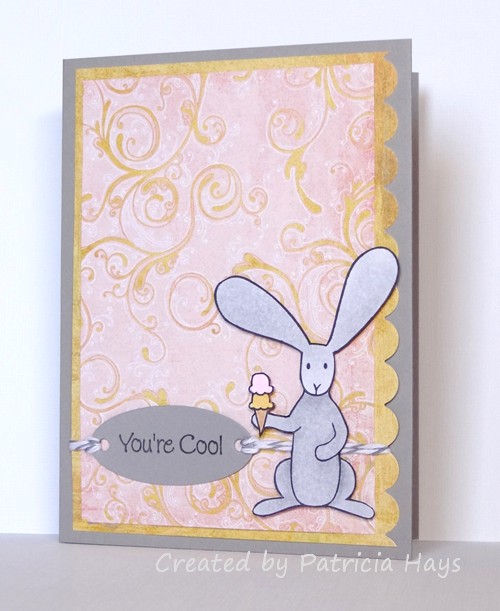
Here’s a card I put together pretty quickly this morning, just in time to enter into the Inkspirational color challenge of pink, banana and slate.  I used Stampin’ Up’s retired color Going Gray for my slate color.  The layout for this card is this week’s OWH Stars & Stamps sketch, substituting the bunny for the circle.  I fussy cut the bunny after I colored him, and he’s attached to the card with dimensional adhesive. I also incorporated the OWH Midweek Throwdown challenge of using tags and twine.

Thanks for stopping by today!

Supplies:
Stamps: Two Scoops for Flopsey (My Favorite Things)
Cardstock: Going Gray (Stampin’ Up); Pure Luxury White (Gina K. Designs) [for the bunny]; designer papers from Two Scoops 6″ x 6″ paper pad (Basic Grey)
Ink: Tuxedo Black (Memento)
Other: markers (Copic); dimensionals (SU); Oyster twine (Really Reasonable Ribbon); petite oval Nestabilities die (Spellbinders)

Hello!  I hope you had a nice Easter.  Mine was good, but it’s been a busy week which made it necessary for me to take a little break from crafting.  But today I wanted to get back in the swing of card making and create something for this week’s Dynamic Duos challenge.

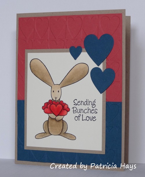
Because March had 5 Saturdays, for this week’s challenge the Dynamic Duos girls gave an open option color combo that let the participants choose one of the two colors.  They provided us with a deep pink, and each participant was allowed to choose the other color, plus use any neutrals.  I decided to use a blue in an attempt to make a gender-neutral card for Operation Write Home. The layout is this week’s OWH Stars & Stamps sketch, turned on its side to put it in portrait orientation.  I accidentally cut the image panel too short, which didn’t leave room for the sentiment to go below the bunny the way I’d planned.  So I carefully inked it up to separate the words into three lines beside the bunny.

Supplies:
Stamps: Flopsey Bunch of Hearts (My Favorite Things)
Cardstock: Kraft, Primrose Petals, Not Quite Navy (Stampin’ Up); Pure Luxury Ivory (Gina K. Designs)
Ink: Tuxedo Black (Memento)
Other: Hearts embossing folder (ProvoCraft); markers (Copic); Hearts dies (Sweet ‘n Sassy Stamps)

I almost titled this post “stripping for Dad” but decided that was a bit too provocative!  ha ha ha

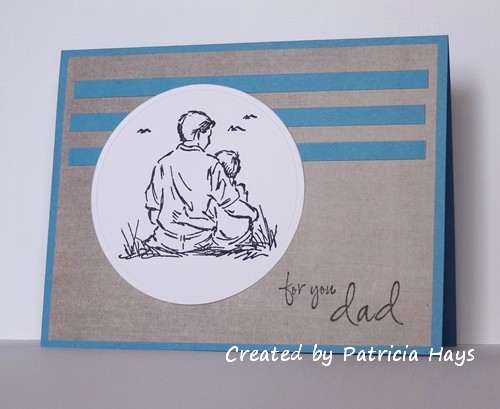
The title comes from the current Cards in Envy challenge to create a card using strips of paper rather than using ribbon as an embellishment.  I kept my card pretty simple, without embellishing the strips.  The layout was inspired by OWH Sketch #89, but I used a circle for my focal point.  I had this image already stamped and cut into the circular shape, and decided I’d go ahead and use that even though it wasn’t exactly what the sketch called for.  I also shifted the circle over to the left to accommodate the sentiment.


And there’s another card that’s on its way to Operation Write Home, to be ready for one of our heroes to send home to his or her dad for Father’s Day.

Supplies:
Stamps: Seaside Sketches (Stampin’ Up); Masculine Messages (Gina K. Designs)
Cardstock: Marina Mist (SU); white (Papertrey Ink); designer paper from “Memoirs” 6″ x 6″ paper pad (Inque Boutique)
Ink: Tuxedo Black (Memento)
Other: standard circle Nestabilities die (Spellbinders)

It’s Friday!  Welcome to another Sweet ‘n Sassy Digi Challenge.  This week we’re challenging our participants to create a project inspired by Spring.  You can make a card, layout, or 3-D item, so long as you use a digital image for your main focal point.  Although you aren’t required to use a Sweet ‘n Sassy digital image, we especially love it when our challenge players do use them.  Be sure to link your work at the Sweet ‘n Sassy Digi Challenge site by Thursday, April 4.

I have to admit I had a hard time feeling the Spring season this week.  Sunday and Monday we received about 5 inches of snow.  It’s all melted now, but the temperatures are still cooler than normal for this time of year here in the Shenandoah Valley.  Although my daffodils and tulips are sprouting, nothing has bloomed yet and I haven’t even seen any blossoms at all on my mini daffodils.

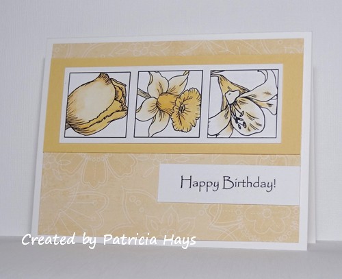
So, to make up for the lack of flowers outside, I created a card with some spring flowers.  I actually printed this border of flowers a few weeks ago, when I was working on challenge #96.  But I printed it too large to work on that card.  So I set this aside until now.  This time I’ve used it with a slight modification of OWH Stars & Stamps sketch #10 .  I was in one of my KISS moods so I decided to use a monochromatic color scheme.  (KISS = Keep It Simple, Stamper)  The sentiment comes from a set called Masculine Birthday Greetings, but I think this font works well on more feminine cards, too.

Thanks for stopping by today!  Be sure to check out the other design team members’ work for more inspiration.

Supplies:
Digital Images:  Tulip Block, Daffodil Block, Lily Block, Masculine Birthday Greetings (Sweet ‘n Sassy Stamps)
Cardstock:  Pure Luxury White (Gina K. Designs); So Saffron, Tea Party designer paper (Stampin’ Up)
Ink:  printer ink
Other:  markers (Copic)

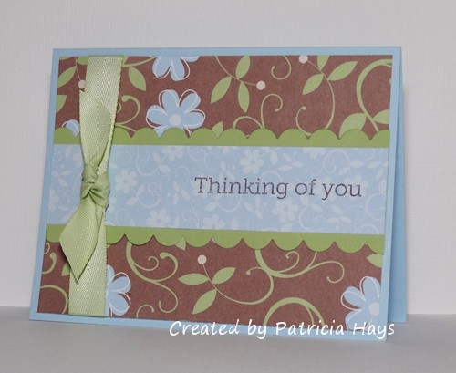
I’m honored and excited to be this week’s sample maker for the Operation Write Home Stars and Stamps Sketch Challenge! If you haven’t joined in the OWH/Our Daily Bread Designs challenge for the month of March yet, this sketch is perfect for it.

I’ve made two sample cards with this sketch.  On the first card, I’ve created an extra layer so that the ribbon could be wrapped around to the back of it.  I chose to use a simple knot bow to help keep the card USPS-machine-friendly. But other than that, I followed the sketch pretty closely.  It felt good to use two of my older designer papers for this card. The sentiment is from one of the OWH/Hero Arts clear stamp sets.

The second card is a one-layer card.  I decided to use a border stamp to create the scalloped elements.  I will admit that even after 10 years of stamping regularly, I still get nervous about stamping on one-layer cards!  I added another border stamp, which looks a lot like faux stitching, between the scalloped borders.  I stamped that in silver, and the ink glared a little on the right side of the photo.  Sorry about that.  I didn’t have anything handy to use as a stamp positioner imaging sheet for the border stamps, so I had to just eyeball getting them straight. The stitching one is a little bit off but I guess that just adds to the handmade feel of the card. Instead of a ribbon and bow, I used a scrap strip of silver metallic paper for the vertical stripe part of the sketch.  I created a faux prize blue ribbon to take the place of the bow.  Even though it’s attached with dimensional adhesive, it still lies flatter than a ribbon bow would.  To accommodate the length of the “blue ribbon”, I moved the horizontal elements up higher on the card, keeping in mind the The Rule of Thirds as discussed in March OWH Design Bootcamp segment.   The deadline for sending Father’s Day cards to the OWH shippers is coming up on April 30, so I’m starting to get some cards made to be prepared for that.

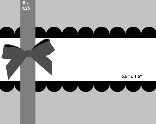
Here’s what the actual sketch looks like:

So now it’s your turn! I’d love to see what you can make with this sketch. Be sure to link your creations on the OWH Stars and Stamps blog. Thanks for stopping by today!

Supplies for the Thinking of You card:
Stamps: Year Round Sentiments (Hero Arts)
Cardstock: Bashful Blue, Certainly Celery, Petal Patch designer series papers (Stampin’ Up)
Ink: Chocolate Chip (SU)
Other: Certainly Celery twill ribbon (SU); scalloped border die (Papertrey Ink)

Supplies for the Dad card:
Stamps: Quinn’s ABCs (Lawn Fawn); Riveting (Stampin’ Up)
Cardstock: Pure Luxury White (Gina K. Designs); Brilliant Blue, Brushed Silver (SU)
Ink: Brilliant Blue (SU); silver (ColorBox)
Other: standard circle and big scalloped circle Nestabilities dies (Spellbinders)

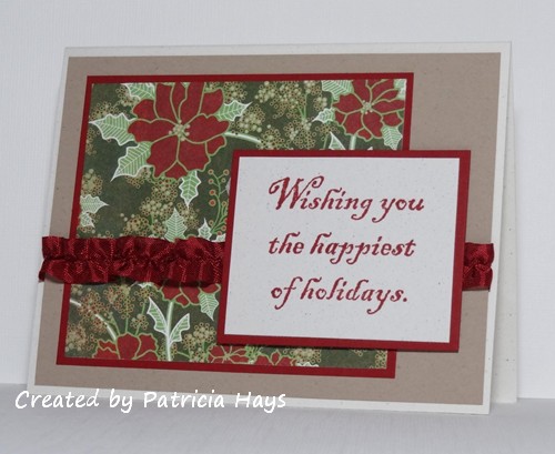
Hello there!  Welcome to the weekend!  It’s the fourth Saturday of the month, which means that this week’s challenge at 52 {Christmas} Card Throwdown will feature an embellishment or a technique.  Louise, our challenge hostess, has chosen to showcase ribbons and bows as embellishments.

I decided to ruffle some seam binding for my ribbon embellishment.  I hadn’t done that for a while.  I have to confess that I got kind of stuck on the ribbon idea and forgot about including a bow.  Oopsie!  This is just a simple card, really, that lets the designer paper do a lot of the work.  The poinsettia print is from the Basic Grey “Nordic Holiday” paper pad, which just happens to be one of the items I’ll be giving as blog candy… see the post on my home page here for more details on that.  The layout is one of the OWH Stars and Stamps sketches that I’d missed out on back when it was introduced.


Go hop over to the 52{C}CT blog to see what the rest of the design team has created.  Then get your creative gears going and make a Christmas card featuring a ribbon and a bow and share it with us using the linky tool provided at the 52{C}CT site.  We’d love to see what you create!

Supplies:
Stamps: Happiest of Holidays (Stampin’ Up)
Cardstock: Naturals White, Kraft, Cherry Cobbler (SU); designer paper from Nordic Holiday 6″ x 6″ paper pad (Basic Grey)
Ink: Cherry Cobbler (SU)
Other: Cherry Cobbler seam binding (SU)

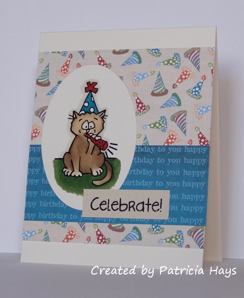
Hello! Happy Friday! Are you ready for another Sweet ‘n Sassy Digi Challenge?

This week’s challenge is Happy Birthday, Fellas. Make a birthday card for a guy of any age from 1 to 101! Just be sure you use at least one digital image for the focal point of your card. You’re not required to use a Sweet ‘n Sassy digital image, but we do love it when our participants use them.

I noticed I’d had this image for a while and hadn’t used it yet, so I figured this challenge was a perfect opportunity to change that. Tank the cat is in a party mood with his hat and his horn. The “Celebrate!” sentiment comes with the image. However, I’ve used my photo editing program to separate the two so I can print them individually. The designer papers are actually from a set of digital designs, too, but the company that created them is no longer in business. I’ve been trying to play catchup on some of the OWH Stars and Stamps sketches that I’ve missed. Today’s card uses sketch #150.

So, now it’s your turn to show us what you can create for a guy! Link your project at the Sweet ‘n Sassy Digi Challenge site by midnight eastern time Thursday, March 28. Remember that for every project you submit throughout the month of March, you will get one entry to be eligible for winning 3 digital images of your choice from the Sweet ‘n Sassy Stamps store! Be sure to play along every week, and to go visit the rest of the design teams’ blogs for more inspiration. Thanks for stopping by today!

Supplies:
Digital Image and sentiment: Celebrate (Sweet ‘n Sassy Stamps)
Cardstock: Pure Luxury Ivory (Gina K. Designs); Naturals Ivory (Stampin’ Up); Vintage Birthday digital designer paper (Lizzie Anne Designs)
Ink: printer ink
Other: markers (Copic); petite oval Nestabilities die (Spellbinders)

Hi!  I have two cards to share with you today, so I’ll just cut the chitchat and get right to them.

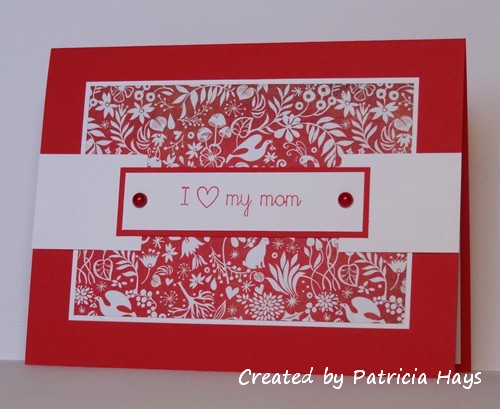
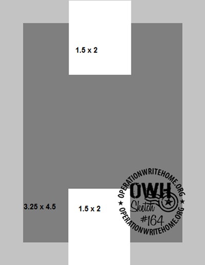
First is a “mom” themed card I made for Operation Write Home.  I figured this sentiment would work for Mother’s Day or for any time one of our heroes wants to send a note to his or her mother.  I used OWH Stars and Stamps sketch #164 for the layout, but turned it on its side and added an extra panel for the sentiment. This is a great sketch for showing off some designer paper.


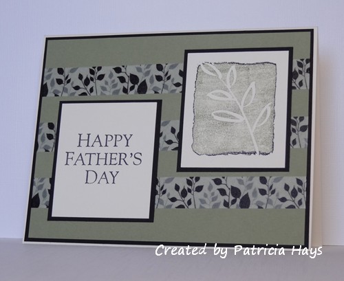
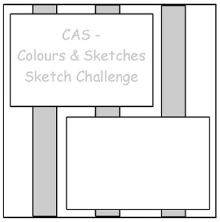
My second card is also for Operation Write Home.  This time I’m giving someone’s dad the opportunity to receive a card.  The layout started out as the CAS – Colours and Sketches challenge #16 layout, but I stretched it into a rectangle and turned it on its side.  This layout had me stumped for a while.  Finally I realized how closely this image stamp matches my washi tape and decided to combine them into a card.

So there they are – two more cards for the box I’m sending out to OWH early next week.  Remember, if you’re creating cards for OWH, the deadline for your shipper to receive Mother’s Day cards is March 31.  Thanks for stopping by today!

Supplies for the Mom card:
Stamps: It’s Good to be Queen (Lizzie Anne Designs)
Cardstock: Poppy Parade, Whisper White (Stampin’ Up); designer paper from Nordic Holiday 6″ x 6″ paper pad
Ink: Poppy Parade (SU)
Other: half pearls (KaiserCraft)

Supplies for the Father’s Day card:
Stamps: All I Have Seen, All Year Cheer II (Stampin’ Up)
Cardstock: Mellow Moss, Basic Black (SU); Pure Luxury Ivory (Gina K. Designs)
Ink: Mellow Moss (SU); Tuxedo Black (Memento)
Other: washi tape (We R Memory Keepers)

I am excited and honored to announce that because my card was chosen as the weekly winner a couple weeks ago at ‘ABC’ Challenges, I was asked to be the guest designer for this week’s challenge!  Thank you, Patty and the rest of the ‘ABC’ Design Team, for this opportunity!

If you came here looking for my weekly Sweet ‘n Sassy Digi Challenge post, please click here: Sweet ‘n Sassy Digi Challenge #96, and new release!

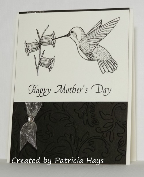
The current ‘ABC’ Challenge is called “In the Air” and it’s all about things you can find in the sky – clouds, birds, airplanes, whatever you might see when you look up outdoors.  I tossed around several different ideas before choosing to showcase a hummingbird on my card.  The only hummingbirds we see here in the eastern United States are the ruby-throated ones, and I think they are fascinating.  It’s only been in the last couple of years that we’ve seen them here in our neighborhood, so last summer my family was finally able to use the feeder that my sister and her husband gave my husband and me for Christmas soon after we got married.  We enjoyed watching the little birds zooming around and fighting each other for feeding rights.  I’m looking forward to putting the feeder out again when it’s closer to summertime.

Anyway, back to the card.  I made it thinking I’d include it in my next shipment of cards to Operation Write Home.  I went back a few months and used OWH Stars and Stamps sketch #138 for the layout, but turned it on its side.  I decided to keep a simple ivory and black color scheme to show off the details in the image (and, I confess, I don’t know if my coloring skills would do justice to this gorgeous image).  I used Sandy Allnock’s ribbon brad trick to embellish the card.

Thanks for stopping by today!  I hope you’ll come back again, and that you have a fun-filled weekend!

Supplies for this card:
Digital Images: Hummingbird with Scripture, Mother’s Day Sentiments (Sweet ‘n Sassy Stamps)
Cardstock: Basic Black (Stampin’ Up); Pure Luxury Ivory (Gina K. Designs)
Ink: printer ink
Other: ribbon (Offray); crystal brad (Recollections); Victoria embossing folder (ProvoCraft)

Hello!  Happy Friday! Today is especially exciting because Sweet ‘n Sassy Stamps is introducing several new digital images! There are four beautiful flowers and two sets of sentiments. The rest of the design team and I are showcasing different ones this week, so please check out everyone’s blogs so you can see all the loveliness! And just in case you need an additional reason to visit the design team’s blogs – one of us is a “mystery blogger”. One of the people who comments on her blog will be chosen at random to receive the entire new digital release! It’s so much of a mystery that even we team members don’t know yet who it is – so be sure to visit them all!

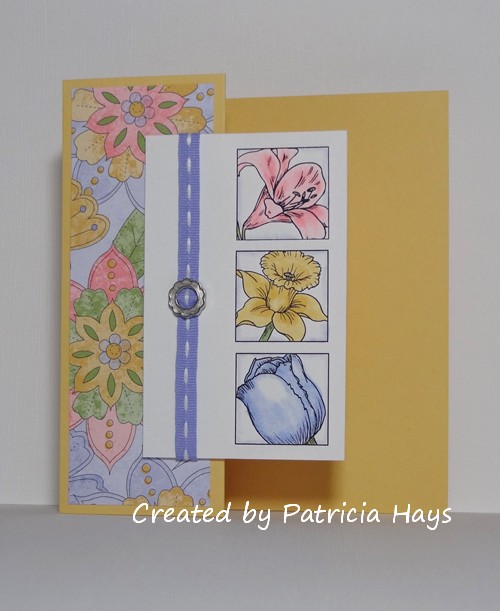
Since it’s Friday, we also have a new Sweet ‘n Sassy Digi Challenge. This week we’re asking you to create a Z-fold card using a digital image as your focal point. Although we especially enjoy seeing what our challenge participants make with Sweet ‘n Sassy digital images, you can use a digi from any stamp company. Some excellent instructions for making a Z-fold card can be found by clicking here: Beate Johns’ Z-fold tutorial

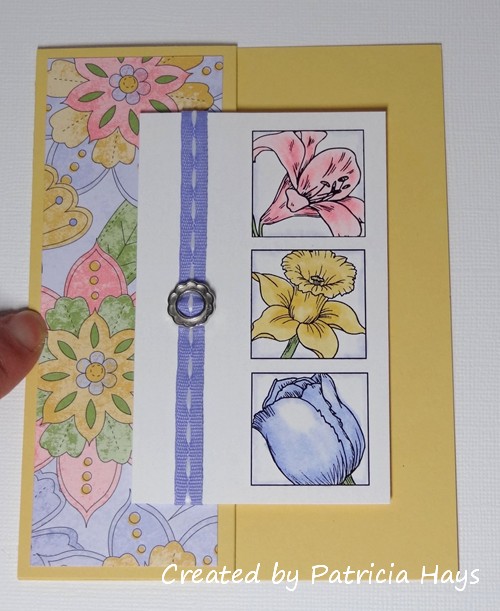
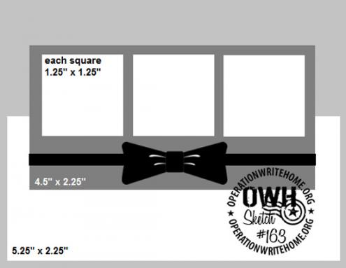
The design team received the new images a few days ago so we could have some lead time for making our cards for today’s post.  When I first saw them, I immediately thought of this week’s OWH Stars and Stamps sketch.  So I tweaked the measurements given in the Z-fold tutorial to make it work for a portrait-oriented A2 card, and I turned the sketch on its side to allow me to combine the two challenges.  Since there were four floral images and I had only 3 blocks on the sketch, I had to choose which flower not to use.  So I decided to use the three that made me think most of Spring.  The daffodil and tulip were easy picks, and then I figured I’d go with the lily because of Easter lilies – although I ended up coloring mine pink instead of leaving it white. I had to resize the images down somewhat so I could fit all three of them on that panel of the card. But that’s one of the fun things about digital images – being able to manipulate them to fit the needs of your card.

Here’s the best photo I could get showing off the Z-fold:

This one shows off the sketch better.  The card kept wanting to pop open for me, so please excuse my finger holding it shut:

Here’s the sketch:

So now it’s time for you to check out what the rest of the design team has done with the other new images, and then make your own Z-fold card to share with us! Link your artwork over at the Sweet ‘n Sassy Digi Challenge website before midnight eastern time Thursday, March 21. We’d love to see what you create!

Thanks for stopping by today.  Have a fabulous weekend!

Supplies:
Digital Images: Lily Block, Daffodil Block, Tulip Block (Sweet ‘n Sassy Stamps)
Cardstock: Pure Luxury White (Gina K. Designs); So Saffron, Tea Party designer paper (Stampin’ Up)
Ink: printer ink
Other: markers (Copic); Sweet Shop ribbon, ribbon slide, dimensionals (SU)

I’m still working on some Mother’s Day cards for Operation Write Home, and here’s one I came up with using the colors from the current CAS – Colours and Sketches challenge.  I think these are lovely colors for a springtime card. I’ve also been trying to complete some of the OWH Stars and Stamps sketches that I’ve missed.  This card uses sketch #135, which is a great one for clean and simple cards with a few layers.  Although the embroidery floss in the button looks almost black in the photo, it’s a good color match to the Rich Razzleberry ink.  I just can’t leave buttonholes naked!  LOL

My own tulips are not this tall and pretty yet; only about 2″ of foliage is peeking up from the ground.  So I am looking forward to seeing them grow and bloom over the next month.

Thanks for stopping by today!

All supplies for this card are from Stampin’ Up unless otherwise noted.
Stamps: Spring Garden, Messages for Mom
Cardstock: Pretty in Pink, Rich Razzleberry, Certainly Celery, Whisper White
Ink: Pretty in Pink, Rich Razzleberry, Certainly Celery
Other: Pretty in Pink button; embroidery floss (DMC); D’Vine Swirls embossing folder (ProvoCraft)

Happy Saturday!  The weekend is here, and it’s time for another 52 {Christmas} Card Throwdown challenge!  This week my fellow team member Louise has a color challenge for us – black, white, and metallic gold.  I ended up making two cards for this challenge.  I wasn’t thrilled with the first one, so I made the second one… and then after making the second one, I liked the first one better!  Go figure.  🙂

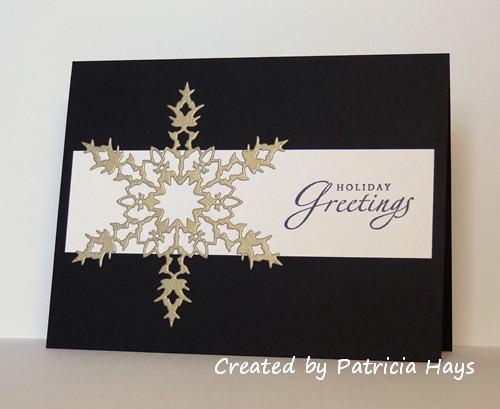
So here’s the first card.  My sweet sons’ Christmas present for me was a gift certificate to Oozak, and some of the things I bought with it are Memory Box dies.  I love snowflakes, so I couldn’t resist the die I used for this card.  I thought gold would be a fun, unexpected color for a snowflake, and I do like the way it turned out.  I ran the gold cardstock through my Xyron machine before I cut the snowflake, thinking that would be the easiest way to add adhesive to the snowflake.  However, it seemed like the die had a hard time going through the backing on the adhesive.  That was discouraging.  I tried adding shims and finally got it to cut all the way through.  I used Stars and Stamps sketch #41 for the layout, substituting the snowflake for one of the rectangular panels.  As I was editing the photo of this card, I had the thought that I should have used textured black cardstock for some additional but subtle visual interest.  Oh well.
 

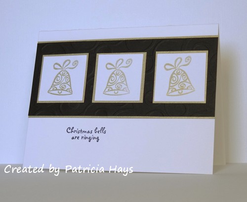
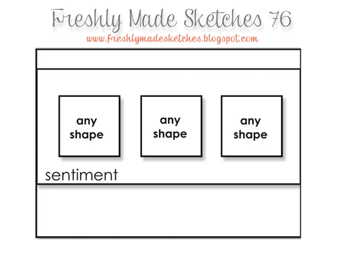
I actually thought of gold bells before I thought about using the snowflake die, but I was having a hard time figuring out just how I would carry out that thought.  I’d already shared one bell card with similar colors just a few months ago, and I didn’t want to copy it.  When I saw this week’s Freshly Made Sketches layout, I thought it might work with another bell stamp I own.  I didn’t want the black panel to be just plain, and one of my swirly embossing folders coordinated really well with the bell image.  But I didn’t want the deep texture that the embossing folders give.  So I embossed the panel, took the cardstock out of the folder, reassembled the “sandwich” with the cardstock out of the folder, and ran it through my Big Kick again.  That actually worked to smooth out the texture more than I bargained for, and it was really hard to get the embossing to show in the photo, so I had to do more tweaking than usual with my photo editing software.  I made one small change to the layout, moving the sentiment to a place where it would be more visible.
So there they are – two cards for this week’s 52 {Christmas} Card Throwdown, and two more for my growing stash of cards for Operation Write Home.  What kind of Christmas card will you create with black, white and gold?  Please be sure to share it at the 52{C}CT site by Friday, March 15.

Supplies for the snowflake card:
Stamps: Sincere Salutations (Stampin’ Up)
Cardstock: Basic Black, Whisper White, Brushed Gold (SU)
Ink: Tuxedo Black (Memento)
Other: Bianca die (Memory Box)

Supplies for the bells card:
Stamps: A Greeting for All Reasons (Stampin’ Up); Holiday Lane (Lizzie Anne Designs)
Cardstock: Basic Black, Whisper White, Brushed Gold (SU)
Ink: Tuxedo Black (Memento); Gold (ColorBox)
Other: D’Vine Swirls embossing folder (ProvoCraft)
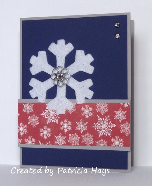
This past week’s challenge at 52 {Christmas} Card Throwdown is to use felt on a Christmas card.  I’ve had some felt snowflake stickers for a while, so I knew I wanted to use at least one of them on my card for this challenge.  However, I was having a hard time figuring out papers and colors and layouts that I liked.  Finally I decided to go the KISS route (Keep It Simple, Stamper) and settled on this design with only one patterned paper.  The layout is this week’s OWH Stars & Stamps sketch. I felt like the center of the snowflake needed some sort of embellishment, so I added a fancy silver doodad with a crystal brad.  Since that all ended up being fairly thick by the Operation Write Home guidelines, I’ll probably use this as an AnyHero card next winter, so it will go only one way through the postal system.  I like that the colors are a nod to the patriotic red, white, and blue, but are not quite the usual.  There is a little bit of glitter on the snowflakes (they came that way), so I’ll keep watch on this to make sure it doesn’t flake off.  It seemed pretty secure while I was creating the card, though.

Amazingly (to me), there is no stamping on this card! The papers I chose didn’t really lend themselves to adding a sentiment. I need to remember more often than I do that sometimes cards are just fine without words on the front.

Thanks for stopping by today!

Supplies:
Cardstock: Going Gray, Night of Navy (Stampin’ Up); designer paper from “Very Merry Christmas” 6″ x 6″ paper pad (Echo Park)
Other: Filigree brad (SU); crystal brads (Recollections); felt snowflake sticker (Creatology)

two more...

Comments Off on two more…
Feb 252013

Here are two more cards I was able to create today for two of the Virtual Card Making Party challenges that Operation Write Home presented over Presidents’ Day weekend.   Both of them tie into the disappearing act challenge that Leslie hosted, but each also was created with one of the other challenges in mind.

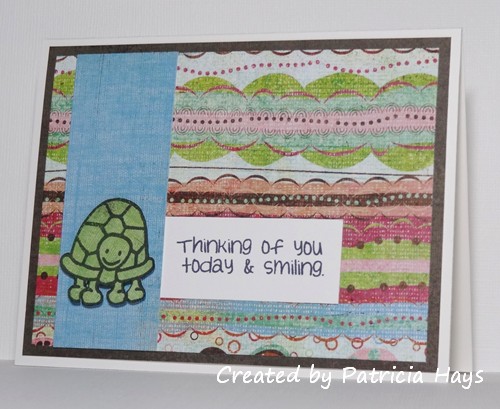
Misty’s challenge was to create a card for a child, using an image of an animal.  Goodness knows I have plenty of animal stamps and digital images that are suitable for children’s cards!  I figured a “thinking of you” card would be most suitable for any occasion, and this particular sentiment seemed to go well with this cute little turtle.  So here they are, put together, along with another piece cut from the same 12″ x 12″ paper I used for the cards I shared on Friday.

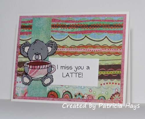
Jen hosted a challenge to use an image depicting coffee, chocolate, or some other form of caffeine.  So I dove back into my digital images and decided to use this one.  I used Microsoft Word to create the sentiment.

I paper pieced the animals on both of these cards. (OK, so the turtle wasn’t really “pieced”, it was simply stamped on the green paper and cut out.) I still have one more piece from that 12″ x 12″ paper to use.  I’m trying to figure out a way to use it with this week’s OWH Stars & Stamps sketch.  I don’t have any more time today to work on that idea, so that card won’t get blogged before the Virtual Card Making Party officially ends and the links close.  Oh well.  But I am NOT giving up on that paper!  🙂

Supplies for these cards:
Stamps for the turtle card: Cute Critters, Thoughtful Rhubarb (Sweet ‘n Sassy Designs)
Digital Image for the koala card: Kiwi’s Cuppa (SNSS)
Cardstock: Pure Luxury White (Gina K. Designs); “Ashbury Street” and various scraps from Phoebe collection (Basic Grey); scraps from Ambrosia 6″ x 6″ paper pad (BG)
Ink: printer ink; Tuxedo Black (Memento)
Other: dimensionals (Stampin’ Up)

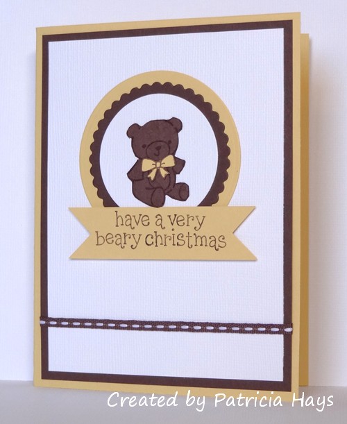
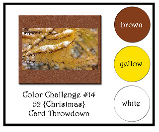
This week’s color challenge at 52 {Christmas} Card Throwdown is a bit unusual – brown, yellow and white.  I had originally thought I’d try to make something with some of my scenic stamps.  But when I was putting away my stamps used for the card in my last blog post, my eye stopped on the teddy bear included in one of the stamp sets.  And the proverbial light bulb went on in my head.

It’s hard to see in the photo, but the bear has a bit of fuzzy texture.  I achieved that by working with a scrap of chocolate brown cardstock to loosen the fibers in it, and then gently pulling the front and back apart into two pieces.  The fuzziness was left behind where the paper was separated.  I wanted the main image panel to have some texture too, to give the card more visual interest.  None of my embossing folders nor texture plates seemed to be the right thing, so I decided to use textured cardstock.  The layout of this card is this week’s OWH Stars & Stamps sketch.


So hooray – there’s another Christmas card to stockpile and send to Operation Write Home later this year.  I think this one would be cute to send home to a child, don’t you?  Thanks for stopping by today!

Supplies:
Stamps: Pa-Rum-Pa-Pum-Pum (Lawn Fawn)
Cardstock: So Saffron, Chocolate Chip, Whisper White textured (Stampin’ Up)
Ink: Chocolate Chip (SU)
Other: Seaside Ribbon Originals, square punch [for notching the banner] (SU); standard circle and petite scalloped circle Nestabilities dies (Spellbinders)

© 2019 Suffusion theme by Sayontan Sinha