Hello there!  This week at 52 {Christmas} Card Throwdown we have a fun recipe challenge for you!  Ruth, our challenge hostess, has come up with a short list of elements that need to be included on your Christmas or wintry card:  Coloring an image, adding rhinestones or ribbon (or both), and using the debossed side of embossed cardstock.

When I read the recipe list, I knew I’d use this cute Rhubarb digital image.  Actually, I’ve used the mirror image of the digi stamp, so that it wouldn’t seem like Rhubarb was looking off the edge of the card.  That’s one really awesome thing about digis vs. traditional stamps – being able to manipulate them to suit your needs when necessary!  🙂  I’ve used red and clear rhinestones for the ornaments on the tree image and in the corners of the focal panel.  To highlight the debossing, I swiped an ink pad across the cardstock.

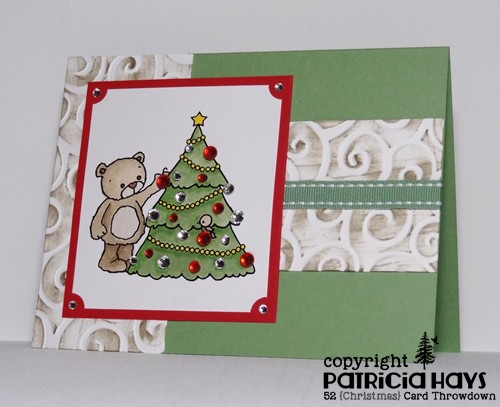
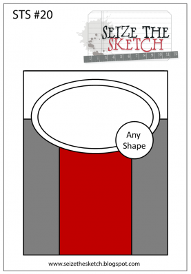
The layout for this card is taken from the current Seize the Sketch challenge – but once again, I’ve done some manipulating.  First I turned the sketch on its side.  Because my focal panel is larger than drawn in the sketch, I opted to leave off the “any shape” element.  I felt that would be a bit too much on a card that was already pretty well packed with layers and embellishments.

Go check out the 52{C}CT blog to see what the rest of the design team has cooked up with this recipe!  Then come up with your own concoction and share your work with us at the challenge site.  You have until 1:00 p.m. Eastern time Friday, May 23 to link your card.  We hope you’ll join us!  Thanks for stopping by today.

Supplies:
Digital Image: Rhubarb Trims the Tree (Sweet ‘n Sassy Stamps)
Cardstock: Wild Wasabi, Real Red (Stampin’ Up); Pure Luxury White (Gina K. Designs)
Ink: printer ink; Crumb Cake (SU)
Other: markers (Copic); red rhinestones (KaiserCraft); clear rhinestones, Wild Wasabi stitched ribbon, ticket corner punch (SU); D’Vine Swirls embossing folder (ProvoCraft)

Hello! This week is color challenge week at 52 {Christmas} Card Throwdown.  Our challenge hostess, Ruth, has chosen a fun, non-traditional color palette for this.  The challenge graphic shows five colors and you should choose at least three of them for your creation. Using neutral colors for stamping images and sentiments is also allowed.

After some thought, I finally decided that these colors could work for a poinsettia.  I printed this poinsettia digital image twice so that I could layer the petals over the leaves and give the flower a bit of dimension.  The sentiment was also computer generated.  The layout for this card is the mirror image of this week’s sketch challenge at CAS – Colours and Sketches squashed into a landscape orientation.  The flourishes are stamped onto the berry colored panel.

Now it’s your turn to show us what you can make with these colors!  If you need more inspiration first, go visit the 52{C}CT site and see what the rest of the design team has created.  Be sure to link your card at the 52{C}CT site by 1:00 p.m. Eastern time on Friday, May 16.  We look forward to having you join us!

Supplies:
Digital Image: Poinsettia (Sweet ‘n Sassy Stamps)
Stamps: Season of Joy (Stampin’ Up)
Cardstock: Old Olive, Rich Razzleberry (SU); Pure Luxury White (Gina K. Designs)
Ink: printer ink; Tuxedo Black (Memento)
Other: markers (Copic)

Hello!  Since it’s the fourth Thursday of the month, we have a sketch challenge for you at CAS – Colours and Sketches.  I’ve stretched the sketch out to a rectangular format and combined it with the colors for the Dynamic Duos challenge that ends later today.  I took a bit of liberty with the sketch by turning the long vertical rectangles into the boards of a fence, and I changed up the smaller rectangular panel into an oval.  I used a star-shaped flower for the star element of the sketch, but you can use any shape there.  The Dynamic Duos “dessert option” of gold is incorporated with the small gold brad for the center of the flower.


Thanks for stopping by today!  Be sure to check out the CAS – Colours and Sketches blog to see what the rest of the design team has done with this sketch.  Then make your own card and link it to the challenge post.  You have until 1:00 p.m. Eastern time Wednesday, April 30 to participate.  We hope you’ll join us!

Supplies:
Stamps: Grunge Borders (Sweet ‘n Sassy Stamps); Sincere Salutations (Stampin’ Up)
Cardstock: Rich Razzleberry, Basic Black, Whisper White (SU)
Ink: Rich Razzleberry (SU); Tuxedo Black (Memento)
Other: Spring Bouquet Flower punch, tag corner punch, gold brad (SU); petite oval and petite scalloped oval Nestabilities dies (Spellbinders)

Hello!  I hope Monday isn’t getting you down, because it’s time for a new Cards in Envy challenge!  This time the theme is “Hippity, Hoppity, Easter’s on its Way”.  Interpret that however you like into an A2 sized card with no lumpy, bumpy embellishments, and you’ve made a card that would be perfect for this challenge!

I’ve decided to use a cute bunny image and springlike colors with a sentiment that helps keep this card from being strictly an Easter card.  That gives it a longer “shelf life” for Operation Write Home.  The layout for this card comes from the Freshly Made Sketches challenge that ends today.  I needed to use dimensional adhesive on the right side of the sentiment panel to accommodate the thickness of the image panels underneath the left side.  But the card is still less than 1/4″ thick, and it will still fit easily into an envelope for mailing.

Now it’s your turn! Check out the Cards in Envy site for all the challenge details and to see what the rest of the design team has made. Then share your creation(s) with us by 7:00 p.m. eastern time Sunday, April 20. We’d love to have you play along with us!

Supplies:
Stamps: Cute Critters (Sweet ‘n Sassy Stamps)
Cardstock: Pretty in Pink, Basic Gray, Tea Party designer paper (Stampin’ Up); Pure Luxury White (Gina K. Designs)
Ink: Tuxedo Black (Memento)
Other: markers (Copic); Dahlia and standard circle Nestabilities dies (Spellbinders)

You read that right – it’s Anything Goes challenge time at Cards in Envy!  Any theme, any colors, any layout, it’s all good!  So long as you create an A2 sized card with no lumpy, bumpy embellishments, anything goes!  What a fantastic time for you to show us your creativity!

My card is a love-themed card suitable for Operation Write Home.  It uses one of my favorite sketches from the OWH Stars & Stamps sketch archives and a lot of retired products.  The color scheme came from the strip of designer paper.  Even though there are several layers, not matting each layer keeps the card relatively flat.

If you need additional inspiration, please go check out the Cards in Envy site and see what the rest of the design team has made.  Then create a card following our challenge guidelines and share it with us on the Cards in Envy site.  We’d love to have you play along with us!

Supplies:
Stamps: Love is Like a Tree (Sweet ‘n Sassy Stamps)
Cardstock: Pretty in Pink, Close to Cocoa, Very Vanilla, Berry Bliss designer series paper (Stampin’ Up)
Ink: Close to Cocoa, Pretty in Pink, Purely Pomegranate (SU)

This week is theme week at 52 {Christmas} Card Throwdown.  We’d like to see your Christmas or wintry cards showcasing stars!

My card was heavily inspired by the card my fellow design team member Gill made for the March sketch challenge.  I loved the clean and simple style with the glittery stars.  However, those of you who know me well know about my personal aversion to glitter, as well as Operation Write Home’s restrictions against using it on cards donated to them.  Instead of glitter, I reached for my metallic cardstock.  I didn’t want to copy Gill’s card exactly, so I’ve arranged the stars a bit differently and used a different sentiment.  The tiny stars are brads.

Be sure to check out what the rest of the design team has made!  Then show us what your stars look like!  Link your starry card to the 52{C}CT site by 1:00 p.m. Eastern time/6:00 p.m. GMT Friday, March 21.  We’d love to have you join in the fun and creativity with us!

Supplies:
Stamps: Christmas Messages (Stampin’ Up)
Cardstock: Pure Luxury White (Gina K. Designs); Brushed Gold, Brushed Copper (Stampin’ Up)
Ink: Champagne (Encore)
Other: Stars dies (Sweet ‘n Sassy Stamps); mini star brads (The Paper Studio)

Hello!  It’s time for another color challenge at 52 {Christmas} Card Throwdown.  Jacqueline, our hostess, has given us some bright, bold colors from which to choose and to pair them up with gold.

I opted to use the minimum requirement of three of the four colors, and I decided to use the current layout from Seize the Sketch for my card.  I had a hard time at first figuring out what to do for the half-circle part of the sketch, but then I figured this die with the stars around the outside of the circle would tie in with the tiny stars on the stocking in the middle.  The focal panel is attached with dimensional adhesive to accommodate the prongs of the gold brads. I’m wishing I’d chosen a different color green.  In real life, the ink matches the cardstock much better than the way it’s captured in the photo.

And now it’s your turn to show us what you can create!  We’d love it if you joined our challenge this week.  You have until 1:00 pm Eastern time Friday, February 14 to link your card at the 52{C}CT site. Thanks for stopping by today!

Supplies:
Stamps: Holiday Baubles (Sweet ‘n Sassy Stamps)
Cardstock: Whisper White, Basic Black, Glorious Green, Real Red textured (Stampin’ Up)
Ink: Glorious Green, Real Red (SU); Tuxedo Black (Memento)
Other: gold brads, dimensionals (SU); Star Circle Nestabilities die (Spellbinders)

It’s time for a double challenge at CAS – Colours and Sketches!  Since it’s the fifth Thursday this month, we’re asking our challenge participants to create a card using the colors and sketch that our hostess, Karen, has provided.

The colors Karen chose are very pretty, but I have to admit I had a difficult time with them.  I made a card, but I didn’t really like the way it turned out.  So I went back to the proverbial drawing board.  I’m not sure why or how the thought of using my reinkers came to mind, but it did – so I created this watercolored background with them.  I decided to turn the sketch on its side, and the scene kind of pulled together from there.  It may not be the most realistically colored sunrise (or sunset) but I’m going with it.


Now it’s your turn to show us what you can create with the colors and the sketch! You have until 1:00 p.m. eastern time Wednesday, February 5 to link your work to the challenge post. Be sure to check out the rest of the design team’s creations for more inspiration.  Thanks for stopping by today!

Supplies:
Stamps: Serene Silhouettes, Happy Place (Sweet ‘n Sassy Stamps)
Cardstock: Basic Black, Rich Razzleberry (Stampin’ Up); Pure Luxury White (Gina K. Designs)
Ink: Tuxedo Black (Memento)
Other: Soft Sky, Blushing Bride, and Rich Razzleberry reinkers (SU)

Hello!  Today marks the beginning of another sketch challenge at CAS – Colours and Sketches.  This time Karen has us working with blocks – which really leaves a lot to the imagination as to how you want to use them!

I’ve decided to combine this challenge with the Dynamic Duos challenge that ends today.  They’re asking us to use soft shades of aqua and pink.  I’ve run some Pink Pirouette cardstock through an embossing folder for the bottom block of the sketch.  For the vertical block, I’ve chosen a piece of designer paper that’s Pool Party and Very Vanilla, and colored in the centers of the flowers with a pink marker to tie all the colors together.   I’ve used both colors to stamp the sentiment so that I could highlight the last word.  The blocks of color also work for the current CAS-ual Fridays challenge, and the pastel colors tie into this week’s OWH Midweek Throwdown challenge.


Be sure to check out what the rest of the CAS – Colours and Sketches design team did with this sketch. Then show us what you can make with it! You can link your card to the challenge blog until 1:00 p.m. eastern time Wednesday, January 29. Thanks for stopping by today!

Supplies:
Stamps: You (Sweet ‘n Sassy Stamps)
Cardstock: Pure Luxury Vanilla (Gina K. Designs); Pink Pirouette, Spice Cake designer paper (Stampin’ Up)
Ink: Pink Pirouette, Pool Party (SU)
Other: Paisley embossing folder (ProvoCraft); marker (Copic)

Hello!  Today marks the start of a new challenge at Cards in Envy.  This time we’re looking “through the window” …  making cards that have a window in the front so that something on the inside of the card shows through.  As usual, cards for the challenge need to be A2 sized and have no thick, lumpy, bumpy embellishments.

This card ended up being a good example of what happens when I create on the fly (so to speak) and not really have a plan in mind for it.  It started off with my wanting this little bunny image to be seen through the window.  This small, sort of fancy rectangular die was a great size to use for the window.  Then I got the idea to use the largest die from that set of Nestabilities to create the shape of the card, since it is very nearly A2 sized.  (It’s actually a bit smaller, about 5 3/8″ x 4″.  But it’ll still fit just fine in an A2 envelope!)  I cut the card base, putting the fold of the card just inside the die so the fold wouldn’t get cut.  Then I cut the designer paper so that the curve of the die shape would hide the fold of the card once the paper was attached to the base.  I stamped the bunny and colored him… and that’s when things started not going as well.  I added a little stippling around the bunny to help set him off from the card base, but when I’m doodling freeform like that, I’m never quite sure whether to follow the shape of the image or the shape of the image panel.   I wanted the end of the sentiment panel that’s against the window to follow the shape of the aperture, so I figured that out, but then I thought that a standard pointy banner shape for the other end wouldn’t look right, so I cut the opposite end to follow the shape, too.  The card still looked too plain, so after a search through my embellishments, I finally found a couple of Prima flowers that coordinated with the colors in the designer paper, and added them to the corner diagonally opposite the window to help balance the design.  Larger flowers would probably have looked better, but I didn’t have any in the right colors. I didn’t think about using a flower punch until literally just now, as I’m typing this post!

Trying to photograph the card so the window would show depth took a few tries, but this one turned out all right.

Whew.  There ya have it.  Even though I don’t think it’s one of my better cards, it’s still good enough to send to Operation Write Home.

Thanks for stopping by today!  Go see what the rest of the Cards in Envy design team are looking at through their windows.  Then create a card of your own and link it to the Cards in Envy site by 7:00 p.m. Eastern time Sunday, February 2.  We’d love to see what you make!

Supplies:
Stamps: Mini Critters, Cute Critters (Sweet ‘n Sassy Stamps)
Cardstock: Pure Luxury Ivory (Gina K. Designs); Spice Cake designer paper (Stampin’ Up)
Ink: Tuxedo Black (Memento)
Other: Labels Eight Nestabilities dies (Spellbinders); markers (Copic); paper flowers (Prima Marketing); mini brad (Recollections)

Just a quick post on Christmas Eve to wish everyone out there a joyous holiday season – whether you celebrate Christmas, Kwanzaa, or you’ve already celebrated Hanukkah.

Today’s card features this week’s Dynamic Duos colors of black and cherry red.  I will admit I’ve used this layout several times in the past; it’s one of the first several OWH Stars & Stamps sketch challenge layouts.

Thanks for stopping by today!  As the sentiment inside the card reads, “Warm holiday wishes to you and yours!”

Edited to add:  Thank you to Cindy B. of the Dynamic Duos Design Team for choosing my card as a Dynamic Runner Up for the week!


Supplies:
Stamps: Cozy Friends (Sweet ‘n Sassy Stamps)
Cardstock: Basic Black, Cherry Cobbler (SU); Solar White (Neenah)
Ink: Tuxedo Black (Memento)
Other: markers (Copic); Snowflakes embossing folder (Sizzix)

This week’s color combo at Dynamic Duos was to pair Midnight Muse with a color of my own choosing.  I’ve been meaning to make some more AnyHero cards for Operation Write Home, so I chose a deep red to go along with the dark blue, and added white and another neutral, for a different take on the patriotic red, white and blue.  The layout for this card is from this week’s Freshly Made Sketches challenge; I’ve added a banner so the sentiment would show off against the card base.

Now I just need to write a note in it, thanking one of our service members for the work he or she is doing to help make our world a better place.

Thanks for stopping by today!  Comments are always welcome and appreciated!

Supplies:
Stamps: Patriotic Cocoa (Sweet ‘n Sassy Stamps)
Cardstock: Midnight Muse, Raspberry Ripple, Whisper White, Sahara Sand textured (Stampin’ Up)
Ink: Midnight Muse (SU)
Other: Stars die, Stars Scallop die (SNSS)

The cooler weather lately and the bright red leaves on our maple tree have me realizing that autumn is definitely here, and today’s card reflects the season.  I’ve combined several challenges.  I squashed the current Seize the Sketch layout into landscape orientation, the focus on the sentiment was inspired by the current Lawnscaping challenge, and the die cut leaves make it eligible for Lori’s Hope You Can Cling To challenge.

Thanks for stopping by today!  Comments are always welcome, read and appreciated!

Supplies:
Digital sentiment: A True Friend (Sweet ‘n Sassy Stamps)
Cardstock: More Mustard, Really Rust, Autumn Vine designer paper (Stampin’ Up)
Ink: printer ink
Other: twill tape, dimensionals (SU); Stitched Leaves dies (Lawn Fawn)

Hello everyone!  Can you believe it’s November already?  The change of month means it’s time for a different design team member to take on hosting duties at 52 {Christmas} Card Throwdown.  It’s Louise‘s turn this time, and she’s created a really neat sketch to get us started.

I’ve stretched the sketch from a square to a rectangle and made it a panel attached to a card base.  Even though I had the layout predetermined for me, it took me a while to figure out what images and colors to use with it.  I finally settled on this bear in a circle image because it lent itself easily to the sketch.  I decided to check out this week’s Color Challenge at Splitcoastampers.com and felt those colors would work with the image.  Although I usually leave the bear white and add just a bit of grey shading to make him a polar bear, this time I decided to challenge myself a bit and color him brown to fit in with the color challenge.  The bear also ties into Stacey’s “Warm & Furry Fuzzies” Hope You Can Cling To challenge.

Thanks for stopping by today!  Be sure to see what the rest of the design team has created.  Then show us what you can do with this sketch.  Link your card to the 52 {Christmas} Card Throwdown site by 1:00 pm Eastern time Friday, November 8.  We’d love to see what you make!

Supplies:
Stamp: Cozy Friends (Sweet ‘n Sassy Stamps)
Digital Sentiment: Winter Wishes (SNSS)
Cardstock: Baked Brown Sugar, Wild Wasabi, Melon Mambo (Stampin’ Up); Pure Luxury White (Gina K. Designs)
Ink: Tuxedo Black (Memento); printer ink
Other: markers (Copic); Snowflake Background embossing folder (Darice); Swiss Dots embossing folder (ProvoCraft); standard circle and big scalloped circle Nestabilities dies (Spellbinders); dimensionals (SU)

It’s taken me most of the week to decide what to create for the current Dynamic Duos challenge, but I finally figured out that I can combine it with one of the last Hope You Can Cling To challenges.  (Since I was a HYCCT hostess, I had advance notice of what all the challenges are – but I don’t think I’m allowed to give any hints about them if I share a card here for an upcoming challenge.)

So, here it is… pretty simple and straightforward.  I masked off an area of the card and sponged Wisteria Wonder ink for the colored panel, and then sponged around the edges of the masked area with Perfect Plum ink.

Thanks for stopping by today!

Supplies:
Stamps: Butterfly Flourish, You (Sweet ‘n Sassy Stamps)
Cardstock: Pure Luxury White (Gina K. Designs)
Ink: Wisteria Wonder, Perfect Plum (Stampin’ Up); Tuxedo Black (Memento)
Other: sponge

© 2019 Suffusion theme by Sayontan Sinha