Whoops!

Comments Off on Whoops!
May 302010

I almost forgot that today’s a blog post day!  I’ve had a busy but enjoyable weekend with my family and wasn’t online at all yesterday, when I normally would have written the post for today.

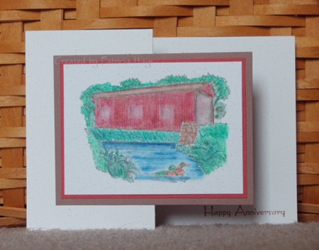
Today is my husband’s parents’ wedding anniversary, so today’s card is the one that my family sent them.  My in-laws aren’t the type of people who typically go for a lot of hearts and flowers and mushy sentimental type stuff, so it’s sometimes difficult coming up with ideas for them.  I decided to finally put to use a covered bridge image that I’d stamped several years ago when Splitcoaststampers was recruiting members to create index cards for the Stampin’ Up stamp set galleries.  You can click here to see this image in its original form.  I took it off of the blush mat, colored it with watercolor pencils and blender pens, and gave it a new double mat. 

Then I decided to get a little creative with the card fold for something different.  I think this might be called a “z fold”; I’m honestly not sure.  Basically you take a 4.25″ x 11″ piece of cardstock, score it at 5.5″ and fold it into a regular A2 card size.  Score the front side of it again at 2.75″.  Fold that in the opposite direction from the first fold, so that what was originally the outside edge of the card touches the folded outer edge of the card.  Adhere the focal point to that half-size card front, being careful so your adhesive doesn’t stick to the inside back of the card. 

The “Happy Anniversary” sentiment is stamped on the inside of the card, and I was careful when I signed the card on behalf of our family to make sure the writing wouldn’t show around the bridge image panel when the card was closed.

When I was talking on the phone with my mother-in-law today, she joked, “49 years… and we haven’t killed each other yet!”  I hope that she and my father-in-law enjoy many more years together.

pil-anniversary-2010.jpg

Supplies:
Stamps: Changing Seasons, Hugs & Wishes (SU)
Cardstock: Naturals White, Close to Cocoa, Ruby Red (SU)
Ink: Going Gray (SU)
Other: watercolor pencils, blender pens (SU)
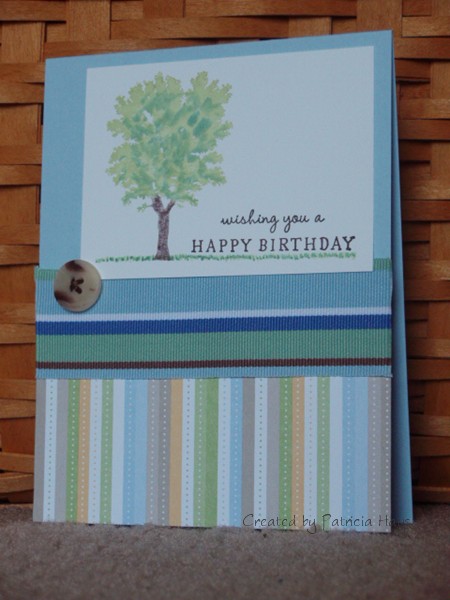
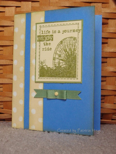
I feel like I’ve been making so many birthday cards lately that I’m having a hard time coming up with something original to say about them in my blog posts. 

Today’s card is on its way to my father-in-law.  It uses this week’s Lizzie Anne Designs sketch challenge and stamps from two different LAD sets.  I drew in the grass by hand, and I sewed the button onto the ribbon before attaching the ribbon to the card. 

I hope my father-in-law likes his card and has a wonderful birthday!

lad-127.jpg

Supplies:
Stamps: Card Quotations, Dream Big (Lizzie Anne Designs)
Cardstock: Bashful Blue, Whisper White; Delicate Dots designer paper (Stampin’ Up)
Ink: Certainly Celery, Sage Shadow, and Chocolate Chip markers (Stampin’ Up)
Other: Seaside Ribbon Originals (Stampin’ Up); embroidery floss (DMC); miscellaneous button

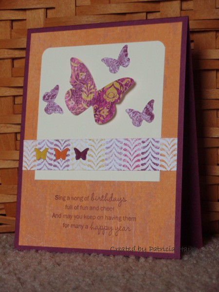
I guess I’m subconsciously stuck on the idea of butterflies on birthday cards right now.  I didn’t think about it until I started writing this post, but today’s card is the second birthday card featuring butterflies I’ve sent out in the last two weeks. 

I’ve had the Sizzix/Stampin’ Up Beautiful Wings die for a while now, but hadn’t used it yet, and when I spotted it on my desk early last week it started seeming like it was calling out to me… “use me… soon… please!”  LOL  So I finally put it to use for this card.  The layout is Lizzie Anne Designs Sketch Challenge #126.  I slightly folded the largest butterfly and glued just the body of it down to the card, so there’s a bit of a 3-D effect going on there.  There isn’t much stamping here – only the sentiment – but I’m pleased with the final result.

victoria-birthday-2010.jpg

Supplies:
Stamps: Card Quotations (Lizzie Anne Designs)
Cardstock: Rich Razzleberry, Very Vanilla, Crushed Curry, Pumpkin Pie, Razzleberry Lemonade designer paper (Stampin’ Up)
Ink: Rich Razzleberry (Stampin’ Up)
Other: Beautiful Wings die (Stampin’ Up)

Today’s card combines several challenges – Lizzie Anne Designs Sketch Challenge #120, Splitcoaststampers Clean & Simple Challenge 67, and Splitcoaststampers Color Challenge 268.  I threw this card together fairly quickly a few days ago and sent it out to my husband’s brother for his birthday.  I hope he liked it and that he enjoyed his special day.

The ribbon treatment was pretty easy.  I took piece of ribbon and cut a “v” shape into the ends.  Then I took another piece, about 2″ long.  I put a piece of adhesive in the middle of it and folded the ends in toward the center, so that the ends met in the middle of the adhesive.  Then I put that loop, adhesive side down, on the straight piece of ribbon and secured them together with a mini brad.  I used glue dots to adhere the whole thing to the card base, so the ends of the brad are hidden.

jay-2010.jpg

Supplies:
Stamps: Singing in the Rain (LAD)
Cardstock: Ballet Blue, Barely Banana, Old Olive, Spring Showers designer paper (SU)
Ink: Old Olive (SU)
Other: olive grosgrain ribbon (Offray); distressing tool, mini brad (Making Memories); sponge

retiring teachers, retiring supplies

Comments Off on retiring teachers, retiring supplies
May 182010

If you are familiar with Stampin’ Up, by now you’ve probably heard that at the end of June 2010, the company is planning to retire many of its current colors of cardstock and ink.  I’ll admit I was pretty stunned at first by the announcement.  I’ll miss some of the colors that are leaving, but I’m also looking forward to seeing the new items.

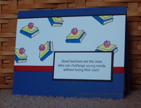
Remember a few weeks ago I shared the card I made for our elementary school’s retiring music teacher?  Today’s card is the one I made for the PTA Executive Board to give to another retiring teacher, who is a Title 1 reading specialist.  Once again, I used the school’s colors of blue and white, and added some black and red accents.  Stampin’ Up’s Brilliant Blue color is a perfect match to the school’s colors, and it’s one of the retiring colors, so that kind of ties in subtlely to the retiring theme.  For the layout, I used Lizzie Anne Designs Weekly Sketch #124

Feel welcome to let me know what you think of it.  🙂

henderson-retiring.jpg

Supplies:
Stamps: School Days (Lizzie Anne Designs)
Cardstock: Brilliant Blue, Basic Black, Whisper White (Stampin’ Up)
Ink: Onyx Black (VersaFine)
Other: Watercolor pencils, blender pens, red grosgrain ribbon (Stampin’ Up)

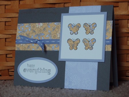
Hi there!  Today’s card is one my family sent to a longtime friend who is celebrating her birthday today.  I used Lizzie Anne Designs Weekly Sketch #125 for the layout.  I decided to stamp the butterflies on a scrap of the designer paper I used, cut them out, and glue them to the focal point, rather than try to color them.  The butterflies are from Lizzie Anne Designs’ Monthly Mix set for May 2010, and the sentiment is from their April 2010 Monthly Mix set.  The sentiment was stamped off once so the ink would look grey rather than black.  I used Nesties to cut the ovals.

I’m excited to be taking part in the first Lizzie Anne Designs Monthly Mix Blog Hop today!  Check out the Lizzie Anne Designs blog for a list of the other people who are participating.

monica-2010.jpg

Supplies:
Stamps: Dream Big, It’s Good to Be Queen (Lizzie Anne Designs)
Cardstock: Whisper White, Almost Amethyst, Basic Gray, Tea Party designer paper (Stampin’ Up)
Ink: Onyx Black (VersaFine)
Other: Sweet Shop Ribbon Originals (Stampin’ Up); petite oval dies (Nestabilities)

back to birthdays

Comments Off on back to birthdays
May 122010

Now that Mother’s Day is over, the birthday season is kicking into gear for me.  It seems like I know a whole lot of people who celebrate their birthday in May or early June.

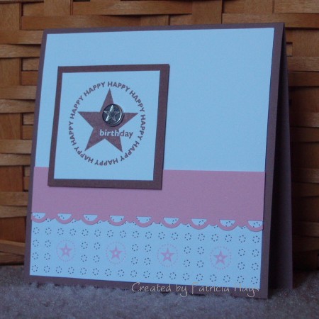
Today’s card is one I sent to a friend who celebrated her special day on Saturday.  I liked how the designer paper coordinated with the stamp.  I’d forgotten I had these brads, but I was looking through my hardware for something else and saw them and thought they’d make a nice finishing touch. 

Then when I was addressing the envelope to my friend, it dawned on me.  I was sending a card with stars on it to my friend who lives in…

… wait for it …

… the Lone Star state. 

I don’t know whether I should be impressed with myself, or just think of myself as a big goof!  LOL

elizabeth-birthday-2010.jpg

Supplies:
Stamps: Starring You (SU)
Cardstock: Close to Cocoa, Pretty in Pink, Whisper White, Berry Bliss designer paper (SU)
Ink: Close to Cocoa (SU)
Other: Scallop Trim border punch, silver Hodgepodge Hardware brad (SU)

Happy Mother's Day

Comments Off on Happy Mother’s Day
May 092010

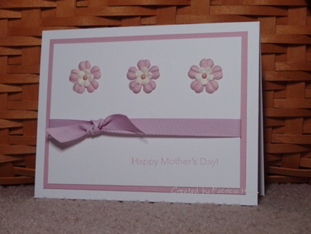
Today’s post is just a quick note to wish all the moms out there a very happy Mother’s Day.  I can’t think of a better way to send a quick note than with a quick and easy card.

I coupled two of the Splitcoaststampers Clean and Simple challenges.  One was to use flowers on the card, and the other was a sketch challenge.  I decided to try out my new Papertrey Ink colored cardstock and ribbon for this card, too. 

esc-md-2010.jpg

Supplies:
Stamps: Messages for Mom (SU)
Cardstock: Basics White, Lavender Moon (PTI)
Ink: Mauve Mist (SU)
Other: Lavender Moon twill ribbon (PTI); flowers (Prima); mini brads

musical inspiration

Comments Off on musical inspiration
May 062010

I’ve mentioned in the past that I make and send cards to the faculty and staff of our elementary school, on behalf of the PTA Executive Board.  This week is Teacher Appreciation Week.  Besides showing the teachers some extra TLC and thanks, it’s also the time that we recognize those who are retiring for all their hard work and dedication over the years. 

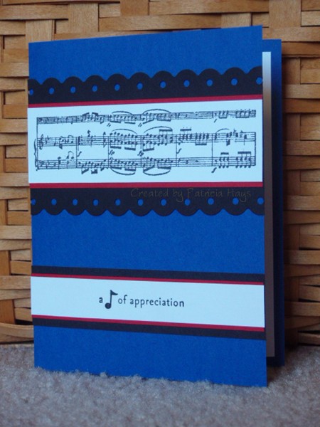
This year, our music teacher is retiring.  I wanted to incorporate the school’s colors, bright blue and white, into the card for him.  I also wanted to do something with a musical theme.  So I chose two of my musical stamps.  That was easy.  The stamps lended themselves nicely to Lizzie Anne Designs Sketch #122. The blue and white seemed a little stark just by themselves, so I thought black might make those two colors kind of “pop”.  It helped, but it didn’t quite do the trick.  So I decided to try using my Fiskars border punch that reminds me of a fermata (the symbol over the note shown here).  That helped too, but the card still seemed to be lacking something.

And then for some odd reason, my son’s marching band uniform came to mind.

Since our elementary school feeds into our high school, the school colors are similar.  The difference is that the high school also includes black as one of their colors.  So the marching band uniforms are blue, white and black…

with just a tiny touch of red.

TA-DA!  I added a little bit of red matting to the card.  And finally the card satisfied me. 

Here’s the card for you to see:

tate-retiring.jpg

Supplies:
Stamps: It’s Good to be Queen (Lizzie Anne Designs); Picture This (Stampin’ Up)
Cardstock: Brilliant Blue, Basic Black, Real Red, Whisper White (SU)
Ink: Onyx Black (VersaFine)
Other: Threading Water border punch (Fiskars)

My son probably won’t like this if he sees it, but I can’t resist also including the inspiration:

smf-10-31-09-resized-2.jpg

© 2019 Suffusion theme by Sayontan Sinha