I’ve mentioned in the past that I make and send cards to the faculty and staff of our elementary school, on behalf of the PTA Executive Board. This week is Teacher Appreciation Week. Besides showing the teachers some extra TLC and thanks, it’s also the time that we recognize those who are retiring for all their hard work and dedication over the years.
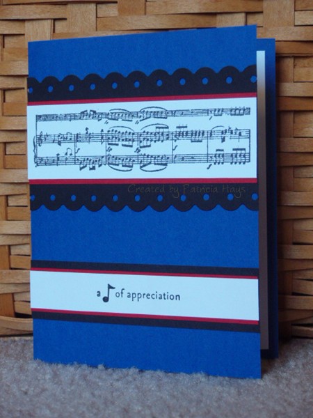
This year, our music teacher is retiring. I wanted to incorporate the school’s colors, bright blue and white, into the card for him. I also wanted to do something with a musical theme. So I chose two of my musical stamps. That was easy. The stamps lended themselves nicely to Lizzie Anne Designs Sketch #122. The blue and white seemed a little stark just by themselves, so I thought black might make those two colors kind of “pop”. It helped, but it didn’t quite do the trick. So I decided to try using my Fiskars border punch that reminds me of a fermata (the symbol over the note shown here). That helped too, but the card still seemed to be lacking something.
And then for some odd reason, my son’s marching band uniform came to mind.
Since our elementary school feeds into our high school, the school colors are similar. The difference is that the high school also includes black as one of their colors. So the marching band uniforms are blue, white and black…
with just a tiny touch of red.
TA-DA! I added a little bit of red matting to the card. And finally the card satisfied me.
Here’s the card for you to see:
Supplies:
Stamps: It’s Good to be Queen (Lizzie Anne Designs); Picture This (Stampin’ Up)
Cardstock: Brilliant Blue, Basic Black, Real Red, Whisper White (SU)
Ink: Onyx Black (VersaFine)
Other: Threading Water border punch (Fiskars)
My son probably won’t like this if he sees it, but I can’t resist also including the inspiration:


Sorry, the comment form is closed at this time.