OWH Labor Day VCMP 5 - masking tape block stamping

Comments Off on OWH Labor Day VCMP 5 – masking tape block stamping
Sep 052013

I’m back with another card for Operation Write Home’s Labor Day Virtual Card Making Party.  The fifth challenge of the party was to adhere strips of masking tape to an acrylic block, apply ink to the tape, and then use that to create an inky background for the card.

I decided to try this with three colors of ink to get an ombre effect.  It worked all right, I suppose.  The lightest color turned out really subtle.  I decided to go with a fall theme for my card, so that dictated my color choices.

So there’s another card for my growing stash for OWH!  Thanks for stopping by today.

Supplies:
Stamps: unnamed leaf stamp (StampCraft); Always in my Thoughts (Stampin’ Up)
Cardstock: Pumpkin Pie, Chocolate Chip, More Mustard, Naturals Ivory (SU)
Ink: Crumb Cake, More Mustard, Pumpkin Pie, Chocolate Chip (SU)
Other: masking tape; acrylic block

Hello!  A new month means a new hostess for our challenges at CAS – Colours and SketchesKaren has some fun ideas planned for September, so I hope you’ll consider playing along with us.

The first Thursday of the month means its color challenge time, and Karen really pulled out the stops with this one!  She’s challenging us to use rainbow colors on our cards.  It doesn’t matter if it’s a bright happy rainbow, or a pastel rainbow, or a rainbow of jewel tones.  It also doesn’t matter if the colors are arranged as a rainbow.  So long as at least five colors are represented, it’s good.  See the challenge blog for all the details.

I decided to go traditional with my rainbow colors.  This challenge seemed like a good time to break out my Faber Castell gel sticks and give them a try.  I’ve used the brand name Gelatos before; the gel sticks look and work just like them, but I found them on Amazon.com at a fraction of the price of Gelatos.  For the card, I swiped the gel sticks on a piece of white cardstock and blended them with my fingers.  Then I stamped the sentiment over the colors.  I thought the sketchy font of the sentiment and the scribbled look of the colors worked well together.  I decided to round the opposing corners of the image panel and the card.  I also popped up the image panel with shims made from scrap cardstock.

I hadn’t played in a CAS-ual Fridays challenge for a while, so I checked out their blog to see what they had going on now.  Their challenge is to combine kraft with text.  I had originally planned to use a white card base, but I decided to use kraft instead.  I like the way the colors pop against it.

So there you have it – an any-season thank you card suitable for me to include in my next shipment to Operation Write Home.

I hope you’ll join us at CAS – Colours and Sketches and give our rainbow challenge a try!  You have until 1:00 p.m. eastern time Wednesday, September 11 to share your card there.

Supplies:
Stamps: Wonderful Words (Stampin’ Up)
Cardstock: Kraft, Basic Black (SU); Pure Luxury White (Gina K. Designs)
Ink: Onyx Black (VersaFine)
Other: corner rounder punch (SU); gel sticks (Faber Castell)

I’ve combined the fourth OWH Labor Day Virtual Card Making Party challenge with this week’s Dynamic Duos color challenge.  The color challenge is to pair Perfect Plum with a color of the participant’s choice.  I picked Certainly Celery.  The VCMP challenge is to create a love-themed card using OWH Stars & Stamps sketch #29.  This is a great sketch for clean and simple styled cards, but it holds potential for being dressed up with embellishments if you’d wish.  I kept it pretty CAS, but I rounded a few corners to keep it from looking too boxy.  The blossoms were stamped onto scrap cardstock, cut out, and then adhered to the focal panel.  The bottom left blossom is popped up a bit with a cardstock shim underneath it, to add just a little dimension to the card.  I had one blossom left over so I used it to perk up the inside of the card.  I wanted to add some sort of visual interest to the green panel, so I stamped the leafy image on it, after stamping the ink off once on scrap paper. Even though the sentiment is from a set called “Masculine Messages”, I think this particular one works well on cards for either men or women.

Thanks for stopping by today!  I still have some more VCMP challenges to work on, so off I go…

Supplies:
Stamps: Best Blossoms (Stampin’ Up); Masculine Messages (Gina K. Designs)
Cardstock: Perfect Plum, Certainly Celery, Very Vanilla (SU)
Ink: Perfect Plum, Certainly Celery
Other: corner rounder punch (EK Success)

OWH Labor Day VCMP 3 - triple die cutting technique

Comments Off on OWH Labor Day VCMP 3 – triple die cutting technique
Sep 032013

The third OWH Labor Day Virtual Card Making Party challenge puts a twist on a popular stamping technique.  Instead of stamping on multiple layers, separating them to mat them, and then reassembling them, this time we’re to cut the layers from one piece of either designer paper or cardstock that’s been stamped with a design.

I decided to use a piece of designer paper for my card. I originally cut the smallest oval from the designer paper, too, but I felt the card looked really “busy” so I replaced it with an oval cut from the same color cardstock as the card base.  I added the flowers because the card needed a little something extra to dress it up.

I do appreciate this technique’s use of less cardstock or designer paper, but making sure my graduated dies were aligned correctly was extremely painstaking for me because I’m a perfectionist.  Assembling the layers so they’d line back up correctly also took a lot of patience.  But eventually I ended up with another card for my OWH stash.

Thanks for stopping by today!

Supplies:
Stamps: Year Round Sentiments (Hero Arts)
Cardstock: Pool Party, Tangerine Tango, Island Indigo, Sycamore Street designer paper (Stampin’ Up)
Ink: Island Indigo (SU)
Other: Spring Bouquet punch (SU); petite oval Nestabilities dies (Spellbinders); mini brads (Making Memories)

Just in the nick of time before this week’s Freshly Made Sketches challenge comes to a close, here’s a card I made combining the challenge layout with the OWH Labor Day Virtual Card Making Party challenge #2.  I’ve turned the sketch on its side.  The VCMP challenge is to use elements that represent each letter of OWH – so I’ve used ornaments, white and Wild Wasabi cardstock (and Wild Wasabi ink), and the sentiment “holiday cheer”.  I guess for a stretch you could say that the hanging ornaments are another H element, and another O could be the open space on the card.  It doesn’t show well in the photo, but the little white banner is made of textured cardstock.

Thanks for stopping by today!

Supplies:
Stamps: Holiday Baubles (Sweet ‘n Sassy Stamps)
Cardstock: Pure Luxury White (Gina K. Designs); Wild Wasabi, Cherry Cobbler, Whisper White textured (Stampin’ Up)
Ink: Wild Wasabi, Cherry Cobbler (SU); Tuxedo Black (Memento)

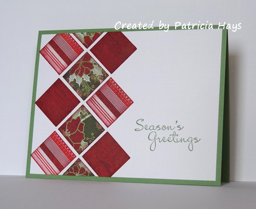
Good morning!  It’s the first Monday of the month, which means it’s time for a new challenge at Cards in Envy!  This time we’re being challenged to make manly, masculine cards to be sent to the men in our lives.  Remember, though, that the main requirement for Cards in Envy challenges is that your card must fit in an A2 sized envelope and not have any lumpy, bumpy embellishments that could push it over the first class postage rate.

I’ve used the challenge to make another card for my Operation Write Home stash.  Occasionally I need a gentle reminder that some of our heroes stationed overseas may be women wanting to send cards home to their husbands or fiancés, or that sometimes the men want to send cards home to their dads, brothers, or any other important man in their lives.  So this challenge was a good nudge for me to create something suitable for a hero to send home to a man.

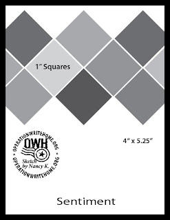
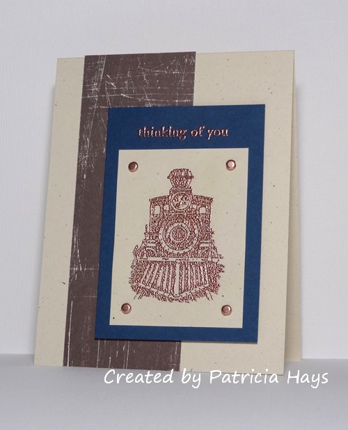
My husband has always loved trains, so I thought the vintage train image was a good start for my masculine card.  I looked through the OWH sketch library for a layout that would work with this image.  Sketch #46 fit the bill, and when I consulted my checklist of OWH sketches, I hadn’t used it before, so hooray, I can check it off now!  The designer paper has a kind of rustic look to it that I thought fit well with the theme.  I tried several different shades of blue and liked this one the best.  I decided to emboss the image with copper embossing powder.  I wanted to use the copper brads as an embellishment.  As far as brads go, these are pretty flat.  I originally considered making a row of them on the blue, above the image panel.  But I decided to add a sentiment to the card, and used the brads in the corners instead.  I also embossed the sentiment – which probably would have turned out better if it had been a larger font,  but I suppose it isn’t too bad.  Unfortunately, I had a hard time getting it to be legible in a photo.


Be sure to check out the Cards in Envy site for all the challenge details and to see what the rest of the design team has created!  Then create a manly card of your own and share it with us using the linky tool on the site.  You have until Sunday, September 15 to play along with us!

Supplies:
Stamps: All Aboard, Three Little Words (Stampin’ Up)
Cardstock: Naturals Ivory, Midnight Muse, Spring Showers designer series paper (SU)
Ink: Champagne (Encore)
Other: copper brads, dimensionals (SU); copper embossing powder (Ranger)

Hello! Operation Write Home is hosting a Virtual Card Making Party to celebrate the Labor Day weekend!  It’s full of fun crafty card making challenges.  Links to all the challenges can be found on the OWH Stars and Stamps blog.

For VCMP challenge #1, we’ve been presented with a sketch to follow to create a winter or holiday card.  I used some of my scraps of Christmasy designer paper, inked the edges of them, and mounted them onto textured cardstock to give the card some subtle extra visual interest.  The sketch seemed a little top heavy to me, so I turned it on its side.  For some reason having it “left heavy” doesn’t bother me.  OK, I’m weird.  LOL

Here’s the sketch:

Now I need to get working on the remaining challenges! 🙂 Thanks for stopping by today.

Supplies:
Stamps:  More Merry Messages (Stampin’ Up)
Cardstock: Wild Wasabi, Whisper White textured (SU); scraps from Nordic Holiday 6″ x 6″ paper pad (Basic Grey)
Ink: Wild Wasabi, Cherry Cobbler (SU)
Other: 1″ square punch (Creative Memories); sponge

© 2019 Suffusion theme by Sayontan Sinha