Hello!  Happy Halloween to my readers who observe it!  🙂

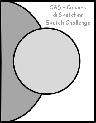
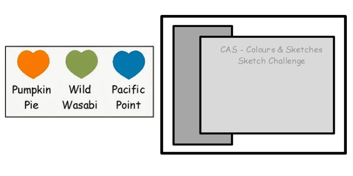
Since it’s the fifth Thursday of the month, this week at CAS – Colours and Sketches we have a double challenge – which means certain colors need to be used with a particular sketch!  That sounds like fun, doesn’t it?

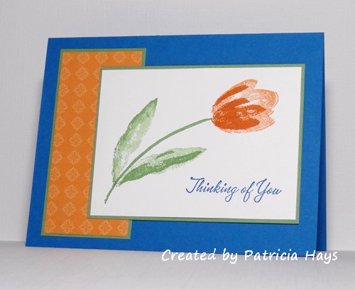
I haven’t yet decided if the card I created will go in my stash for Operation Write Home or for Hope You Can Cling To.  I did have one of the HYCCT challenges in the back of my mind while I was working on this.  Either way, the card will be appropriate for either cause.  The tulip seems a little out of season now at the end of October, but I have no way of knowing when this card will actually be sent to someone, and besides, who wouldn’t like to be surprised with a pretty flower any time of year?  I used some older stamps and designer paper, but I have a feeling the recipient won’t mind that.

Although the colors listed are Stampin’ Up color names, you do not need to use Stampin’ Up products to create your card.  Simply use whatever you have that is closest to those colors.

Be sure to see what the rest of the design team has made!  Then we’d love it if you join in our challenge by making a clean and simple styled card of your own using this sketch and these colors.  Share your work with us at the CAS – Colours and Sketches site by 1:00 p.m. Eastern time Wednesday, November 6.  We’d love to see what you make!

All supplies for this card are from Stampin’ Up.
Stamps: Terrific Tulips, Warmest Regards
Cardstock: Pacific Point, Wild Wasabi, Whisper White, Baja Breeze designer paper
Ink: Pumpkin Pie, Wild Wasabi, Pacific Point

It’s taken me most of the week to decide what to create for the current Dynamic Duos challenge, but I finally figured out that I can combine it with one of the last Hope You Can Cling To challenges.  (Since I was a HYCCT hostess, I had advance notice of what all the challenges are – but I don’t think I’m allowed to give any hints about them if I share a card here for an upcoming challenge.)

So, here it is… pretty simple and straightforward.  I masked off an area of the card and sponged Wisteria Wonder ink for the colored panel, and then sponged around the edges of the masked area with Perfect Plum ink.

Thanks for stopping by today!

Supplies:
Stamps: Butterfly Flourish, You (Sweet ‘n Sassy Stamps)
Cardstock: Pure Luxury White (Gina K. Designs)
Ink: Wisteria Wonder, Perfect Plum (Stampin’ Up); Tuxedo Black (Memento)
Other: sponge

Hello there!  I don’t know about your area, but here in the Shenandoah Valley it is really starting to feel like winter isn’t far away!  In the last few days high temperatures have dropped from the low 70s to the low 50s, and we’ve had freeze warnings the last two nights.  The drop in temperatures is one reminder that Christmas is coming pretty quickly!  It’s just under two months away!  But if you’ve been playing along with 52 {Christmas} Card Throwdown this year, you should have a good stash of holiday cards ready to be signed, addressed and sent.

This week Danielle is offering up a technique challenge, to create a card using a fancy fold.  As much as I enjoy making flap cards, I figured since I’ve already shared two of them in October, I ought to do something different for this challenge.  But I did kind of take the easy way through that by creating a simple Z-fold card.  Even though I used a Rhubarb bear digital image for last week’s 52{C}CT card, I decided to use another one for today’s card.  I also used a long-retired background stamp to embellish the panel on the left.  I’ve been wanting to try out this silver glittery cardstock for a while, and today seemed like a good day to do so.  I used Liquid Applique to make the trim on the hat fluffy, and I added a bit of Stickles to it while the Liquid Applique was still wet.  There’s also some Stickles on the ribbon on the present although the photo makes it look like it’s all concentrated at the knot of the bow.

The rest of the design team members have come up with a wide variety of fancy folds!  Be sure to check them out at the 52{C}CT site.  Then create a fancy fold Christmas or winter card of your own and share it with us!  You can link up your artwork until 1:00 p.m. Eastern time Friday, November 1.  We’d love to see what you make!

Supplies:
Digital Image: Rhubarb Santa (Sweet ‘n Sassy Stamps)
Stamp: Stipple Plaid (Stampin’ Up)
Cardstock: Rose Red, Pretty in Pink, Silver Glimmer (Stampin’ Up); Pure Luxury White (Gina K. Designs)
Ink: Rose Red (SU); printer ink
Other: markers (Copic); Liquid Applique (Marvy); Frosted Lace Stickles (Ranger)

Hello!  It’s time for another challenge at CAS – Colours and Sketches.  I’ve been enjoying my turn as hostess this month!

Today marks the start of another sketch challenge week.  The sketch I’ve prepared has a lot of fun curves in it.  (Well, I think they’re fun.)  I’ve decided to turn my card into a flap card that’s held closed by a very thin set of magnets.  I had the Hope You Can Cling To “Sending Flowers” challenge from earlier this week on my mind as I was creating this card. I enjoyed using some of my retired cardstock and designer paper, along with a stamp set I haven’t used in quite a while.

Here’s what it looks like when the flap is opened.  The designer paper hides one of the magnets.


What will you do with this sketch?  Will you layer designer papers or solid cardstock?  Will you create a standard fold card or try a flap card?  Maybe you’ll turn the sketch on its side, or squash it into a square rather than use it as a rectangle.  There are so many possibilities!  I hope you’ll try out something and share what you create with us!  Link your work to the CAS – Colours and Sketches blog by 1:00 p.m. eastern time Wednesday, October 30.

Thank you for stopping by today!  Comments are always welcome and appreciated!

Supplies are from Stampin’ Up unless otherwise indicated:
Stamps: Close as a Memory
Cardstock: River Rock, Pretty in Pink, Very Vanilla, Porcelain Prints designer series paper
Ink: Pretty in Pink, Regal Rose, Wild Wasabi markers
Other: standard circle and petite scalloped circle Nestabilities dies (Spellbinders); magnets (Basic Grey)

Today’s card combines the Dynamic Duos color challenge of Tangerine Tango and Basic Black with the Hope You Can Cling To “Let’s Punch Out Breast Cancer” challenge of using punches or die cuts.  I just received the “hello” die a few days ago and this HYCCT challenge was a super opportunity to use it right away!  I’ve used dies to cut three oval shapes, sponged them with tangerine ink, and assembled them to form a pumpkin.  The pumpkin stem is the leftover punched from the letter “o” in the sentiment, with a bit of black and tangerine ink sponged on it.  I used a woodgrain border stamp to create a shelf or a board or something like that for the pumpkin to sit upon, so it wouldn’t just seem to be floating on the card.

Thanks for stopping by today!  Your comments are always read and appreciated.

Supplies:
Stamps: Grunge Borders (Sweet ‘n Sassy Stamps)
Cardstock: Tangerine Tango, Basic Black, Kraft (Stampin’ Up)
Ink: Tangerine Tango (SU); Tuxedo Black (Memento)
Other: Hello Script die (Memory Box); oval die (Sizzix); sponge

Hi there!  It’s Cards in Envy challenge introduction day!  Our challenge for the next two weeks is “In the Spotlight” – showcasing cards that use the spotlight technique, where a part of a black and white image is popped up with color.  There’s a terrific tutorial for it here on the Splitcoaststampers.com website.

My image technically is grey and white, but it gives the same idea.  Actually I guess you could use any color ink for this technique, so long as you only spotlight a part of the image with full coloring.  I used a couple of square punches for my spotlight.  A lot of people tend to use circles and I wanted to do something a little different.  The layout for my card is Seize the Sketch #6.  This card also fits into the SCS “Scene of Serenity” Hope You Can Cling To challenge.

If you need additional inspiration, please go check out the Cards in Envy site and see what the rest of the design team has made.  What will you create with this technique?  Share your work with us on the Cards in Envy site by 7:00 p.m. Eastern time Sunday, November 3.  We’d love to have you play along with us!

Supplies:
Stamps: Changing Seasons (Stampin’ Up); Christmas Tags (Sweet ‘n Sassy Stamps)
Cardstock: Smoky Slate, Real Red, Basic Gray, Naturals White (SU)
Ink: Basic Gray, Real Red (SU)
Other: Premier colored pencils (Prismacolor); square punches (EK Success and Creative Memories)

Hello!  The third Saturday of the month means it’s theme challenge time at 52 {Christmas} Card Throwdown.  This time our hostess, Danielle, would like us to use bling on our cards.

I decided to go blingy with a Christmas tree image, using red and clear rhinestones for the ornaments and adding Stickles to the garland.  The star on top is a silver brad. The layout for the card is an older sketch from the Operation Write Home Stars & Stamps blog.

This also fits into the Hope You Can Cling To “Blingtastic” challenge.

Thanks for stopping by today!  I hope you’ll join in and play along with us at 52{C}CT and/or at Splitcoaststampers!

Supplies:
Digital Image: Rhubarb Trims the Tree (Sweet ‘n Sassy Stamps)
Cardstock: Kraft (Stampin’ Up); Pure Luxury White (Gina K. Designs); designer papers from Arctic Frost 6″ x 6″ paper pad (Basic Grey)
Ink: printer ink
Other: markers (Copic); star brad (The Paper Studio); red rhinestones (KaiserCraft); clear rhinestones (Bazzill); Frosted Lace Stickles (Ranger)

Hello! Holy cow, this week has gone by quickly! It’s Thursday again, which means it’s time for a new challenge at CAS – Colours and Sketches.

Since it’s the third Thursday of the month, we have a color challenge this time. In honor of Breast Cancer Awareness Month, I’ve chosen two shades of pink. I wanted to use a rich, dark brown for the third color. I debated between Chocolate Chip and Early Espresso before finally settling on the latter.  I’ve kind of taken the easy route by using last week’s sketch layout for this week’s card, too.  Since cutting the pink panels into triangles kind of lends itself to making two cards, I’ve done that (but I’m only showing one here since they’re twins), and now I have one card for Hope You Can Cling To and one for Operation Write Home.

Be sure to check out what the rest of the CAS – Colours and Sketches Design Team has made with these colors, and then make a card of your own! Although Stampin’ Up color names are listed for reference, you may use any other company’s products that are similar in color. Share your work via the linky tool on the CAS – Colours and Sketches blog by 1:00 p.m. eastern time on October 23. Thanks for stopping by today!

Supplies:
Stamps: Branch Out, Three Little Words, Small Sayings (Stampin’ Up)
Cardstock: Pink Pirouette, Rose Red, Early Espresso (SU); Pure Luxury White (Gina K. Designs)
Ink: Pink Pirouette, Rose Red, Early Espresso (SU)
Other: Bitty Banners die (SU)

OK, sorry for the corny punny post title.  I just wanted to quickly get this posted and that’s the first thing that popped into my head.

This card is for the current Dynamic Duos challenge using So Saffron and Calypso Coral.  I went kind of “old school” on this one with retired stamps and a technique I haven’t seen much of lately.  I’ve used the kissing technique for the background and for the big “U”.  I wasn’t sure how the U would turn out, so I stamped it on a scrap of white cardstock and then fussy cut it to put on the card.  The card was too plain and flat and boring with just cardstock, so I found my matching twine.  There wasn’t a whole lot of room to use it, so I decided to put it at an angle to give it a little more interest. Then I popped up the main panel over it with dimensional adhesive.

Thanks for stopping by today!  🙂

All supplies are from Stampin’ Up:
Stamps: All About U, Floral, Linen
Cardstock: So Saffron, Calypso Coral, Whisper White
Ink: So Saffron, Calypso Coral
Other: Calypso Coral twine, dimensionals

All during the month of October, Splitcoaststampers is sponsoring Hope You Can Cling To to benefit the MD Anderson Cancer Center. A different challenge is being presented each day of the month. I’m excited to be hosting the challenge for today, October 15!

Because so many people affected by cancer are full of hope in one way or another – whether it’s hope to beat this disease, or hope that a cure will be found soon – I’ve decided to call my challenge “Bursting with Hope” and encourage the challenge participants to create a card using a starburst technique. The only real requirement is that the starburst be made with cardstock or patterned paper. There are various tutorials available online; the one I’ve written for this challenge can be found here.

And here is the card I made while I was creating the tutorial. I just couldn’t resist using some fun Basic Grey papers and a Lawn Fawn image for my card. I decided to do a little paper piecing to “color” the ice cream cone.

I’m also entering this card in the current Lawnscaping challenge.

When I was starting out on the tutorial card, I second guessed my paper choices, so I put the triangles I had already cut aside and started again.  I didn’t want to just toss the first set of triangles I had cut, so I decided to do something a little different with them.  I mentally pictured vertical and horizontal lines dividing the card into fourths and placed the long “legs” of four triangles on those lines. Then I lined up the legs of the remaining triangles from the center of the card to the corners. I trimmed the excess and added the sentiment/image panel.  It’s a totally different starburst effect than the tutorial.

I hope you’ll join in the Hope You Can Cling To challenges at Splitcoaststampers.com and help bring cheer to the cancer patients at MD Anderson!  Thanks for stopping by today!

Supplies for the ice cream cone card:
Stamps: Here’s the Scoop (Lawn Fawn)
Cardstock: Pure Luxury White (Gina K. Designs); Early Espresso (SU); papers from Phoebe 6″ x 6″ paper pad (Basic Grey)
Ink: Early Espresso (SU)
Other: standard circle and big scalloped circle Nestabilities dies (Spellbinders); sponge

Supplies for the thank you card:
Stamps: Riveting (SU)
Cardstock: Soft Sky textured, Whisper White (SU); papers from Phoebe 6″ x 6″ paper pad (Basic Grey)
Ink: Early Espresso (SU)
Other: rhinestone (SU); standard circle and big scalloped circle Nestabilities dies (Spellbinders); sponge

Hello!  Last week and weekend were pretty hectic for me so I took a little break from the weekly 52 {Christmas} Card Throwdown challenge, but I’m happy to be back again this week.  Danielle is our hostess this month, and she has a different twist on our color challenge this time.  Instead of specifying certain colors to use, she’s asking us NOT to use red or green.  Anything else is ok.

Operation Write Home will still accept winter cards through the end of December, so I’m trying to get some made to send then along with Valentines. Or, I might decide to include this with my Hope You Can To stash because it just might fit into an upcoming challenge.  (As a HYCCT challenge hostess, I know what all the challenges will be – but I can’t really give details about them until they are presented to the public.)  I’ve decided to go with a snowflake theme in monochromatic blues.  I ran the top panel through an embossing folder and then sponged white ink over the snowflakes to highlight them.  For my die cut snowflake, I first took a scrap piece of cardstock the same color as the card base, ran it through my Xyron machine so it would have adhesive, and covered it with shimmery paint.  After the paint was fully dry, I used a die and my Big Kick to cut the snowflake shape.  A pearl finishes it off with a bit of additional shimmer.  Once again, I’ve gotten layout inspiration from this week’s Freshly Made Sketches challenge.

Now it’s your turn to show us your Christmasy, wintry creation(s) that don’t use red or green!  Link your work to the 52 {Christmas} Card Throwdown site by 1:00 p.m. Eastern time Friday, October 18.  We’d love to see what you create!  Be sure to check out what the rest of the design team has made, too!

Supplies:
Stamps: none
Cardstock: Soft Sky, Blue Bayou, Baja Breeze (Stampin’ Up)
Ink: craft White (SU)
Other: Frost White shimmer paint, sponge dauber (SU); Crystal snowflake die (Memory Box); half pearl (KaiserCraft); Snowflake Background embossing folder (Darice)

Hello!  Today I’m excited to share the first sketch I’ve created for CAS – Colours and Sketches!  OK, I’m kind of nervous about it too.  It’s a little intimidating for me to be creating the challenges instead of just participating in them!

My sons’ band teacher is expecting her first child next month, and the band was able to pull off a surprise baby shower for her Wednesday afternoon.  (Keeping it a surprise was no small feat considering the marching band has about 53 members, plus their parents and the other band staff members knew about the shower!) My challenge card is the one my family gave along with our gifts to her.  Even though the train image is from a Christmas themed stamp set, I thought it would be suitable for a card welcoming a baby boy.  The engine and cars are paper pieced, but I used markers to color the wheels and smokestack.  The car stamps do include a star, but I knew I wouldn’t be able to use a lighter color marker on the patterned paper and make it look good, so I created stars with a punch and yellow paper.  The engine stamp also has a star, but I decided to dress that one up with a silver star-shaped brad.  I added tiny silver brads to the wheels, too.  To better accommodate all the brad prongs, I used dimensional adhesive to attach the focal panel to the card.

This card also fits into the current Lawnscaping challenge to use patterned paper.  🙂

The sketch is designed for an A2 card (5.5″ x 4.25″), but if you prefer to make square cards, feel welcome to tweak it!  You may also turn the sketch on its side if you’d like.  So long as you retain the basic elements of the triangular panels with the block over top of them, and your card can be described as “clean and simple” or “clean and layered”, you’re meeting the challenge.  Share your work with us at the CAS – Colours and Sketches blog by 1:00 p.m. Eastern time Wednesday, October 16.

Thanks for stopping by today!

Supplies:
Stamps: Pa-Rum-Pa-Pum-Pum, Critters Down Under (Lawn Fawn)
Cardstock: Early Espresso, Naturals White (Stampin’ Up); designer papers from Oh Baby! Boy collection (Basic Grey)
Ink: Early Espresso (SU)
Other: markers (Copic); dimensionals (SU); star brad (The Paper Studio); tiny round brads (Recollections); star punch (Fiskars)

I’ve managed to combine several challenges for today’s card.  The colors are from the current Dynamic Duos color challenge of Cajun Craze and Island Indigo.  I have to admit the colors had me puzzled for a while, trying to figure out what to do with them.  Then I thought about how one of them is a rather good brick color, so I’ve used my brick embossing folder on a Cajun Craze panel and highlighted the texture by swiping my white ink pad across it.  The current Freshly Made Sketches layout, rotated so that the embellishment is in the top left corner instead of the bottom right, lent itself to being a brick wall with a wreath hanging on it.  (That’s not too weird, is it?)  All of the flowers were stamped in Island Indigo ink, but two of them were stamped off once to get the lighter color.  I trimmed the two on the ends down quite a bit so they’d be smaller than the others.

I can’t give too many hints, but this card just might qualify also for one of the upcoming Hope You Can Cling To challenges at Splitcoaststampers.com.  😉

Thanks for stopping by today!  Comments are always read and appreciated!

Supplies:
Stamps: Best Blossoms (Stampin’ Up)
Cardstock: Island Indigo, Naturals White, Cajun Craze, Whisper White (SU)
Ink: Island Indigo, craft White (SU)
Other: brick embossing folder (Tim Holtz); grapevine wreath die (Memory Box)

hopeful flappy, happy smile

Comments Off on hopeful flappy, happy smile
Oct 082013

My friend Sabrina is hosting a Hope You Can Cling To challenge over at Splitcoaststampers.com, and I was more than happy to help her out by making a sample card for her challenge. The challenge title is “It’s a Cover Up”.  Sabrina explains it all in excellent detail in the challenge writeup, but the idea of it is to create a card that has some sort of moveable element that covers up the sentiment.

I decided to make a flap card for the challenge.  I wanted to use one of my smiley face stamps because they’re just so cheery and I thought they’d bring a smile to the card’s eventual sender and recipient.  I added some hand stitching around the edges of the smiley face panel, which hides one half of the magnetic closure that helps keep the card shut.  The designer paper covers the other magnet.  First I’ll show a photo of the card when it is closed:

And here it is opened up, revealing the sentiment:

The sentiment panel folds downward, creating a lot of room for the card giver to include a personal message.

I hope you’ll join the Splitcoaststampers community throughout the rest of October as we join together in creating cards for the patients at MD Anderson Cancer Center in Houston, Texas and their families. You can get all the details about the different challenges and the prizes that will be awarded to challenge participants in November at Splitcoaststampers.com.

Supplies:
Stamps: Jump – Smileys (Uptown Stamp Company); sentiment stamp (Studio G)
Cardstock: Pure Luxury White (Gina K. Designs); Crushed Curry, Razzleberry Lemonade designer series paper (Stampin’ Up)
Ink: Tuxedo Black (Memento)
Other: tag corner punch (SU); markers (Copic); embroidery floss (DMC); magnets (Basic Grey)

Hello!  It’s the first Monday of the month, which means it’s time for a new challenge at Cards in Envy.  This time we’re getting into an October mood with Halloween cards – whether they are scary, creepy, silly or fun, anything that’s Halloweenish and is A2 sized and fits in a standard A2 envelope will work for this challenge.

I’ve always tended to focus on the fun aspects of Halloween – dressing up in costume and trick or treating.  I have to admit I’ve never much been a fan of skeletons and the Grim Reaper and the darker side of Halloween.  So in browsing through my stamps, I finally settled on creating a black cat wearing a witch’s hat.  The cat and the hat were stamped on a scrap piece of white cardstock, colored with Copics, and fussy cut, and then I attached the hat onto the cat’s head.  I used the current sketch from Seize the Sketch for the layout, turning the sketch on its side.  To make the banner tails match up evenly, I put all three layers together with temporary adhesive and cut them all at the same time.  The temporary adhesive allowed me to detach them and realign them, using permanent adhesive the second time.

I just realized that the dimension of the banner combined with the camera angle make it look like the black mat isn’t cut evenly where the banner meets it.  Trust me, it’s all even in real life.

So now it’s your turn!  Check out the Cards in Envy site for all the challenge details, and share your Halloween creation(s) with us by 7:00 p.m. eastern time Sunday, October 20.  We’d love to have you play along with us!

Supplies:
Stamps: Critters in the ‘Burbs, Hats Off to You (Lawn Fawn); Sweet & Spooky (Lizzie Anne Designs)
Cardstock: Pumpkin Pie, Basic Black, Whisper White, Razzleberry Lemonade designer series paper (Stampin’ Up)
Ink: Tuxedo Black (Memento)
Other: markers (Copic); dimensionals (SU)

© 2019 Suffusion theme by Sayontan Sinha