It’s time for a double challenge at CAS – Colours and Sketches!  Since it’s the fifth Thursday this month, we’re asking our challenge participants to create a card using the colors and sketch that our hostess, Karen, has provided.

The colors Karen chose are very pretty, but I have to admit I had a difficult time with them.  I made a card, but I didn’t really like the way it turned out.  So I went back to the proverbial drawing board.  I’m not sure why or how the thought of using my reinkers came to mind, but it did – so I created this watercolored background with them.  I decided to turn the sketch on its side, and the scene kind of pulled together from there.  It may not be the most realistically colored sunrise (or sunset) but I’m going with it.


Now it’s your turn to show us what you can create with the colors and the sketch! You have until 1:00 p.m. eastern time Wednesday, February 5 to link your work to the challenge post. Be sure to check out the rest of the design team’s creations for more inspiration.  Thanks for stopping by today!

Supplies:
Stamps: Serene Silhouettes, Happy Place (Sweet ‘n Sassy Stamps)
Cardstock: Basic Black, Rich Razzleberry (Stampin’ Up); Pure Luxury White (Gina K. Designs)
Ink: Tuxedo Black (Memento)
Other: Soft Sky, Blushing Bride, and Rich Razzleberry reinkers (SU)

This is just a quick card that I made for the Dynamic Duos challenge.  They’re repeating one of their color combos from a while ago – Basic Black and Melon Mambo – so I hope they don’t mind that I’ve made a card following the same basic design as one I’ve done in the past.  This time I’ve turned the layout from landscape to portrait orientation, and I’ve changed the stamps used for the card.  To color the stars, I used the closest Copic marker I had to Melon Mambo along with the colorless blender to add some color gradient.

And there’s another card to add to my stash for Operation Write Home!  Thanks for stopping by today.

Supplies:
Stamps: So Much To Say (Lawn Fawn)
Cardstock: Melon Mambo (Stampin’ Up); Pure Luxury White (Gina K. Designs)
Ink: Tuxedo Black (Memento)
Other: markers (Copic)

Hello!  The fourth Saturday of the month means it’s Stash Challenge time at 52 {Christmas} Card Throwdown – which means we’re going to be using products and/or techniques that most crafters are likely to already have in their crafting repertoire.  This week we’re doing double embossing – combining both dry embossing and heat embossing on the same card.

My card ended up taking on a life of its own, but I’m mostly pleased with the way it turned out.  I decided to go with a snowflake theme.  I ran the white cardstock through an embossing folder with a snowflake design.  Then I swiped my Versamark ink pad over the embossed design, sprinkled it with embossing powder, and heat embossed it.  I noticed that some ink and embossing powder got in places that weren’t raised.  I didn’t want to waste the materials and effort, so I added some additional random heat embossing to the edges to kind of distress the panel.  Punched corners and pearls finish off the card.

We’d love to see what you can do with double embossing!  Link your card to the 52{C}CT site by 1:00 p.m. Eastern time Friday, January 31.  Thanks for stopping by today!

Supplies:
Stamp: Christmas Messages (Stampin’ Up)
Cardstock: Soft Sky, Night of Navy, Whisper White (SU)
Ink: Night of Navy (SU); VersaMark (Tsukineko)
Other: Northern Flurry embossing folder, ticket corner punch (SU); Silver Pearl embossing powder (PSX); half pearls (KaiserCraft)

Hello!  Today marks the beginning of another sketch challenge at CAS – Colours and Sketches.  This time Karen has us working with blocks – which really leaves a lot to the imagination as to how you want to use them!

I’ve decided to combine this challenge with the Dynamic Duos challenge that ends today.  They’re asking us to use soft shades of aqua and pink.  I’ve run some Pink Pirouette cardstock through an embossing folder for the bottom block of the sketch.  For the vertical block, I’ve chosen a piece of designer paper that’s Pool Party and Very Vanilla, and colored in the centers of the flowers with a pink marker to tie all the colors together.   I’ve used both colors to stamp the sentiment so that I could highlight the last word.  The blocks of color also work for the current CAS-ual Fridays challenge, and the pastel colors tie into this week’s OWH Midweek Throwdown challenge.


Be sure to check out what the rest of the CAS – Colours and Sketches design team did with this sketch. Then show us what you can make with it! You can link your card to the challenge blog until 1:00 p.m. eastern time Wednesday, January 29. Thanks for stopping by today!

Supplies:
Stamps: You (Sweet ‘n Sassy Stamps)
Cardstock: Pure Luxury Vanilla (Gina K. Designs); Pink Pirouette, Spice Cake designer paper (Stampin’ Up)
Ink: Pink Pirouette, Pool Party (SU)
Other: Paisley embossing folder (ProvoCraft); marker (Copic)

Hello!  Today marks the start of a new challenge at Cards in Envy.  This time we’re looking “through the window” …  making cards that have a window in the front so that something on the inside of the card shows through.  As usual, cards for the challenge need to be A2 sized and have no thick, lumpy, bumpy embellishments.

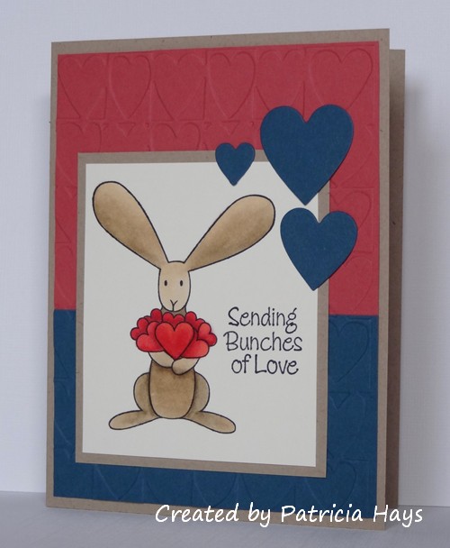
This card ended up being a good example of what happens when I create on the fly (so to speak) and not really have a plan in mind for it.  It started off with my wanting this little bunny image to be seen through the window.  This small, sort of fancy rectangular die was a great size to use for the window.  Then I got the idea to use the largest die from that set of Nestabilities to create the shape of the card, since it is very nearly A2 sized.  (It’s actually a bit smaller, about 5 3/8″ x 4″.  But it’ll still fit just fine in an A2 envelope!)  I cut the card base, putting the fold of the card just inside the die so the fold wouldn’t get cut.  Then I cut the designer paper so that the curve of the die shape would hide the fold of the card once the paper was attached to the base.  I stamped the bunny and colored him… and that’s when things started not going as well.  I added a little stippling around the bunny to help set him off from the card base, but when I’m doodling freeform like that, I’m never quite sure whether to follow the shape of the image or the shape of the image panel.   I wanted the end of the sentiment panel that’s against the window to follow the shape of the aperture, so I figured that out, but then I thought that a standard pointy banner shape for the other end wouldn’t look right, so I cut the opposite end to follow the shape, too.  The card still looked too plain, so after a search through my embellishments, I finally found a couple of Prima flowers that coordinated with the colors in the designer paper, and added them to the corner diagonally opposite the window to help balance the design.  Larger flowers would probably have looked better, but I didn’t have any in the right colors. I didn’t think about using a flower punch until literally just now, as I’m typing this post!

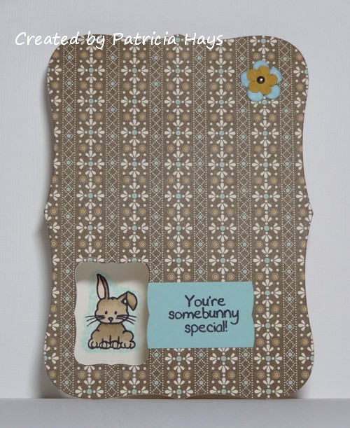
Trying to photograph the card so the window would show depth took a few tries, but this one turned out all right.

Whew.  There ya have it.  Even though I don’t think it’s one of my better cards, it’s still good enough to send to Operation Write Home.

Thanks for stopping by today!  Go see what the rest of the Cards in Envy design team are looking at through their windows.  Then create a card of your own and link it to the Cards in Envy site by 7:00 p.m. Eastern time Sunday, February 2.  We’d love to see what you make!

Supplies:
Stamps: Mini Critters, Cute Critters (Sweet ‘n Sassy Stamps)
Cardstock: Pure Luxury Ivory (Gina K. Designs); Spice Cake designer paper (Stampin’ Up)
Ink: Tuxedo Black (Memento)
Other: Labels Eight Nestabilities dies (Spellbinders); markers (Copic); paper flowers (Prima Marketing); mini brad (Recollections)

Hello!  Can you believe how quickly January is passing by?  It’s more than half over already!

Over at 52 {Christmas} Card Throwdown we’ve been having fun with Mynnette‘s challenges this month.  This week she gives us a recipe challenge: a monochromatic card, with clean and simple styling, with ribbon and a rhinestone.  The design team has cooked up a wide variety of cards with this recipe – be sure to go check them out!

Although I tried several different layout ideas in my head, I kept coming back to this week’s sketch from Freshly Made Sketches.  For this card, I’ve turned the sketch on its side, and I’ve moved the embellishment to the end of the ribbon/banner.  The light blue cardstock for the tilted panel has a subtle linen texture that’s super hard to catch in photographs.  I stamped the ornament on a scrap piece of smooth cardstock in the same shade of light blue.  It has a couple cardstock shims between it and the tilted panel to allow the end of the ribbon to lie smoothly underneath it.

The sentiment stamp is from a set of holiday sentiments designed by the girls of Lizzie Anne Designs for Gourmet Rubber Stamps.  Although I’ve never met Tricia and Meridith in person, we’ve been online friends for several years.  When my family was visiting my inlaws in Florida after Christmas, I talked my husband into helping me find one of the scrapbooking/stamping stores not too far from where his family lives.  Finding Tricia’s and Meridith’s stamps there was a sweet surprise (and a few other LAD sets besides this one managed to come home with me, too)!

So anyway, now it’s your turn to see what you can make with this recipe!  Share your work with us at the 52{C}CT website by 1:00 p.m. Eastern time Friday, January 24.  We’d love to see what you create!  Thanks for stopping by today.

All supplies, except where noted, are from Stampin’ Up.
Stamps:  Holiday Script (Lizzie Anne Designs); Delightful Decorations
Cardstock: Baja Breeze, Soft Sky, Soft Sky textured
Ink: Blue Bayou
Other: Blue Bayou stitched ribbon, rhinestone

Hello!  We’re back to another color challenge this week at CAS – Colours and Sketches.  Karen, our hostess, has mixed a neutral color in with some muted jewel tones (if that makes sense).   I think it’s a pretty combo!

I knew I wanted to use my new birdie set that I got for Christmas again, and I picked out this image of the bird sitting in its nest.  I looked to the current Freshly Made Sketches challenge for the layout of the card.  I tossed around a few different ideas for which color to make the card base and which to make the tilted panel, and finally settled on the plum base with an embossed panel.  The colors for the image panel were pretty easy to figure out, but in retrospect, I probably should have stamped the bird again on a scrap piece of cardstock, colored that, and popped it up on top of the panel to help the bird stand out more from the nest.  I’ll have to remember that the next time I use this image.


Thanks for stopping by today!  I hope you’ll check out what the rest of the design team members have made, and then share your own creation with us at the CAS – Colours and Sketches site!  You have until 1:00 p.m. Eastern time Wednesday, January 22 to link your card.

Supplies:
Stamps: For the Birds (Stampin’ Up); Sophie’s Sentiments (Lawn Fawn)
Cardstock: Perfect Plum, Kraft, Rose Red (SU); Pure Luxury Ivory (Gina K. Designs)
Ink: Tuxedo Black (Memento)
Other: Plaid embossing folder (Sizzix); markers (Copic); Labels Nine Nestabilities die (Spellbinders)

If a color could be a nemesis, I think mine is Stampin’ Up’s Summer Starfruit.  There’s just something about it that makes me not like it very much, and as a result, I have a hard time working with it.  So the current Dynamic Duos challenge of using Summer Starfruit and Garden Green has definitely been a challenge for me.  (Besides the fact that it’s very similar to a Dynamic Duos challenge from last summer.)

However, I finally came up with this rather CAS card for the challenge.  I’ve used OWH Stars & Stamps sketch #205 for the layout, but modified the circle into a rectangle.

Thanks for stopping by today!  🙂

Supplies:
Stamps: For the Birds (Stampin’ Up)
Cardstock: Summer Starfruit, Garden Green, Sycamore Street designer paper (SU); Pure Luxury White (Gina K. Designs)
Ink: Tuxedo Black (Memento)
Other: markers (Copic)

Hello!  This week is color challenge week at 52 {Christmas} Card Throwdown, and we have a fun, non-traditional color palette for this.  Our challenge graphic shows five colors and you should choose at least three of them for your creation. Using white or cream cardstock for a background, and black ink for stamping images and sentiments, is also allowed.

I decided to keep with a mainly pastel color scheme and omitted the teal from the color palette, using the other four colors – which, in an interesting coincidence, are all retired Stampin’ Up colors.  I’ve paired the color challenge with one of last fall’s OWH Stars & Stamps sketches, turning the sketch on its side to accommodate the image.  I used an embossing folder on the large purple block, and the yellow cardstock banner has a subtle linen texture.

Now it’s your turn to show us what you can make with these colors!  If you need more inspiration first, go visit the 52{C}CT site and see what the rest of the design team has created.  Be sure to link your card at the 52{C}CT site by 1:00 p.m. Eastern time on Friday, January 17.  We look forward to having you join us!

Supplies:
Stamp: For the Birds (Stampin’ Up)
Cardstock: Bashful Blue, Almost Amethyst, Lovely Lilac, Barely Banana textured (SU); Solar White (Neenah)
Ink: Tuxedo Black (Memento)
Other: markers (Copic); Snowflake Background embossing folder (Darice)

Hello! After a nice holiday break, the girls of CAS – Colours and Sketches are back and ready to start a new year of challenges! Karen is our hostess this month, and she’s starting us off with a sketch this week.  Karen’s note to the design team included “the blob at the bottom can be a torn edge or corner stamping.”

I originally planned to just use some of my older supplies for this card, but when I was working on it, I realized that once again, things just weren’t going to turn out as planned.  I thought this rub-on in the floral design roughly followed the shape of the “blob” part of the sketch (even though it’s quite a bit larger than the shape in the sketch! oops).  I chose this retired cardstock because it seemed like a light and cheery color for a card to send to Operation Write Home this spring.  This started out as a one-layer card with the floral design and a sentiment.  However, the font of the sentiment wasn’t large enough to make the sentiment legible.  So I tore along the edges of the floral design, adhered it to a white layer, stamped a different sentiment, and put it all on a base of the colored cardstock.  I briefly considered just using a white card base, instead of a white layer, but something about that didn’t look right to me.  I added a small butterfly to the inside of the card, too.


Be sure to go to the CAS – Colours and Sketches site and check out what the rest of the design team has made.  Then share your own work using this sketch with us!  You have until 1:00 p.m. Eastern time Wednesday, January 16 to link your creation.  We’d love to see what you do with this sketch!

Supplies:
Stamps: Year Round Sentiments (Hero Arts)
Cardstock: Apricot Appeal, Whisper White (Stampin’ Up)
Ink: Apricot Appeal (SU)
Other: Love & Happiness rub on (SU)

Cards in Envy - Snow Buddy Like You!

Comments Off on Cards in Envy – Snow Buddy Like You!
Jan 062014

Hello!  I hope Monday is being kind to you today.  It’s a happy day over at the Cards in Envy challenge blog because we’re starting off the year with a new challenge!  This time our theme is “Snow Buddy Like You”.  We want to see your cards showing images of snowmen (and/or snowwomen).  Remember that for our challenges, all cards must be A2 sized and cannot have lumpy, bumpy embellishments more than 1/4″ thick.

I’ve combined a snowman patterned paper with a large stamped snowman image and OWH Stars & Stamps bonus sketch #31.  I have to admit that when I made this card, I was in a rush to get it finished and mailed off in a shipment to Operation Write Home before their submission deadline for winter and valentine cards.  So I didn’t take the time to heat emboss the snowman.  As the white ink dried on the black cardstock, it ended up taking on a greyish hue similar to that in the designer paper.  Score!  The cherry red strip was dry embossed with a snowflake embossing folder.  I didn’t really have a good place to put a sentiment, so I opted to just not use one, making this more of an any-occasion card for one of our military men or women to use to write home to their loved ones.

If you need additional inspiration, please go check out the Cards in Envy site and see what the rest of the design team has made.  Then create a snowbuddy card and share it with us on the Cards in Envy site by 7:00 p.m. Eastern time Sunday, January 19.  We’d love to have you play along with us!

Supplies:
Stamps: Kissmas & Mistletoe (Unity)
Cardstock: Basic Black, Cherry Cobbler (Stampin’ Up); designer paper from Winter Wonderland paper pack (Lizzie Anne Designs)
Ink: Whisper White craft (SU)
Other: Snowflakes embossing folder (Sizzix)

Hello!  Over at 52 {Christmas} Card Throwdown the rest of the design team and I are ready for another fun year of challenges!  We’re also excited to be showing off our redesigned blog.  January starts off with a sketch challenge, and this month’s hostess, Mynnette, has come up with a nice one that can be kept clean and simple or dressed up all fancy.

I’ve decided to let designer papers do most of the work on my card.  The papers and the sentiment stamp are from two different companies, so it was a nice little surprise to discover how well the snowflakes on the two coordinate.  I added tiny pearls to the snowflakes in the sentiment to tie in with the larger scattered pearls.

Thanks for stopping by today.  Be sure to see what the rest of the design team has made.  Then share your own creation with us by linking it at the 52{C}CT blog by 1:00 p.m. Eastern time Friday, January 10.  We’d love to see what you make with our sketch!

Supplies:
Stamps: Winter Wishes (Unity)
Cardstock: Naturals White, Close to Cocoa (Stampin’ Up); designer papers from Winter Wonderland paper pack (Lizzie Anne Designs)
Ink: Close to Cocoa (SU)
Other: pearls (KaiserCraft); petite oval plain Nestabilities die (Spellbinders)

Hello!  Today’s post is just a quick one to share a card I made using the current Freshly Made Sketches layout.  It’s a fantastic sketch for using up some paper scraps! I actually made this card last week so I could send it off to Operation Write Home before their December 31 Valentine deadline, but I didn’t have a chance to blog it until now.  This also works with the current Inkspirational challenge theme of “Anything Inkspirational Goes”.


Thanks for stopping by today!  Comments are always welcome – I read each one, and they brighten my day! 🙂

Supplies:
Stamps: So Much Love (Lizzie Anne Designs)
Cardstock: Riding Hood Red, Whisper White (Stampin’ Up); scraps of designer papers from Two Scoops 6″ x 6″ paper pad (Basic Grey)
Ink: Riding Hood Red (SU)
Other: Riding Hood Red pleated satin ribbon (SU); sponge

Hello, and Happy New Year!  I’ve decided to join in Operation Write Home‘s annual “Top Cards of the Year” blog hop again this year.

top13

This time it’s a little bit different – instead of a Top Ten, they’ve changed it up to be the Top 13 of 2013!  Which is fine by me – the more cards, the more fun, and besides, it’s pretty hard for me to narrow my top picks down to only 10 cards!  So I’ve chosen one card from each month, and added one more that I really liked.  Links to the original posts can be found under each photo; you can click on them if you’d like details on each card.

January


February


March


April


May


June


July


August


September


October


November


December


Bonus


Thanks for taking a look at my cards today!  I hope you have a wonderful 2014!

© 2019 Suffusion theme by Sayontan Sinha