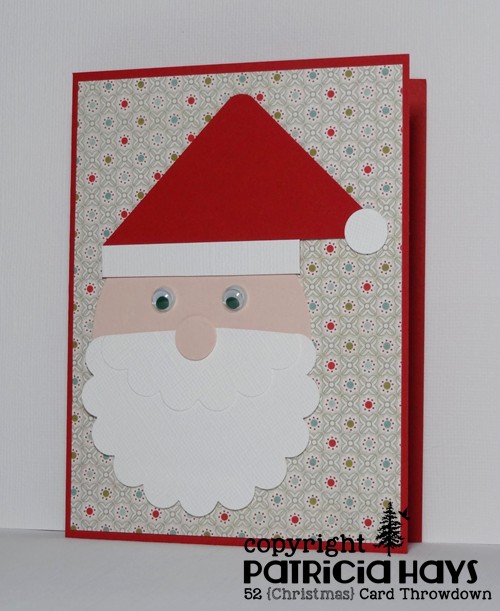
Hello there!  It’s Saturday, which means it’s time for a new challenge at 52 {Christmas} Card Throwdown.  This week we have a technique challenge for you – using punch art to create the main focal point of your Christmas or wintry card.  You’re also welcome to use dies to create your artwork.

I will readily admit that punch art has always been challenging for me, and this time was no exception.  After a lot of browsing online, I finally found the directions to make a Santa head.  It looked easy enough, and I had the same punches that were called for in the instructions… well, almost.  Although I had the same shapes of punches, I did not have the same sizes as used in the online example.  So I had to modify a bit, especially with figuring the size I needed to make the hat.  Thankfully it ended up still being small enough to fit on a card.  I found some wiggly eyes in my craft stash and decided to use a couple of them instead of drawing in Santa’s eyes.  I guess it turned out all right even though I didn’t take the time to add shadowing to the punched pieces.  I did raise Santa up from the card front with some scrap cardstock shims.

52CCT 03-28-2015

So, now it’s time for you to check out the other design team members’ creations, and then make a card with your own punch art to link to the challenge site!  We’d love to see what you can do!  Thanks for stopping by today.

Supplies:
Stamps: none
Cardstock: Real Red, Whisper White textured, Blush Blossom (Stampin’ Up); designer paper from Arctic Frost 6″ x 6″ paper pad (Basic Grey)
Ink: none
Other: scalloped circle punch, circle punches, corner rounder punch (EK Success); wiggly eyes (source unknown)

Hello!  At CAS Colours & Sketches this week, we’re closing out the month of March with a sketch challenge.  I’ve gone patriotic with it to create a card that I’ll write a message of support in and then send to Operation Write Home to be used as an “AnyHero” note that can be given to one of our military men or women stationed overseas.  I took a tiny bit of liberty with the sketch, stretching it out to a rectangle.  It’s really a quite straightforward card so I’ll just go ahead and share it:

CASCAS117

sketch 117

Be sure to see what the rest of the design team has done with the sketch!  Then create your own card and share it with us at the CC&S blog.  You have until 1:00 p.m. Eastern time Wednesday, April 1 to enter the challenge.  Thanks for stopping by today!

Supplies:
Stamp: Thank You for your Sacrifice and Service (Unity)
Cardstock: Brilliant Blue, Whisper White, Real Red (Stampin’ Up)
Ink: Real Red (SU)
Other: Stars dies (Sweet ‘n Sassy Stamps); Stars embossing folder (ProvoCraft)

If you’ve been reading my blog for any length of time, you’ve probably figured out that I seriously love the adorable animal stamps from Lawn Fawn.  Each year to commemorate the company’s birthday, they put out a new little celebratory set.  As soon as I saw this year’s set, I knew I had to have it – not just for myself, but also for a dear friend of mine.  I preordered it from one of my favorite online stores, and waited patiently, and finally received the stamps a few weeks ago – one set for my friend, and one for me.

Then I had the dilemma of when the best time to give my friend her set would be.  Her birthday isn’t until September, and I didn’t think I could wait that long.  So I did a little calendar math and reasoned that since March and September are six months apart, I’d send it to her for her half-birthday.  I thought that a half-birthday gift would be a much more unexpected surprise than a birthday gift, and that just seemed like a really fun thing to do.

So I sent my friend’s set to her recently, tucked inside of the card I’m sharing here today.  I used a wash of distress ink on watercolor paper to create some variegated blue paper and then cut it with dies, using the darkest blues for the waves and the lightest blues for the sky.  I toyed with the idea of coloring the otter with distress inks too, but I haven’t done any detail painting like that for a while, so I decided to play it safe and color the otter with markers instead.  Once he was colored, I fussy cut him so I could place him floating among the waves.  The sentiment stamp actually reads “have an otterly great birthday”, but that didn’t seem exactly right for this particular purpose.  So I inked it selectively and fit the wording into the space available, using my trusty Stamp-a-ma-jig to line it up neatly.  I used OWH Stars & Stamps sketch #184 for the layout of the card.  Hopefully I’ve used enough distress ink for the card to count toward the current Lawnscaping challenge, too.

102 - distressed otter

I hope my friend enjoys using this stamp set as much as I enjoyed making this card for her!  She’s an “otterrific” lady and I hope she realizes how much our circle of friends loves her.  Thanks for stopping by today!

Supplies:
Stamps: Year Five (Lawn Fawn)
Cardstock: Marina Mist, Kraft (Stampin’ Up); watercolor paper (Artist’s Loft); designer paper from Nature’s Whisper paper pack (Creative Memories)
Ink: Tuxedo Black (Memento); Faded Jeans Distress Ink (Tim Holtz)
Other: markers (Copic); stitched circle Stackables die (Lawn Fawn); Landscape Trio die (Mama Elephant)

Hello!  I hope your week has gotten off to a good start.  Today I’m sharing a card I made using the current Freshly Made Sketches layout.  I stayed true to the sketch, just adding mats behind the two main panels.  The wire that the birds are perched upon shows off my awesome drawing skills. ROFL!

FMS178

I was planning to put this card in my next shipment to Operation Write Home, but maybe instead I’ll keep it and send it to a friend.  Or maybe I just need to make more of these.  🙂

Thanks for stopping by today!

Supplies for this card:
Stamps: Feathered Friends [for Simon Says Stamp], So Much to Say (Lawn Fawn)
Cardstock: Daffodil Delight, Strawberry Slush (Stampin’ Up); Pure Luxury White (Gina K. Designs)
Ink: Tuxedo Black (Memento)
Other: stitched circle dies (Lawn Fawn); markers (Copic)

Hello!  Once again, it’s time for a new challenge at 52 {Christmas} Card Throwdown.  This week’s theme is “Silent Night”.  There are lots of ways to interpret that, so feel free to check out the 52{C}CT site to see what the rest of the design team has made.

I decided to go with what I think is a peaceful winter scene.  I stamped the trees onto glossy cardstock with white pigment ink and then heat embossed them with clear embossing powder.  Then I masked off the ground, to keep it white and looking like it’s snow-covered, so I could sponge some deep blue inks above it to create a nighttime sky.  After I removed the mask, I added in a tiny bit of light grey ink to the ground to create a few shadows.  The current challenge at Retro Rubber is to use embossing powder, and I’ve used the sketch from The Crooked Stamper Sketch Challenge (but turned it on its side) so yay – that’s three challenges in one card.

52CCT 03-21-2015

RRCB10

What will you do with our theme?  Please show us by linking your own Christmas or wintry card at the 52{C}CT site by 1:00 p.m. Eastern time Friday, March 27.  We’d love to see your artwork!  Thanks for stopping by today.

Supplies:
Stamps: Lovely As A Tree (Stampin’ Up); Holiday Script (Lizzie Anne Designs)
Cardstock: Not Quite Navy, Smoky Slate, Whisper White, Glossy White (Stampin’ Up)
Ink: Not Quite Navy, Midnight Muse, Smoky Slate, Whisper White (SU)
Other: clear detail embossing powder (SU); Snowflakes embossing folder (Darice); oval Nestabilities dies (Spellbinders); corner rounder punch (EK Success); sponge

This week at CAS Colours & Sketches we have some bright, fresh, springtimey colors for you to use in creating a clean and simple styled card.  Sadly, I needed to make a sympathy card so I’ve used the challenge colors for it.  I’ve also used this week’s sketch from CAS(E) this Sketch!.  I don’t think I can say much else without thinking about why I had to make a sympathy card, and that will get me crying again, so here’s the card:

CASCAS116

Thanks for stopping by today.  Remember to hug the people you love.

All supplies for this card are from Stampin’ Up.
Stamps: Roses in Winter, Thoughts & Prayers
Cardstock: Daffodil Delight, Strawberry Slush, Very Vanilla
Ink: Strawberry Slush, Wild Wasabi
Other: Beautiful Wings die, pearls

Hello!  Since it’s the third Monday of the month, it’s time for another challenge at Cards in Envy.  Our theme for the next few weeks is “Spring is in the Air”.  Let anything related to the season of Spring inspire your creativity when you make a card for this challenge – flowers, colors, animals, whatever seems like Spring to you!  Remember that for our challenges, all cards must be A2 sized and cannot have lumpy, bumpy embellishments more than 1/4″ thick.

One of my favorite things about Spring is that flowers start blooming.  Even though we’ve had a lot of cold, snowy weather over the last month, the daffodils in my flower border are starting to put out foliage.  In anticipation of them showing their sunshiny-yellow blossoms, I’ve used a daffodil stamp for my card and colored it in representation of the daffodils that grew in my family’s yard when I was growing up.  The layout is OWH Stars & Stamps sketch #B-17 – a bonus sketch from a 2012 blog hop.  I’ve turned the sketch on its side and stamped the sentiment directly onto the main panel of the card rather than making a small panel especially for it.  The vertical strip of designer paper is some pretty old stuff, and the green cardstock is a retired Stampin’ Up color, so I’m continuing on my personal goal of actually using up some of my older stamping supplies.

CIE 03-16-2015

Be sure to check out what the rest of the Cards in Envy design team has made!  How will the changing season inspire you?  We’d love to see your creativity!  Share your card using the linky tool at the Cards in Envy site by 7:00 p.m. Eastern time Sunday, April 5.

Supplies:
Stamps: Three Daffodils (Hero Arts); Always in My Thoughts (Stampin’ Up)
Cardstock: Certainly Celery, So Saffron, Petals & Paisleys designer series paper (SU); Pure Luxury White (Gina K. Designs)
Ink: Tuxedo Black (Memento)
Other: markers (Copics)

Hello!  I know, I don’t often post on Sundays, but I wanted to share a card I made last night, combining several online challenges and using some of my older products.

The current Shopping Our Stash challenge theme calls for using numbers in some way, and at Clear It Out they want us to use products that are orange.  I remembered that in one of my older Basic Grey paper collections there was a print with numbers all over it, so I got that out, and by good chance, some of the numbers were an orangey color!  The current sketch at Freshly Made Sketches has a nice large panel that seemed like a good way to showcase the number print.  Another paper in the same Basic Grey collection had a orangey-yellow block pattern, and there was a coordinating more-or-less solid paper (from a distance it looks solid, but up close you can see streaks and color variations in it).  The sketch pulled the three papers together nicely.  I felt the numbers would work well for a birthday theme, so I stamped a party hat from one of my older Lawn Fawn stamp sets onto a scrap, colored it to coordinate with the papers, fussy cut it, and attached it in the place of the round element on the sketch.  I positioned the hat and the banner a bit lower than the way it’s drawn on the sketch to allow that sideways orange 8 to show.  (Or maybe it’s supposed to be infinity?)  It all came together like this:

FMS177

So there ya have it.  I figure it will be a good any age card to send to Operation Write Home.  Although the colors do suggest a boyish or masculine vibe, I think it’s pretty gender neutral.  And it felt good to finally cut into that number paper!

Thanks for stopping by today!  All comments are read and greatly appreciated.  Have a great day!

Supplies:
Stamps: Hats Off to You (Lawn Fawn)
Cardstock: Naturals White (Stampin’ Up); “Brigham”, “Zachary”, and “Marigold” papers from Oh Baby! Boy collection (Basic Grey)
Ink: Tuxedo Black (Memento)
Other: markers (Copic)

Hello! This week is color challenge week at 52 {Christmas} Card Throwdown.  We have a non-traditional color palette this time – pink, light blue, and silver.

I pondered the colors for a while and tossed a few ideas around in my head, but nothing seemed “right” until I decided to revisit one of my older cards and just switch up the colors.  The result is a clean and layered card with some embossing and a few rhinestone embellishments.

52CCT 03-14-2015

And now it’s your turn to show us what you can create!  We’d love it if you joined our challenge this week.  You have until 7:00 pm Eastern time Friday, March 20 to link your card at the 52{C}CT site. Thanks for stopping by today!

Supplies:
Stamp: Winter Wishes (Unity)
Cardstock: Pink Pirouette, Brushed Silver, Bashful Blue, Whisper White (Stampin’ Up)
Ink: Pink Pirouette (SU)
Other: Snowflakes embossing folder (Sizzix), ticket corner punch (SU); rhinestones (Recollections)

Hello!  It’s time for a sketch challenge again over at CAS Colours & Sketches.  You’re welcome to manipulate the sketch, or change the circle to another shape, so long as we can still easily recognize the main elements of the sketch.

I actually made two cards.  For both of them, I stretched the sketch out to a rectangle.  I made one card with a portrait-oriented layout and the other with a landscape-oriented layout.  I flipped the portrait-oriented one mirror image, just to make it a little different.  The tags that I used for the circular element are from the same stamp set.  I used designer papers from the same package for the strips and banners elements of the sketch.  On the portrait-oriented one, I decided to pleat the horizontal strip to give it a little extra visual interest.

CASCAS115 portrait

CASCAS115 landscape

sketch 115

I suppose I could enter both of these cards into the current Retro Rubber challenge, but I’ll just go with the one with the pleated strip since that’s a little more unique.

RRBC09

Thanks for stopping by today!  Be sure to see what the rest of the CC&S Design Team has done with the sketch.  Then show us your own take on it by linking your card at the CC&S site by 1:00 p.m. Eastern time Wednesday, March 18.  We’d love to have you join us!

All supplies for both cards are from Stampin’ Up.
Stamps: Too Terrific Tags
Cardstock: So Saffron, Pretty in Pink, Whisper White, Tea Party Designer Series papers
Ink: Wild Wasabi, Pretty in Pink
Other: tag punch, candy dots

Hello!  I have just a quick post tonight to share a card I made combining several online challenges.  The current Lawnscaping challenge is to use dots and/or stripes.  I’ve used a stripey paper and a dotty paper for that.  At Retro Rubber Challenge blog, they are inviting their participants to use older stamps (at least a year old) and to incorporate a tag on their project.  The butterfly and the sentiment are from two of my older Lawn Fawn stamp sets.  As I was starting to put the tag on the card front, I noticed how much the card was resembling the current sketch at CAS(E) this Sketch!  So I thought about what to do for the trio of banner elements, and decided to use these really old snap/rivet things I have.  Anyone else remember them?  On a card they look like brads, but they attach like eyelets.  Yes, I had some fun pounding them with my hammer, LOL.  Even though the colors and patterns aren’t my usual thing, I kinda like the way the card came together.

101- butterfly tag

RRBC09

Thanks for stopping by!  All comments are read and appreciated… well, except the spam comments – they’re read, but not appreciated.  Unless they’re so bizarre that they make me laugh.  I can always appreciate a good laugh! LOL

Supplies:
Stamps: Flutter By, Sophie’s Sentiments (Lawn Fawn)
Cardstock: Naturals White (Stampin’ Up); designer papers from Bright Side Petite Paper Pack (Lawn Fawn)
Ink: Tuxedo Black (Memento)
Other: markers (Copic); tag corner punch, Calypso Coral twine (SU); Lemon twine (Really Reasonable Ribbon); eyelet and snaps (source unknown)

Hello there, and happy Saturday to you!  Can you believe it’s March already?  I have to say that it still feels like winter here in the Shenandoah Valley because we got about 5 inches of snow Thursday – just after the snow we got on Valentine’s Day finally was mostly melted away!

At 52 {Christmas} Card Throwdown our month of challenges always starts off with a sketch, and this time it’s a nice one that can be kept simple or dressed up with layers and interesting shaped panels and embellishments.  I’ve chosen to keep it clean and layered in style.  I’ve been on one of my “trying to use older products” kicks the last few days, and that’s reflected in this card.  I’ve used stamps, cardstock, and designer paper that’s been retired for several years, and I’ve had the tiny round brads for a while.  The star brad is a leftover from the Christmas cards my family sent in 2010.  The brads make this card eligible for the current Shopping Our Stash challenge – well, they might not be my very oldest hardware, but I’ve had them for at least 4 years.  The tree panel is raised from the card base with dimensional adhesive.

52CCT 03-07-2015

And now it’s your turn to show us what you can create!  We’d love it if you joined our challenge this week.  You have until 7:00 pm Eastern time Friday, March 13 to link your card at the 52{C}CT site. Thanks for stopping by today!

All supplies except the brads are from Stampin’ Up.
Stamps: Season of Joy, Sincere Salutations
Cardstock: Certainly Celery, Naturals Ivory, Certainly Celery Prints designer paper
Ink: Certainly Celery
Other: dimensionals, corner rounder punch; round mini brads (Recollections); star brad (The Paper Studio)

Hello!  It’s time for a new month of challenges at CAS Colours & Sketches!  One of our newest design team members, Jane, is our hostess this month and she has some fun challenge ideas in store for us!

As always, we start the month with a color challenge.  I’ve decided to combine the colors with the CAS(E) this Sketch! challenge that ends this morning. I had the worst time trying to get the colors to show true in the photo, so you’re going to have to take my word for it that “thanks” and the flower are a deep blackberry purple and that the “for all you do” is stamped in dark mossy green.  It was fun getting some use out of one of my old Cuttlebug alphabet die sets for this card!

CASCAS114

colors #114

I’m also entering this card in the Clear it Out challenge, where the theme this week is  “Anything Goes”.

How will you use these colors?  Be sure to check out the CC&S blog to see what the rest of the design team has made.  Once you’ve made your own card, be sure to link it at the challenge post by 1:00 p.m. Eastern time Wednesday, March 11.  We’d love to have you join us!  Thanks for stopping by today.

Supplies:
Stamps: Handwritten Notes (Avery Elle)
Cardstock: Naturals White, Lost Lagoon, Blackberry Bliss, Mossy Meadow (Stampin’ Up)
Ink: Mossy Meadow (SU)
Other: Olivia alphabet die (ProvoCraft)

Hello again!  It’s time for another challenge at Cards in Envy.  For the next two weeks, we have a pretty easy theme for you to follow:  Anything Goes with a Bow.  That’s right – all you need to do for this challenge is to make an A2 sized card (4.25″ x 5.5″) with no embellishments more than 1/4″ thick so that it could be mailed at the standard postage rate – but it must include a bow of some sort.  You may use a bow made of ribbon, twine, or paper so long as it’s less than 1/4″ thick.  You could also choose to use an image of a bow.

I’ve combined our bow challenge with the current Freshly Made Sketches layout, which conveniently included a bow element.  I’ve taken the liberty of scooting the bow to the left of the main image panel.  I’ve paper pieced my scene using cardstock and Basic Grey papers.  I used a die to cut the basic cloud shape and then trimmed it down with my scissors so it would better fit in the space.

CIE 03-02-2015

This card was included in the package I sent to Operation Write Home last week.  I hope one of our heroes will enjoy sending it home to his or her child.

If you need additional inspiration, please go check out the Cards in Envy site and see what the rest of the design team has made.  Then create a card with a bow following our challenge guidelines and share it with us using the linky tool on the Cards in Envy site by 7:00 p.m. Eastern time Sunday, March 15.  We’d love to have you play along with us!  Thanks for stopping by today.

Supplies:
Stamps: Thoughtful Rhubarb (Sweet ‘n Sassy Stamps)
Cardstock: Pure Luxury White (Gina K. Designs); Bashful Blue, Early Espresso (Stampin’ Up); designer papers from Blush and Oxford 6″ x 6″ paper pads (Basic Grey)
Ink: Tuxedo Black
Other: cloud die (SNSS); stitched landscape die (Mama Elephant); Lemon twine (Really Reasonable Ribbon)

© 2019 Suffusion theme by Sayontan Sinha