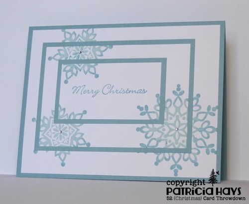
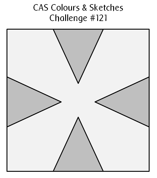
Hello there!  It’s the fifth Thursday of the month, so that means at CAS Colours & Sketches we have a double challenge for you!  This week we have a sketch and a color combination for you to use together in creating a clean and simple styled card.

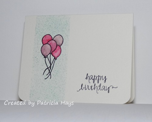
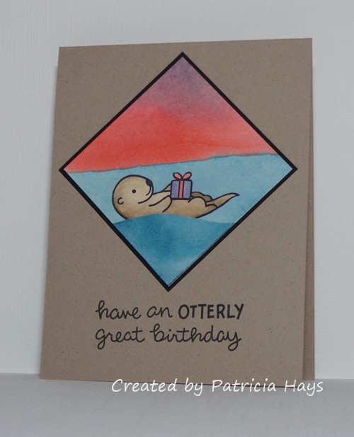
I’ve taken a few liberties with the sketch element – I’ve turned it 45° on its side and attached it to an A2 sized card base.  The challenge colors reminded me of a beach at sunset, so I made a watercolor wash using inks in the three colors for the background of my sketch element.  (I actually made two, but I didn’t like how the wisteria color turned out on the first one, so I tried again and came up with the one you see here.)  I stamped the otter and his gift box on a scrap of white cardstock, colored them, fussy cut them, and attached them to the square.  Then I freehand cut a wave from the first watercolor wash I’d made and attached that to the square so the otter wouldn’t look like he was randomly floating.  The first wash was a lot darker than the second, so there’s some color variation there, but trust me, they’re from the same color ink!  Anyway, then I attached my sketch element to the card base and added the sentiment.

CASCAS122

double122

I’m including this in the “Make Your Mark” challenge at Addicted to Stamps and More, too.

Thanks for stopping by today!  Be sure to see what the other CAS – Colours and Sketches design team members have made.  Then show us what you can create with the colors and the sketch! You have until 6:00 p.m. eastern time Wednesday, May 6 to link your work to the challenge post.

Supplies:
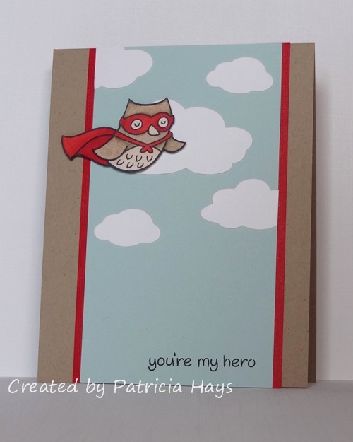
Stamps: Year Five (Lawn Fawn)
Cardstock: Kraft, Basic Black (Stampin’ Up); Solar White (Neenah); watercolor paper (Artist’s Loft)
Ink: Tuxedo Black (Memento)
Other: Wisteria Wonder, Calypso Coral, and Island Indigo reinkers (SU); markers (Copic)

Hello!  It’s 8 months to Christmas!  Are you going to be ready for it?  At 52 {Christmas} Card Throwdown, our goal is to help you avoid some of the last-minute rush by creating a Christmas card each week.  This time our challenge for you is to use the Triple Time Stamping technique to create your card.

I’ve opted to keep my card clean and layered in style.  I arranged the layers slightly off center, with a wider margin on the right and bottom than on the left and top, to give the card a little more visual interest.  The snowflakes are stamped using the Rock ‘n Roll technique, inked first with a very pale blue and then edged with a shade darker.  A tiny rhinestone in the center of each snowflake adds a bit of sparkle to the card.

52CCT 04-25-2015

And now it’s your turn to show us what you can create!  We’d love it if you joined our challenge this week.  You have until 7:00 pm Eastern time Friday, May 1 to link your card at the 52{C}CT site. Thanks for stopping by today!

All supplies except the rhinestones are from Stampin’ Up.
Stamps: Festive Flurry, Madonna and Child
Cardstock: Baja Breeze, Whisper White
Ink: Baja Breeze, Soft Sky
Other: rhinestones (Recollections)

Hello!  The current challenge at The Paper Players has been intriguing me all week.  It’s to create a clean and simple styled card and incorporate watercoloring into it.  Since the challenge closes this afternoon, I figured this morning it was now or never if I wanted to join in.  The current CAS(E) this Sketch! layout seemed to lend itself well to including a watercolored background so I’ve combined the two challenges in today’s card.  I started off with a wash of green ink on watercolor paper, which turned out pretty light, but that was OK because I didn’t want it to obscure the image.  Once it was dry, I stamped the holly image.  Then I used a damp paintbrush to trace over the lines, blending in all the little shading lines and softening the edges of the image.  I stamped a cherry colored ink pad on acetate and used the ink from there to color in the berries.  I accidentally tapped the brush over the cardstock as I was finishing up the berries, splattering a bit of the watered-down red ink near the bottom edge of the watercolor paper.  So I made a last-minute decision to add some more splatters randomly over and around the image.  I chose a green cardstock for the base and here’s the final result:

CTS120

I realize it probably seems a little weird to have a Christmasy design in April, but none of the previous ideas I had came together very well for me.  It still makes a good card for me to stockpile for Operation Write Home.  Since there’s no sentiment on it, the person who chooses to send it can use it for any occasion during the holiday season.  And Christmas Eve is just 8 months away from today!

Thanks for stopping by my blog today.  All comments are read and appreciated!  (Well, not the spam comments.  They are read, but they are not appreciated unless the content or grammar strikes my funny bone – like the poorly worded one that talked about testing traffic lights.  LOL!)

Supplies:
Stamp: Christmas Blueprint 4 (Tim Holtz)
Cardstock: Garden Green (Stampin’ Up); watercolor paper (Artist’s Loft)
Ink: Garden Green, Cherry Cobbler (SU)
Other: paintbrush

Hello!  It’s time for a sketch challenge again over at CAS Colours & Sketches.  We have a pretty interesting one for you this time!  You’re welcome to manipulate the sketch, so long as we can still easily recognize the main elements.

The sketch was drawn up for a square card.  Since I prefer to make A2 sized rectangular cards, rather than trying to stretch the sketch out into a rectangle, I just put the square element on a rectangular card base.  Even though I think it’s a really neat sketch, I had a difficult time deciding what I wanted to do with it.  I thought about using butterflies or flowers or even ice cream cones for the triangular elements of the sketch, but nothing seemed “right”, so in the end I just stayed very true to the sketch and used triangles of designer paper.  It was a nice way to use up some scraps I had!  I have to admit it’s not one of my most favorite cards – it seems too flat, like it’s lacking something.  But it’s definitely not one of my worst cards either, so I’m OK with it.  It will be a good addition to the stockpile I’m building for Operation Write Home.

CASCAS121

Be sure to check out what the rest of the CC&S Design Team has done with this sketch – they’ve made some amazing cards!  Then give it a try yourself.  You have until 6:00 p.m. Eastern time Wednesday, April 29 to link your card at the challenge site.  Thanks for stopping by today!

Supplies:
Stamps: Year-Round Sentiments (Hero Arts)
Cardstock: Pure Luxury Ivory (Gina K. Designs); Rich Razzleberry, Razzleberry Tart designer papers (Stampin’ Up)
Ink: Rich Razzleberry (SU)

Hello!  Today’s card combines the layout from Freshly Made Sketches challenge #182 and the “Up, up and away” theme from Less is More challenge #220.  I took a few liberties with the sketch, turning it 180° upside-down and substituting the owl for the rectangular shape. That forced me to move the sentiment onto the main focal panel.  I’ve used dimensional adhesive to attach the owl to better give it the effect of being in flight.

FMS182

Edited on April 21, 2015:  At Sarah’s invitation in the comments, I’m also entering this into the Uniko Studio “Things with Wings” challenge.

Thanks for visiting my blog today!  All comments are read and appreciated.

Supplies:
Stamps: Critters in Costume (Lawn Fawn)
Cardstock: Kraft, Real Red Core’dinations, Soft Sky (Stampin’ Up); Pure Luxury White (Gina K. Designs)
Ink: Tuxedo Black (Memento)
Other: markers (Copic); cloud dies (Sweet ‘n Sassy Stamps); dimensionals (SU)

Hello!  It’s the third Monday of the month, which means it’s time for a new challenge at Cards in Envy.  This time we have a color challenge for you – “Pretty in Pink”.

I wanted to use the current sketch from CAS(E) this Sketch! for the layout of my card.  The vase of flowers in the inspiration photo at Addicted to Stamps and More nudged me in the direction of using pink flowers on my card, and the creamy white table and chairs inspired me to choose ivory for my card base.  I looked through my stamp sets to figure out which one to use, and found this one that I hadn’t used for a long time.  I thought it might work well with some of my stash of Prima flowers, so I went through them and found these that were just the right size, with the bonus of the darker ones matching the dark pink cardstock perfectly.  The rediscovered stamp set and flowers tie into the current Shopping Our Stash challenge.  The current challenge at Retro Rubber is to use brads, so I looked through my horde of brads and found these little green ones that would work as the centers of the flowers.  So I was able to combine all the challenges together and came up with this:

CIE 04-20-2015

RRBC12

Now that I’ve completed my card for this challenge, I have the Psychedelic Furs song “Pretty in Pink” running through my head, and I’m tempted to see if I can find the Molly Ringwald movie on Netflix.  Ah, the 1980s.  Good times!  🙂

If you need additional inspiration, please go check out the Cards in Envy site and see what the rest of the design team has made.  Then create your own pink card following our challenge guidelines and share it with us on the Cards in Envy site by 7:00 p.m. Eastern time Sunday, May 3.  You can make your card  for any occasion or theme you like, so long as the dominant color is pink, it’s A2 sized, and that there are no lumpy, bumpy embellishments that would prevent the card from being mailed at the first class postage rate.  We’d love to have you play along with us!  Thanks for stopping by today.

Edited on April 24, 2015:  Thank you to the Addicted to Stamps and More team for naming me as an Honourable Addict for their challenge!  What a sweet surprise!

Edited on April 26, 2015:  Thank you also to the Retro Rubber Mod Squad for selecting my card as one of their Fab Five!  What a happy way for my week to start!

Supplies:
Stamps: Artfully Asian, Three Little Words (Stampin’ Up)
Cardstock: Pure Luxury Ivory (Gina K. Designs); Pink Passion, Pink Pirouette (SU)
Ink: Wild Wasabi, Pink Passion (SU)
Other: marker (Copic); flowers (Prima); brads (Recollections)

Hello!  The third Saturday of the month means it’s theme challenge time at 52 {Christmas} Card Throwdown.  This time our hostess, Louise, was inspired by her love of cats and has chosen the theme of “Christmas cats”.  So long as a cat is the focus of your Christmas or wintry card, it’ll be just right for our challenge.

Luckily for me, I had chosen a digital stamp set featuring a cat when Deedee’s Digis sponsored our 52CCT challenges last September.  I’ve used it again for today’s card.  This time I printed out the pre-colored version of the image and a designer paper that comes in the set, along with one of the sentiments.  I rarely use pre-colored images but I wasn’t feeling particularly creative when I was making this card, so it was nice to have an easy way out.  Then I chose some solid cardstock that coordinated with the red and the grey in the image and designer paper.  The layout for my card comes from the current Crooked Stamper Sketch Challenge, but I’ve flipped it mirror-image so the cat wouldn’t be “looking off the edge” of the card. I used a square punch to cut the tail of the banner.

52CCT 04-18-2015

All right – now it’s your turn to get creating!  We’d love it if you share your Christmas kitty cards on our challenge blog.  You can link your card until 7:00 p.m. Eastern time Friday, April 24.  Thanks for stopping by today!

Supplies:
Digital Images: Meowy Christmas (Deedee’s Digis)
Cardstock: Smoky Slate, Rose Red, Whisper White (Stampin’ Up); Meowy Christmas designer paper (Deedee’s Digis)
Ink: printer ink
Other: square punch (Creative Memories); standard circle and big scalloped circle Nestabilities dies (Spellbinders)

It’s color challenge week again at CAS Colours & Sketches, and we have some bright cheery ones for you this time.  I have to admit it took me a while to decide how I wanted to use them on my card.  I finally decided to combine the color challenge with a couple other challenges and make a birthday card.

The current challenge at Less is More is to make a one-layer card incorporating splatters of some sort.  So I masked off an area on the front of my card, stamped the balloons (masking each one as I stamped them), and splattered some Coastal Cabana ink over the area with an old toothbrush.  Then I removed all the masks, partially colored the balloons with Perfect Plum and Rose Red watercolor crayons, and used a paintbrush and water to spread and blend the color over the balloons.  It’s been a long time since I’ve participated in a challenge at AEIHeartU, and their current one is to use watercoloring, so the balloons qualify this card for that.  Using the corner rounder on the bottom corners of the card was a last-minute decision to do something a bit different.  I think it ties in with the roundness of the balloons.  And there you have it – one layer, splatters, watercoloring, and the three CC&S colors.

CASCAS120

Challenge 23

How will you use our challenge colors?  If you want additional inspiration, be sure to see what the rest of the CC&S design team has made.  Then link your own card to the challenge post by 6:00 p.m. Eastern time Wednesday, April 22.  We’d love to have you join us!  Thanks for stopping by today.

Supplies:
Stamps: Storybook, So Happy (Avery Elle)
Cardstock: watercolor paper (Artist’s Loft)
Ink: Tuxedo Black (Memento)
Other: Coastal Cabana reinker, Rose Red and Perfect Plum watercolor crayons (Stampin’ Up); corner rounder (EK Success); paintbrush, water

This is a pretty quick and simple card I made to combine the current CAS(E) this Sketch! layout with the current Clear It Out challenge to use yellow things.  I’ve cut this doily die from some textured sunshiny yellow cardstock and used the same color ink for the sentiment.  A couple matching brads hold the banner in place.

CTS118

Thanks for stopping by!

Supplies:
Stamp: In My Heart (Mama Elephant)
Cardstock: Pure Luxury White (Gina K. Designs); Summer Sun textured (Stampin’ Up)
Ink: Summer Sun (SU)
Other: For the Record 2, Documented die (Sizzix); Dimensional Banner die (My Favorite Things); brads (Making Memories)

Hello there!  It’s the second Saturday of the month, and that means it’s color challenge time at 52 {Christmas} Card Throwdown.  This time we’re asking our challenge participants to be inspired by the colors of coffee and cream.

I am not a coffee drinker – I like the smell of it (most of the time, at least), but I don’t care for the taste.  But with the challenge colors stated the way they are, I couldn’t resist using the Stampin’ Up color called Early Espresso.  It’s a very dark brown, so I guess that goes along with my husband’s preference to drink his coffee black.  It doesn’t show up very well because the cardstock is so dark, but I stamped it with a background stamp to (try to) give it a little extra visual interest.  I stamped the toy soldier stamp with Early Espresso ink on watercolor paper and then used a slightly damp paintbrush to blur some of the lines and give the image a bit of color.  The layout for this card comes from this week’s Freshly Made Sketches challenge.  The sentiment is from a long-retired Stampin’ Up stamp set.  I thought it was especially appropriate for a card that’s going to be donated to Operation Write Home.

52CCT 04-11-2015

Be sure to check out what the rest of the design team has made.  Then show us what you can create with these colors!  We’d love it if you joined our challenge this week.  You have until 7:00 pm Eastern time Friday, April 17 to link your card at the 52{C}CT site. Thanks for stopping by today!

Supplies:
Stamps: Christmas Blueprint (Tim Holtz); Wishes Awash, Sanded (Stampin’ Up)
Cardstock: Pure Luxury Ivory (Gina K. Designs); Early Espresso (SU); watercolor paper (Artist’s Loft)
Ink: Early Espresso (SU)
Other: brads (Recollections); paintbrush, water

OK, I have to admit this isn’t one of my most favorite cards I’ve ever made.  It’s one that came together very quickly for me, combining OWH Stars & Stamps sketch #251 with the current Less is More challenge to use black as a dominant color.  One of the Less is More co-creators, Chrissie, has been a frequent supporter of the CAS Colours & Sketches challenge blog and I’d like to reciprocate the favor.  Hopefully in the coming weeks I’ll be able to do that!

LIM218

I’ve used washi tape to create the vertical stripes.  Here’s the sketch diagram:

sketch 251

As luck would have it, this happened when I was trying to photograph the card:

LIM218 Lyric

I guess he felt he needed to be in the photo too since the LIM challenge was “predominantly black”. Silly kitty.

Thanks for stopping by today!  Comments are always read and appreciated.  🙂

Supplies:
Stamps: Incredible (Technique Tuesday)
Cardstock: Basic Black, Whisper White (Stampin’ Up)
Ink: Tuxedo Black (Memento)
Other: washi tape (We R Memory Keepers)

Hello!  It’s time for another sketch challenge at CAS – Colours and Sketches!   As always, the sketch can be rotated or flipped – so long as we can see the basic elements of the original sketch, it’s all good!

I’ve stretched the sketch out to a portrait-oriented rectangle for this card.  After a lot of thinking of various things I could use for the circular elements, I finally decided on these cute little birdies.  I stamped them onto scraps of designer paper, colored in their beaks, and fussy cut them.  I positioned them in place on the sky blue background, drew in the birds’ legs and the rightmost bird’s right eye, and then used dimensional adhesive to pop the birds up over the background. Admittedly, it’s not the most imaginative use of dimension, but it’s enough to qualify this card for the current Lawnscaping challenge.  The code word for the current challenge at Addicted to CAS is “cute”, and it’s “Clean and Simple” week at Addicted to Stamps, so I’m going to enter into those challenges, too.  And it’s a good card to add to my stash for Operation Write Home!

CASCAS119

Thanks for stopping by today!  I hope you’ll join us over at CAS – Colours and Sketches with your own take on this sketch!  You have until 7:00 p.m. Eastern time Wednesday, April 15 to link your card at the challenge website.

Supplies:
Stamps: Feathered Friends [for Simon Says Stamp]; Sophie’s Sentiments (Lawn Fawn)
Cardstock: Pink Pirouette, Early Espresso (Stampin’ Up); designer papers from Two Scoops 6″ x 6″ paper pad and Blitzen collection (Basic Grey)
Ink: Early Espresso (SU)
Other: dimensionals (SU); marker (Copic)

I have just a quick post tonight to share the card I’ve made for the CAS(E) this Sketch! challenge that ends tomorrow morning.  I’ll admit I took a bit of liberty with the sketch by turning it 90° and adding a few panels, but I think you can still see the basics of the sketch within the focal panel.  I felt like the card looked too plain with just the focal panel on the base, so I added a punch of color with the textured red mat.  After I’d stamped the images on the ivory focal panel, I had a “DUH!” moment where I realized I needed white for the milk.  So I stamped all the elements on a scrap of white cardstock, colored them, fussy cut them, and then adhered them to the focal panel.  The straw in the milk glass took a little bit of finagling with my x-acto knife, but I finally got it to look kind of realistic.

CTS117

Since I used a die to cut the focal panel, I’m going to submit this into the current challenge at The Paper Players.  I’m also entering this into the “Anything Goes” challenge at Clear It Out challenge blog.

Thanks for stopping by today!  Comments are always read and appreciated!

Supplies:
Stamps: Milk and Cookies (Lawn Fawn)
Cardstock: Crumb Cake, Early Espresso, Real Red Core’dinations (Stampin’ Up); Pure Luxury White and Ivory (Gina K. Designs)
Ink: Tuxedo Black (Memento)
Other: markers (Copic); Stitched Journaling Card die (Lawn Fawn)

Hi there! It’s Cards in Envy challenge introduction day! For the next two weeks we have a theme challenge of “Child’s Play”.  Show us your A2 sized cards that are suitable to be given to a child.  Remember to keep your cards flat enough to fit in an envelope and be mailed at the first class postage rate.

Since I don’t have any young children in my life, my card is going to be sent to Operation Write Home.  I wanted to keep it gender neutral, so I chose a gray and bright yellow color scheme with pops of some other colors.  The cute jumping smiley face is appropriate for either a boy or a girl.  Although the smiley face stamp and the sentiment stamp might seem like they were made for each other, they are from different companies.  I bought them several years apart from two different stores.  The layout I used for this card is the sketch from the current Retro Rubber challenge.  Well, actually it’s the mirror image of the sketch.  I did it that way so the smiley face would seem to be looking toward the middle of the card rather than off the edge of it.

CIE 04-06-2015

RRCB11

Be sure to check out what the rest of the Cards in Envy design team has done for this challenge, and then go make a card to brighten a child’s day!  We’d love to see your creativity!  Share your card using the linky tool at the Cards in Envy site by 7:00 p.m. Eastern time Sunday, April 19.  Thanks for stopping by today!

Edited on April 12, 2015: Thank you to the Retro Rubber Design Team for naming my card as one of their Fab Five for their sketch challenge! I’m delighted and honored!

Supplies:
Stamps: Jump – Smileys (Uptown Design Company); sentiment stamp (Studio G)
Cardstock: Crushed Curry, Smoky Slate, Watercolor Wonder designer series paper (Stampin’ Up); Pure Luxury White (Gina K. Designs)
Ink: Tuxedo Black (Memento)
Other: markers (Copic); Stitched Scalloped Borders die (Lawn Fawn); candy dots (SU)

Hello!  I realize it seems a little strange to be talking about Christmas on the day before Easter, but really, is it wrong to be in the Christmas spirit of giving and love all year round?  I think not.

Since it’s the first Saturday of the month, it’s time for another sketch challenge at 52 {Christmas} Card Throwdown.  Our challenge hostess for the month of April is Louise, and she’s designed a sketch that’s perfect for using up scraps of designer paper or cardstock.  I have a tendency to hang on to all sorts of scraps “just in case I’ll need them sometime” – well, this card was the perfect time to use a lot of the scraps I’d been hoarding from one of my Basic Grey paper pads.  I did not cut into any whole sheets of designer paper for this card. (For that matter, even the card base was left over from another card.)  I did take the liberty of stretching the sketch out to a rectangle and turning it onto its side.  The sentiment from one of my older stamp sets fit nicely in one block. I drew in some faux cross stitching to connect the different designer papers, tying this card into the current Shopping Our Stash challenge.  As I was moving some things on my desk earlier this week, I found these dyed Prima flowers that were left over from a card I’d made quite a while back.  The color matched nicely for this card, so I decided to add them, attaching them with some brads.  The designer papers, the flowers, and the brads all count toward the “hoarded items” for the current Clear it Out challenge.

52CCT 04-04-2015

Go hop over to the 52{C}CT blog to see what the rest of the design team has created.  Then get your creative gears going and make your own Christmas or wintry card with this sketch, and share it with us using the linky tool provided at the 52{C}CT site.  We’d love to see what you do!  Thanks for stopping by today!

Supplies:
Stamp: Happiest of Holidays (Stampin’ Up)
Cardstock: Cherry Cobbler (SU); designer papers from Aspen Frost 6″ x 6″ paper pad (Basic Grey)
Ink: Cherry Cobbler (SU)
Other: Cherry Cobbler marker (SU); flowers (Prima Marketing); brads (Recollections)

© 2019 Suffusion theme by Sayontan Sinha